Graphing a Report
The graph output type isn't the preferred option for reports and saved searches anymore. To see your data in a graph, use SuiteAnalytics Workbook's chart features instead. For more information about how to use charts in SuiteAnalytics Workbook, see Workbook Charts.
You can click the Graph button in the footer of most reports to view that report as a graph.
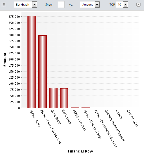
The following customization options are available for graphs:
-
Type of graph - Bar graph, pie chart, and line graph are available. Default is bar graph.
-
Show and vs - Use the Show and vs. fields to define your X and Y axes.
In the Show field, choose the values you want on your X-axis.
In the vs. field, choose the values for your Y-axis.
-
Top - Choose to graph the top 5, 10, 15, 20, 25, or 50 values.
-
Also show - Choose a second field to show on your Y-axis.
This option is only available for bar and line graphs.
-
2nd Y-axis - Check this box if you want the value selected in the Also show field to show in a second Y- axis on your report.
This option is only available for bar and line graphs.
For more robust graphing, contact your account service provider to purchase SuiteAnalytics Connect.