42 Creating Databound Gantt Chart and Timeline Components
projectGantt, resourceUtilizationGantt, schedulingGantt, and timeline components to create Gantt charts and timelines that visually represent business data. It describes how to use ADF data controls to create these components with data-first development.If you are designing your page using simple UI-first development, then you can add the Gantt chart or timeline to your page and configure the data bindings later. For information about the data requirements, tag structure, and options for customizing the look and behavior of the Gantt chart and timeline components, see the Using Gantt Chart Components and Using Timeline Components chapters in Developing Web User Interfaces with Oracle ADF Faces.
This chapter includes the following sections:
About ADF Data Visualization Components
ADF Data Visualization components provide extensive graphical and tabular capabilities for visually displaying and analyzing business data. Each component needs to be bound to data before it can be rendered since the appearance of the component is dictated by the data that is displayed.
There are three types of ADF Gantt chart components; a project Gantt chart used for project management, a scheduling Gantt chart used for resource scheduling, and a resource utilization Gantt chart used for displaying resource metrics. All Gantt charts display two regions combined with a splitter. The list region displays a list of tasks or resources, and the chart region displays task progress, resource utilization, or resource progress graphed over time.
The ADF timeline is an interactive data visualization tool that allows users to view events in chronological order and easily navigate forwards and backwards within a defined time range. Events are represented as timeline items using simple ADF components to display information such as text and images, or supply actions such a links. A dual timeline can be configured to display two series of events to allow a side-by-side comparison of related information.
The prefix dvt: occurs at the beginning of each data visualization component name indicating that the component belongs to the ADF Data Visualization Tools (DVT) tag library.
Data Visualization Components Use Cases and Examples
For detailed descriptions of each data visualization use cases and examples, see the following:
-
Gantt chart components: Gantt Chart Component Use Cases and Examples section in Developing Web User Interfaces with Oracle ADF Faces.
-
Timeline components: Timeline Use Cases and Examples section in Developing Web User Interfaces with Oracle ADF Faces.
End User and Presentation Features
Visually compelling data visualization components enable end users to understand and analyze complex business data. The components are rich in features that provide out-of-the-box interactivity support. For detailed descriptions of the end user and presentation features for each component, see the following:
-
Gantt chart components: End User and Presentation Features section in Developing Web User Interfaces with Oracle ADF Faces.
-
Timeline components: End User and Presentation Features section in Developing Web User Interfaces with Oracle ADF Faces.
Additional Functionality for Data Visualization Components
You may find it helpful to understand other Oracle ADF features before you data bind your data visualization components. Additionally, once you have added a data visualization component to your page, you may find that you need to add functionality such as validation and accessibility. Following are links to other functionality that data visualization components use:
-
Partial page rendering: You may want a data visualization component to refresh to show new data based on an action taken on another component on the page. For more information, see the Rerendering Partial Page Content chapter in Developing Web User Interfaces with Oracle ADF Faces.
-
Personalization: Users can change the way the data visualization components display at runtime, those values will not be retained once the user leaves the page unless you configure your application to allow user customization. For more information, see the Allowing User Customization on JSF Pages chapter in Developing Web User Interfaces with Oracle ADF Faces.
-
Accessibility: By default, data visualization components are accessible. You can make your application pages available to screen readers. For more information, see the Developing Accessible ADF Faces Pages chapter in Developing Web User Interfaces with Oracle ADF Faces.
-
Skins and styles: You can customize the appearance of data visualization components using an ADF skin that you apply to the application or by applying CSS style properties directly using a style-related property (
styleClassorinlineStyle). For more information, see the Customizing the Appearance Using Styles and Skins chapter in Developing Web User Interfaces with Oracle ADF Faces. -
Placeholder data controls: If you know the data visualization components on your page will eventually use ADF data binding, but you need to develop the pages before the data controls are ready, then you should consider using placeholder data controls, rather than manually binding the components. Using placeholder data controls will provide the same declarative development experience as using developed data controls. For more information, see Designing a Page Using Placeholder Data Controls.
Creating Databound Gantt Charts
A Gantt chart is a type of bar chart displayed on the horizontal axis. It is used in planning and tracking projects to show tasks or resources in a time frame with a distinct beginning and end.
When you create a Gantt chart, you can choose from the following types:
-
Project
A project Gantt chart lists tasks vertically and shows the duration of each task as a bar on a horizontal time line.
-
Resource Utilization
A resource utilization Gantt chart shows graphically whether resources are over or under allocated. It shows resources vertically while showing their allocation and, optionally, capacity on the horizontal time axis.
-
Scheduling
A scheduling Gantt chart is based on manual scheduling boards and shows resources vertically with corresponding activities on the horizontal time axis. Examples of resources include people, machines, or rooms.
How to Create a Databound Project Gantt Chart
For a project Gantt chart, you must specify values for tasks. Optionally, you can specify values for split tasks, subtasks, recurring tasks, and dependencies between tasks, if your data collection has accessors for this additional information.
The project Gantt chart is displayed with default values for overall start time and end time and for the major and minor time axis values. In a project Gantt chart, the setting for the major time axis defaults to weeks and the setting for the minor time axis defaults to days.
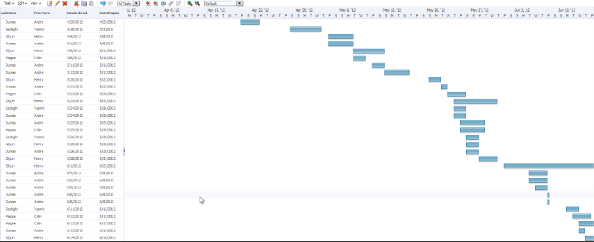
Figure 42-1 shows a project Gantt chart in which each task is an order to be filled. The list region on the left side of the splitter shows columns with the name of the person responsible for the order and columns for the order date and ship date. In the chart region on the right side of the splitter, the Gantt chart displays a horizontal bar from the order date to the ship date for each order.
Figure 42-1 Project Gantt Chart for Orders Shipped
To create a project Gantt chart using a data control, bind the project Gantt chart component to a data collection. JDeveloper allows you to do this declaratively by dragging and dropping a collection from the Data Controls panel.
Tip:
You can also create a project Gantt chart by dragging a project Gantt chart component from the Components window and completing the Create Project Gantt dialog. This approach allows you to design the Gantt chart user interface before binding the component to data.
Before you begin:
It may be helpful to have an understanding of databound Gantt charts. For more information, see Creating Databound Gantt Charts.
You may also find it helpful to understand functionality that can be added using other Oracle ADF features. For more information, see Additional Functionality for Data Visualization Components.
You will need to complete these tasks:
-
Create an application module that contains instances of the view objects that you want in your data model, as described in Creating and Modifying an Application Module.
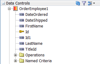
For example, the data source for the project Gantt chart in Figure 42-1 comes from a view object representing shipping orders including their shipping and delivery dates, in the Summit sample application for ADF DVT components.
-
Create a JSF page as described in the How to Create JSF Pages section of Developing Web User Interfaces with Oracle ADF Faces.
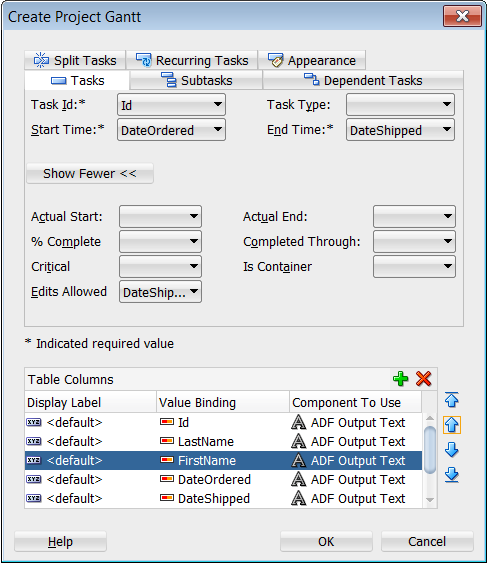
To create a project Gantt chart using the Data Controls panel:
After creating the project Gantt chart, use the Properties window to specify values for additional attributes. For detailed information about Gantt chart use cases, end user and presentation features, tag structure, and adding special features to Gantt charts, see the Using Gantt Chart Components chapter in Developing Web User Interfaces with Oracle ADF Faces.
What Happens When You Create a Project Gantt Chart from a Data Control
Dragging and dropping a view object from the Data Controls panel to create a project Gantt chart has the following effect:
-
Creates the bindings for the Gantt chart and adds the bindings to the page definition file
-
Adds the necessary code for the UI components to the JSF page
The example below displays the row set bindings generated for the project Gantt chart in Figure 42-1 to display shipped orders. This code example shows the node defined for tasks with attributes for task Id, start date, and end dates. There are also nodes defined for subtasks, dependent tasks, split tasks, and recurring tasks with no defined attributes.
<bindings>
  <gantt IterBinding="OrderEmployee1Iterator" id="OrderEmployee1"
         xmlns="http://xmlns.oracle.com/adfm/dvt">    <ganttDataMap>      <nodeDefinition DefName="model.OrderEmployee" type="Tasks">        <AttrNames>
          <Item Value="TaskId" type="taskId"/>
          <Item Value="StartDate" type="startTime"/>
          <Item Value="EndDate" type="endTime"/>
          <Item Value="TaskType" type="taskType"/>
        </AttrNames>
      </nodeDefinition>
      <nodeDefinition type="subTasks">
        <AttrNames/>
      </nodeDefinition>
      <nodeDefinition type="Dependents">
        <AttrNames/>
      </nodeDefinition>
      <nodeDefinition type="SplitTasks">
        <AttrNames/>
      </nodeDefinition>
      <nodeDefinition type="RecurringTasks">
        <AttrNames/>
      </nodeDefinition>
  </ganttDataMap>
 </gantt>
</bindings>
The example below shows the code generated on the JSF page for the project Gantt chart. This tag code contains settings for the overall start and end time for the project Gantt chart. It also shows the default time axis settings for the major axis in weeks and the minor axis in days. Finally, it lists the specifications for each column that appears in the list region of the Gantt chart.
<dvt:projectGantt id="gantt1" value="#{bindings.OrderEmployee1.projectGanttModel}"
                  dataChangeListener="#{bindings.OrderEmployee1.projectGanttModel
                      .processDataChanged}"
                  var="row"
                  startTime="2012-03-31" endTime="2012-06-30">
  <f:facet name="major">
    <dvt:timeAxis scale="weeks" id="ta1"/>
  </f:facet>
  <f:facet name="minor">
    <dvt:timeAxis scale="days" id="ta2"/>
  </f:facet>
  <f:facet name="nodeStamp">
    <af:column
        sortProperty="#{bindings.OrderEmployee1.hints.FirstName.name}"
        sortable="false"
        headerText="#{bindings.OrderEmployee1.hints.FirstName.label}"
        id="c1">
      <af:outputText value="#{row.FirstName}" id="ot1"/>
    </af:column>
  </f:facet>
    <af:column sortProperty="LastName" sortable="false"
             headerText="#{bindings.OrderEmployee1.hints.LastName.label}">
      <af:outputText value="#{row.LastName}"/>
    </af:column>
    <af:column sortProperty="OrderDate" sortable="false"
             headerText="#{bindings.OrderEmployee1.hints.OrderDate.label}">
       <af:outputText value="#{row.OrderDate}">
         <af:convertDateTime
             pattern="#{bindings.OrderEmployee1.hints.OrderDate.format}"/>
       </af:outputText>
     </af:column>
     <af:column sortProperty="ShippedDate" sortable="false"
         headerText="#{bindings.OrderEmployee1.hints.ShippedDate.label}">
       <af:outputText value="#{row.ShippedDate}">
       <af:convertDateTime
         pattern="#{bindings.OrderEmployee1.hints.ShippedDate.format}"/>
       </af:outputText>
     </af:column>
     <af:column sortProperty="TaskType" sortable="false"
         headerText="#{bindings.OrderEmployee1.hints.TaskType.label}">
       <af:outputText value="#{row.TaskType}"/>
     </af:column>
 </projectGantt>
How to Create a Databound Resource Utilization Gantt Chart
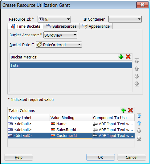
For a resource utilization Gantt chart, you must supply identification for resources, identification for time, and start and end times for resource usage. Optionally, you can provide data values for subresources.
The resource utilization Gantt chart is displayed with default values for the major and minor time axis values. In a resource utilization Gantt chart, the setting for the major time axis defaults to weeks and the setting for the minor time axis defaults to days.
Figure 42-4 shows a resource utilization Gantt chart that lists each resource and an associated calendar that can display when the resource is in use.
Figure 42-4 Resource Utilization Gantt Chart

To create a resource utilization Gantt chart using a data control, you bind the resource utilization component to a data collection. JDeveloper allows you to do this declaratively by dragging a collection from the Data Controls panel and dropping it on a JSF page.
Tip:
You can also create a resource utilization Gantt chart by dragging a resource utilization Gantt chart component from the Components window and completing the Create Resource Utilization Gantt dialog. This approach gives you the option of designing the Gantt chart user interface before binding the component to data.
Before you begin:
It may be helpful to have an understanding of databound Gantt charts. For more information, see Creating Databound Gantt Charts.
You may also find it helpful to understand functionality that can be added using other Oracle ADF features. For more information, see Additional Functionality for Data Visualization Components.
You will need to complete these tasks:
-
Create an application module that contains instances of the view objects that you want in your data model, as described in Creating and Modifying an Application Module.
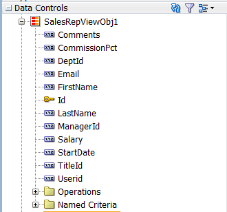
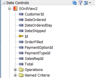
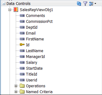
For example, the data source for the Gantt chart in Figure 42-4 comes from view objects in the Summit ADF DVT sample application. Use the
SalesRepViewObj1view object representing the sales personnel with a view link to theSOrdView2view object that includes the time bucket accessor and attributes for order and ship dates. -
Create a JSF page as described in the How to Create JSF Pages section of Developing Web User Interfaces with Oracle ADF Faces.
To create a resource utilization Gantt chart using the Data Controls panel:
After creating the resource utilization Gantt chart, use the Properties window to specify values for additional attributes. For detailed information about Gantt chart use cases, end user and presentation features, tag structure, and adding special features to Gantt charts, see the Using Gantt Chart Components chapter in Developing Web User Interfaces with Oracle ADF Faces.
What Happens When You Create a Resource Utilization Gantt Chart
Dragging and dropping a view object from the Data Controls panel onto a JSF page to create a resource utilization Gantt chart has the following effects:
-
Creates bindings for the resource utilization Gantt chart and adds the bindings to the page definition file
-
Adds the necessary code for the UI components to the JSF page
The example below shows the row set bindings that were generated for the resource utilization Gantt chart illustrated in Figure 42-7.
<bindings>
  <gantt IterBinding="SalesRepViewObj1Iterator" id="SalesRepViewObj1"
         xmlns="http://xmlns.oracle.com/adfm/dvt">
    <ganttDataMap>
      <nodeDefinition DefName="model.SalesRepViewObj" type="Resources">
        <AttrNames>
          <Item Value="Id" type="resourceId"/>
        </AttrNames>
        <Accessors>
          <Item Value="SOrdView" type="timeBuckets"/>
        </Accessors>
      </nodeDefinition>
      <nodeDefinition type="TimeBuckets" DefName="model.SOrdView">
        <AttrNames>
          <Item Value="DateOrderedDay" type="time"/>
          <Item type="metric" Value="Total"/>
        </AttrNames>
      </nodeDefinition>
      <nodeDefinition type="Subresources">
        <AttrNames/>
      </nodeDefinition>
    </ganttDataMap>
  </gantt>
</bindings>
The example below shows the code generated on the JSF page for the resource utilization Gantt chart. This tag code contains settings for the overall start and end time for the resource utilization Gantt chart. These settings have to be edited manually. The code also shows the time axis settings for the major time axis (in weeks) and the minor time axis (in days). Finally, it lists the specifications for each column to appear in the list region of the resource utilization Gantt chart.
<dvt:resourceUtilizationGantt id="gantt1"
            value="#{bindings.SalesRepViewObj1.resourceUtilizationGanttModel}"
            var="row" metrics="#{bindings.SalesRepViewObj1.metrics}"
            taskbarFormatManager="#{bindings.SalesRepViewObj1.
                resourceUtilizationGanttTaskbarFormatManager}"
            startTime="2012-05-09" endTime="2013-05-15"
            summary="#{viewcontrollerBundle.RESOURCE_UTILIZATION_GANTT_CHART}">
  <f:facet name="major">
    <dvt:timeAxis scale="weeks" id="ta1"/>
  </f:facet>
  <f:facet name="minor">
    <dvt:timeAxis scale="days" id="ta2"/>
  </f:facet>
  <f:facet name="nodeStamp">
    <af:column sortProperty="#{bindings.SalesRepViewObj1.hints.FirstName.name}"
               sortable="false"
               headerText="#{bindings.SalesRepViewObj1.hints.FirstName.label}"
               id="c1">
      <af:outputText value="#{row.FirstName}"
                  shortDesc="#{bindings.SalesRepViewObj1.hints.FirstName.tooltip}"
                  id="ot1"/>
    </af:column>
  </f:facet>
    <af:column sortProperty="#{bindings.SalesRepViewObj1.hints.LastName.name}"
               sortable="false"
               headerText="#{bindings.SalesRepViewObj1.hints.LastName.label}"
               id="c2">
      <af:outputText value="#{row.LastName}"
                   shortDesc="#{bindings.SalesRepViewObj1.hints.LastName.tooltip}"
                   id="ot2"/>
    </af:column>
    <af:column sortProperty="#{bindings.SalesRepViewObj1.hints.Email.name}"
               sortable="false"
               headerText="#{bindings.SalesRepViewObj1.hints.Email.label}"
               id="c3">
      <af:outputText value="#{row.Email}"
                     shortDesc="#{bindings.SalesRepViewObj1.hints.Email.tooltip}"
                     id="ot3"/>
    </af:column>
</dvt:resourceUtilizationGantt>
How to Create a Databound Scheduling Gantt Chart
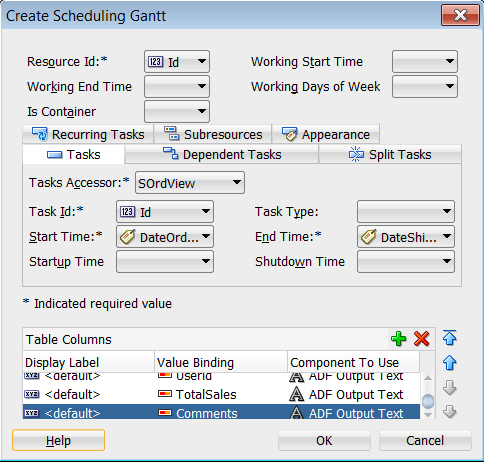
For a scheduling Gantt chart, you must supply identification for resources, identification for tasks, and start and end times for tasks. Optionally, you can provide data values for subresources, recurring tasks, split tasks, and dependencies between tasks.
The scheduling Gantt chart is displayed with default values for overall start and end time and for the major and minor time axis values. In a scheduling Gantt chart, the setting for the major time axis defaults to weeks and the setting for the minor time axis defaults to days.
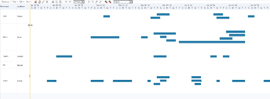
Figure 42-8 shows a scheduling Gantt chart that lists each resource and all the orders for which that resource is responsible. In contrast to a project Gantt chart, the scheduling Gantt chart shows all the tasks for a given resource on the same line, while the project Gantt chart lists each task on a separate line.
Figure 42-8 Scheduling Gantt Chart for Order Shipping
To create a scheduling Gantt chart using a data control, you bind the schedulingGantt tag to a data collection. JDeveloper allows you to do this declaratively by dragging and dropping a collection from the Data Controls panel.
Before you begin:
It may be helpful to have an understanding of databound Gantt charts. For more information, see Creating Databound Gantt Charts.
You may also find it helpful to understand functionality that can be added using other Oracle ADF features. For more information, see Additional Functionality for Data Visualization Components.
You will need to complete these tasks:
-
Create an application module that contains instances of the view objects that you want in your data model, as described in Creating and Modifying an Application Module.
For example, the data source for the Gantt chart in Figure 42-8 comes from view objects in the Summit ADF DVT sample application. Use the
SalesRepViewObj1view object representing the sales personnel with a view link to theSOrdView2view object that includes the tasks accessor and attributes for order and ship dates. -
Create a JSF page as described in the How to Create JSF Pages section of Developing Web User Interfaces with Oracle ADF Faces.
To create a scheduling Gantt chart using the Data Controls panel:
What Happens When You Create a Scheduling Gantt Chart
Dropping a scheduling Gantt chart from the Data Controls panel has the following effect:
-
Creates the bindings for the Gantt chart and adds the bindings to the page definition file
-
Adds the necessary code for the UI components to the JSF page
The example below shows the row set bindings that were generated for the scheduling Gantt chart that displays resources and orders shipped.
<bindings>
  <gantt IterBinding="SalesRepViewObj1Iterator" id="SalesRepViewObj1"
         xmlns="http://xmlns.oracle.com/adfm/dvt">
    <ganttDataMap>
      <nodeDefinition DefName="model.SalesRepViewObj" type="Resources">
        <AttrNames>
          <Item Value="Id" type="resourceId"/>
        </AttrNames>
        <Accessors>
          <Item Value="SOrdView" type="tasks"/>
        </Accessors>
      </nodeDefinition>
      <nodeDefinition type="Tasks" DefName="model.SOrdView">
        <AttrNames>
          <Item Value="Id" type="taskId"/>
          <Item Value="DateOrdered" type="startTime"/>
          <Item Value="DateShipped" type="endTime"/>
        </AttrNames>
      </nodeDefinition>
      <nodeDefinition type="Dependents">
        <AttrNames/>
      </nodeDefinition>
      <nodeDefinition type="SplitTasks">
        <AttrNames/>
      </nodeDefinition>
      <nodeDefinition type="RecurringTasks">
        <AttrNames/>
      </nodeDefinition>
      <nodeDefinition type="Subresources">
        <AttrNames/>
      </nodeDefinition>
    </ganttDataMap>
  </gantt>
</bindings>
The example below shows the code generated on the JSF page for the scheduling Gantt chart. This tag code contains settings for the overall start and end time for the scheduling Gantt chart. It also shows the time axis settings for the major time axis in weeks and the minor time axis in days. Finally, it lists the specifications for each column that appears in the list region of the Gantt chart.
<dvt:schedulingGantt id="gantt1"
                     value="#{bindings.SalesRepViewObj1.schedulingGanttModel}"
                     dataChangeListener="#{bindings.SalesRepViewObj1.
                         schedulingGanttModel.processDataChanged}"
                     var="row" startTime="2012-04-15" endTime="2013-05-15"
                     summary="#{viewcontrollerBundle.SCHEDULING_GANTT_CHART}">
  <f:facet name="major">
    <dvt:timeAxis scale="weeks" id="ta1"/>
  </f:facet>
  <f:facet name="minor">
    <dvt:timeAxis scale="days" id="ta2"/>
  </f:facet>
<f:facet name="nodeStamp">
  <af:column sortProperty="#{bindings.SalesRepViewObj1.hints.FirstName.name}"
             sortable="false"
             headerText="#{bindings.SalesRepViewObj1.hints.FirstName.label}"
             id="c1">
    <af:outputText value="#{row.FirstName}"
                   shortDesc="#{bindings.SalesRepViewObj1.hints.
                       FirstName.tooltip}"
                   id="ot1"/>
  </af:column>
</f:facet>
  <af:column sortProperty="#{bindings.SalesRepViewObj1.hints.LastName.name}"
             sortable="false"
             headerText="#{bindings.SalesRepViewObj1.hints.LastName.label}"
             id="c2">
    <af:outputText value="#{row.LastName}"
                   shortDesc="#{bindings.SalesRepViewObj1.hints.LastName.tooltip}"
                   id="ot2"/>
  </af:column>
  <af:column sortProperty="#{bindings.SalesRepViewObj1.hints.Email.name}"
             sortable="false"
             headerText="#{bindings.SalesRepViewObj1.hints.Email.label}" id="c3">
    <af:outputText value="#{row.Email}"
                   shortDesc="#{bindings.SalesRepViewObj1.hints.Email.tooltip}"
                   id="ot3"/>
  </af:column>
</dvt:schedulingGantt>
What You May Need to Know About Data Change Event Handling
When you use ADF data controls to data bind project and scheduling Gantt charts, a data change listener is automatically provided for data change events that require an update to row attributes, for example:
-
DURATION_CHANGE: End time of a task; resize task bar -
PROGRESS_CHANGE: Progress of task; resize progress bar -
TIME_CHANGE: Start and end time of a task; move the task bar
At design time, the data change listener provides a built-in processDataChange method for project and scheduling Gantt bindings as illustrated in the example below.
<dvt:projectGantt id="gantt1"
                  dataChangeListener="#{bindings.GanttProjectView1.
                      projectGanttModel.processDataChanged}"
                  value="#{bindings.GanttProjectView1.projectGanttModel}"
                  ...
</dvt:projectGantt>
Data change events requiring row insertion or deletion are not supported, for example:
-
TASK_SPLITTED: Split a task -
TASK_MERGED: Merge task with another task -
LINK: Link two tasks together -
UNLINK: Unlink two tasks linked together -
COPY: Copy one or more tasks or resources -
CREATE: Create a new task -
CREATE_RESOURCE: Create a new resource -
CUT: Cut one or more tasks or resources -
PASTE: Paste tasks or resources -
UPDATE: Update a task -
UPDATE_RESOURCE: Update a resource -
TASKS_PROPERTIES_UPDATE: Task properties dialog event -
INDENT: Indent a task or resource -
OUTDENT: Outdent a task or resource -
DELETE: Delete one or more tasks or resources
If you wish to configure your application to handle events that do not have a default implementation, specify a method in a backing bean and delegate to the built-in processDataChange method. For example, the first block of code below shows a dataChangeListener configured to use a handleDataChange method to handle a TASK_PROPERTIES_UPDATE event using the backing bean shown in the class code below.
<dvt:projectGantt id="gantt1"
                  dataChangeListener="#{backingBeanScope.backing_
                      projectGantt.handleDataChange}"
                  value="#{bindings.GanttProjectView1.projectGanttModel}"
                  ...
</dvt:projectGantt>
public void handleDataChange(DataChangeEvent evt)
{
    // handle events not supported by built-in "processDataChange" method
    int _type = evt.getActionType();
    if (_type == DataChangeEvent.TASK_PROPERTIES_UPDATE)
    {
        // handle event.
    }
    else  // delegate to built-in "processDataChange" method.
    {
				Application app = facesContext.getApplication();
        String expression =
            "#{bindings.GanttProjectView1.projectGanttModel.processDataChanged}";
        ExpressionFactory elFactory = app.getExpressionFactory();
        ELContext elContext = facesContext.getELContext();
        MethodExpression methodExp = elFactory.createMethodExpression(elContext,
            expression, null, new Class[] {DataChangeEvent.class});
        methodExp.invoke(elContext, new Object[] {evt});
    }
}
Note:
The project and scheduling Gantt chart's default implementation of a dataChangeListener for ADF data controls will not perform commit or rollback changes to the database. You must configure your application to handle those operations.
Creating Databound Timelines
A timeline is an interactive data visualization tool that allows users to view date-based events in chronological order and easily navigate forwards and backwards within a defined time range.
A timeline is composed of the display of events as timeline items along a time axis, a movable overview window that corresponds to the period of viewable time in the timeline, and an overview time axis that displays the total time increment for the timeline. A horizontal zoom control is available to change the viewable time range. Timeline items corresponding to events display associated information or actions and are connected to the date of the event in the time axis. Timelines items are represented by a marker in the overview panel. No more that two series of events are supported by the timeline component.
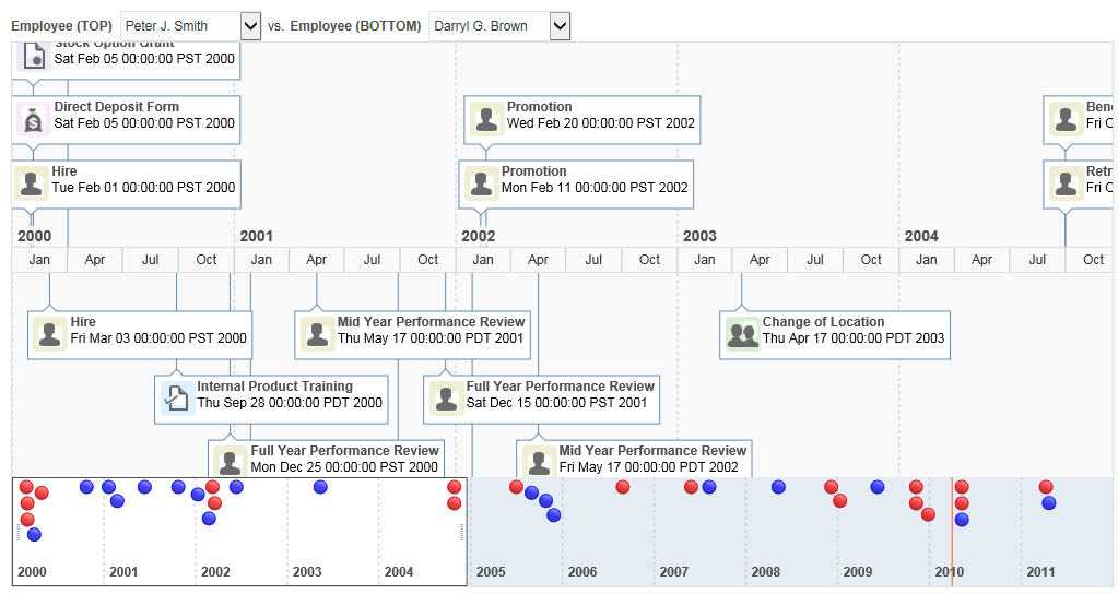
A dual timeline can be used for a side-by-side comparison of events. For example, you can use a timeline to display the hire dates of employees, or use a dual timeline to compare multiple human resource events between two employees.
Figure 42-12 shows a timeline in the Summit ADF DVT sample application. In this example, two lines of text are displayed along with images. When selection is configured, the timeline item, line feeler, and the event marker in the overview panel are highlighted.
Figure 42-12 Sample Timeline
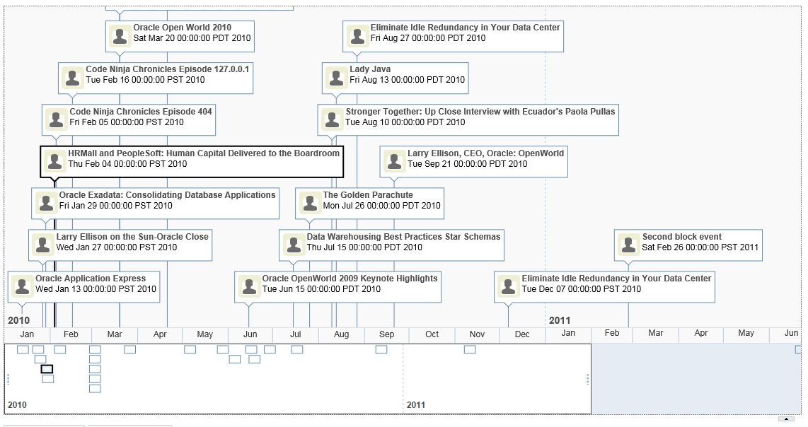
Figure 42-13 shows a dual timeline comparing multiple human resource events between two employees. The time axis is positioned between the two series of events and the overview panel displays at the bottom of the timeline.
Figure 42-13 Dual Timeline Comparing Human Resource Events
The content of timeline items, marker display, and time axis are configurable. For detailed information about timeline use cases, end user and presentation features, tag structure, and adding special features to timelines, see the Using Timeline Components chapter in Developing Web User Interfaces with Oracle ADF Faces.
How to Create a Timeline Using ADF Data Controls
The data displayed in a timeline is based on data collections. The timeline component uses a model to access the data in the underlying list. The specific model class is oracle.adf.view.rich.model.CollectionModel. You can also use other model instances, for example, java.util.List, java.util.Array, and javax.faces.model.DataModel. The data layer will automatically convert the instance into a CollectionModel.
Using data controls in Oracle ADF, JDeveloper makes this a declarative task. You drag and drop a data collection from the Data Controls panel that generates one (up to two) series of events onto the JSF page.
Before you begin:
It may be helpful to have an understanding of databound timelines. See Creating Databound Timelines.
You may also find it helpful to understand functionality that can be added using other Oracle ADF features. See Additional Functionality for Data Visualization Components.
You will need to complete these tasks:
-
Create an application module that contains instances of the view objects that you want in your data model, as described in Creating and Modifying an Application Module.
For example, the data source for the timeline in Figure 42-12 comes from a single table in the Summit ADF DVT sample application. Use the
SEmptable to create a view object representing the employees including their hire dates. -
Create a JSF page as described in the How to Create JSF Pages section of Developing Web User Interfaces with Oracle ADF Faces.
To create a timeline using the Data Controls panel:
-
From the Data Controls panel, select a collection.
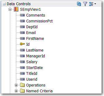
Figure 42-14 shows an example where you could select the
SEmpView1collection in the Data Controls panel to create a timeline that displays the hire dates of employees.Figure 42-14 Data Collection for Timeline of Employee Hire Dates
Description of "Figure 42-14 Data Collection for Timeline of Employee Hire Dates" -
Drag the collection onto the JSF page, and from the context menu choose Timeline.
-
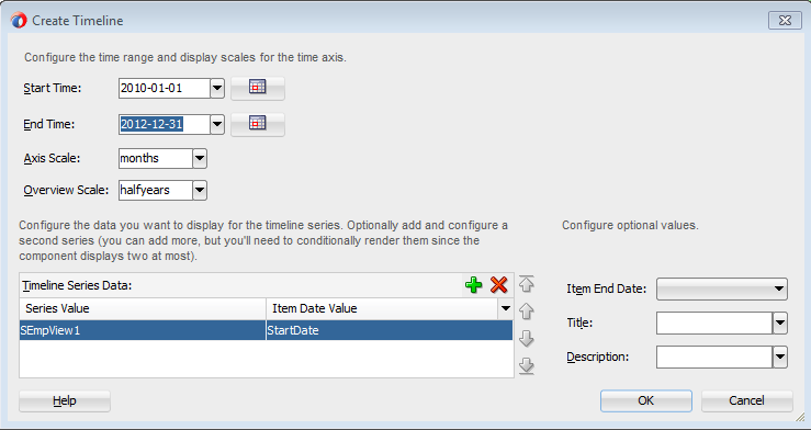
In the Create Timeline dialog, configure the time axis and overview axis by setting the following values:
-
Start Time: Enter the starting date to use for the time range of the timeline using the format
yyyy-mm-dd. Select a start date that will include events in the data collection you wish to display on the timeline. From the dropdown list you can selectCurrent Date. You can also click the Calendar icon to display a date picker dialog. The default value is set for three months before the current date. -
End Time: Enter the ending date to use for the timeline time range using the format
yyyy-mm-dd. Select an end date that will include events in the data collection you wish to display on the timeline. From the dropdown list you can selectCurrent Date. You can also click the Calendar icon to display a date picker dialog. The default value isCurrent Date. -
Axis Scale: Use the dropdown list to select the time scale to use for the timeline time axis. The time axis shows the user the current time increment for the timeline.
You must use a smaller time scale than the Overview Scale. For example, you cannot set the axis scale to
yearsif the overview scale is set tomonths. You can also specify a custom axis scale.Valid values are
twoyears,years,halfyears,quarters(default),twomonths,months,twoweeks,weeks,days,sixhours,threehours,hours,halfhours,quarterhours. You can also specify a custom axis scale. See How to Add a Custom Time Scale to a Timeline in Developing Web User Interfaces with Oracle ADF Faces. -
Overview Scale: Use the dropdown list to select the time scale to use for the timeline overview axis. The overview axis shows the user the total time increment covered by the timeline.
Valid values are
twoyears,years(default),halfyears,quarters,twomonths,months,twoweeks,weeks,days,sixhours,threehours,hours,halfhours,quarterhours. You can also specify a custom axis scale. See How to Add a Custom Time Scale to a Timeline in Developing Web User Interfaces with Oracle ADF Faces.
-
- In the Create Timeline dialog, configure the timeline data model for at least one (at most two for a dual timeline), by setting the following values:
-
Series Value: Use the dropdown list to select the data collection to use in the timeline. By default, the data collection you inserted from the Data Controls panel is displayed. JDeveloper automatically lists any collection from the application module that includes at least one qualifying date-based attribute from which to choose.
-
Item Date Value: Use the dropdown list to select the date-based attribute to use for the timeline items stamped in the timeline. JDeveloper automatically lists all qualifying attributes in the collection referenced in the Series Value from which to choose.
Note:
You can add and configure more series, but you will need to conditionally render them since the component displays two at most. -
- You can also configure the following values that are optional:
-
Item End Date: Specify the time-related attribute in the data collection that represents the end date for the timeline item. Use the dropdown list to display a list of available choices.
-
Title: Enter text or use the dropdown to specify the attribute in the data collection that represents the title for the timeline item.
-
Description: Enter text or use the dropdown to specify the attribute in the data collection that represents the description for the timeline item.
For example, in Figure 42-15 you can specify all the values.
-
-
Click OK to complete the definition of the data binding, or Cancel to end the creation of the timeline.
What Happens When You Use Data Controls to Create a Timeline
When you use ADF data controls to create a timeline, JDeveloper:
-
Defines the bindings for the timeline in the page definition file of the JSF page, and
-
Inserts code in the JSF page for the DVT timeline components.
The example below shows the bindings defined in the page definition file of the JSF page for the Summit ADF DVT sample timeline in Figure 42-12.
<bindings>
  <tree IterBinding="SEmpView1Iterator" id="SEmpView1" ChangeEventPolicy="ppr">
    <nodeDefinition DefName="model.SEmpView" Name="SEmpView1">
      <AttrNames>
        <Item Value="DeptId"/>
        <Item Value="FirstName"/>
        <Item Value="Id"/>
        <Item Value="LastName"/>
        <Item Value="StartDate"/>
      </AttrNames>
    </nodeDefinition>
  </tree>
</bindings>
The example below shows the code inserted in the JSF page for the example timeline in Figure 42-12.
<dvt:timeline id="tl1" startTime="2010-01-01" endTime="2011-12-31" itemSelection="multiple"
              binding="#{extEditor.component}" summary="Timeline Component Demo">
    <dvt:timeSeries id="ts1" var="evt" value="#{timeline.model}">
        <dvt:timeItem id="ti1" value="#{evt.date}" title="#{evt.description}" description="#{evt.date}"
                      thumbnail="/resources/images/timeline/employment.png"/>
    </dvt:timeSeries>
    <dvt:timeAxis id="ta1" scale="weeks" zoomOrder="quarters months weeks days"/>
    <dvt:timelineOverview id="ov1">
        <dvt:timeAxis id="ta2" scale="years"/>
    </dvt:timelineOverview>
</dvt:timeline>
What You May Need to Know About Using Data Controls to Create a Dual Timeline
When you use the Data Controls panel to create a dual timeline, you can configure the same or different data collections to configure the two timeline series and specify the timeline item display attributes and overview marker for each one. JDeveloper automatically lists any data collection from the application module that includes at least one qualifying date-based attribute from which to choose in the Create Timeline wizard.
The example below shows the sample code for the dual timeline displayed in Figure 42-13.
<dvt:timeline id="tl1" startTime="2000-01-01" endTime="2011-12-31"
                       inlineStyle="width:1024px;height:500px" itemSelection="single" currentTime="2010-04-01">
    <dvt:timeSeries id="ts1" var="evt" value="#{timeline.firstModel}">
        <dvt:timeItem id="ti1" value="#{evt.date}" group="#{evt.group}" title="#{evt.description}"
                      description="#{evt.date}" thumbnail="/resources/images/timeline/#{evt.type}.png">
            <f:facet name="overviewItem">
                <dvt:marker id="m1" shape="circle" fillColor="#ff0000"/>
            </f:facet>
        </dvt:timeItem>
    </dvt:timeSeries>
    <dvt:timeSeries id="ts2" var="evt" value="#{timeline.secondModel}">
        <dvt:timeItem id="ti2" value="#{evt.date}" title="#{evt.description}"
                      description="#{evt.date}" thumbnail="/resources/images/timeline/#{evt.type}.png">
            <f:facet name="overviewItem">
                <dvt:marker id="m2" shape="circle" fillColor="#0000ff"/>
            </f:facet>
        </dvt:timeItem>
   </dvt:timeSeries>
   <dvt:timeAxis id="ta1" scale="quarters" zoomOrder="quarters months weeks days"/>
   <dvt:timelineOverview id="ov1">
       <dvt:timeAxis id="ta2" scale="years"/>
   </dvt:timelineOverview>
</dvt:timeline>
For information about the data requirements, tag structure, and options for customizing the look and behavior of the component, see the Using Timeline Components chapter in the Developing Web User Interfaces with Oracle ADF Faces.
