37 Creating Databound Calendar and Carousel Components
This chapter includes the following sections:
About Databound ADF Faces Calendar and Carousel Components
The ADF Faces calendar component displays user activities by day, week, month, or by list view. The carousel component gives the user the ability to view an image from a series of images.
ADF Faces calendar and ADF Faces carousel are complex components that you can use to include calendar functions or display rotating images in your application. The ADF Faces calendar displays activities in daily, weekly, monthly, or list views for a given provider. The calendar is configurable to display only some of the views. The calendar includes a toolbar with built-in functionality that allows a user to change the view (between daily, weekly, monthly, or list), go to the previous or next day, week, or month, and return to today. The toolbar is customizable and allows you to choose which buttons and text to display, and you can also add buttons or other components.
The ADF Faces carousel displays images in a revolving loop that the user can select by using the slider or clicking on images. It can be configured to have either a horizontal or vertical orientation. You can use other components in conjunction with the carousel. You can add a toolbar or menu bar, and then add buttons or menu items that allow users to perform actions on the current object.
Databound ADF Faces Calendar and Carousel Components Use Cases and Examples
The ADF Faces calendar can be used whenever you want to add a calendar feature to your application. You will need to have the relevant data in your data store that represents the content provided by the calendar, such as the date, time, title, location, and owner. You can use the familiar patterns of entity objects and view objects to model the data and then use drag and drop from the Data Controls panel to create the calendar.
The carousel component gives the user the ability to view an image from a series of images. The user can see partial views of the images before and after the image being viewed and can scroll through each image in the sequence. The user can do so using a slider or navigation buttons. The carousel is useful for showing objects that require a highly visual presentation. For example, it can be used to display a photographic collection or merchandise in a catalog.
Additional Functionality of Databound ADF Faces Calendar and Carousel Components
You may find it helpful to understand other Oracle ADF features before you configure or use ADF Faces calendar and carousel components. Additionally, you may want to read about what you can do with your calendar and carousel components. Following are links to other functionality that may be of interest.
-
You can customize the calendar for individual users so that the calendar appears in the selected configuration when that user accesses the calendar. For more information, see Allowing User Customizations at Runtime.
-
Calendars are based on entity objects. For information on creating entity objects, see Creating a Business Domain Layer Using Entity Objects.
-
For more information about partial page rendering and the partialTriggers attribute, see the Rerendering Partial Page Content chapter of Developing Web User Interfaces with Oracle ADF Faces.
-
The carousel component uses a tree binding to iterate over the data. For more information about the tree binding, see Iterator and Value Bindings for Tables.
Using the ADF Faces Calendar Component
The ADF Faces calendar can be used whenever you want to add a calendar feature to your application. You will need to have the relevant data in your data store that represents the content provided by the calendar, such as the date, time, title, location, and owner.
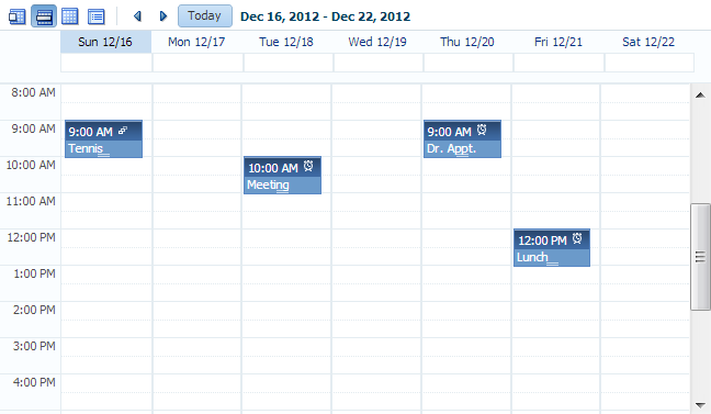
ADF Faces includes a calendar component that displays activities in daily, weekly, or monthly views. Figure 37-1 shows an ADF Faces calendar in weekly view mode with some sample activities.
Figure 37-1 ADF Faces Calendar

The calendar component also includes the following functionality:
-
A toolbar that allows users to switch between monthly, weekly, daily, and list views.
Tip:
When these toolbar buttons are used, attribute values on the calendar are changed. You can configure these values to be persisted so that they remain for a particular user whenever they accesses the calendar. For more information, see Allowing User Customizations at Runtime.
-
Configurable start of the week days and start of the day hours. For example, a calendar's week might start on Sunday and the day might show 8:00 am at the top.
-
Configurable styles using skinning keys.
Additionally, you can implement the following functionality using other ADF Faces components and the rich client framework:
-
Popup functionality. Components placed in supported facets that respond to certain events and allow the user to act on activities or the calendar. For example, when a user clicks an activity in the calendar, the
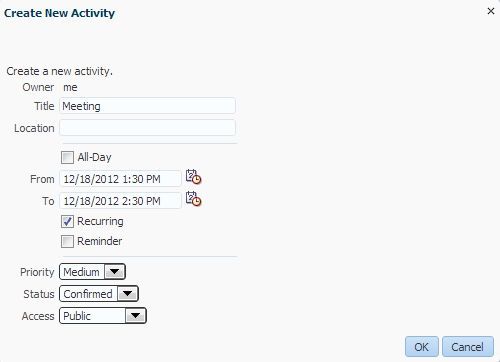
CalendarActivityEventis invoked and any popup component in theActivityDetailfacet is displayed. You might use a dialog component that contains a form where users can view and edit the activity, as shown in Figure 37-2.Figure 37-2 Edit Dialog for ActivityDetail Facet

Description of "Figure 37-2 Edit Dialog for ActivityDetail Facet" -
Drag and drop capability: You can add the
calendarDropTargettag that allows a user to drag an activity to another place on the calendar. You then implement the functionality so that the time is actually changed on the activity and persisted to the data store. -
Toolbar customization: By default, the toolbar contains buttons that allow the user to switch between the different views, along with previous and next buttons and a button that returns to the current date. The toolbar also displays the current date range (or the date when in day view). You can customize the toolbar by adding facets that contain additional buttons of your choosing.
-
Skinning: The calendar uses skinning keys to determine things like colors and icons used. You can extend the skin to change the appearance of the calendar.
Details for configuring the built-in functionality or for implementing additional functionality can be found in the Using a Calendar Component chapter of Developing Web User Interfaces with Oracle ADF Faces.
An ADF Faces Calendar component must be bound to a CalendarModel class. This class can be created for you when you use ADF Business Components to manage your calendar's data. For example, say you have data in your data store that represents the details of an activity, such as the date, time, title, location, and owner. When you create an entity object to represent that data, and then a view object to display the data, you can drag and drop the associated collection from the Data Controls panel to create the calendar. JDeveloper will declaratively create the model and bind the view to that model so that the correct data will display when the calendar is launched. However, in order for the model to be created, your entity objects in the data model project with ADF Business Components and your view objects in the same project must contain date-effective attributes. Additionally, the view objects must contain variables that will be used to modify the query to return the correct activities for the given date range.
How to Create the ADF Faces Calendar
Before you can create a calendar on a JSF page, you must first create an entity object with specific attributes that represent attributes on a calendar. You then must create a view object from that entity object, and modify the query to use named bind variables that represent the date range and current time zone to display. This will allow the query to return only the activities that should be displayed in the given view on the calendar.
For example, say you have a database table that represents an activity. It has a column for title, start time, end time, and a reference to a provider object that represents the owner. You would create an entity object and a view object based on that table (ensuring that it meets the requirements, as described in the following steps). To the view object, you would then add named bind variables for the start and end times currently displayed on the calendar, along with the time zone currently in use by the calendar, so that the query returns only those activities that fall within that time range.
Once you add the calendar component to a JSF page, you can configure it and add functionality.
Before you begin:
It may be helpful to have an understanding of the options that are available to you when you create a calendar. For more information, see Using the ADF Faces Calendar Component.
To create an ADF Faces calendar:
What Happens When You Create a Calendar
When you drop a collection as a calendar, JDeveloper:
-
Defines an iterator binding to the collection of activities, and another iterator binding to the collection of providers.
-
Defines an action binding to the
executeWithParamsoperation on the activities collection. It is this operation that will be invoked to execute the query to return the activities to display. Because the operation requires parameters to determine the date range and time zone,NamedDataelements are also created for each of the parameters (created as named bind variables on the view object). For more information aboutNamedDataelements, see Method Parameters.Note:
A runtime error will occur if you specify
java.sql.Dateas theNDTypein the calendar page definition file. Use one of the following supported data types instead:-
oracle.jbo.domain.Timestamp -
oracle.jbo.domain.Date -
java.sql.Timestamp -
java.util.Date
-
-
Defines a calendar binding. This binding contains a
nodeelement that represents a row in the collection and maps the data control attributes to the calendar activity's attributes, as defined when using the wizard.Thevalueis the data control attribute and thetypeis the calendar attribute. For any custom defined attributes, thetypewill becustomandvaluewill be the data control attribute. Each row (node) is represented by arowKey, which is the activity ID.There is also a
providerDefinitionelement that determines the source and mapping of available providers. This mapping allows the calendar model to filter activities based on the state of the provider (either enabled or disabled).Tip:
To access a custom attribute, use the
CalendarActivity.getCustomAttributes()method, passing in the name of the attribute as defined by thevalueelement.The following example shows the page definition code for a calendar.
<executables>
    <iterator Binds="ActivityView1" RangeSize="-1"
              DataControl="AppModuleDataControl" id="ActivityView1Iterator"/>
    <iterator Binds="EmployeesView1" RangeSize="25"
              DataControl="AppModuleDataControl" id="EmployeesView1Iterator"/>
  </executables>
  <bindings>
    <action IterBinding="ActivityView1Iterator" id="ExecuteWithParams"
            RequiresUpdateModel="true" Action="executeWithParams">
      <NamedData NDName="startTime"
                 NDValue="#{bindings.ActivityView1.startDate}"
                 NDType="oracle.jbo.domain.Date"/>
      <NamedData NDName="endTime" NDValue="#{bindings.ActivityView1.endDate}"
                 NDType="oracle.jbo.domain.Date"/>
      <NamedData NDName="timeZone"
                 NDValue="#{bindings.ActivityView1.timeZoneId}"
                 NDType="java.lang.String"/>
    </action>
    <calendar IterBinding="ActivityView1Iterator" id="ActivityView1"
              xmlns="http://xmlns.oracle.com/adf/faces/binding"
              ActionBindingName="ExecuteWithParams">
      <nodeDefinition DefName="model.ActivityView">
        <AttrNames>
          <Item Type="id" Value="Id"/>
          <Item Type="providerId" Value="ProviderId"/>
          <Item Type="title" Value="Title"/>
          <Item Type="startTime" Value="StartTime"/>
          <Item Type="endTime" Value="EndTime"/>
        </AttrNames>
      </nodeDefinition>
      <providerDefinition IterBindingName="EmployeesView1Iterator">
        <AttrNames>
          <Item Type="id" Value="EmployeeId"/>
          <Item Type="displayName" Value="FirstName"/>
        </AttrNames>
      </providerDefinition>
    </calendar>
  </bindings>
JDeveloper inserts code onto the JSF page that binds the calendar value to the CalendarModel class, as shown in the following example.
<af:form>
  <af:calendar value="#{bindings.ActivityView1.calendarModel}"/>
</af:form>
The CalendarModel class uses CalendarActivityDefinition class to access the calendar binding.
What Happens at Runtime: How the Calendar Binding Works
When the calendar is accessed, the executeWithParams operation is invoked, with the value of the startDate and endDate parameters determined by the value of the calendar component's view and activeDay attributes. For example, if the view attribute is set to month and the activeDay is set to the current date (say, May 5, 2013), then the value for the startDate would be May 1, 2013 and the endDate value would be May 31, 2013. By default, the time zone value is taken from the time-zone setting in the trinidad-config.xml file (for more information, see the Configuration in trinidad-config.xml section of Developing Web User Interfaces with Oracle ADF Faces). Therefore, the query would be restricted to return only activities that fall within that date range.
When the query returns data, because the calendar component is bound to the CalendarModel, the CalendarModel uses the CalendarActivityDefinition class to access the calendar binding class and map the values from the data source to the calendar, using the mappings provided by the binding.
Using the ADF Faces Carousel Component
The ADF Faces carousel component gives the user the ability to view an image from a series of images. The user can see partial views of the images before and after the image being viewed and can scroll through each image in the sequence.
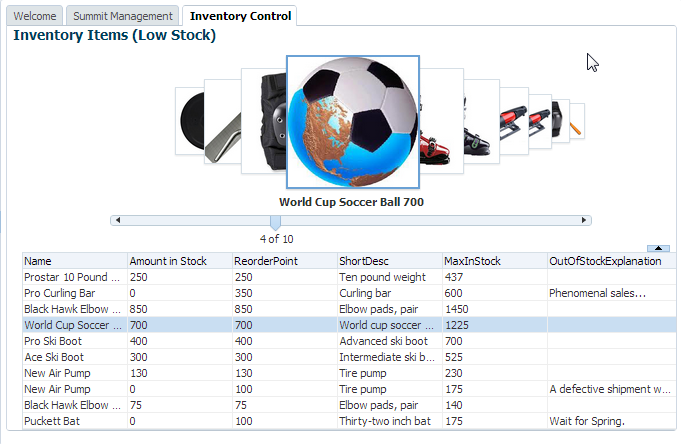
You can display images in a revolving carousel, as shown in Figure 37-3. Users can change the image at the front by using either the slider at the bottom or by dragging another image to the front.
Instead of containing a child carouselItem component for each image to be displayed, and then binding these components to the individual images, the carousel component is bound to a complete collection and repeatedly renders one carouselItem component by stamping the value for each item, similar to the way a tree stamps out each row of data. As each item is stamped, the data for the current item is copied into a property that can be addressed using an EL expression using the carousel component's var attribute. Once the carousel has completed rendering, this property is removed or reverted back to its previous value. Carousels contain a nodeStamp facet, which is a holder for the carouselItem component used to display the text and short description for each item, and is also the parent component to the image displayed for each item. For more information about the carousel component, see the Displaying Images in a Carousel section of Developing Web User Interfaces with Oracle ADF Faces.
How to Create a Databound Carousel Component
When using a carousel component in a Fusion web application, you create the component using the Data Controls panel. You also use a managed bean to handle the carousel spin event and for other logic you may need to display your items.
Before you begin:
It may be helpful to have an understanding of the options that are available to you when you create a carousel. For more information, see Using the ADF Faces Carousel Component.
You may also find it useful to understand functionality that can be used with carousels. For more information, see Additional Functionality of Databound ADF Faces Calendar and Carousel Components.
Perform the following in JDeveloper:
-
Create a view object for the collection to be displayed in the carousel. For example, to create the carousel shown in Figure 37-3, you use the
Inventoryview object.l -
Create a managed bean to hold a method that handles the spinning of the carousel. The following example shows the handler method that might be used to display items in the carousel.
public void handleCarouselSpin(CarouselSpinEvent event)
{
// This method is invoked when there is a spin event on the carousel in
// InventoryControl.jsff. The purpose is to get the newly selected item in the
// carousel and update the iterator current row with the value

// get the bindingContainer
  DCBindingContainer dcBindings = (DCBindingContainer)
  BindingContext.getCurrent().getCurrentBindingsEntry();
  // get the NewItemKey from the event object. The first entry in the list is the
  // currently selected item
  List itemKeyList = (List) event.getNewItemKey();
  // create a Key ojbect instance and set it to the first key in the list
  Key currentItemKey = (Key) itemKeyList.get(0);
  // get the iteratorBinding
  DCIteratorBinding inventoryIterator =
 dcBindings.findIteratorBinding("InventoryIterator");
 // set the iterator
 inventoryIterator.setCurrentRowWithKey(currentItemKey.toStringFormat(true));
}
To create a databound carousel component:
What Happens When You Create a Carousel
When you drop a collection from the Data Controls panel as a carousel, a tree value binding is created. A tree consists of a hierarchy of nodes, where each subnode is a branch off a higher-level node.
The tree binding iterates over the data exposed by the iterator binding. The carousel wraps the result set from the iterator binding in a treeModel object, which is an extension of the collectionModel. The collectionModel allows each item in the collection to be available within the carousel component using the var attribute. For more information about the tree binding, see Iterator and Value Bindings for Tables.
JDeveloper adds both a carousel component and its child carouselItem component onto the page, as shown in the following example.
<af:carousel
        currentItemKey="#{bindings.Products.treeModel.rootCurrencyRowKey}"
        value="#{bindings.Products.treeModel}" var="item"
        id="c1"
        carouselSpinListener="#{InventoryControl.handleCarouselSpin}">
  <f:facet name="nodeStamp">
    <af:carouselItem id="ci1" text="#{item.Name}"/>
  </f:facet>
</af:carousel>
The carousel value is bound to the treeModel for the associated collection, and the currentItemKey attribute of the carousel is bound to the rootCurrencyRowKey of the binding object. In this example, the carousel iterates over the items in the Products iterator binding. The iterator binding binds to a rowKeySet that keeps track of the current product. By default, the currentItemKey attribute of the carousel is bound to the rootCurrencyRowKey of the binding object, which causes the product currently displayed at the front of the carousel to be the root and the current item. The carouselItem component accesses the current data object for the current item presented to the carousel tag using the item variable.
