17 Using a Calendar Component
This chapter includes the following sections:
About Creating a Calendar Component
ADF Faces provides a calendar component that displays user activities. You can add functionality to this component so that the user can edit, create, and delete activities from the calendar.
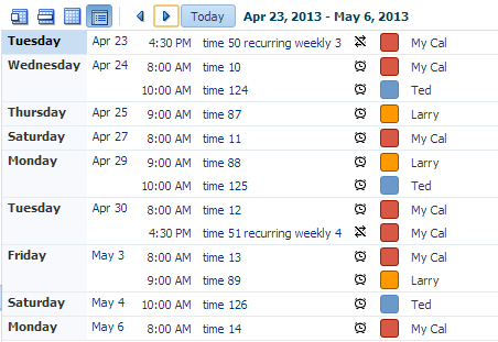
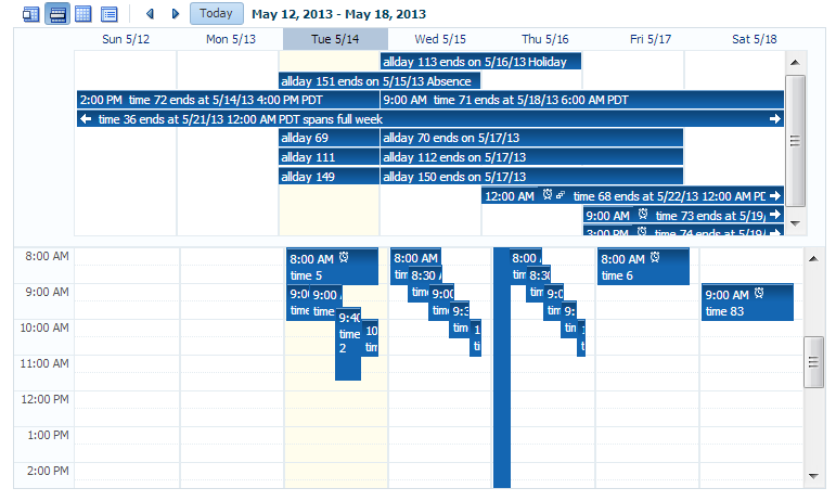
ADF Faces includes a calendar component that by default displays activities in daily, weekly, monthly, or list views for a given provider or providers (a provider is the owner of an activity). Figure 17-1 shows an ADF Faces calendar in weekly view mode with some sample activities.
Note:
Printing is possible in the printable page mode for all types of views and the scrollbars will be dropped in the printed file.Figure 17-1 ADF Faces Calendar Showing Weekly View

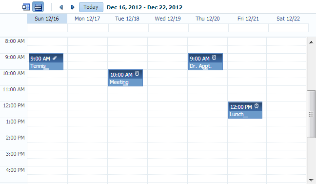
You can configure the calendar so that it displays only a subset of views. For example, you may not want your calendar to use the month and list views. You can configure it so that only the day and week views are available, as shown in Figure 17-2. Because only day and week views are available, those are the only buttons displayed in the toolbar.
Figure 17-2 Calendar Configured to Use Only Week and Day Views
By default, the calendar displays dates and times based on the locale set in the trinidad-config.xml file using the formatting-locale parameter. See Configuration in trinidad-config.xml. If a locale is not specified in that file, then it is based on the locale sent by the browser. For example, in the United States, by default, the start day of the week is Sunday, and 2 p.m. is shown as 2:00 PM. In France, the default start day is Monday, and 2 p.m. is shown as 14:00. The time zone for the calendar is also based on the time-zone parameter setting in trinidad-config.xml. You can override the default when you configure the calendar. See Configuring the Calendar Component.
The calendar includes a toolbar with built-in functionality that enables a user to change the view (between daily, weekly, monthly, or list), go to the previous or next day, week, or month, and return to today. The toolbar is fully customizable. You can choose which buttons and text to display, and you can also add buttons or other components. See Customizing the Toolbar.
Tip:
When these toolbar buttons are used, attribute values on the calendar are changed. You can configure these values to be persisted so that they remain for the user during the duration of the session. See Allowing User Customization on JSF Pages.
You can also configure your application so that the values will be persisted and used each time the user logs into the system. For this persistence to take place, your application must use the Fusion technology stack. See Allowing User Customizations at Runtime in Developing Fusion Web Applications with Oracle Application Development Framework.
The calendar component displays activities based on the activities and the provider returned by the CalendarModel class. By default, the calendar component is read-only. That is, it can display only those activities that are returned. You can add functionality within supported facets of the calendar so that users can edit, create, and delete activities. When certain events are invoked, popup components placed in these corresponding facets are opened, which enable the user to act on activities or the calendar.
For example, when a user clicks on an activity in the calendar, the CalendarActivityEvent is invoked and the popup component in the ActivityDetail facet is opened. You might use a dialog component that contains a form where users can view and edit the activity, as shown in Figure 17-3.
Figure 17-3 Dialog Implemented to Edit an Activity
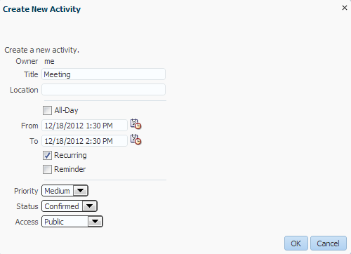
Description of "Figure 17-3 Dialog Implemented to Edit an Activity"
For information about implementing additional functionality using events, facets, and popup components, see Adding Functionality Using Popup Components.
The calendar component supports the ADF Faces drag and drop architectural feature. Users can drag activities to different areas of the calendar, executing either a copy or a move operation, and can also drag handles on the activity to change the duration of the activity. For information about adding drag and drop functionality, see Adding Drag and Drop Functionality to a Calendar.
By default, the calendar displays activities using a blue color ramp. A color ramp is a set of colors in a color family and is used to represent the different states of activities. In the default calendar, for a short-duration activity shown in the daily view, the time of an activity is shown with a dark blue background, while the title of the activity is shown with a light blue background, as shown in Figure 17-1. You can customize how the activities are displayed by changing the color ramp.
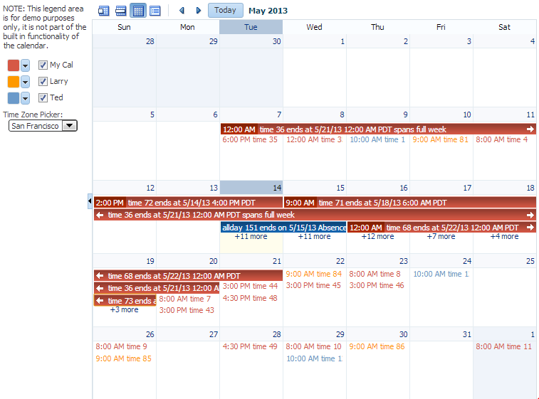
Each activity is associated with a provider, that is, an owner. If you implement your calendar so that it can display activities from more than one provider, you can also style those activities so that each provider's activity shows in a different color, as shown in Figure 17-4.
Figure 17-4 Month View with Activities from Different Providers
Calendar Use Cases and Examples
The calendar component provides the features you need to implement calendar-related functions such as creating activities in daily, weekly, monthly or list view. It features a customizable toolbar that can be used for switching views. It has configurable start of the week and start of the day functions. Like other ADF Faces components, it supports skinning in order to customize its style and appearance.
You can create popups by inserting them into the calendar facets to add more functionality. You can also implement the calendar so the user can drag and drop activities from one area to another within the calendar.
The calendar uses the CalendarModel class to display the activities for a given time period. You must create your own implementation of the model class for your calendar. If your application uses the Fusion technology stack, you can create ADF Business Components over your data source that represents the activities, and the model will be created for you. You can then declaratively create the calendar, and it will automatically be bound to that model. See Using the ADF Faces Calendar Component in Developing Fusion Web Applications with Oracle Application Development Framework.
If your application does not use the Fusion technology stack, then you create your own implementation of the CalendarModel class and the associated CalendarActivity and CalendarProvider classes. The classes are abstract classes with abstract methods. You must provide the functionality behind the methods, suitable for your implementation of the calendar. See Creating the Calendar.
Additional Functionality for the Calendar
You may find it helpful to understand other ADF Faces features before you implement your calendar component. Additionally, once you have added a calendar component to your page, you may find that you need to add functionality such as validation and accessibility. Following are links to other functionality that calendar components can use.
-
Client components: Components can be client components. To work with the components on the client, see Using ADF Faces Client-Side Architecture .
-
JavaScript APIs: All components have JavaScript client APIs that you can use to set or get property values. See the JavaScript API Reference for Oracle ADF Faces.
-
Events: Components fire both server-side and client-side events that you can have your application react to by executing some logic. See Handling Events.
-
You can display tips and messages, as well as associate online help with a calendar component. See Displaying Tips, Messages, and Help.
-
You may want other components on a page to update based on selections you make from a calendar component. See Using the Optimized Lifecycle.
-
You can change the appearance using skins. See Customizing the Appearance Using Styles and Skins.
-
You can make your components accessible. See Developing Accessible ADF Faces Pages.
-
Instead of entering values for attributes that take strings as values, you can use property files. These files enable you to manage translation of these strings. See Internationalizing and Localizing Pages.
-
You can create popups for additional functionality. For information about using these events to provide additional functionality, see Adding Functionality Using Popup Components.
-
If your application uses ADF Model, then you can create automatically bound forms using data controls (whether based on ADF Business Components or other business services). See Creating a Basic Databound Page in Developing Fusion Web Applications with Oracle Application Development Framework.
Creating the Calendar
The ADF Faces calendar component allows a user to view their activities by day, week, month, or by list view. To use a calendar component, you must define the logic required by the calendar in Java classes.
Before you can add a calendar component to a page, you must implement the logic required by the calendar in Java classes that extend ADF Faces calendar abstract classes. After you create the classes, you can add the calendar to a page.
Note:
If your application uses the Fusion technology stack, implement the calendar classes using ADF Business Components. This will enable you to declaratively create and bind your calendar component. See Using the ADF Faces Calendar Component in Developing Fusion Web Applications with Oracle Application Development Framework.
Before you implement your logic, it helps to have an understanding of the CalendarModel and CalendarActivity classes, as described in the following section.
Calendar Classes
The calendar component must be bound to an implementation of the CalendarModel class. The CalendarModel class contains the data for the calendar. This class is responsible for returning a collection of calendar activities, given the following set of parameters:
-
Provider ID: The owner of the activities. For example, you may implement the
CalendarModelclass such that the calendar can return just the activities associated with the owner currently in session, or it can also return other owners' activities. -
Time range: The expanse of time for which all activities that begin within that time should be returned. A date range for a calendar is inclusive for the start time and exclusive for the end time (also known as half-open), meaning that it will return all activities that intersect that range, including those that start before the start time, but end after the start time (and before the end time).
A calendar activity represents an object on the calendar, and usually spans a certain period of time. The CalendarActivity class is an abstract class whose methods you can implement to return information about the specific activities.
Activities can be recurring, have associated reminders, and be of a specific time type (for example, TIME (with a start and end time) or ALLDAY). Activities can also have start and end dates, a location, a title, and a tag.
The CalendarProvider class represents the owner of an activity. A provider can be either enabled or disabled for a calendar.
How to Create a Calendar
Create your own implementations of the CalendarModel and CalendarActivity classes and implement the abstract methods to provide the logic.
Before you begin:
It may be helpful to have an understanding of the CalendarModel and CalendarActivity classes. See Calendar Classes.
You may also find it helpful to understand functionality that can be added using other ADF Faces features. See Additional Functionality for the Calendar.
To create the calendar model classes:
-
Create a managed bean that will return an instance of the
oracle.adf.view.rich.model.CalendarModelclass. This instance must:-
Extend the
oracle.adf.view.rich.model.CalendarModelclass. -
Implement the abstract methods.
For information about the
CalendarModelclass, see the Java API Reference for Oracle ADF Faces. -
Implement any other needed functionality for the calendar. For example, you might add logic that sets the time zone, as in the
oracle.adfdemo.view.calendar.rich.model.DemoCalendarBeanmanaged bean in the ADF Faces Components Demo application (for information about downloading and installing the demo application, see ADF Faces Components Demo Application ).
For information about creating managed beans, see Creating and Using Managed Beans.
-
-
Create a managed bean that will return an instance of the
oracle.adf.view.rich.model.CalendarActivityclass. This instance must:-
Extend the
oracle.adf.view.rich.model.CalendarActivityclass. -
Implement the abstract methods.
For information about the
CalendarActivityclass, see the Java API Reference for Oracle ADF Faces. -
Implement any other required functionality for the calendar activities. For an example, see the
oracle.adfdemo.view.calendar.rich.model.DemoCalendarActivitymanaged bean in the ADF Faces Components Demo application.Tip:
If you want to style individual instances of an activity (for example, if you want each provider's activities to be displayed in a different color), then use the
getTagsmethod to return a tag that represents what group the activity belongs to (for example, using the provider ID). See How to Style Activities.
-
-
Create a managed bean that will return an instance of the
oracle.adf.view.rich.model.CalendarProviderclass. This instance must:-
Extend the
oracle.adf.view.rich.model.CalendarProviderclass. -
Implement the abstract methods.
For information about the
CalendarProviderclass, see the Java API Reference for Oracle ADF Faces. -
Implement any other required functionality for the calendar providers.
-
To create the calendar component:
Configuring the Calendar Component
The ADF Faces calendar component can be configured using the Properties window. You can configure the component using the available views.
Configure the many display attributes for the calendar, for example, the time displayed at the beginning of a day.
How to Configure the Calendar Component
You configure the calendar using the Properties window.
Before you begin:
It may be helpful to have an understanding of the calendar component. See Configuring the Calendar Component.
You may also find it helpful to understand functionality that can be added using other ADF Faces features. See Additional Functionality for the Calendar.
To configure a calendar:
You can now add the following functionality:
-
Create, edit, and delete activities using popup components. See Adding Functionality Using Popup Components.
-
Move activities around on the calendar. See Adding Drag and Drop Functionality to a Calendar.
-
Change or add to the toolbar buttons in the toolbar. See Customizing the Toolbar.
-
Change the appearance of the calendar and events. See Styling the Calendar.
What Happens at Runtime: Calendar Events and PPR
The calendar has two events that are used in conjunction with facets to provide a way to easily implement additional functionality needed in a calendar, such as editing or adding activities. These two events are CalendarActivityEvent (invoked when an action occurs on an activity) and CalendarEvent (invoked when an action occurs on the calendar itself). For information about using these events to provide additional functionality, see Adding Functionality Using Popup Components.
The calendar also supports events that are fired when certain changes occur. The CalendarActivityDurationChangeEvent is fired when the user changes the duration of an activity by making changes to the start or end time. The CalendarDisplayChangeEvent is fired when the value of a display attribute changes. For example, if a user changes the view attribute from day to month, the calendar is rerendered automatically because the calendar component becomes a partial page rendering (PPR) target, triggering an immediate refresh.
Adding Functionality Using Popup Components
You can add ADF Faces popup components to a calendar component. To add functionality, you must create the popups and associated components in the associated facets.
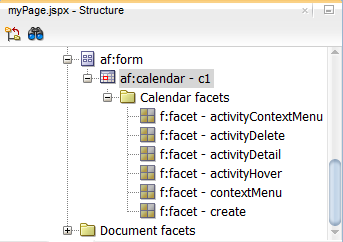
When a user acts upon an activity, a CalendarActivityEvent is fired. This event causes the popup component contained in a facet to be displayed, based on the user's action. For example, if the user right-clicks an activity, the CalendarActivityEvent causes the popup component in the activityContextMenu to be displayed. The event is also delivered to the server, where a configured listener can act upon the event. You create the popup components for the facets (or if you do not want to use a popup component, implement the server-side listener). It is in these popup components and facets where you can implement functionality that will enable users to create, delete, and edit activities, as well as to configure their instances of the calendar.
Table 17-1 shows the different user actions that invoke events, the event that is invoked, and the associated facet that will display its contents when the event is invoked. The table also shows the component you must use within the popup component. You create the popup and the associated component within the facet, along with any functionality implemented in the handler for the associated listener. If you do not insert a popup component into any of the facets in the table, then the associated event will be delivered to the server, where you can act on it accordingly by implementing handlers for the events.
Table 17-1 Calendar Faces Events and Associated Facets
| User Action | Event | Associated Facet | Component to Use in Popup |
|---|---|---|---|
|
Right-click an activity. |
|
|
|
|
Select an activity and press the Delete key. |
|
|
|
|
Click an activity or select an activity and press the Enter key. |
|
|
|
|
Hover over an activity. |
|
|
|
|
Right-click the calendar (not an activity or the toolbar). |
|
|
|
|
Click or double-click any free space in the calendar (not an activity). |
|
|
|
How to Add Functionality Using Popup Components
To add functionality, create the popups and associated components in the associated facets.
Before you begin:
It may be helpful to have an understanding of popup components. See Adding Functionality Using Popup Components.
You may also find it helpful to understand functionality that can be added using other ADF Faces features. See Additional Functionality for the Calendar.
To add functionality using popup components:
Customizing the Toolbar
You can customize the ADF Faces calendar component toolbar to change the display date, to display additional toolbar buttons, or to add a text describing the current view. To customize the toolbar, you must place the toolbar and toolbar buttons in the custom facets that you create.
By default, the toolbar in the calendar enables the user to change the view between day, week, month, and list, go to the next or previous item in the view, or go to the present day. The toolbar also displays a text description of the current view. For example in the day view, it displays the active date, as shown in Figure 17-9.
Figure 17-9 Toolbar in Day View of a Calendar
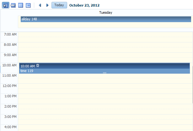
Figure 17-10 shows a toolbar that has been customized. It has added toolbar buttons, including buttons that are right-aligned on the top toolbar, and buttons in a second toolbar.
Figure 17-10 Customized Toolbar for a Calendar
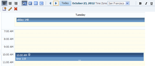
Description of "Figure 17-10 Customized Toolbar for a Calendar"
How to Customize the Toolbar
Place the toolbar and toolbar buttons you want to add in custom facets that you create. Then, reference the facet (or facets) from an attribute on the calendar, along with keywords that determine how or where the contained items should be displayed.
Before you begin:
It may be helpful to have an understanding of calendar toolbar customization. See Customizing the Toolbar.
You may also find it helpful to understand functionality that can be added using other ADF Faces features. See Additional Functionality for the Calendar.
To customize the toolbar:
Styling the Calendar
The ADF Faces calendar component allows you to apply available styles and select skins to change its appearance. You can also add activityStyles and dateCustomizer attributes to enable users to ease the styling instances of a calendar.
Like other ADF Faces components, the calendar component can be styled as described in Customizing the Appearance Using Styles and Skins. However, along with standard styling procedures, the calendar component has specific attributes that make styling instances of a calendar easier. These attributes are:
-
activityStyles: Allows you to individually style each activity instance. For example, you may want to show activities belonging to different providers in different colors. -
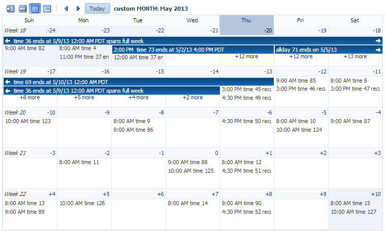
dateCustomizer: Allows you to display strings other than the calendar date for the day in the month view. For example, you may want to display countdown or countup type numbers, as shown in Figure 17-11. This attribute also allows you to add strings to the blank portion of the header for a day, for example to show the total number of hours worked per day. You can also use this attribute to color code certain days, such as holidays. See How to Customize Dates.Figure 17-11 Customized Display of Dates in a Calendar
Description of "Figure 17-11 Customized Display of Dates in a Calendar"
How to Style Activities
The activityStyles attribute uses InstanceStyles objects to style specific instances of an activity. The InstanceStyles class is a way to provide per-instance inline styles based on skinning keys.
The most common usage of the activityStyles attribute is to display activities belonging to a specific provider using a specific color. For example, the calendar shown in Figure 17-12 shows activities belonging to three different providers. The user can change that color used to represent a provider's activities in the left panel. The activityStyles attribute is used to determine the color displayed for each activity, based on the provider with which it is associated.
Figure 17-12 Activities Styled to Display Color for Different Providers
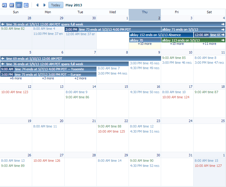
Note that instead of using a single color, a range of a color is used in the calendar. This is called a color ramp. A color ramp is a set of colors in a color family and is used to represent the different states of activities. For example, Ted's activities use the blue color ramp. Activities whose time span is within one day are displayed in medium blue text. Activities that span across multiple days are shown in a medium blue box with white text. Darker blue is the background for the start time, while lighter blue is the background for the title. These three different blues are all part of the Blue color ramp.
The CalendarActivityRamp class is a subclass (of InstanceStyles) that supports some built-in color ramps and can take a representative color (for example, the blue chosen for Ted's activities) and return the correct color ramp to be used to display each activity in the calendar.
The activityStyles attribute must be bound to a map object. The map key is the set returned from the getTags method on an activity. The map value is an InstanceStyles object, most likely an instance of CalendarActivityRamp. This InstanceStyles object will take in skinning keys, and for each activity, styles will be returned.
Before you begin:
It may be helpful to have an understanding of calendar styles. See Styling the Calendar.
You may also find it helpful to understand functionality that can be added using other ADF Faces features. See Additional Functionality for the Calendar.
To style activities:
What Happens at Runtime: Activity Styling
During calendar rendering for each activity, the renderer calls the CalendarActivity.getTags method to get a string set. The string set is then passed to the map bound to the activityStyles attribute, and an InstanceStyles object is returned (which may be a CalendarActivityRamp).
Using the example:
-
If the string set
{"Me"}is passed in, the redCalendarActivityRampis returned. -
If the string set
{"LE"}is passed in, the orangeCalendarActivityRampis returned. -
If the string set
{"TF"}is passed in, the blueCalendarActivityRampis returned.
How to Customize Dates
If you want to display something other than the date number string in the day header of the monthly view, you can bind the dateCustomizer attribute to an implementation of a DateCustomizer class that determines what should be displayed for the date. You can use the dateCustomizer attribute to add strings to the blank portion of the header for a day, for example to show the total number of hours worked per day.
To color code dates, implement a new method named getInlineStyle in the DateCustomizer class. The getInlineStyle method returns inline CSS styles, which can be applied to the style attribute for the section of the calendar specified by a key. You can use getInlineStyle to set the background color on a date in the month grid. For accessibility, the information provided by the color coding must also be available to a screen reader. You can expose this information using the dateHeaderStamp facet to specify components that will be displayed in the header section of a date cell. For example, if the date is color coded because it is a holiday, you can specify an af:image with the shortDesc set to the holiday name, as well as programmatically specify which date it should display for, and the image will be displayed in the header for that date. For information about the DateCustomizer class, refer to the ADF Faces Javadoc. For information about the dateHeaderStamp facet, see the tag documentation for the calendar component.
Before you begin:
It may be helpful to have an understanding of calendar styling. See Styling the Calendar.
You may also find it helpful to understand functionality that can be added using other ADF Faces features. See Additional Functionality for the Calendar.
To customize the date string:
The following example shows how you can use the DemoDateCustomizer class to display the week number in the first day of the week, and a countdown number to a specific date instead of the day of the month, as shown in Figure 17-11.
/* Date Customizer Displaying Countdown Numbers */
public class MyDateCustomizer extends DateCustomizer
{
  public String format(Date date, String key, Locale locale, TimeZone tz)
  {

    if ("af|calendar::month-grid-cell-header-misc".equals(key))
    {
     // return appropriate string
    }
    else if ("af|calendar::month-grid-cell-header-day-link".equals(key))
    {
      // return appropriate string
    }
  return null;

  }
}
The following code example shows how you can use the DemoDateCustomizer class to display color coded holidays.
/* Date Customizer Displaying Color Coded Holidays */
public class MyDateCustomizer extends DateCustomizer
{
public String getInlineStyle(Date date, String key, Locale locale, TimeZone tz)
  {
    if ("af|calendar::day-all-day-activity-area".equals (key) ||
        "af|calendar::day-timed-activity-area".equals (key) ||
        "af|calendar::week-all-day-activity-area".equals (key) ||
        "af|calendar::week-timed-activity-area".equals (key) ||
        "af|calendar::month-grid-cell".equals(key) ||
        "af|calendar::list-row".equals(key))
    {
      Calendar curCal = Calendar.getInstance (tz, locale);
      curCal.setTime (date);

      if (_getUSHoliday (curCal) != null)
        return "background-color: #fafaeb;";
    }
  return null;
  }
}
The following code example shows how you can use the DemoDateCustomizer class to display color coded holidays using the dateHeaderStamp facet as it is used on the dateCustomizerCalendar.jspx page of the File Explorer application.
/* Date Customizer Displaying Color Coded Holidays with dateHeaderStamp */
<af:calendar  id="cal"  ..>
  <f:facet name="dateHeaderStamp">
    <af:image rendered="#{calendarBean.dateCustomizer.USHoliday}"
              source="/images/holidayStar_16X16.png"
              shortDesc="#{calendarBean.dateCustomizer.dateHeaderDesc}"
    ../>
  </f:facet>
</af:calendar>
