15 Using Menus, Toolbars, and Toolboxes
menu, menuBar, commandMenuItem, goMenuItem, toolbar, and toolbox components.For information about creating navigation menus, that is, menus that allow you to navigate through a hierarchy of pages, see Using Navigation Items for a Page Hierarchy.
This chapter includes the following sections:
About Menus, Toolbars, and Toolboxes
ADF Faces provides menus and toolbars as UI elements that allow a user to choose from a specified list of options (in the case of a menu) or to click buttons (in the case of a toolbar) to effect some change to the application. You can select any menu dropdown or buttons in a toolbar to trigger an action.
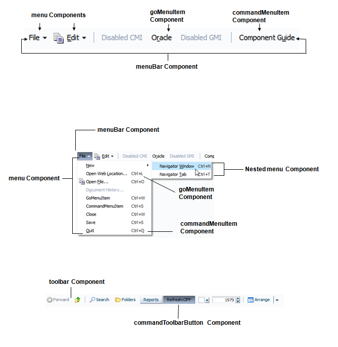
Menu bars and toolbars allow you to organize menus, buttons, and other simple components in a horizontal bar. When a user clicks a menu in the bar, the menu drops down and the user can select from the menu items, which then causes some action to happen in the application. Icons in the toolbar also cause some action to happen in the application. Figure 15-1 shows the different components used to create menus and toolbars.
Menu Components Use Cases and Examples
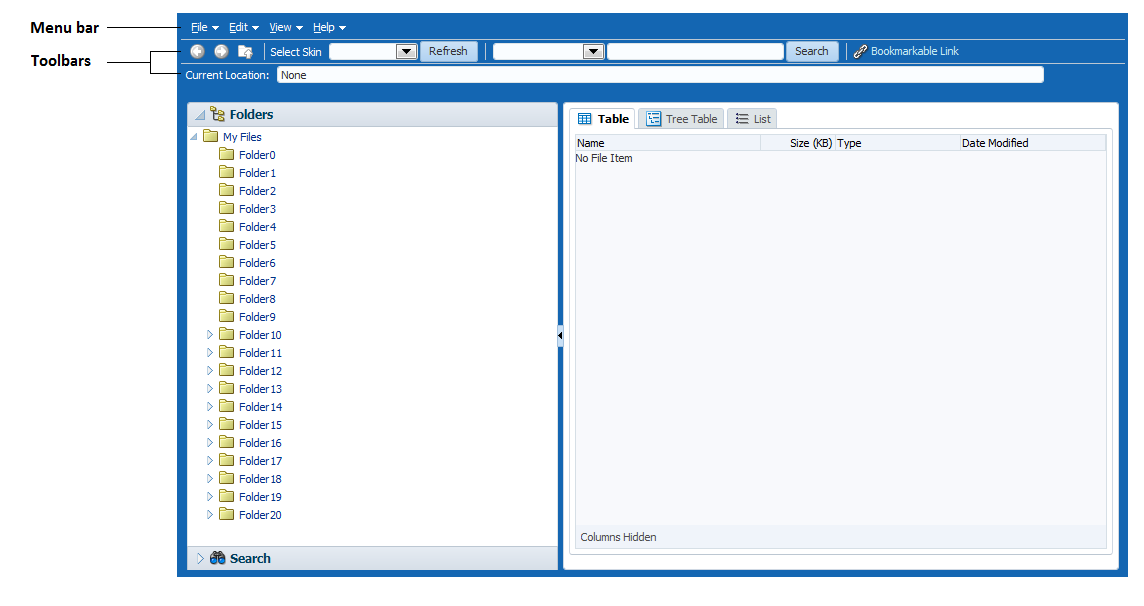
Menu components are used to create menus that allow users to add or edit items, search data, change the view, or launch help. For example, the ADF Faces Components Demo application contains both a menu bar and a toolbar, as shown in Figure 15-2.
Figure 15-2 Menu Bar and Toolbar in File Explorer Application
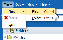
When a user chooses a menu item in the menu bar, the menu component displays a list of menu items, as shown in Figure 15-3.
Figure 15-3 Menu in the File Explorer Application
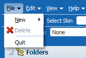
Description of "Figure 15-3 Menu in the File Explorer Application"
As shown in Figure 15-4, menus can be nested.
Buttons in a toolbar also allow a user to invoke some sort of action on an application or to open a context menu that behaves the same as a standard menu.
You can organize toolbars and menu bars using a toolbox. The toolbox gives you the ability to define relative sizes for the toolbars on the same line and to define several layers of toolbars and menu bars vertically.
Note:
If you want to create menus and toolbars in a table, then follow the procedures in Displaying Table Menus, Toolbars, and Status Bars.
If you want to create a context menu for a component (that is, a menu that launches when a user right-clicks the component), follow the procedures in How to Create a Context Menu.
Additional Functionality for Menu and Toolbar Components
You may find it helpful to understand other ADF Faces features before you implement your menu and toolbar components. Additionally, once you have added these components to the page, you may find that you need to add functionality such as validation and accessibility. Following are links to other functionality that menu and toolbar components can use.
-
Invoking functionality: ADF Faces offer tags that can be used with menu command components to invoke functionality, such as downloading a file or resetting submitted values. See Using Buttons or Links to Invoke Functionality.
-
Table menus: You can create menus and toolbars that display above a table and work only on that table (as opposed to the whole application). See Displaying Table Menus, Toolbars, and Status Bars.
-
Context menus: You can create menus that launch in a popup when a user right-clicks an item in the UI. See How to Create a Context Menu.
-
Using parameters in text: You can use the ADF Faces EL format tags if you want text displayed in a component to contain parameters that will resolve at runtime. See How to Use the EL Format Tags.
-
Events: You can use command menu components to launch action events. For information about events, see Handling Events. For information about action events specifically, see Using Buttons and Links for Navigation.
-
Accessibility: You can use specific attributes on the menu components to create shortcuts that allow users to open menus using a keyboard. For information about how to define access keys, see How to Define Access Keys for an ADF Faces Component. For information about accessibility, see Specifying Component-Level Accessibility Properties.
-
Localization: Instead of entering values for attributes that take strings as values, you can use property files. These files allow you to manage translation of these strings. See Internationalizing and Localizing Pages.
-
Skins: You can change the look and feel of menus (such as the icon used to display a selected menu item), along with some basic functionality (such as the maximum number of menu items that display) by changing the skin. See Customizing the Appearance Using Styles and Skins.
Using Menus in a Menu Bar
ADF Faces provides a menuBar component that contains various menu items from which a user can execute a command. You can group multiple menu bars in a toolbox and can also nest menu components to create submenus.
Use the menuBar component to render a bar that contains the menu bar items (such as File in the File Explorer application). These items can be menu components, which hold a vertical menu, as well as commandMenuItem components that invoke some operation on the application, and goMenuItem components that invoke a URL, as shown in Figure 15-5.
Menu components can also contain commandMenuItem or goMenuItem components, or you can nest menu components inside menu components to create submenus. The different components used to create a menu are shown in Figure 15-6.
Figure 15-6 Components Used to Create a Menu
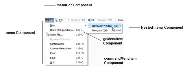
Description of "Figure 15-6 Components Used to Create a Menu"
You can use more than one menu bar by enclosing them in a toolbox. Enclosing them in a toolbox stacks the menu bars so that the first menu bar in the toolbox is displayed at the top, and the last menu bar is displayed at the bottom. When you use more than one menu bar in a single toolbox row (by having them grouped inside the toolbox), then the flex attribute will determine which menu bar will take up the most space.
If you want menu bars to be displayed next to each other (rather than being stacked), you can enclose them in a group component.
Tip:
You can also use the toolbox component to group menu bars with toolbars, or to group multiple menu bars. Use the group component to group menu bars and toolbars on the same row.
Within a menu bar, you can set one component to stretch so that the menu bar will always be the same size as its parent container. For example, in Figure 15-7, the menu bar is set to stretch a spacer component that is placed between the Disabled GMI menu and the Component Guide button. When the window is resized, that spacer component either stretches or shrinks so that the menu bar will always be the same width as the parent. Using a spacer component like this also ensures that any components to the right of the spacer will remain right-justified in the menu bar.
Figure 15-7 Spacer Component Stretches and Shrinks
When a window is resized such that all the components within the menu bar can no longer be displayed, the menu bar displays an overflow icon, identified by the arrow cursor as shown in Figure 15-8.
Figure 15-8 Overflow Icon in a Menu Bar
Note:
The overflow icon does not display in the Internet Explorer browser. In Firefox and Chrome, the overflow icon displays only after the user resizes the browser window.Clicking that overflow icon displays the remaining components in a popup window, as shown in Figure 15-9.
Figure 15-9 menu Component in an Overflow Popup Window
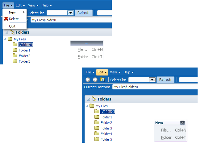
Menus and submenus can be made to be detachable and to float on the browser window. Figure 15-10 shows the Menu 1 submenu in the Detachables menu configured to be detachable. The top of the menu is rendered with a bar to indicate that it can be detached.
Figure 15-10 Detachable Menu

The user can drag the detachable menu to anywhere within the browser. When the mouse button is released, the menu stays on top of the application until the user closes it, as shown in Figure 15-11.
Tip:
Consider using detachable menus when you expect users to:
-
Execute similar commands repeatedly on a page.
-
Execute similar commands on different rows of data in a large table, tree table, or tree.
-
View data in long and wide tables, tree tables, or trees. Users can choose which columns or branches to hide or display with a single click.
-
Format data in long or wide tables, tree tables, or trees.
The menu and commandMenuItem components can each include an icon image. Figure 15-12 shows the Delete menu item configured to display a delete icon (a red X).
Figure 15-12 Icons Can Be Used in Menus
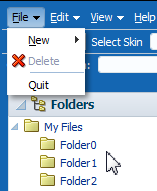
Aside from always displaying graphics, you can configure commandMenuItem components to display a graphic when the menu item is chosen. For example, you can configure a commandMenuItem component to display a checkmark when chosen, or you can group menu items together and configure them to behave like a group of radio buttons, so that an icon displays next to the label when one of items in the group is chosen. Figure 15-13 shows the View menu with the Folders menu item configured to use a checkmark when chosen. The Table, Tree Table, and List menu items are configured to be radio buttons, and allow the user to choose only one of the group.
Figure 15-13 Icons and Radio Buttons Denote the Chosen Menu Items

You can set the initial selected state of the commandMenuItem component using an EL expression. However, after that, the value of the selected state must be managed through the commandMenuItem component using an action listener. Thus, runtime selection of the menu item will have no affect on the EL-specified property used to set the initial state.
You can also configure a commandMenuItem component to have an antonym. Antonyms display different text when the user chooses a menu item.
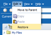
Figure 15-14 The Edit Menu of the File Explorer Application
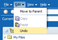
Figure 15-14 shows the commandMenuItem component for the Undo menu item configured to be an antonym. When the user chooses Undo, the next time the user returns to the menu, the menu item will display the antonym Restore, as shown in Figure 15-15.
Figure 15-15 Menu Items Can Be Antonyms
Because an action is expected when a user chooses a menu item, you must bind the action or actionListener attribute of the commandMenuItem component to some method that will execute the needed functionality.
Along with commandMenuItem components, a menu can also include one or more goMenuItem components. These are navigation components similar to the link component, in that they perform direct page navigation, without delivering an ActionEvent event. Figure 15-16 shows three goMenuItem components used to navigate to external web sites.
Figure 15-16 Menus Can Use goMenuItem Components
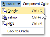
Description of "Figure 15-16 Menus Can Use goMenuItem Components"
Aside from menus that are invoked from menu bars, you can also create context menus that are invoked when a user right-clicks a UI component, and popup menus that are invoked when a user clicks a command component. See How to Create a Context Menu.
Note:
ADF Faces provides a button with built-in functionality that allows a user to view a printable version of the current page. Menus and menu bars do not render on these pages. See Using ADF Faces Client Behavior Tags.
By default, the contents of the menu are delivered immediately, as the page is rendered. If you plan on having a large number of children in a menu (multiple menu and commandMenuItem components), you can choose to configure the menu to use lazy content delivery. This means that the child components are not retrieved from the server until the menu is accessed.
Note:
Content delivery for menus used as popup context menus is determined by the parent popup dialog, and not the menu itself.
You can also create menus that mainly provide navigation throughout the application, and are not used to cause any change on a selected item in an application. To create this type of menu, see Using a Menu Model to Create a Page Hierarchy.
How to Create and Use Menus in a Menu Bar
To create a menu, you first have to create a menu bar to hold the menus. You then add and configure menu and commandMenuItem components as needed.
Note:
If you want to create menus in a table, follow the procedures outlined in Displaying Table Menus, Toolbars, and Status Bars.
Before you begin:
It may be helpful to have an understanding of how the attributes can affect functionality. See Using Menus in a Menu Bar.
You may also find it helpful to understand functionality that can be added using other ADF Faces features. See Additional Functionality for Menu and Toolbar Components.
To create and use menus in a menu bar:
Using Toolbars
ADF Faces provides a toolbar component that can have icons, buttons, inputText, and other components. You can add components to the toolbar based on the type of operation that you want the users to perform on the application.
Along with menus, you can create toolbars in your application that contain toolbar buttons used to initiate some operation in the application. The buttons can display text, an icon, or a combination of both. Toolbar buttons can also open menus in a popup window. Along with toolbar buttons, other UI components, such as dropdown lists, can be displayed in toolbars. Figure 15-18 shows the toolbar from the File Explorer application.
Tip:
Toolbars can contain buttons and links instead of toolbar buttons. However, toolbar buttons provide additional functionality, such as opening popup menus. Toolbar buttons can also be used outside of a toolbar component.
Figure 15-18 Toolbar in the File Explorer Application
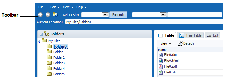
Description of "Figure 15-18 Toolbar in the File Explorer Application"
The toolbar component can contain many different types of components, such as inputText components, LOV components, selection list components, and command components. ADF Faces includes a button component that has a popup facet, allowing you to provide popup menus from a toolbar button. You can configure your toolbar button so that it only opens the popup dialog and does not fire an action event. As with menus, you can group related toolbar buttons on the toolbar using the group component.
You can use more than one toolbar by enclosing them in a toolbox. Enclosing toolbars in a toolbox stacks them so that the first toolbar on the page is displayed at the top, and the last toolbar is displayed on the bottom. For example, in the File Explorer application, the currently selected folder name is displayed in the Current Location toolbar, as shown in Figure 15-18. When you use more than one toolbar, you can set the flex attribute on the toolbars to determine which toolbar should take up the most space. In this case, the Current Location toolbar is set to be the longest.
If you wish toolbars to be displayed next to each other (rather than stacked), you can enclose them in a group component.
Tip:
You can also use the toolbox component to group menu bars with toolbars, or to group multiple menu bars. As with grouping toolbars, use the group component to group menu bars and toolbars on the same row.
Within a toolbar, you can set one component to stretch so that the toolbar will always be the same size as its parent container. For example, in the File Explorer application, the lower toolbar that displays the current location contains the component that shows the selected folder. This component is set to stretch so that when the window is resized, that component and the toolbar will always be the same width as the parent. However, because no component in the top toolbar is set to stretch, it does not change size when the window is resized. When a window is resized such that all the components within the toolbar can no longer be displayed, the toolbar displays an overflow icon, identified by an arrow cursor in the upper right-hand corner, as shown in Figure 15-19.
Figure 15-19 Overflow Icon in a Toolbar

Clicking that overflow icon displays the remaining components in a popup window, as shown in Figure 15-20.
Figure 15-20 Toolbar Component in an Overflow Popup Window

When you expect overflow to occur in your toolbar, it is best to wrap it in a toolbox that has special layout logic to help in the overflow.
How to Create and Use Toolbars
If you are going to use more than one toolbar component on a page, or if you plan to use menu bars with toolbars, you first create the toolbox component to hold them. You then create the toolbars, and last, you create the toolbar buttons.
Tip:
If you encounter layout issues with single toolbars or menu bars, consider wrapping them in a toolbox component, because this component can handle overflow and layout issues.
Before you begin:
It may be helpful to have an understanding of how the attributes can affect functionality. See Using Toolbars.
You may also find it helpful to understand functionality that can be added using other ADF Faces features. See Additional Functionality for Menu and Toolbar Components.
To create and use toolbars:
What Happens at Runtime: How the Size of Menu Bars and Toolbars Is Determined
When a page with a menu bar or toolbar is first displayed or resized, the space needed for each bar is based on the value of the bar's flex attribute. The percentage of size allocated to each bar is determined by dividing its flex attribute value by the sum of all the flex attribute values. For example, say you have three toolbars in a toolbox, and those toolbars are grouped together to display on the same line. The first toolbar is given a flex attribute value of 1, the second toolbar also has a flex attribute value of 1, and the third has a flex attribute value of 2, giving a total of 4 for all flex attribute values. In this example, the toolbars would have the following allocation percentages:
-
Toolbar 1: 1/4 = 25%
-
Toolbar 2: 1/4 = 25%
-
Toolbar 3: 2/4 = 50%
Once the allocation for the bars is determined, and the size set accordingly, each element within the toolbars are placed left to right. Any components that do not fit are placed into the overflow list for the bar, keeping the same order as they would have if displayed, but from top to bottom instead of left to right.
Note:
If the application is configured to read right to left, the toolbars will be placed right to left. See Language Reading Direction.
What You May Need to Know About Toolbars
Toolbars are supported and rendered by parent components such as panelHeader, showDetailHeader, and showDetailItem, which have a toolbar facet for adding toolbars and toolbar buttons to section headers and accordion panel headers.
Note the following points about toolbars at runtime:
-
A toolbar and its buttons do not display on a header if that header is in a collapsed state. The toolbar displays only when the header is in an expanded state.
-
When the available space on a header is less than the space needed by a toolbar and all its buttons, ADF Faces automatically renders overflow icons that allow users to select hidden buttons from an overflow list.
-
Toolbars do not render on printable pages.
Accessing Keyboard in Toolbar
The arrow keys are used to move focus between toolbar items. The toolbar is a single tabstop with the left and right arrow keys being used to access the items on the toolbar. For items in overflow, the up and down arrow keys also work to move focus.
You can use the arrow key when you reach the toolbar’s last (or first) component. The arrow key will move its focus to the next (or previous) component outside the toolbar and will not circle around the components.
