Benchmark 360 KPI Graph
The Benchmark 360 dashboard shows KPI data as a bar graph, so you can spot patterns affecting your business. The graph shows benchmark data for the current month, based on the KPI you pick from the tiles.
The following screenshot shows the Benchmark 360 KPI Graph portlet:
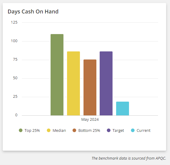
The x-axis on the graph represents the current month of a year for the selected KPI such as May 2024 or June 2024.
The y-axis represents the numerical range for a selected KPI. FFor example, if you pick the Revenue per FTE tile, the range shows revenue amounts. The KPI graph shows the currency that matches the value's currency.
Refer to the Graph Legends for the color codes shown on the KPI Graph portlet.
Related Topics
- Benchmark 360
- Setting Up Benchmark 360 SuiteApp
- Setting Benchmark 360 Preferences
- Guidelines for Creating a Custom Workbook for Benchmark 360
- Benchmark 360 Dashboard Portlets
- Benchmark 360 Key Performance Indicators
- Benchmark 360 Products and Features
- Benchmark 360 Best Business Practices
- Benchmark 360 Limitations