Benchmark 360 Dashboard Portlets
The Benchmark 360 dashboard contains KPI tiles and portlets. Users with an Administrator roles must set the preferences for the data to display in the dashboard. See, Setting Benchmark 360 Preferences.
Subsidiary Selector
On the top-right side of the dashboard, prior to the dashboard portlets, the Subsidiary dropdown button shows your current selection of a subsidiary. You can click the subsidiary selector to show the parent subsidiary and all other available subsidiaries of that company.

When you change the subsidiary, the data on the benchmark dashboard also changes to display the corresponding data for the selected subsidiary.
The Benchmark 360 portlets are arranged in dashboard in the following order:
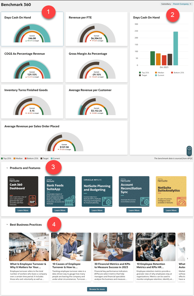
Click the link to the following help topics to view the descriptions for each portlets in the Benchmark 360 dashboard:
|
Item |
Portlet |
Description |
|---|---|---|
|
1 |
This portlet shows the five preselected KPIs which includes Days Cash on Hand, Days Sales Outstanding, Days Payable Outstanding, Employee Turnover Rate, and Revenue per FTE. |
|
|
2 |
This portlet shows a KPI graph which displays a bar graph representation of the KPIs you select from the KPI portlet. |
|
|
3 |
This portlet shows NetSuite products and features relative to the KPIs you select from the KPI portlet. |
|
|
4 |
This portlet shows NetSuite articles that contain informative topics and best business practices. |
Graph Legends
Each KPI contains two semi-circle graphs with multiple colors. Each color represents a value which corresponds to the performance of a metric. The parts of the semi-circle graph include:
-
Outer Graph- The outer graph which displays colors purple and blue represents your Target value and Current value respectively.
-
Inner Graph- The inner graph which displays color amber, yellow, and green represents industry benchmarks such as Top 25%, Median, and Bottom 25% sourced from APQC.
The following screenshot shows the graph colors and values for two of Benchmark 360 KPI tiles:
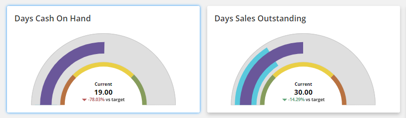
Use the following table as a guide for the representation of colors in the semi-circle graphs:
|
Color |
Description |
|---|---|
|
Purple |
Purple represents the Target value you set in the preferences record. If you do not set a target value, this color represents a default Median value from the benchmark data sourced from APQC. |
|
Blue |
Blue represents the Current value of a metric. The maximum current value is computed based on the value of the Top 25% target. |
|
Green |
Green represents the Top 25% of the Target value which comes after amber and yellow on the graph. For DSO and Employee Turnover Rate KPIs, green comes before yellow and amber, which means the top 25% is shown first. |
|
Yellow |
Yellow graph represents the Median of the Target value. The size of inner graphs remains the same regardless of the values. |
|
Amber |
Amber represents the Bottom 25% of the Target value. |
|
Gray |
Gray indicates that a Current value is the same with a Target value for a specific metric. A value of 0 with no icon is shown on the graph. |
The KPIs also include text and numerical values shown in the middle section of the semi-circle graph. Use the following table as a guide for the representation of the symbols and other values:
|
Text/Symbol |
Description |
|---|---|
|
Current Value |
The scope of data calculation for Current value for each KPI varies. NetSuite calculates the value DPO and DSO for the current month. For DCOH, RPFTE, and ETR, the Current value is calculated annually based on the previous year's data. For example, the current date is May 28, 2024. The calculation includes data from May 29, 2023 to May 28, 2024. The current value is shown inside the innermost semi-circle. |
|
Variance Value |
Variance is the percentage difference between the current value and the target value. If the target value is zero, the variance also shows an em dash. The variance value is shown at the bottom center of a semi-circle graph in either red or green text. |
|
Green Arrow |
The green arrow pointing upward or downward along with a percentage value represents an increase or decrease on variance. The up arrow in green symbol means that the current value is higher than the target value. This is an indicator of a good performance for Days Cash On Hand, Days Payable Outstanding, and Revenue per FTE KPIs. On the contrary, a satisfactory indicator for Days Sales Outstanding (DSO) and Employee Turnover Rate must show a down arrow in green. |
|
Red Arrow |
The red arrow pointing upward or downward along with a percentage value also represents the Variance. The down arrow in red symbol means that the current value is lower than the target value. It is an indicator of an unfavorable performance for Days Cash On Hand, Days Payable Outstanding, and Revenue per FTE KPIs. The opposite is true for Days Sales Outstanding (DSO) and Employee Turnover Rate KPIs. These KPIs show a red arrow pointing upwards if a current value goes above the target value. |
|
Em Dash |
An em dash is shown in KPI tiles for the following scenarios:
|
Related Topics
- Benchmark 360
- Setting Up Benchmark 360 SuiteApp
- Setting Benchmark 360 Preferences
- Guidelines for Creating a Custom Workbook for Benchmark 360
- Benchmark 360 Key Performance Indicators
- Benchmark 360 KPI Graph
- Benchmark 360 Products and Features
- Benchmark 360 Best Business Practices
- Benchmark 360 Limitations