39 Creating Databound NBox Components
nBox components that visually represent business data. It describes how to use ADF data controls to create a NBox with data-first development. If you are designing your page using simple UI-first development, then you can add the NBox to your page and configure the data bindings later. For information about the data requirements, tag structure, and options for customizing the look and behavior of the nBox components, see Using NBox Components in Developing Web User Interfaces with Oracle ADF Faces.
This chapter includes the following sections:
About ADF Data Visualization NBox Components
The NBox Component is a data grouping visualization that utilizes two ranges of data to form a grid of cells, and each cell contains customizable nodes that represent individual data items. NBox components are useful to group data with multiple factors of consideration, such as employee potential against employee performance.
ADF Data Visualization components provide extensive graphical and tabular capabilities for visually displaying and analyzing business data. You must bind each component to data before it can be rendered since the appearance of the components is dictated by the data that is displayed.
The ADF nBox component produces an interactive component that you can use to visualize and compare data across a two-dimensional grid, represented visually by rows and columns. The nBox component is comprised of two parts: the node that represents the data and the grid that comprises the cells into which the nodes are placed. If the number of nodes is greater than the space allocated for the cell, the NBox displays an indicator that users can click to access the additional nodes.
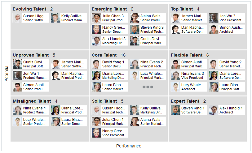
For example, you can use the nBox component to compare employee potential and performance data, where the row represents employee potential and the column represents employee performance. The node that represents the employee is stamped into the appropriate cell.
Figure 39-1 NBox Component Comparing Employee Potential and Performance
Description of "Figure 39-1 NBox Component Comparing Employee Potential and Performance"
The prefix dvt: occurs at the beginning of each data visualization component name indicating that the component belongs to the ADF Data Visualization Tools (DVT) tag library.
End User and Presentation Features
Visually compelling data visualization components enable end users to understand and analyze complex business data. The components are rich in features that provide out-of-the-box interactivity support. For detailed descriptions of the end user and presentation features for the NBox component, see the End User and Presentation Features section in Developing Web User Interfaces with Oracle ADF Faces.
Data Visualization Components Use Cases and Examples
For detailed descriptions of each data visualization use case and example, see the NBox Use Cases and Examples section in Developing Web User Interfaces with Oracle ADF Faces.
Additional Functionality for Data Visualization Components
You may find it helpful to understand other Oracle ADF features before you data bind your data visualization components. Additionally, once you have added a data visualization component to your page, you may find that you need to add functionality such as validation and accessibility. Following are links to other functionality that data visualization components use:
-
Partial page rendering: You may want a data visualization component to refresh to show new data based on an action taken on another component on the page. For more information, see Rerendering Partial Page Content in Developing Web User Interfaces with Oracle ADF Faces.
-
Personalization: Users can change the way the data visualization components display at runtime, those values will not be retained once the user leaves the page unless you configure your application to allow user customization. For more information, see Allowing User Customization on JSF Pages in Developing Web User Interfaces with Oracle ADF Faces.
-
Accessibility: You can make your data visualization components accessible. For more information, see Developing Accessible ADF Faces Pages in Developing Web User Interfaces with Oracle ADF Faces.
-
Skins and styles: You can customize the appearance of data visualization components using an ADF skin that you apply to the application or by applying CSS style properties directly using a style-related property (
styleClassorinlineStyle). For more information, see Customizing the Appearance Using Styles and Skins in Developing Web User Interfaces with Oracle ADF Faces. -
Placeholder data controls: If you know the data visualization components on your page will eventually use ADF data binding, but you need to develop the pages before the data controls are ready, then you should consider using placeholder data controls, rather than manually binding the components. Using placeholder data controls will provide the same declarative development experience as using developed data controls. For more information, see Designing a Page Using Placeholder Data Controls.
Creating Databound NBox Components
DVT NBox components can be created and bound to a data collection with a data-first development approach. JDeveloper allows you to do this declaratively by dragging and dropping a collection from the Data Controls panel.
The ADF NBox component displays data in a grid layout, with a configurable number of rows and columns used to represent two dimensions or measures of data. Nodes represent the actual data and are stamped inside the grid's cells according to where the node's value falls within the ranges or measures specified for the cells.
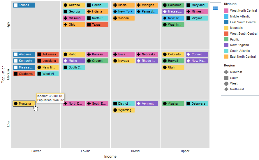
Figure 39-2 shows a sample NBox configured to display a grid with three rows and four columns. Each row represents a range of population data, labeled as Low, Medium, or High. Each column represents a range of income data, labeled as Lower, Lo-Mid, Hi-Mid, or Upper. The nodes represent the states, which are stamped into a cell depending on the value of the state's population and income level. The sample NBox also uses optional attribute groups to color each node depending upon its Division value and to vary the node's icon marker shape depending upon its Region value.
Figure 39-2 NBox Showing United States State Income and Population
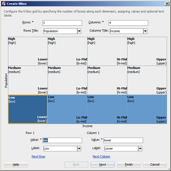
The Create NBox wizard provides declarative support for creating the NBox and binding it to data. In the wizard pages you can:
-
Specify the initial layout of the NBox, including:
-
Number of rows and columns (Required)
-
Values for each NBox row and column (Required)
-
Titles for the NBox rows and columns
-
Labels for each NBox row and column
-
-
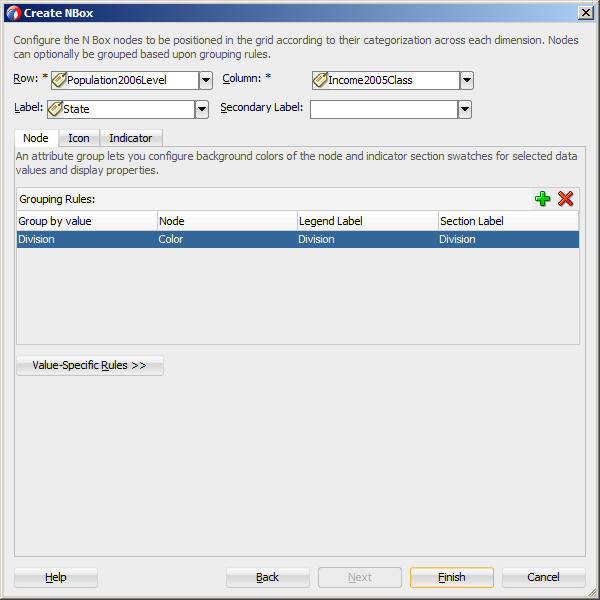
Configure the NBox nodes, including:
-
Attributes to use from the data collection to determine the node's row and column placement (Required)
-
Primary and secondary node labels
-
Attribute groups to group nodes by color or shape according to a specified attribute
-
Images to use for the node's icon or indicator
-
After you complete the NBox wizard and the NBox is added to your page, you can further customize the NBox using the Properties window. For additional information, see Using NBox Components in Developing Web User Interfaces with Oracle ADF Faces.
How to Create an NBox Component Using ADF Data Controls
To create a DVT NBox using a data control, bind the dvt:nBox component to a collection. JDeveloper allows you to do this declaratively by dragging and dropping a collection from the Data Controls panel.
Tip:
You can also create the NBox by dragging the NBox from the Components window. This approach allows you the option of designing the NBox user interface before binding the component to data.
Before you begin:
It may be helpful to have an understanding of databound NBoxes. For more information, see About ADF Data Visualization NBox Components.
You may also find it helpful to understand functionality that can be added using other Oracle ADF features. For more information, see Additional Functionality for Data Visualization Components.
You will need to complete these tasks:
-
Create an application module that contains instances of the view objects that you want in your data model for the NBox, as described in Creating and Modifying an Application Module.
Figure 39-3 shows the data control for the NBox displayed in Figure 39-2. In this example,
CensusView1contains the data collection for the NBox. NBox nodes are represented visually as rectangular boxes identified by their state names. Each node is stamped into one of the NBox cells according to the values in the node'sPopulation2006Leveland Income2005Classattributes.Figure 39-3 Data Control for NBox Showing United States Income and Population
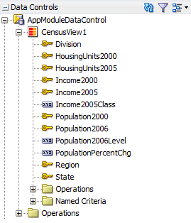
Description of "Figure 39-3 Data Control for NBox Showing United States Income and Population"The
Population2006LevelandIncome2005Classattributes are defined as transient attributes whose values are derived from thePopulation2006andIncome2005 attributes in the data collection. In this example, the rows are defined as ranges, with the lowest range displayed on the bottom row of the NBox. For example, a node whosePopulation2006value is less than or equal to 1,000,000 will be assigned aPopulation2006Leveloflow. Columns are also defined as ranges, with the lowest range displayed in the leftmost column for left-to-right locales and in the rightmost column for right-to-left locales.package model import oracle.jbo.script.annotation.TransientValueExpression; @TransientValueExpression(attributeName="Population2006Level") def Population2006Level_ExpressionScript_Expression() {Population2006 <= 1000000 ? 'low': (Population2006 <= 5000000 ? 'medium' : 'high') } @TransientValueExpression(attributeName="Income2005Class") def Income2005Class_ExpressionScript_Expression() { Income2005 <= 40000.0 ? 'lower' : (Income2005 <= 45000.0 ? 'lo-mid' : (Income2005 <= 50000.0 ? 'hi-mid' : 'upper')) }For information about adding transient attributes to view objects, see Adding Calculated and Transient Attributes to a View Object.
-
Create a JSF page as described in the How to Create JSF Pages section of Developing Web User Interfaces with Oracle ADF Faces.
To create a databound NBox:
After completing the Create NBox dialog, you can use the Properties window to specify settings for the NBox attributes, and you can also use the child tags associated with the NBox tag to customize the NBox further. For detailed information about NBox end user and presentation features, use cases, tag structure, and special features, see Using NBox Components in Developing Web User Interfaces with Oracle ADF Faces.
What Happens When You Create a Databound NBox
Creating an NBox from the Data Controls panel has the following effect:
-
Creates the bindings for the NBox in the page definition file (pageName
PageDef.xml) of the JSF page -
Adds the necessary tags to the JSF page for the
dvt:nBoxcomponent
Bindings for NBox Components
The following code sample shows the bindings that JDeveloper generated for a dvt:nBox component using the data collection shown in Figure 39-3:
<executables>
  <variableIterator id="variables"/>
  <iterator Binds="CensusView1" RangeSize="-1" DataControl="AppModuleDataControl"
            id="CensusView1Iterator"/>
</executables>
<bindings>
  <tree IterBinding="CensusView1Iterator" id="CensusView1">
    <nodeDefinition DefName="model.CensusView" Name="CensusView10">
      <AttrNames>
        <Item Value="Population2006Level"/>
        <Item Value="Income2005Class"/>
        <Item Value="State"/>
        <Item Value="Division"/>
        <Item Value="Region"/>
      </AttrNames>
    </nodeDefinition>
  </tree>
</bindings>
The rules for populating the NBox node are defined in a node definition. Each node definition references a view object and the attributes specified in the Create NBox dialog. For additional information about the pageNamePageDef.xml file, see pageNamePageDef.xml.
Editing the NBox Binding
Attributes that were not specified in the Create NBox dialog during creation will not be included in the binding. If you need to reference another attribute in the data collection, you must add it manually to the binding. For example, the sample in this section displays a tooltip showing the state's income and population when the user hovers over a node.
For the tooltip to evaluate properly, you must add the Population2006 and Income2005 attributes to the binding definition for the NBox. To add the binding, in the Structure window, right-click the dvt:nBox component and choose Go to Binding. Choose Edit in the Binding section to add the Population2006 and Income 2005 attributes.
Figure 39-7 shows the completed Edit Tree Binding with Population2006 and Income2005 added to the display attributes.
Figure 39-7 Edit Tree Binding Dialog for NBox Sample
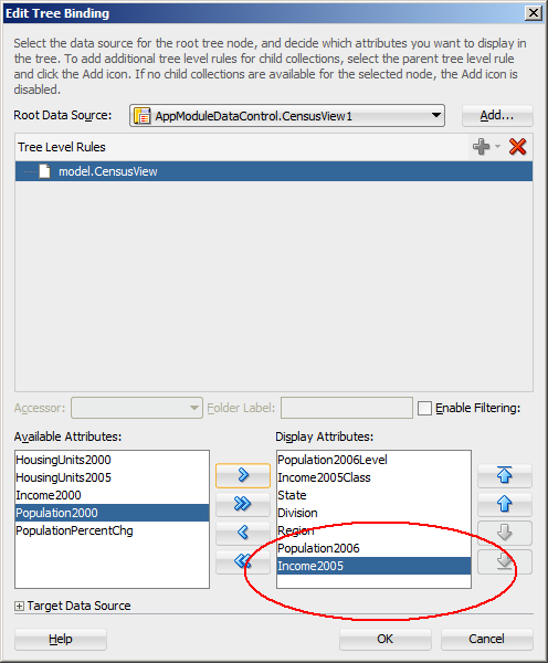
Description of "Figure 39-7 Edit Tree Binding Dialog for NBox Sample"
After you click OK, the binding will be updated with the added attributes. The following code sample shows the revised binding for the CensusView10 node definition.
<nodeDefinition DefName="model.CensusView" Name="CensusView10">
  <AttrNames>
    <Item Value="Population2006Level"/>
    <Item Value="Income2005Class"/>
    <Item Value="State"/>
    <Item Value="Division"/>
    <Item Value="Region"/>
    <Item Value="Population2006"/>
    <Item Value="Income2005"/>
  </AttrNames>
</nodeDefinition>
Code on the JSF page for an NBox Component
The following example shows the code that is generated on the JSF page for the NBox:
<dvt:nBox id="nb1" var="ent" rowsTitle="#{viewcontrollerBundle.POPULATION}"
          value="#{bindings.CensusView1.collectionModel}"
          columnsTitle="#{viewcontrollerBundle.INCOME}">
  <f:facet name="rows">
    <af:group id="g1">
      <dvt:nBoxRow label="#{viewcontrollerBundle.LOW}" id="nbr1" value="low"/>
      <dvt:nBoxRow label="#{viewcontrollerBundle.MEDIUM}" id="nbr2" value="medium"/>
      <dvt:nBoxRow label="#{viewcontrollerBundle.HIGH}" id="nbr3" value="high"/>
    </af:group>
  </f:facet>
  <f:facet name="columns">
    <af:group id="g2">
      <dvt:nBoxColumn label="#{viewcontrollerBundle.LOWER}" id="nbc1" value="lower"/>
      <dvt:nBoxColumn label="#{viewcontrollerBundle.LO_MID}" id="nbc2" value="lo-mid"/>
      <dvt:nBoxColumn label="#{viewcontrollerBundle.HI_MID}" id="nbc3" value="hi-mid"/>
      <dvt:nBoxColumn label="#{viewcontrollerBundle.UPPER}" id="nbc4" value="upper"/>
    </af:group>
  </f:facet>
  <dvt:nBoxNode column="#{ent.Income2005Class}" row="#{ent.Population2006Level}"
                label="#{ent.State}" id="nbn1">
    <dvt:attributeGroups value="#{ent.Division}" type="color"
                         label="#{ent.Division}"
                         sectionLabel="#{viewcontrollerBundle.DIVISION}" id="ag1"/>
    <f:facet name="icon">
      <dvt:marker id="m1">
        <dvt:attributeGroups value="#{ent.Region}" type="shape"
                             label="#{ent.Region}"
                             sectionLabel="#{viewcontrollerBundle.REGION}"
                             id="ag2"/>
      </dvt:marker>
    </f:facet>
  </dvt:nBoxNode>
</dvt:nBox>
Modifying NBox Properties and Layout
After you create your NBox, you can modify the layout of the component or add additional elements, such as a label, using the Create NBox dialog. To open the dialog, use the Edit icon in the Properties window for the nBox component. You can also customize the layout of the Nbox directly in the code, in the visual editor, or by setting values in the Properties window.
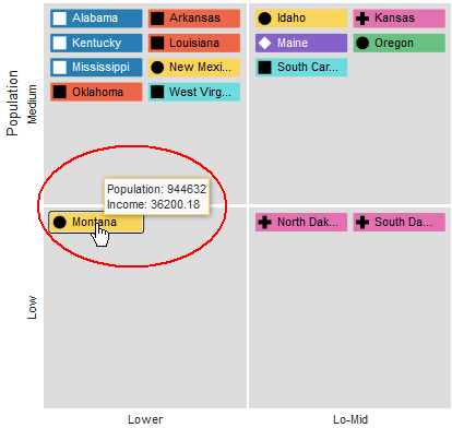
For example, to add the tooltip shown in Figure 39-6 to your NBox, you can enter a value for the NBox node's shortDesc attribute in the Properties window or in the code editor.
<dvt:nBoxNode column="#{ent.Income2005Class}" row="#{ent.Population2006Level}"
label="#{ent.State}" id="nbn1"
shortDesc="Population: #{ent.Population2006}<br/>Income: #{ent.Income2005}">
... contents omitted
</dvt:nBoxNode>
For additional information and examples for customizing your NBox, see Using NBox Componentsin Developing Web User Interfaces with Oracle ADF Faces.
