9 Available Components
There are four types of components available in this panel.
a. Forms
b. Controls
c. Framework Components
d. Visualization
e. Framework CCA Loader
f. Business
g. Partials
h. Extensions
A) Forms
This section contains the components which are required in designing a form.
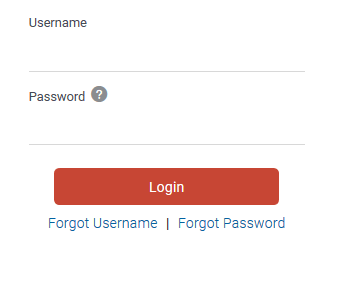
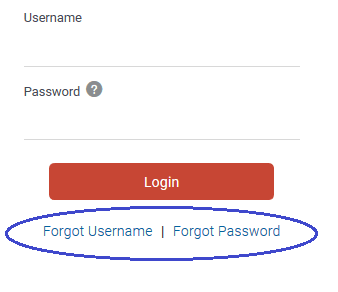
For example, a Login form accepts user name and password and validates a user. In the example below, developer can use Input Text and Input Password element for user name and password respectively.
- Anchor Tag
- Avatar
- Check Box
- Combo Box
- Date Picker
- File Picker
- Image
- Input Number
- Input Password
- Input Text
- List View
- Menu
- Radio Buttons
- Select
- Switch
- Table
- Text
- Text Area
- Train
- Tree View
This section contains the components, which are used to control the activity on the form.
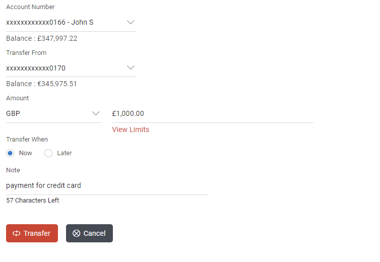
- Transfer button to confirm the transaction
- Cancel button to cancel the transaction
In the below example, buttons are displayed:
- Button
- Button Set
- Container
- Component Loader
This section contains the components, which are predefined & supported by OBDX. It has in-built functionality.
In the below example, an account input component which lists all the accounts of the user and shows its details like balance and address of the account selected by the user.

- Account Input
- Amount Input
- Bank Look Up
- Help Panel
- Navigation Bar
- Page Section
- Row Control
D) Visualization
This section contains the components, which are useful to design a widget that display s information graphically.
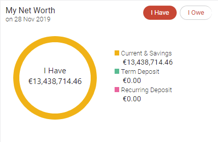
In the below example, a chart that shows the net worth of different accounts (CASA) of the user
E) Framework CCA Loader
This section contains the framework CCA components, which are predefined and supported by OBDX. It has in-built functionality.
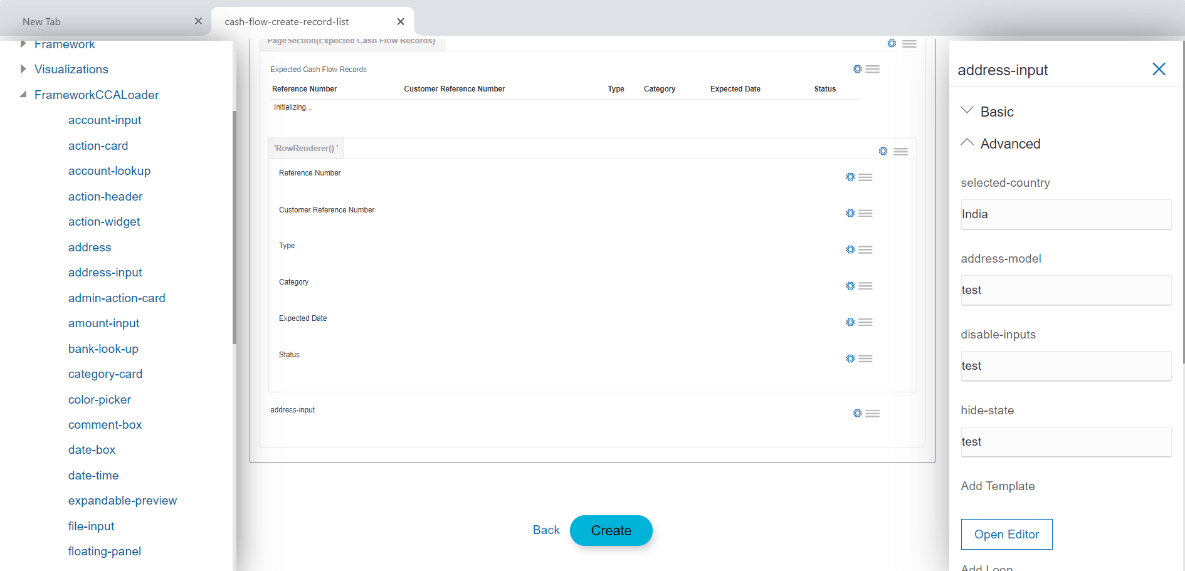
In the below example, an address-input component which contains predefined address structure. On right panel all the properties of address-input CCA component are available.
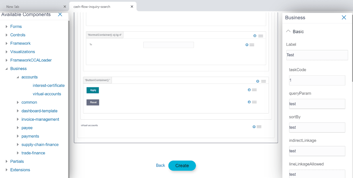
F) Business
This section contains the Business components, which are created by user and are reusable components. Business components generate.
In the below example, a virtual-accounts component which contains predefined virtual accounts list. On right panel all the properties of virtual-accounts CCA component are available.
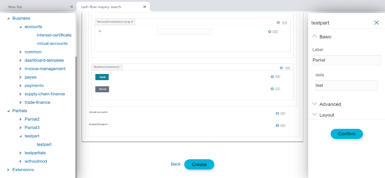
G) Partials
This section contains the Partial templates, which are created by user and are reusable independent HTML template.
H) Extensions
This section contains the components which are customized OBDX components and are saved in extensions folder.
- Chart
- TimeLine
Details of components
- Anchor Tag :
Usage: This component is used to add a link. This link can be an image / icon or text.
Example:Supported attributes:
a) Basic:- Label
- Format Label
b) Advanced:- Select anchor type
- Add formatter
- REST API chain
- Hook functions
- Add Loop
- Add Custom Attributes
- Conditional Field
c) Layout:- Grid
- Avatar
Usage: This component is used to display initials for name or product and images in a circle.
Example:
a) Basic:- Label
b) Advanced:- Select Size
- Enter Image Path
- Enter Initials
- Add Loop
- Add Custom Attributes:
- Conditional Field
c) Layout:- Grid
- Check Box:
Usage: This component is used to add checkbox to allow a user select one or more options from the available choices.
Example:
Supported attributes:
a) Basic:- Label
- Hide Label
- Value
- Options
b) Advanced:- Value Change Handler
- Validations
- Required Field
- Add Loop
- Add Custom Attributes
- Conditional Field
c) Layout:- Grid
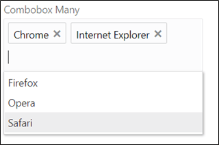
- Combo Box:
Usage: This component is used to add a drop down to allow user to make multiple selection from the predefined options or type his own option.
Example:
Supported attributes:
a) Basic:- Label
- Hide Label
- Value
- Select Type
- Options
b) Advanced:- Value Change Handler
- Validations
- Required Field
- Add Loop
- Add Custom Attributes
- Conditional Field
c) Layout:- Grid
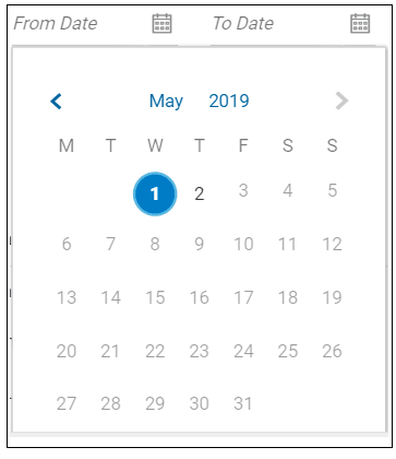
- Date Picker:
Usage: This component is used to add an input box to accept date as an input from user.
Example:
Supported attributes:
a) Basic:- Label
- Hide Label
- Value
b) Advanced:- Value Change Handler
- Validations
- Required Field
- Add Loop
- Add Custom Attributes
- Conditional Field
c) Layout:- Grid
- File Picker:
Usage: This component is used to add an action as a button to accept the documents (files) as an input from user.
Example:
Supported attributes:
a) Basic:- Label
d) Advanced:- Selection Mode
- Enter Allowed File Extensions
- REST API chain
- Hook functions
- Required Field
- Add Loop
- Add Custom Attributes
- Conditional Field
e) Layout:- Layout:
- Image:
Usage: This component is used to add an image.
Example:

Description of the illustration uxextensibility100.pngSupported attributes:
a) Basic:- Image source
b) Advanced:- Add Loop
- Add Custom Attributes
- Conditional Field
c) Layout:- Grid
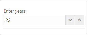
- Input Number:
Usage: This component is used to add an input box to accept numbers as an input from the user.
Example:
Supported attributes:
a) Basic:- Label
- Hide Label
- Value
b) Advanced:- Enter Minimum Length
- Enter Maximum Length
- Enter Step
- Value Change Handler
- Validations
- Required Field
- Add Loop
- Add Custom Attributes
- Conditional Field
c) Layout:- Grid
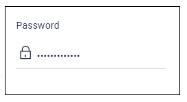
- Input Password:
Usage: This component is used to add an input box to accept the password as an input from the user.
Example:
Supported attributes:
a) Basic:- Label
- Hide Label
- Value
b) Advanced:- Value Change Handler
- Validations
- Required Field
- Add Loop
- Add Custom Attributes
- Conditional Field
c) Layout:- Grid
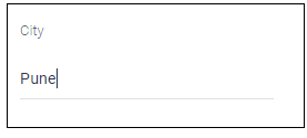
- Input Text:
Usage: This component is used to add an input box to accept text as an input from the user.
Example:
Supported attributes:
a) Basic:- Label
- Hide Label
- Value
b) Advanced:- Value Change Handler
- Validations
- Required Field
- Add Loop
- Add Custom Attributes
- Conditional Field
c) Layout:- Grid
- List View:
Usage: This component is used to add a view which groups several items and display s them in a vertical scrollable list.
Example:
Supported attributes:
a) Basic:- Label
- Source variable
- Id attribute
b) Advanced:- Renderer ID
- Pagination
- Indexer
- Add Loop
- Add Custom Attributes
- Conditional Field
c) Layout:- Grid
- Menu:
Usage: This component is used to add an element, which displays popup menu with multiple options relevant to the particular row for easier navigation.
Example:
Supported attributes:
a) Basic:- Label
- ID
- Options
b) Advanced:- Enter Menu Launcher
- REST API chain
- Hook functions
- Add Loop
- Add Custom Attributes
- Conditional Field
c) Layout:- Grid
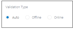
- Radio Buttons:
Usage: This component is used to add buttons to let a user select an option from the available choices.
Example:
Supported attributes:
a) Basic:- Label
- Hide Label
- Value
- Options
b) Advanced:- Value Change Handler
- Validations
- Required Field
- Add Loop
- Add Custom Attributes
- Conditional Field
c) Layout:- Grid
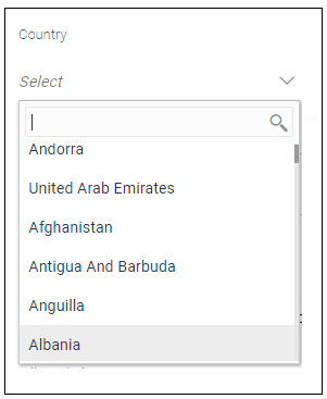
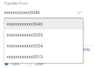
- Select:
Usage: This component is used to add a drop down, to allow user to make a choice from the predefined options.
Example:
Supported attributes:
a) Basic:- Label
- Hide Label
- Value
- Select type
- Options
b) Advanced:- Value Change Handler
- Validations
- Required Field
- Add Loop
- Add Custom Attributes
- Conditional Field
c) Layout:- Grid
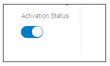
- Switch:
Usage: This component is used to add a toggle button for binary status such as on/off.
Example:
Supported attributes:
a) Basic:- Label
- Hide Label
- Value
b) Advanced:- Value change handler
- Required field
- Add Loop
- Add Custom Attributes
- Conditional Field
c) Layout:- Grid
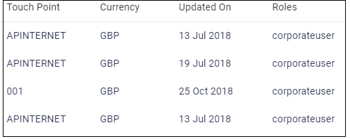
- Table:
Usage: This component is used to add a view which groups several items and display s them in row- column fashion.
Example:
Supported attributes:
a) Basic:- Label
- Source variable
- Id attribute
- Columns
b) Advanced:- Row renderer
- Pagination
- Add Loop
- Add Custom Attributes
- Conditional Field
c) Layout:- Grid
- Text:
Usage: This component is used to add a simple text.
Example:

Supported attributes:
a) Basic:
b) Advanced:- Aria label
- Tag type
- Binding Source
- Add formatter
- Add loop
- Add Custom Attributes
- Conditional Field
c) Layout:- Grid
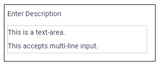
- Text Area:
Usage: This component is used to add an input box to accept the multi-line text as an input from user.
Example:
Supported attributes:
a) Basic:- Label
- Hide Label
- Value
b) Advanced:- Enter rows
- Value Change Handler
- Validations
- Required Field
- Add Loop
- Add Custom Attributes
- Conditional Field
c) Layout:- Grid
- Train:
Usage: This component is used to add an element for navigation that allows a user to go between different "steps" i.e. different components. Each step can display information about the state of the step such as "visited", "unvisited", "disabled".
Example:
Supported attributes:
a) Basic:- Label
- Value
b) Advanced:- Selected step
- Value change handler
- Add Loop
- Add Custom Attributes:
- Conditional Field
c) Layout:- Grid
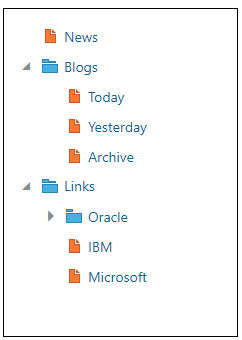
- Tree View:
Usage: This component is used to add an element to display the hierarchical relationship between the items of the tree.
Example:
Supported attributes:
a) Basic:- Label
- Source variable
b) Advanced:- Renderer ID
- Add Loop
- Add Custom Attributes
- Conditional Field
c) Layout:- Grid
- Button:
Usage: This component is used to add a call to action to the page which can be configured to perform various actions on its click.
Example:
Supported attributes:
a) Basic:- Label
b) Advanced:- Icons
- Select Class Type
- Select Type
- Rest API Chain
- Hook Function
- Add Loop
- Add Custom Attributes
- Conditional Field
c) Layout:- Grid
- Button Set:
Usage: Basically button set is a group of button which can be used as radio button or checkbox button. In case of single selection it act as radio button and in case of multiple selection it act as checkbox set button.
Example:
a) Radio button set
b) Checkbox button set
Supported attributes:
a) Basic:- ID: It accepts the same value as Label
- Value
- Select Type:
1) Buttons Set One: Choose this to use it as radio button set
2) Button Set Many: Choose this to use it a checkbox button set
- Options
b) Advanced:- Value Change Handler
- Add Loop
- Add Custom Attributes
- Conditional Field
c) Layout:- Grid
- Container:
Usage: This component is used to provide a wrapper or group for form elements to apply a common behavior to them. e.g. display / hide of buttons. An element is always placed inside the container start element and container end element.
1. On Dropping the container element at the desired position on form area, a panel will open on the right side.
2. User can select the type, fill the required fields and click confirm.
Note:
Container can also be used inside container.Supported attributes:
a) Basic:- Select Type Of Container
b) Advanced:- Add Loop
- Add Custom Attributes
- Conditional Field
c) Layout:- Grid
- Component Loader:
Usage: Component Loader is used to load already created component or partial in current component.
Supported attributes:
a) Advanced:- Select Type:
- Component
- Select Type
- Framework Elements: To use
Framework Components.
Refer to framework components section for more detail.
- Transaction: To load transaction type of component. Refer to Transaction component section.
- Single: To load normal component.
- Framework Elements: To use
Framework Components.
- Select Type
- Component
b) Partial:- Add Loop
- Add Custom Attributes
- Conditional Field
c) Layout:- Grid
- Select Type:
C) Framework Component:
- Account Input:
Usage: Component which provides account selection that is fetched from current logged in user or custom URL
Example:
Supported attributes:
a) Basic:- Label
- Value
b) Advanced:- Enter Type: These values will passed to ‘type’ key in
params for account input.
- balance
- address
- nodeValue
- loans
- Add Loop
- Add Custom Attributes
- Conditional Field
c) Layout:- Grid
- Amount Input:
Usage: This component is used to accept amount in an input box. The component gives currency selection and entered amount is formatted with respect to selected currency.
Example:
Supported attributes:
a) Basic:- Label
- Value
b) Advanced:- Enter Currency Variable: To store selected currency value.
- Required
- Currency List Required: Whether to display currency list. In case currency list is required, user has to provide URL to fetch currency list or provide a function called Currency Parser which returns the currency list.
- Currency URL: URL for Fetching currency.
- Currency Parser: Custom function which returns currency list that can be declared in init function
- Enter Root ID: Root id which will be passed in params of amount input.
- Enter Root Class: Root class which will be passed in params of amount input.
- Add Loop
- Add Custom Attributes
- Conditional Field
c) Layout:- Grid
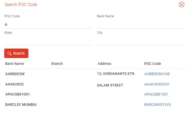
- Bank Look up:
Usage: This component is used to provide bank look up on the basis of IFSC Code, state, city or branch name.
Example:
Supported attributes:
a) Basic:- Label
b) Advanced:- Clearing Code Type
- Account Type
- Region
- Network Code
- Add Loop
- Conditional Field
c) Layout:- Grid
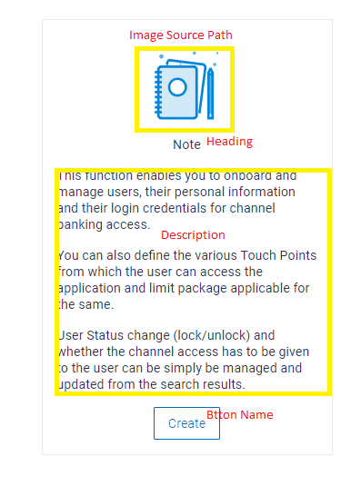
- Bank Look up:
Usage: This component is used to display related information about the current component.
Example:
Supported attributes:
a) Basic:- Partial Name: Name of the partial which will be created inside ChannelPath/partials/help/
b) Advanced:- Enter Heading
- Image Source: Path of image inside channelPath/images/
- Enter Description
- Enter Button Name
- Rest API Chain: Rest to be fired on button click
- Hook Function: Write action to be performed on button click
- Add Loop
- Conditional Field
c) Layout:- Grid
- Navigation Bar:
Usage: This component is used to provide tab based page Navigation, where each tab item / name will display specific view.
Example:
Supported attributes:
a) Basic:- Label:
- Tabs: Can be provided externally or custom just like select box option. In case user is not familiar with how to provide option, refer Option section in Available attributes.
b) Advanced:
- UI Options:
a) Icon Available
b) Default option
c) Menu Float
d) Full Width
e) Edge
- Navigation Bar Description
- Add Loop
- Conditional Field
c) Layout:- Grid
- Page Section:
Usage: This component is used to provide basic layout structure and styling for every page / screen.
Note:
All the form elements must be present inside this container.Example: In the example below, Page Section is added and header is optional. The other form elements can also be added via Partial.
Supported attributes:
a) Basic:- Label
- Format label
- Hide Page Heading: Switch to active mode to hide the page section heading.
b) Advanced:
- Add Loop
- Conditional Field
c) Layout:- Grid
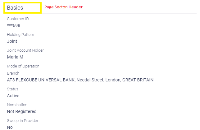
- Row Control:
This component is used to display label and its corresponding value in structure supported by OBDX framework
Example:
Supported attributes:
a) Basic:- Label
- Format label
- Value
b) Advanced:
- Add Formatter
- Add Loop
- Conditional Field
c) Layout:- Grid
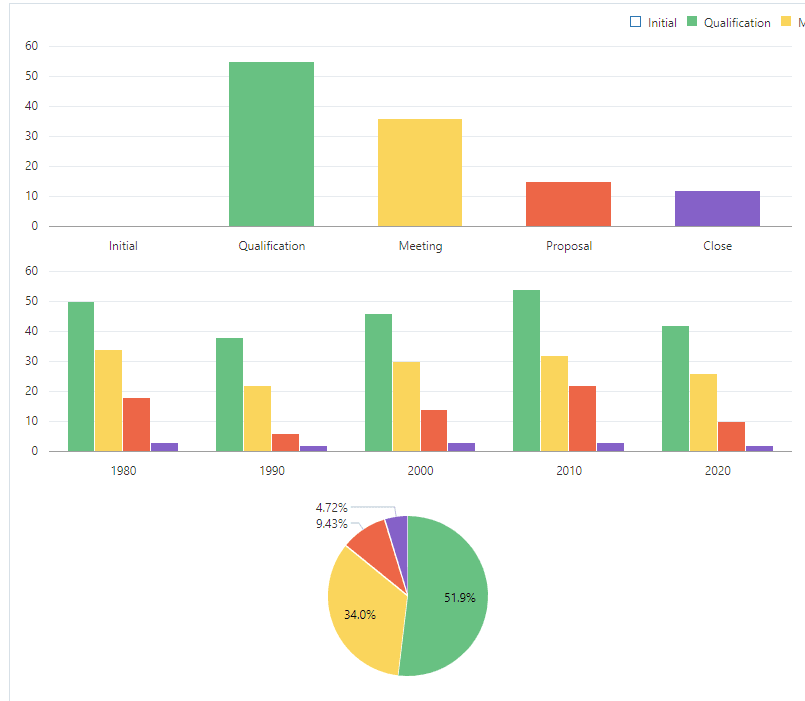
d) Visualizations:- Chart: There are three types of chart that can be drawn
with the help of tool:
- Pie Chart
- Bar Chart
- Line Chart. For more information about each chart type, visit jet.us.oracle.com
Supported Attributes:
a) Advanced:- Series
- Groups
- Add loop
- Add Custom Attributes
- Conditional Field
b) Layout:- Grid
- Timeline:
Usage: This component is used to display the timeline component. To provide values to timeline component use Add Custom Attribute (refer section Add Custom attribute in Available Attributes).
Example:
Supported Attributes:
a) Basic:- Label
b) Advanced:- Add Loop
- Add Custom Attributes
- Conditional Field
c) Layout:- Grid
