10.3 Options
Description: This attribute is used for all the components, which enables the user to select one or more options. For example, select box, radio buttons, checkboxes etc.
Component used to accept the input: Collapsible element, Button set and Input texts.
- External
- Custom
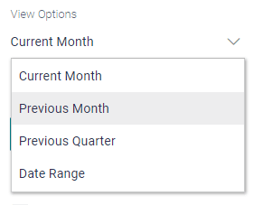
Example: User has a select box, which shows multiple options like Current month, Previous month as shown in the below image.
- External
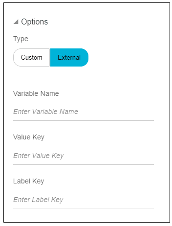
In this type, if user has options to be displayed on the screen which are getting fetched from a REST API, then select the type as external.
Under this type, there are three input fields.- Variable name: This field stores the data fetched from
REST API. It is mandatory to have the data in this variable in
value=>label format. In case the data is not in this format, then
convert it to the required format and enter that variable name in
this field.
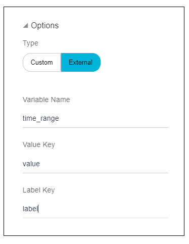
Example: The variable name is time_range.
This variable has the following data which is fetched from REST API.
time_range = [{ label : “Current Month”, value :”CM”}, { label : “Previous Month”, value :”PM”}, { label : “Previous Quarter”, value :”PQ”}, { label : “Date Range”, value:”DR”}] - Value key: As mentioned in point (1), value from
variable name represents the actual data that will be used for
further processing and is to be entered in this field.
Here time_range is an array having multiple objects.
In this
object
                                        {label:”Current Month”, value:”CM”} , value “CM”
is going to be processed.Hence, in this case value key will be, “value”.
- Label Key: As mentioned in point (1) above, label from
variable name represents the description that needs to be displayed
against an option of an input field such as select box, radio button
set etc. This label is to be entered in this field.
In this
object {label:”Current Month”, value:”CM”} , label
                                        “Current Month “
is going to be displayed on screen,in this case label key will be, “label”.
Note:
User can name this value key and label key as per their choice i.e. {label:”Current Month”, value:”CM”} can be written as {name:”Current Month”, id:”CM”}. In this case, value key will be “id”, and label key will be “name”. - Variable name: This field stores the data fetched from
REST API. It is mandatory to have the data in this variable in
value=>label format. In case the data is not in this format, then
convert it to the required format and enter that variable name in
this field.
- Custom
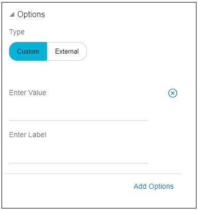
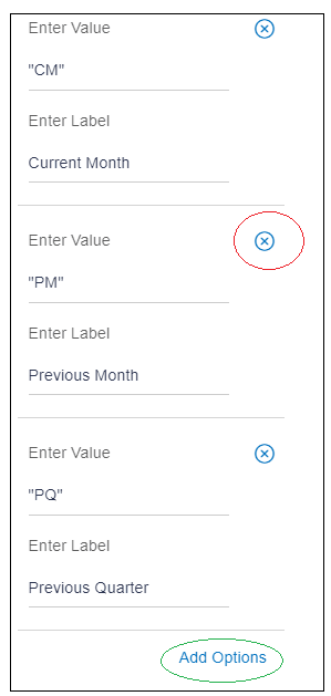
In this type, if user wants to add the options manually, i.e. for data not fetched from any REST API, then select the type custom.
Under this type, there are two input fields.- Enter Value: This field represents the actual data that
will be used for further processing. If user enters the value in
double quotes, it will be processed as string. For special cases
such as Boolean, where the value is true/ false do not enter the
value in double quotes.
In the below image, “CM”, “PM”,”PQ” are the values.
- Enter Label: This field represents the description that
needs to be displayed against an option of an input field such as
select box, radio button set, etc.
As shown in the image below, Current Month, Previous Month and Previous Quarter are the labels.
User can add more options using the “Add Options” link highlighted in green below.
User can delete the option using the icon highlighted in red.
- Enter Value: This field represents the actual data that
will be used for further processing. If user enters the value in
double quotes, it will be processed as string. For special cases
such as Boolean, where the value is true/ false do not enter the
value in double quotes.
Parent topic: Available Attributes

