8 Design Component
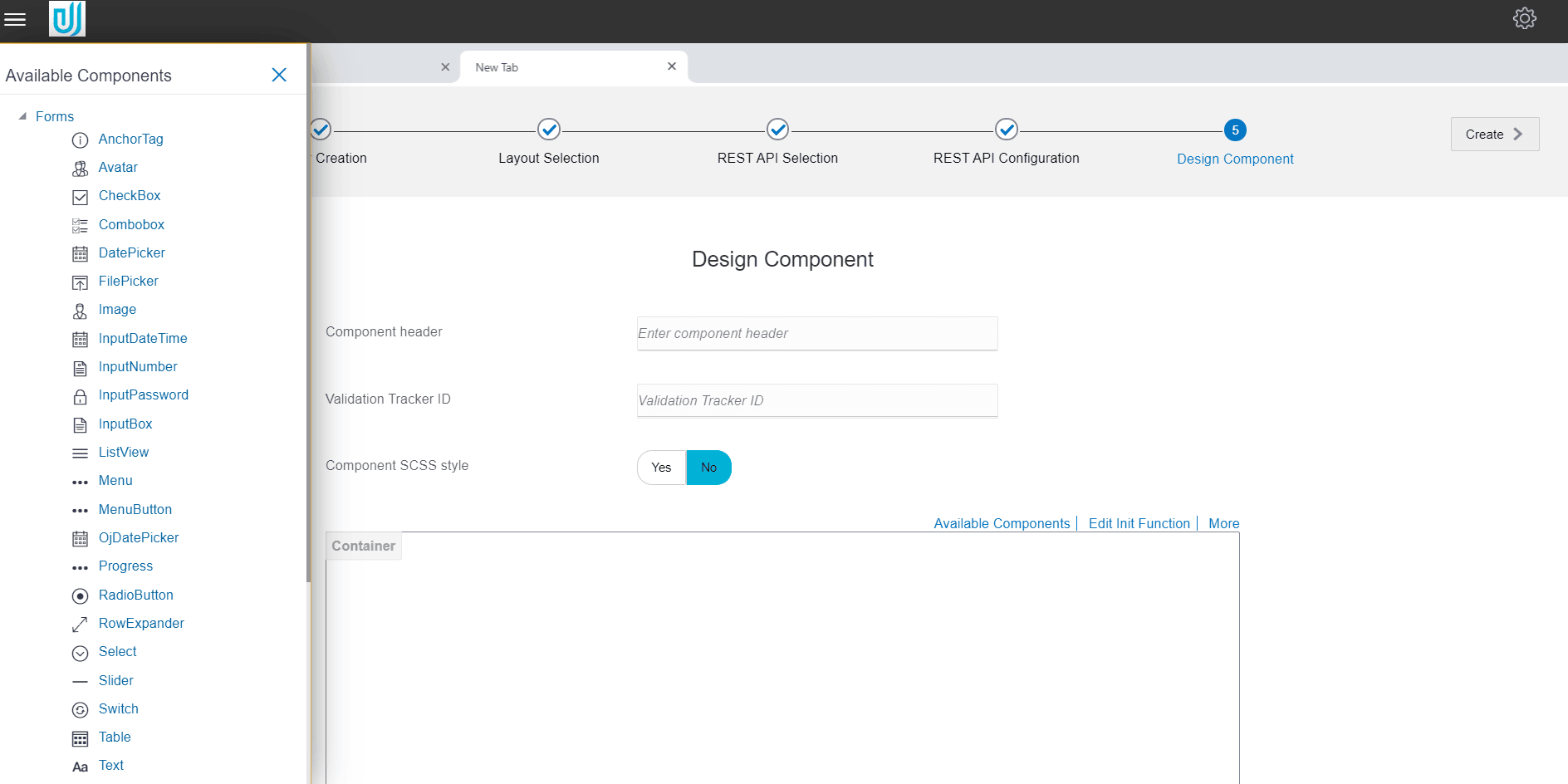
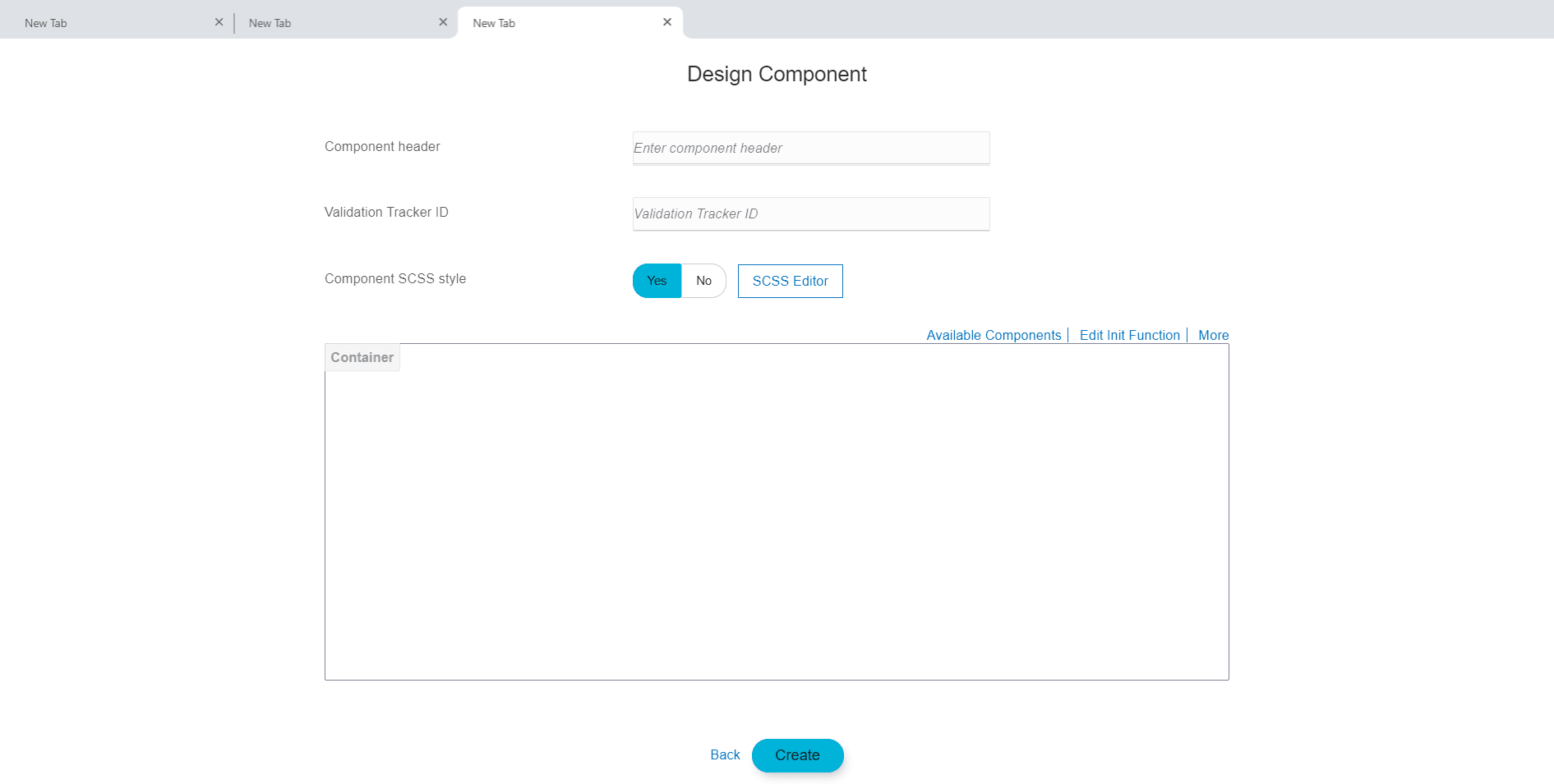
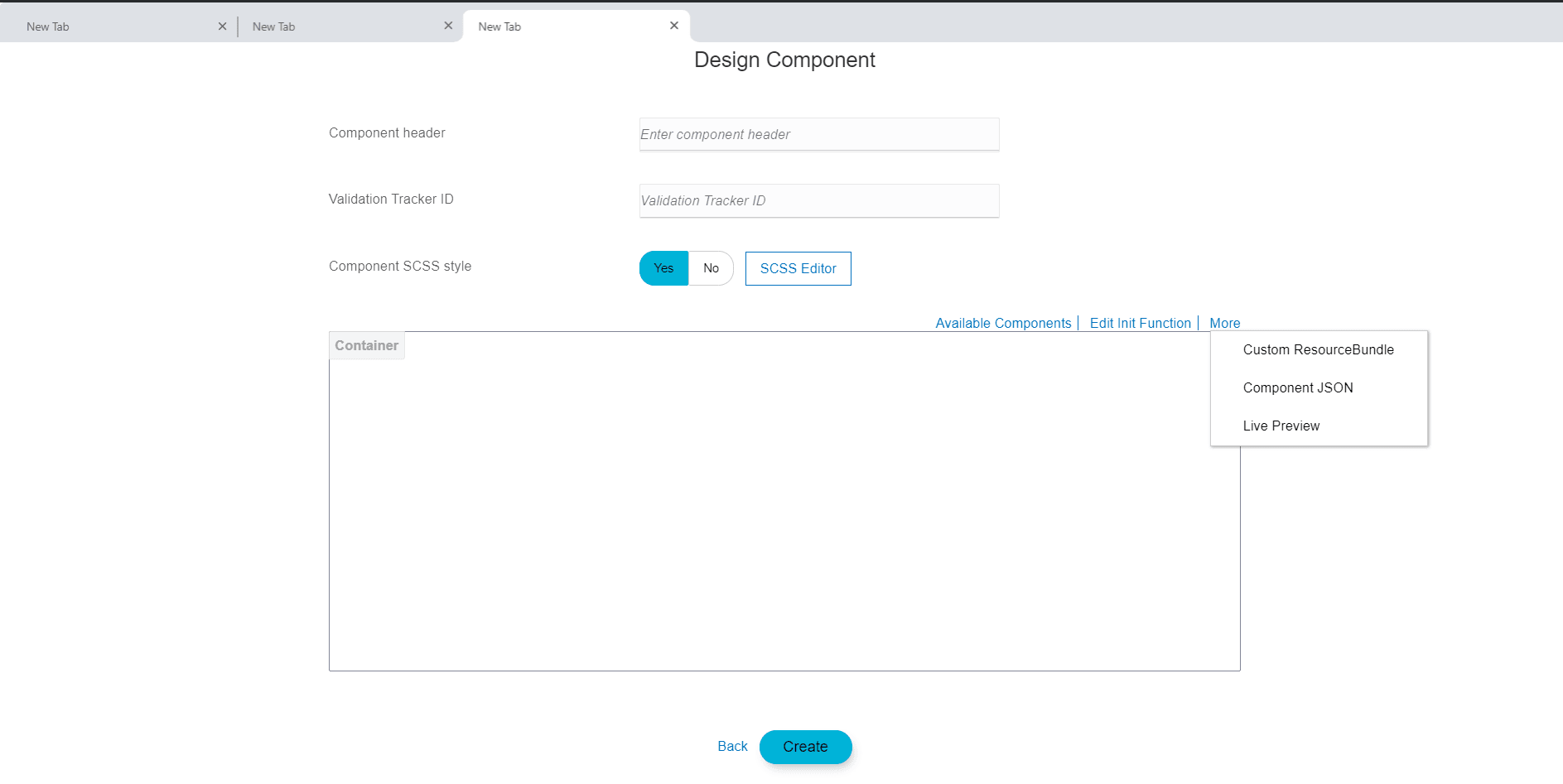
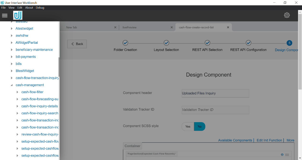
This step enables the user to design how the contents of the screen are to be displayed. User can make use of available form elements e.g. Input Text, Button etc. Each element can further be configured, placed and styled by the user as per the screen requirement.
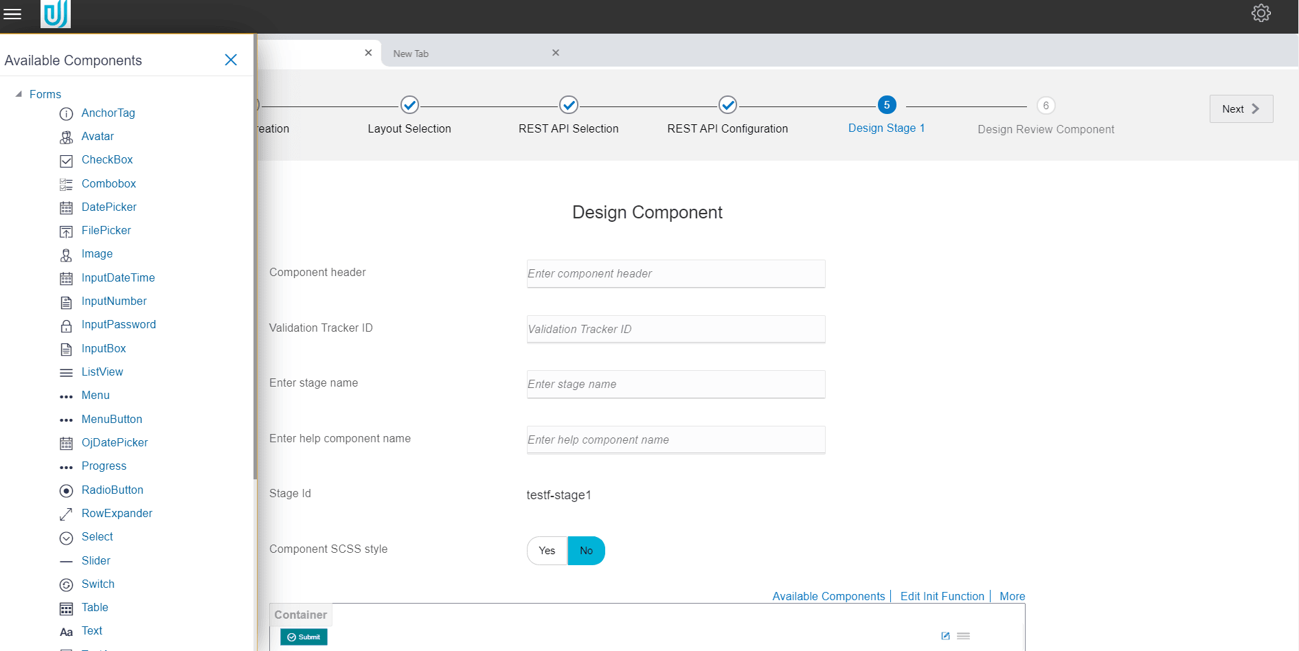
If the type of component is FLOW, the name of the stage changes to Design Stage 1, Design Stage 2, depending on the number of stages.
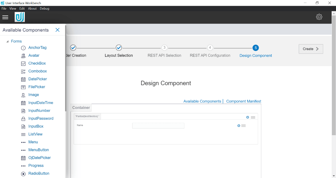
If the type of component is PARTIAL, canvas is displayed with default container type as Partial. User can then design the Partial by drag and drop from Available components.
If the type of component is PARTIAL, canvas is displayed with default container type as Partial. User can then design the Partial by drag and drop from Available components.
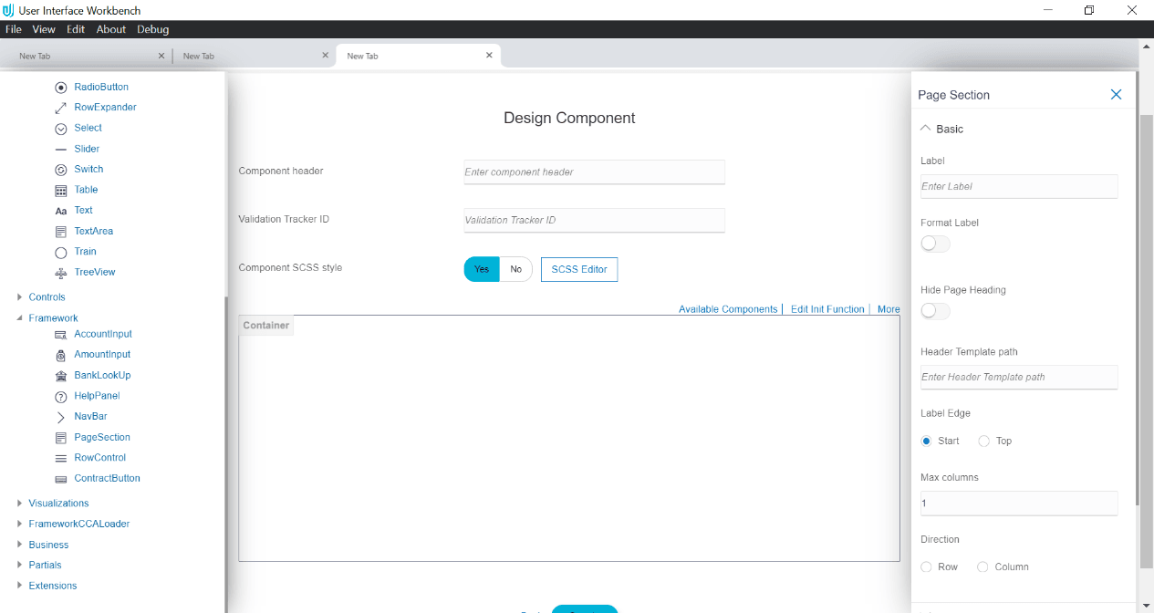
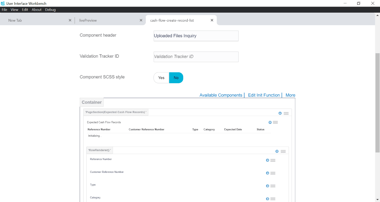
- Component Header
The text entered in this field will be displayed as the Page Title. E.g. Cheque Book Request, Loan Repayment etc.
- Validation Tracker ID
The ID provided by the user should be the ID of the element within which the form elements reside. The tool by default generates this ID. So this is an optional field. However, there may arise a situation where the user needs to use such an ID. In such case, user can provide custom ID in this field.
- Component CSS Style
User has the provision to provide custom style sheet (CSS) for the screen he wants to generate and change the look and feel of the component as per his requirement.
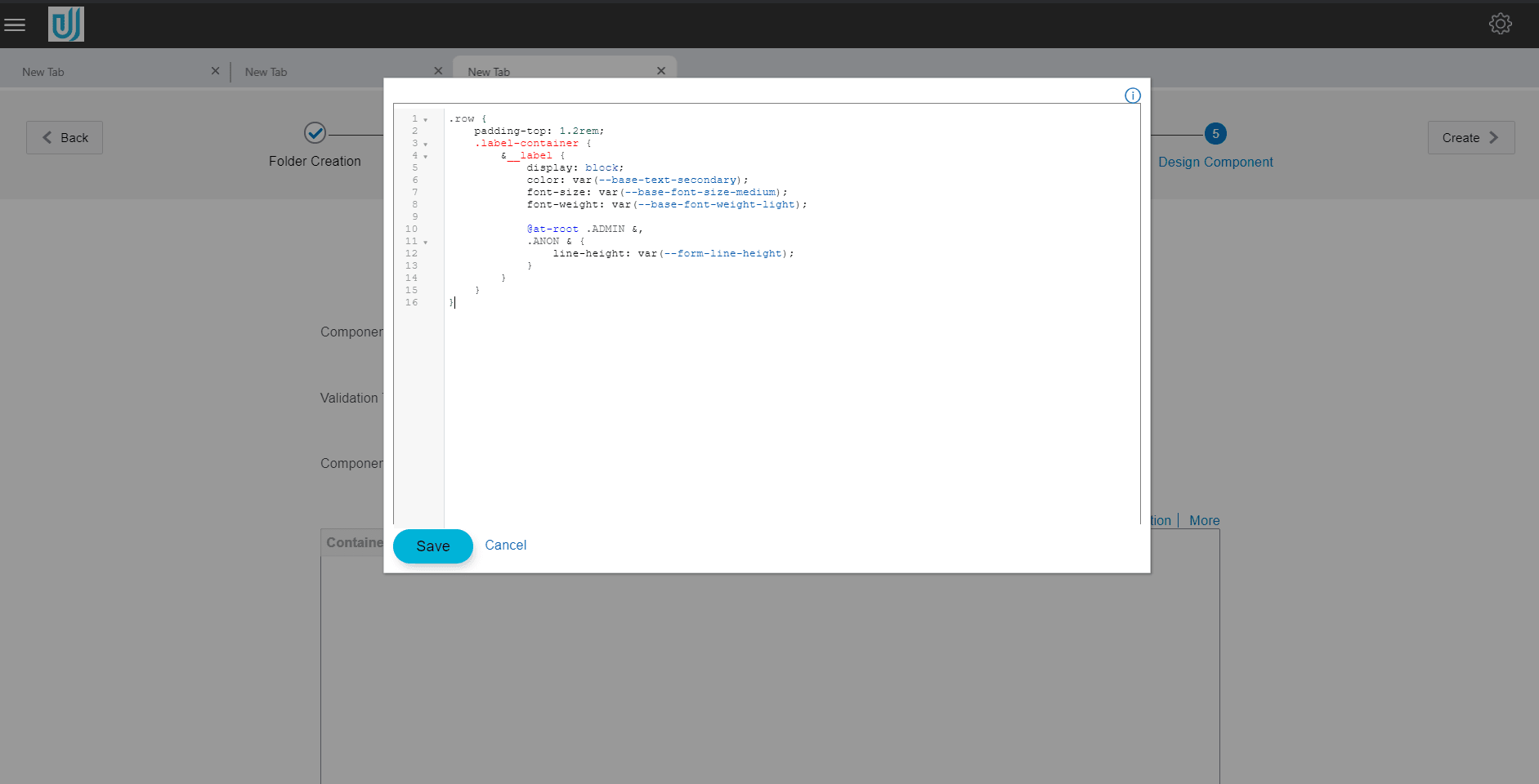
To create custom style sheet, user has to toggle the button to Yes. A CSS Editor button will appear on the right of the toggle button.
On this button click, an editor window pops up. This code editor supports Sass(Syntactically awesome style sheets). User can provide the custom classes in this editor.
After component creation, Sass file and processed Sass i.e. CSS file will be generated that will contain user defined style definition written in sass editor.
The next section can be considered as a canvas where user can design the screen contents.
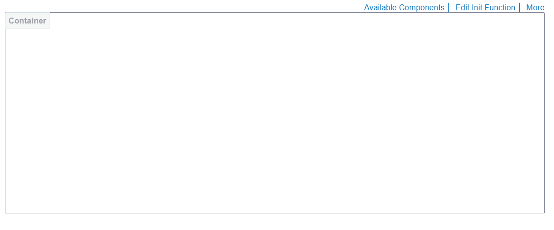
The links in the top right section in the above image are explained below:
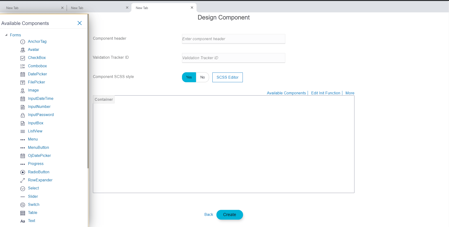
- Available Components
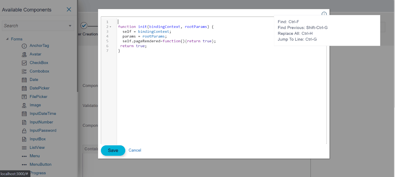
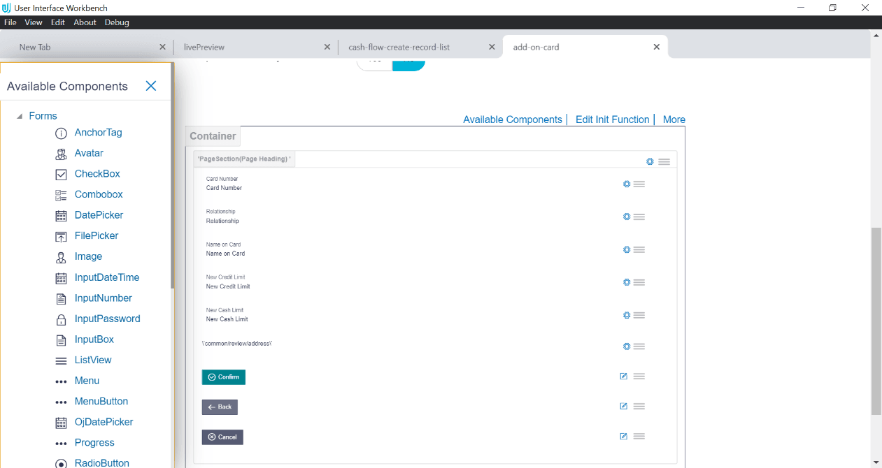
On clicking this link, a panel opens on the left side, which contains the UI elements supported by the tool.
- Edit Init Function
This link opens the editor for writing ‘init function’, which you generated in previous step (REST API Configuration). After making changes to init function, click save to apply the changes. Clicking on cancel button will simply discard the changes.
User can perform find, find previous, replace all and jump to line on the code editor.
- More
On clicking more, context menu is opened that has following options:
- Custom Resource Bundle
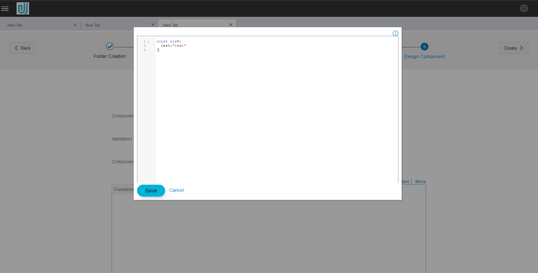
To add custom entry to the resource bundle file (which contains all the text that will be displayed on the screen), user can select this option. After selecting this option, editor window will pop up where user can add the custom entry.
To add new entry, add key and the resource value inside the braces of ’const nls’ , as shown in the picture below:
This resource bundle value can be used in two way in the component
- Inside init function: Here resource bundle value can be accessed with code self.nls.custom_key.
- Inside html: In normal scenario, tool creates resource bundle for every string attached to html element. But in special case, this can be simply done by writing $component.nls.custom_key.
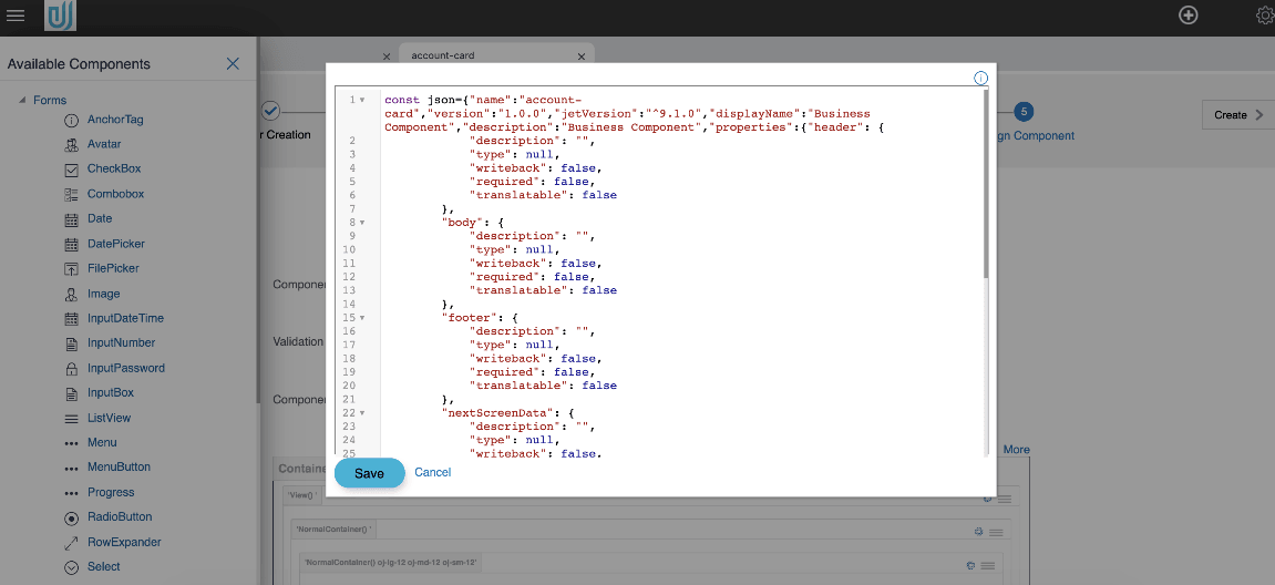
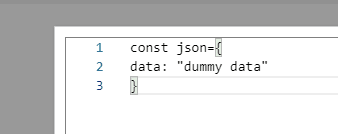
- Component JSON : Selecting this option will open
editor window. On creation of component, this JSON file is created
inside the component.
- Live Preview
Live Preview option will be displayed on Design component for Component Type Individual and Widget, for Flow component it will be displayed on Design Review screen.
Follow below steps for Live Preview:- Update channel/config/obdx.conf file with following instructions. Replace “Header always append X-Frame-Options DENY Header always append X-Frame-Options DENY” with “Header always unset X-Frame-Options”.
- Restart OHS server.
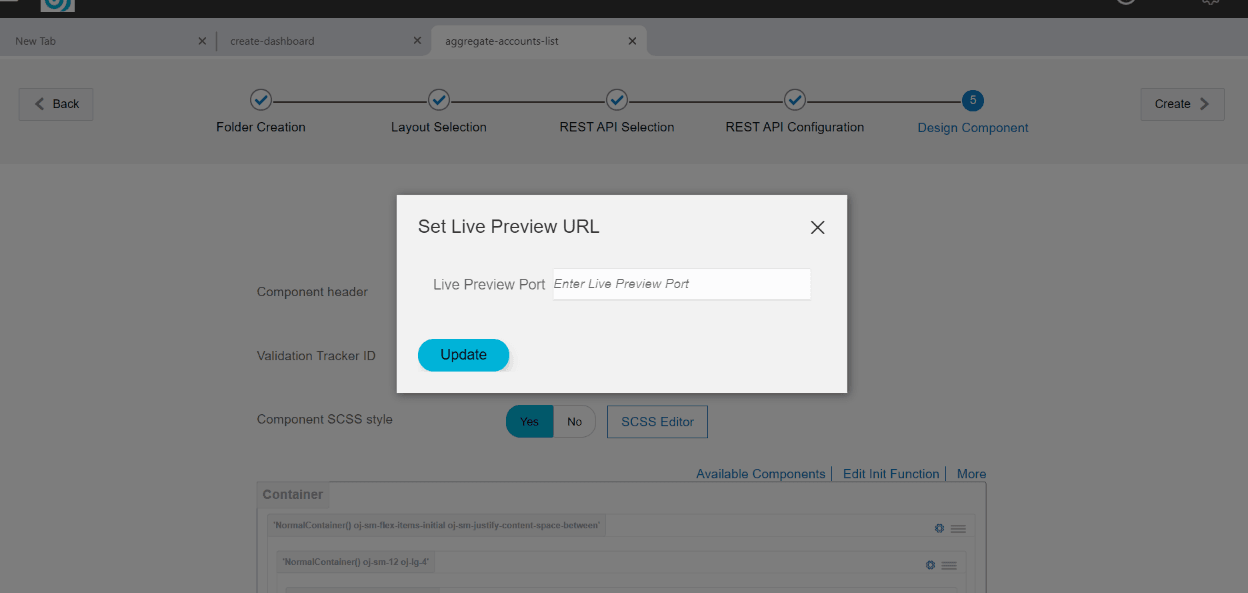
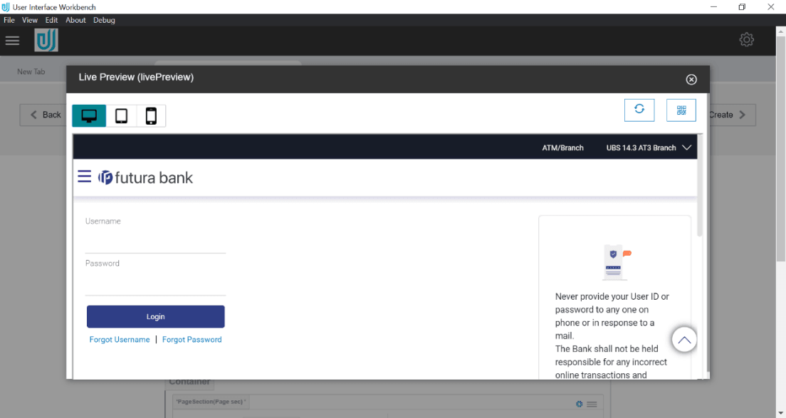
Selecting this option will open popup window, if Live Preview PORT number is not set user will be prompted to enter live preview PORT number else Preview window will be directly open. Once live preview PORT number is set live preview of the component will be displayed in popup.
Preview of new component to be created can be displayed in multiple devices such as tablets, mobiles etc. as well using QR code scan feature.
For testing your component on different devices such as Mobile, tablet etc.; follow below steps- Install QR code scanner and Cisco AnyConnect on your device.
- Connect ORACLE VPN using Cisco AnyConnect.
- Open McAfee widget, go to “Quick Settings” and “Disable Endpoint Security Firewall of McAfee”.
- Open Windows Defender firewall and Advance security, click on Inbound Rules and add new rule, select port and specify the port on which on which OHS server is running and save the rule.
- Scan the QR code from Live Preview window and view your component.
- Widget Manifest Manifest in case of widget can be written in editor on click of this option
- Component Manifest Parameters for business component can be given with this option
- Custom Resource Bundle
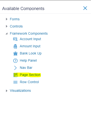
To create a screen, first element has to be Page Section (refer Page section doc), which can be found in framework Components section of left panel.
To add any element from left panel to form area, either drop it on a particular location or just click on it to add it as a last element in form area.
After clicking on Page Section option panel on the right will be opened where details for this element are captured.
After filling compulsory fields, click confirm to add element. In case all the required fields are not filled, error message will be thrown.
For Page Section, only Label element is compulsory. After confirming, Page Section is added to the form area.
To make changes to the element, click on edit icon or to remove the element, click on delete icon, or to copy element just below this click on copy icon.
User can add as many Page Sections as needed in the screen and add form elements to it.
Adding form element to page-section
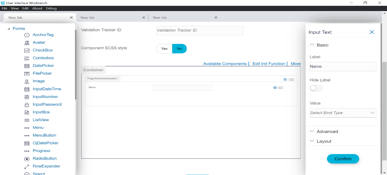
After adding Page Section, any element, which are present in available element panel can be added or dropped below it. For example, to add input box click on available components, then click Expand Forms section, and then click Input Text element
Fill in the required details in the right panel for the element and click confirm. Input element will be added to the form layout below Page Section.
Reordering a form element
Added elements inside form area can be re-ordered among themselves. To re-order an element click and hold the right most drag icon and release at desired position.
Deleting a form element
To delete form element click on delete icon.
Copying a form element
To copy an already present form element in form area, click the copy icon, new copy of the selected element will added below it, which can again be re-ordered if required.
Editing a form element
To edit an already present form element in form area click the edit icon, a right panel will open where the details can be updated. After editing, click on confirm to save the changes.
Creating Component
Once the user is satisfied with the screen design, user can click on the create component button to generate the component.
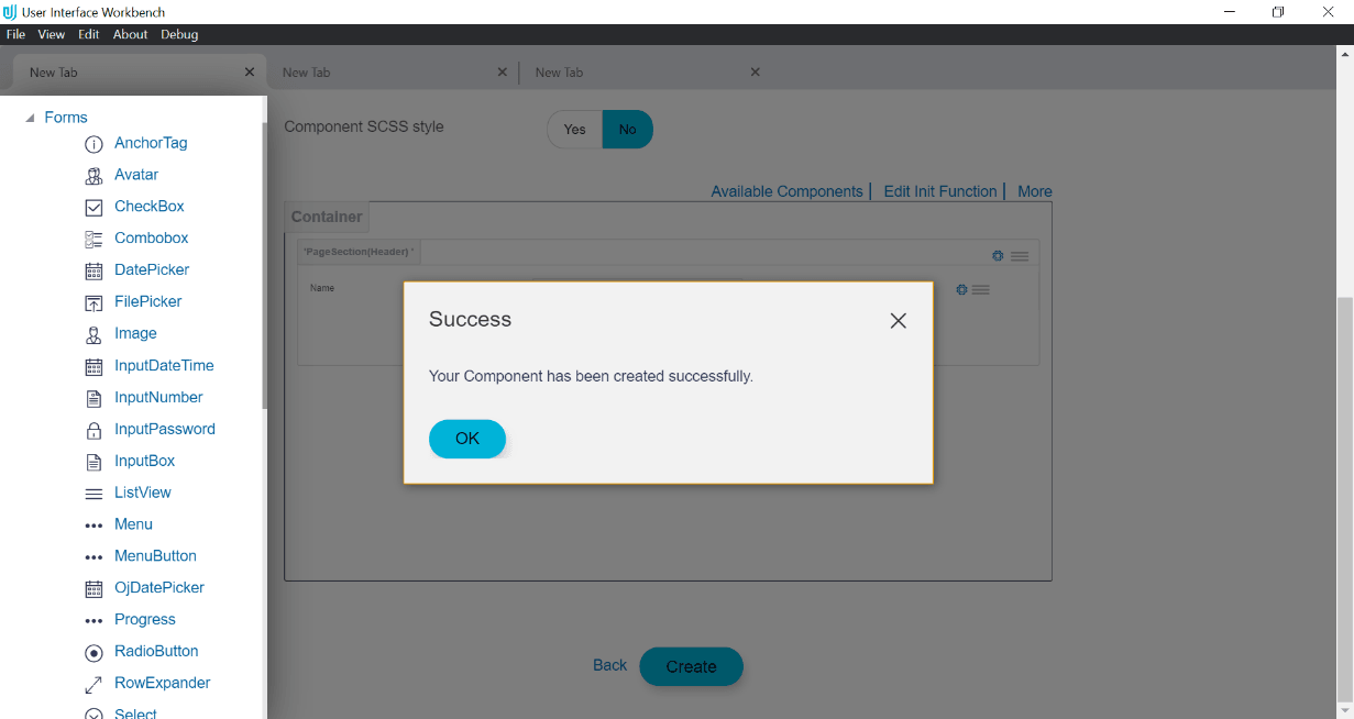
If all the details filled for each form element are valid then component will be generated and a success message will be displayed in a dialog box stating that the components have been created successfully.
Click the OK button or cancel icon to close the pop up. User can make further changes to it and then update the created component by clicking on ‘Create Component’ button.
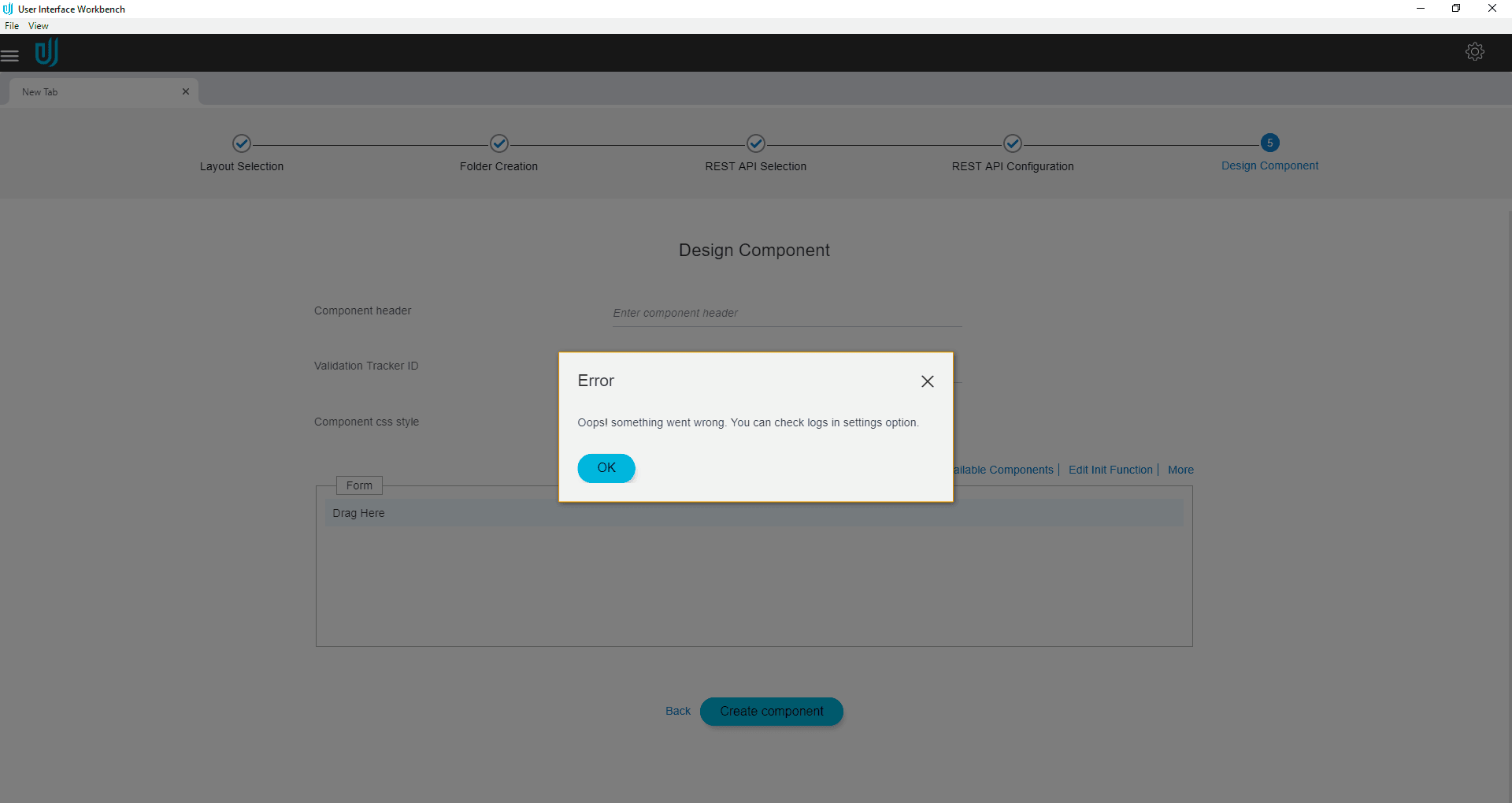
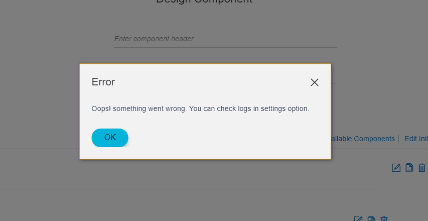
In case there is an error in case of component generation, error message will be displayed in a dialog box.
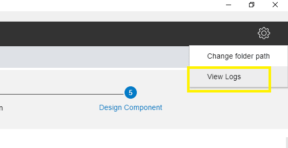
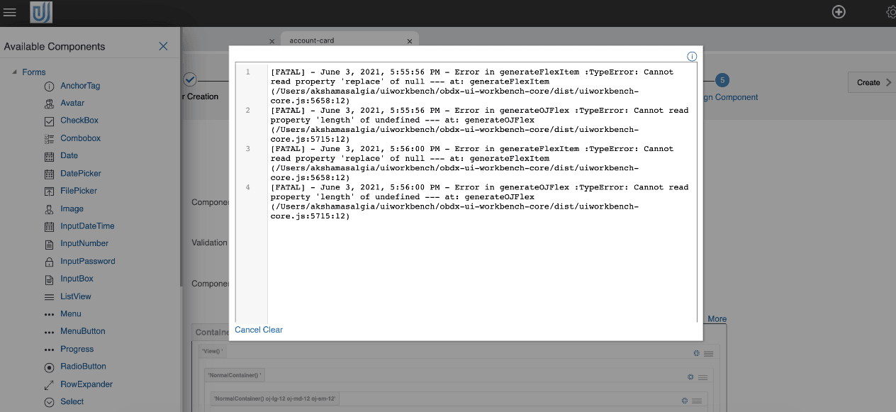
To find out what errors caused the screen creation failure, click on View Logs option which can be found in the setting icon on top right corner of the tool in the dark grey panel.
User can fix the errors and can click on Create Component again. If there are no further errors, component will be generated and success window will be displayed.
Users can clear old logs by clicking on ‘Clear’ button.
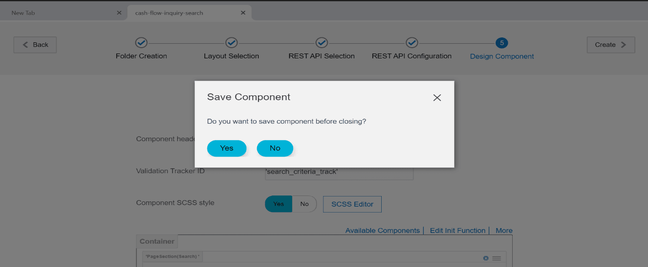
When user tries to close the component tab, “Save Component” popup is opened, on click of ‘Yes’ the components is generated/saved and on click of ‘No’ changes are discarded.
Generated Artefacts
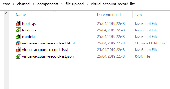
After Creating components following files are generated inside channel path selected by the user;
- Hooks.js – It contains all the custom code written by user in the Init function or Hook function.
- Loader.js – This is the entry file to load the component.
- Model.js – This file is responsible for communicating with server and transferring data between component and server.
- Component_name.js- This file is the view model for the component.
- Component_name.html – It contains the html code for the designed layout.
- Component_name.json – Code written in component JSON window is added in this file
- Component_name.scss - If Component SCSS style was turned on, a SCSS file is created which contains the code written in SCSS Editor.
- Component_name.css - If Component CSS style was turned on, the same file is created which contains code written in CSS Editor.
e.g. Below screenshot refers to a virtual-account-record-list component which is generated using the tool.
Note:
Generated artefacts must not be overwritten manually.- component_name.js – It contains the language specific values entered by user.
c. Inside channel_path/metadata/module_name/component_name:
- component_name.json- This is the manifest file for the component.
- hooks.js- It contains all the custom code written by user in Init function or Hook function.
E.g. metadata files for Virtual-Account-Record-List component
Cloning Component
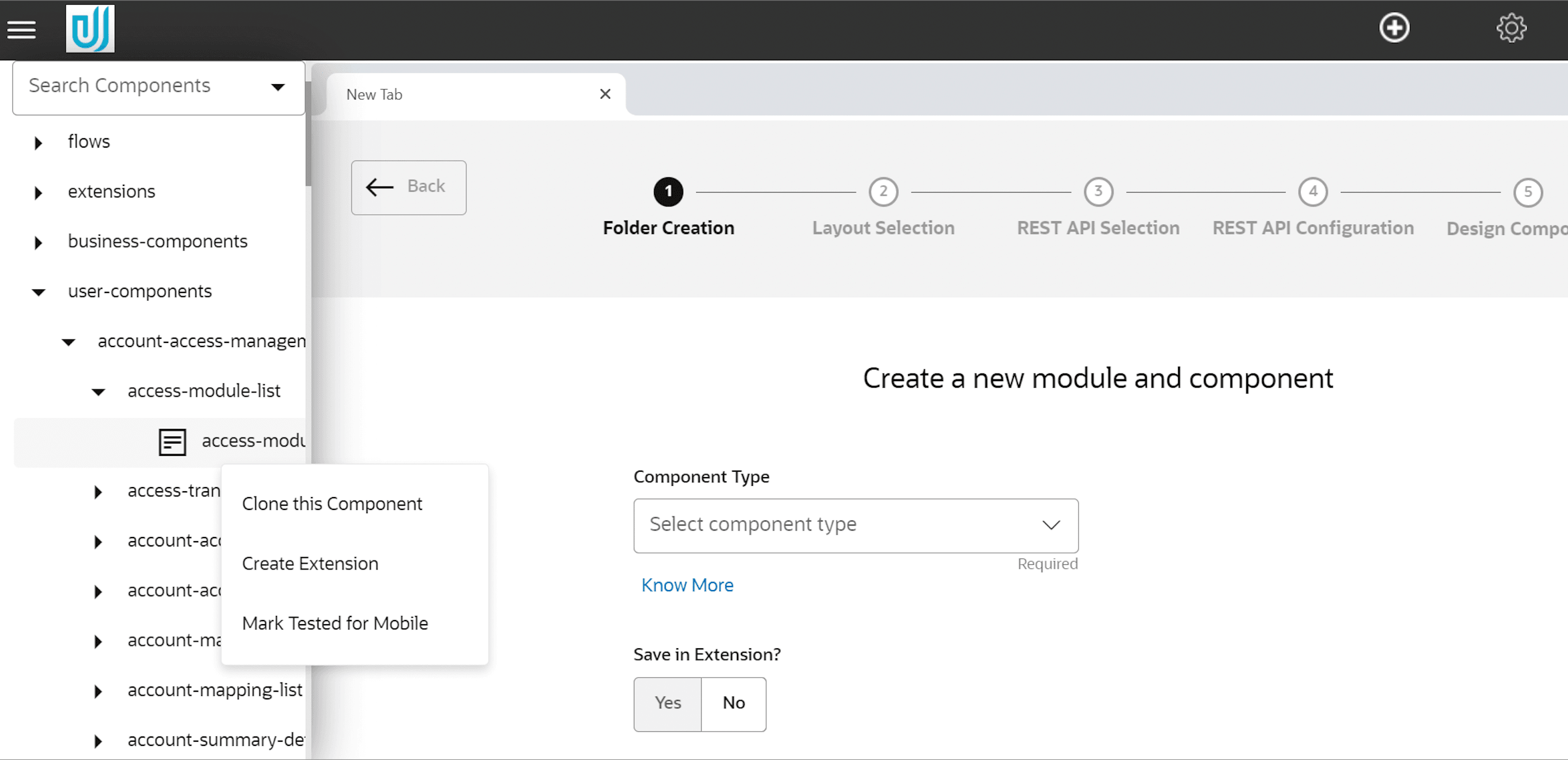
Users can clone tool generated components. To clone a component, click on File Explorer icon, available at top left corner of the tool in the grey panel.
Traverse to the desired component and select clone this component option.
Enter the new component name.
Extending Component
Users can extend tool generated components. The new extended component manifest gets saved in the extensions folder. User can then customize the extended component.
To extend a component, click on File Explorer icon, available at top left corner of the tool in the grey panel and then select create extension option.
Editing Component
All the components generated using the tool can be edited by opening the component in the tool.
To edit a component, click on File Explorer icon, available at top left corner of the tool in the grey panel.
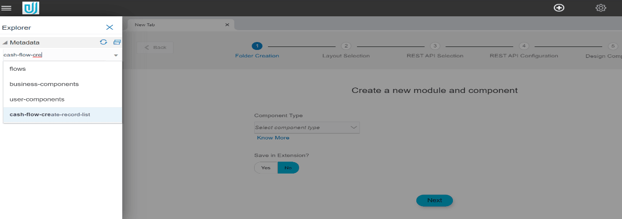
All the created components are present under Metadata accordion. To start editing a component, expand the module_name, then click component and then click component name. Users can also search the components from search panel and click on searched component to edit.
Once the user clicks on the screen name, he will be directed to the screen created during the first time.
The user can now edit the screen as per requirement and save the changes by clicking on Create Component Button.
Design Review Component
If the type of component is FLOW, this step is automatically added. It is similar to design component stage.
In this Stage, a default design is created using the fields which have been designed on the design stages.
Thus a review page can be generated without user intervention.
In case the design does not meet the requirements, user can make changes in the design as needed. Once the user manipulates the screen, the tool stops automatic design generation. For e.g. If user adds a field in one of the design pages, then he will have to add that field on the review design step also.
Confirmation Screen:
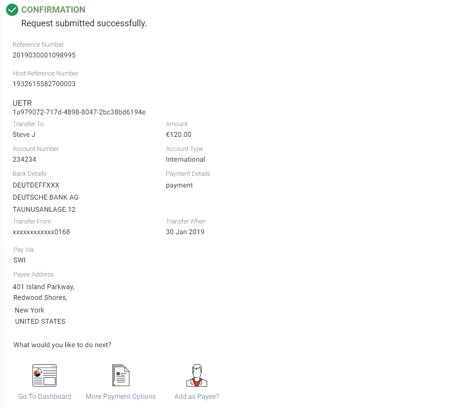
Confirmation screen is used to show confirmation of the operation, only in case of flows. User can design his own confirmation screen. Confirmation template option will be available when Component Type is Flow & Flow Type is Create.
- Standard
It is a standard template of confirmation screen, which means user cannot modify or add any component in this screen. Screen will look like image below.
- Animated Page
In this case user can design his own confirmation screen.
One extra step will get added in train after review screen, this will be the design step for confirmation screen.
Toolkit will generate a page with an animated imaged centrally placed by default.
User can delete or change this image. He can also add any text of his choice e.g. Thank You or Transaction Confirmed or can add other components e.g. Buttons, Icons etc.
Confirm folder will get generated in NLS, metadata & in created component folder also.
