4.5.8 Visualize Data in a Pie Chart

A pie chart is a graphical representation of data in a circular form, with each slice of the circle representing a fraction that is a proportionate part of the whole.

When to use this chart: Use this chart to visualize the numerical proportion of the parts to the whole.
Dataset: The IRIS dataset. The IRIS dataset contains 3 classes. These classes are the three different Iris species—Setosa, Versicolor, and Virginica. The dataset has 50 samples each, and four numeric properties about those classes—Sepal Length, Sepal Width, Petal Length, and Petal Width.
To visualize data in a pie chart:
  1. Run the following script in an R paragraph to create the IRIS dataset:
    %r
    library(ORE)
    
    if (ore.exists("IRIS_R")) ore.drop(table="IRIS_R")
    
    ore.create(iris, table = "IRIS_R", overwrite=TRUE)
    
    ore.exec("ANALYZE TABLE IRIS_R COMPUTE STATISTICS")
    
    z.show(cat("Shape:", dim(IRIS_R)))
    This creates the table IRIS_R.
  2. Now, run the following SQL command to view the dataset.
    %sql
    select * from OMLUSER.IRIS_R
  3. By default, the dataset is displayed in a table. Click on the pie chart icon.

    Figure 4-35 Iris table with the pie chart icon highlighted


    Iris table with the pie chart icon highlighted

  4. The data is now displayed in a pie chart. By default, the pie chart shows the average sepal length for each of the three species of iris. It also shows a 5% threshold for others.

    Figure 4-36 Pie Chart - Depicts the average sepal length for the three classes


    Pie Chart - Depicts the average sepal length for the three classes

  5. Click on the Settings icon to open the Settings dialog. Click Customization.
    • Variant: Click Donut.
    • Inner Radius: Click the up arrow and set it to 40.
    • Label: Type Sepal Length of the 3 Iris species.
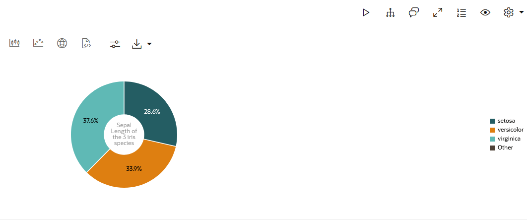
    • Close the dialog. The data is now rendered in a donut chart, as shown below:

      Figure 4-37 Donut chart - A variation of Pie Chart


      Donut chart - A variation of Pie Chart

  6. Once again, click on the Settings icon. Under Setup,
    • Series to Show: Select Petal Length while retaining Sepal Length.
  7. Click Customization:
    • Variant: Click Pie.
    • Dimension: Click 3D.
    • Sorting: Click Ascending.

    Figure 4-38 Pie Chart - Depicts the average sepal length and petal length for the three classes in two pie charts


    Pie Chart - Depicts the average sepal length and petal length for the three classes in two pie charts

    The data is now displayed in two 3 dimensional pie charts, one showing the average sepal length, and the other showing the average petal length for each of the three species of the iris flower.
This completes the task of visualizing your data in a piee chart.