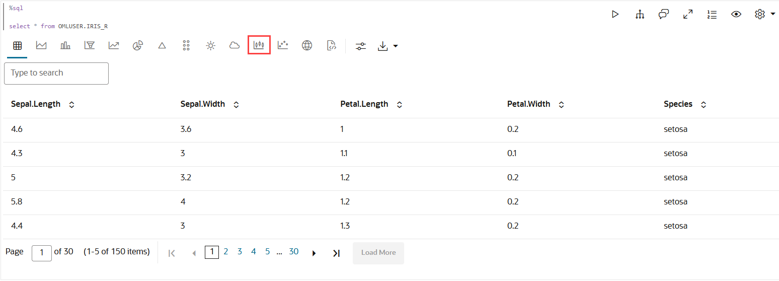
4.5.9 Visualize Data in a Box Plot
A box plot provides an overview of data distributions in numeric data. It provides general information about the symmetry, skewness, variance, and outliers in a dataset. The box plot uses boxes and lines to depict the data distribution.
The box plot has the following components:
- Central Box—Inter-quartile range and
quartiles:
- Q1 (First Quartile)—This is the value below which 25% of the data falls. It represents the boundary between the lowest 25% and highest 75% of values.
- Q3 (Third Quartile)—This represents the value below which 75% of the data falls, serving as a border between the lowest 75% and highest 25% of values.
- Interquartile Range (IQR)—The IQR is the range in which the central 50% of the values fall. IQR = Q3 - Q1
- Whiskers—The whiskers of the box plot extend from the central box to the minimum and maximum data values that are not considered outliers. They provide a graphical representation of the majority of the data's distribution.
- Outliers—Outliers are data points that deviate significantly from other data points, typically due to data variability or errors. An outlier is plotted as a dot beyond the ends of the whiskers of a box plot.
- Median—The median is the value that divides the dataset into two halves, with 50% of the values falling below it and 50% falling above it. In the box plot, a line or a mark inside the central frame represents the median.
When to use this chart: Use this chart
to show distributions of numeric data, especially if you want to compare
them between multiple groups.
Data set:
IRIS dataset. The IRIS dataset contains 3
classes (three different Iris species - Setosa, Versicolor, and Virginica)
along with 50 samples each, and four numeric properties about those classes:
Sepal Length, Sepal Width, Petal Length, and Petal Width.
To visualize data in a box plot:
This completes the task of visualizing your data in a box plot.
Parent topic: Visualize your Data in Oracle Machine Learning Notebooks


