4.5.3 Visualize Data in a Funnel Chart
A funnel chart is a graphical representation that resembles the shape of a funnel where each segment gets progressively narrower. The segments are arranged vertically and depict a hierarchy. Within the funnel chart, each segment corresponds to a step or stage in a sequential process.
When to use this chart: Use this chart to visualize
a linear sequential process, mostly in business and sales contexts. For example, you can use a
funnel chart to track the sales process, order fulfillment, website visitor trends, and so on.
Data set:
CUSTOMER_INSURANCE_LTV. In this example, we will use the example template
notebook OML-Run-me-first.
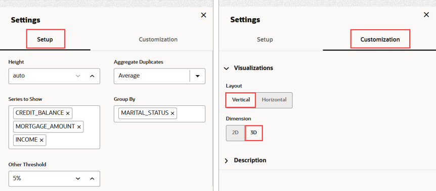
To visualize the data in a funnel chart:
This completes the task of visualizing your data in a funnel chart.
Parent topic: Visualize your Data in Oracle Machine Learning Notebooks


