4.5.2 Visualize Data in a Bar Chart

A bar chart is a graphical representation of data in rectangular bars. The length or height of the bars, depending on the horizontal or vertical orientation, depict the dataset distribution. One axis represents a category, while the other represents values or counts.

When to use this chart: Use bar charts to show a distribution of data points, and perform a comparison of metric values across different subgroups of your data.
Dataset: CUSTOMER_INSURANCE_LTV. In this example, we will use the example template notebook OML-Run-me-first.
To visualize data in a bar chart:
  1. In the OML-Run-Me-First notebook, go to the paragraph where you viewed the CUSTOMER_INSURANCE_LTV. Click on the bar chart icon.

    Figure 4-14 Tool bar showing the bar chart icon


    Tool bar showing the bar chart icon

  2. By default, it shows CREDIT_BALANCE along the Y-axis and the data is grouped by MARITAL_STATUS along the X-axis.

    Figure 4-15 Defaut Bar chart


    Defaut Bar chart

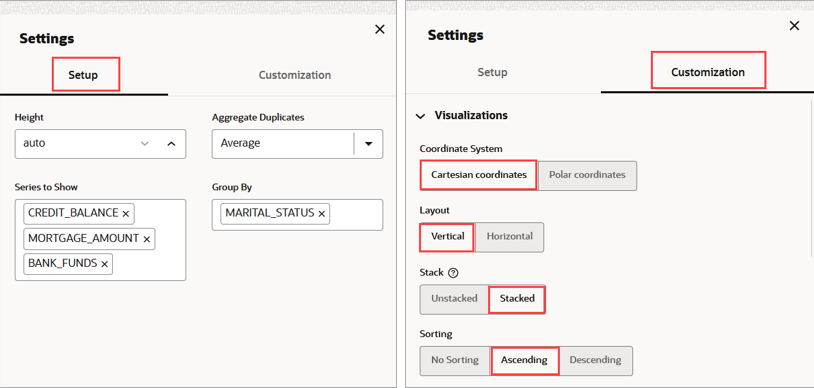
  3. Click on the Settings icon to get a different view of this data. Under Setup:
    • Series to Show: Select CREDIT_BALANCE, MORTGAGE_AMOUNT, and BANK_FUNDS.
    • In Group By: Select MARITAL_STATUS.
  4. The average of CREDIT_BALANCE, MORTGAGE_AMOUNT, and BANK_FUNDS are each represented by adjacent bar charts, and the bar charts are grouped by MARITAL_STATUS—single, married, divorced, widowed, and others. The bar chart now looks like this, as shown in the screenshot below:

    Figure 4-16 Bar chart


    Bar chart

  5. Once again, click on the Settings icon and click Customization:

    Figure 4-17 Bar Chart Settings and Customization


    Bar Chart Settings and Customization

    • Coordinate System—The coordinate system of the chart. Supported Values—Polar Coordinates, Cartesian Coordinates. Click Cartesian Coordinates.
    • Layout—The chart orientation. Either horizontal or vertical.
    • Stack—Defines whether the data items are stacked or not. Click Stacked.
    • Sorting—Specifies the sorting of the data. It should only be used for pie charts, bar/line/area charts with one series, or stacked bar/area charts. Sorting will not apply when using a hierarchical group axis. Click Ascending.
    • Zoom—Specifies the zoom and scroll behavior of the chart. Live behavior means that the chart will be updated continuously as it is being manipulated, while "delayed" means that the update will wait until the zoom/scroll action is done. While "live" zoom and scroll provides the best end user experience, no guarantees are made about the rendering performance or usability for large data sets or slow client environments. If performance is an issue, "delayed" zoom and scroll should be used instead.
    The bar chart now presents the data in a stacked manner, and in ascending order, as shown in the screenshot below:

    Figure 4-18 Stacked Bar Chart


    Stacked Bar Chart

This completes the task of visualizing your data in a bar chart, and customizing its output.