2 Working with Oracle Stream Analytics
 This topic applies only to Oracle user-managed services.
Home Page
The Home page is the first page that you see when you login to Oracle Stream Analytics. This page lists the industry verticals that Oracle Stream Analytics supports.
Each industry vertical has a tag associated with it and the tags are case-sensitive.
-
Distributed Intelligence for IOT - Acquire, analyze, and act on high-volume, high-velocity data from sensors and devices both at the edge and in the data center in real-time. Tag for this vertical is IOT.
-
Risk and Fraud Management - Leverage industry's best stream processing platform to assess risk and prevent financial fraud in real-time. Tag for this vertical is risk.
-
Transportation and Logistics - Manage fleet, track assets, and improve supply chain efficiencies by combining streaming data with Oracle's advanced spatial functions. Tag for this vertical is transportation.
-
Customer Experience and Consumer Analytics - Know the sentiment of your customers to reduce churn, improve loyalty, make offers, and attract customers in real-time. Tag for this vertical is customer.
-
Telecommunications - Pro actively monitor your networks, predict network failures, and prevent distributed denial of service type attacks. Tag for this vertical is telecom.
-
Retail — Understand and Apply instant Retail Shopping trends, instigate beneficial shelf life patterns and placements, be responsive to Customers cart utilization and interoperate with advanced Vending Machines. Tag for this vertical is retail.
The Home page is as shown below:
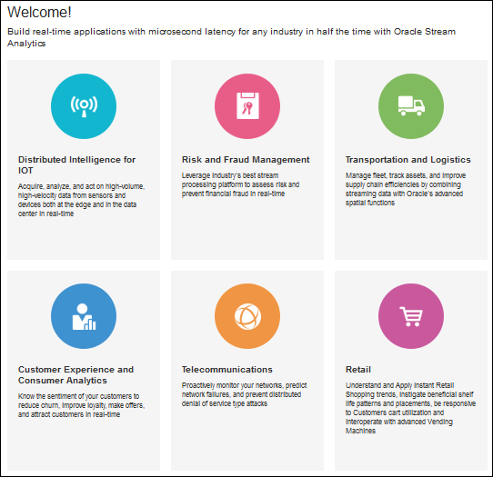
Description of the illustration home_page.png
You can navigate to the Catalog or the Patterns page from the home page to get started with Oracle Stream Analytics.
About the Catalog
The Catalog page is the location where resources including pipelines, streams, references, maps, connections, targets, dashboards, predictive models, custom jars, visualizations, and cubes are listed. This is the go-to place for you to perform any tasks in Oracle Stream Analytics.
You can mark a resource as a favorite in the Catalog by clicking on the Star icon. Click the icon again to remove it from your favorites. You can also delete a resource or view its topology using the menu icon to the right of the favorite icon.
The tags applied to items in the Catalog are also listed on the screen below the left navigation pane. You can click any of these tags to display only the items with that tag in the Catalog. The tag appears at the top of the screen. Click Clear All at the top of the screen to clear the Catalog and display all the items.
You can include or exclude pipelines, streams, references, predictive models, geo fences, connections, targets, custom jars, visualizations, dashboards, and cubes using the View All link in the left panel under Show Me. When you click View All, a check mark appears beside it and all the components are displayed in the Catalog.
When you want to display or view only a few or selective items in the Catalog, deselect View All and select the individual components. Only the selected components will appear in the Catalog.
Typical Workflow for Administering Oracle Stream Analytics
The typical workflow lists the artifacts required to create a pipeline in Oracle Stream Analytics.
The prerequisites for a pipeline are:
-
A connection is required to create a stream, except for a file stream.
-
A stream is required to create a pipeline.
Cache Configuration for Coherence
Oracle Stream Analytics requires a special coherence cache configuration and the proxy schema, so that it can connect to the coherence.
To enrich stream data with external coherence cluster reference data, you must access external coherence cluster using extend client APIs. To access external cluster as client, you need to configure cache-config with ExtendTcpCacheService and ExtendTcpInvocationService.
Configure the Coherence Cluster
Make sure that you have Coherence for Java is installed.
To configure the external cluster as client:
-
Create an XML file named
cache-config.xml. -
Copy the following XML to the file:
<?xml version="1.0"?> <cache-config xmlns:xsi="http://www.w3.org/2001/XMLSchema-instance" xmlns="http://xmlns.oracle.com/coherence/coherence-cache-config" xsi:schemaLocation="http://xmlns.oracle.com/coherence/coherence-cache-config coherence-cache-config.xsd"> <caching-scheme-mapping> <cache-mapping> <cache-name> externalcache* </cache-name> <schema-name> remote </schema-name> </cahce-mapping> </caching-scheme-mapping> <caching-schemes> <remote-cache-scheme> <scheme-name> remote </scheme-name> <service-name> ExtendTcpCacheService </service-name> <initiator-config> <tcp-initiator> <remote-addresses> <socket-address> <address>localhost </address> <port>9099</port> </socket-address> </remote-addresses> </tcp-initiator> <outgoing-message-handler> <request-timeout>5s</request-timeout> </outgoing-message-handler> </initiator-config> </remote-cache-scheme> <remote-invocation-scheme> <scheme-name>extend-invocation</scheme-name> <service-name>ExtendTcpInvocationService</service-name> <initiator-config> <tcp-initiator> <remote-addresses> <socket-address> <address>localhost</address> <port>9099</port> </socket-address> </remote-addresses> </tcp-initiator> <outgoing-message-handler> <request-timeout>5s</request-timeout> </outgoing-message-handler> </initiator-config> </remote-invocation-scheme> </caching-schemes> </cache-config> -
Save and close the file.
-
Test the connection to the cluster.
InvocationService service = (InvocationService) CacheFactory.getConfigurableCacheFactory().ensureService("ExtendTcpInvocationService");ensureService()will throw exception if there is no coherence cluster available with the given host and port. -
Create a coherence reference using a coherence connection.
-
Register the coherence as reference.
The following is the sample code to register the coherence as reference:
override def initialize():Unit = {
    repartition = true
    val externalEvent = EventType("externalorders",IntAttr("orderId"), VarCharAttr("orderDesc", 20))
    val sExtSrcProps = Map(EXT_URL -> "",EXT_ENTITY_NAME -> "externalcache")
    val jExtSrcProps = new java.util.HashMap[String,String](sExtSrcProps)
    val converter = ConverterFactory(ConverterType.COHERENCE,externalEvent)
    cc.registerEventType(externalEvent)
    cc.registerRelation(externalEvent).onExternal(jExtSrcProps,ExtSourceType.COHERENCE,converter)
 }

def main(args: Array[String]) {
    cql = "istream(select R.orderId as orderId, R.orderStatus as orderStatus, Ext.orderDesc as orderDesc from orders[now] as R, externalorders as Ext where R.orderId = Ext.orderId)"
    name = "CoherenceCorrelation"
    processOrders(args)
    }
}
// EXT_URL is not used for coherence as reference , currently used for webservice & database, so this will be set to EMPTY
//EXT_ENTITY_NAME is the cache name of the external coherence cluster
For the above example, coherence cache must have key as orderId <Integer> and value as Map of values for orderId and orderDesc. A sample cache similar to the following will populate:
NamedCache cache = CacheFactory.getCache("externalcache");
Map<String,Object> order1 = new HashMap<String, Object>();
order1.put("orderId", new Integer(1));
order1.put("orderDesc", "HP Deskjet v2");
Map<String,Object> order2 = new HashMap<String, Object>();
order2.put("orderId", new Integer(2));
order2.put("orderDesc", "Oracle Database 12");
MapString,Object> order3 = new HashMap<String, Object>();
order3.put("orderId", new Integer(3));
order3.put("orderDesc", "Apple iPhone6s");
Map<String,Object> order4 = new HashMap<String, Object>();
order4.put("orderId", new Integer(4));
order4.put("orderDesc", "Logitech Mouse");
cache.put(1,order1);
cache.put(2,order2);
cache.put(3,order3);
cache.put(4,order4);
Creating a Stream
A stream is a source of events with a given content (shape).
To create a stream:
-
Navigate to Catalog.
-
Select Stream in the Create New Item menu.
-
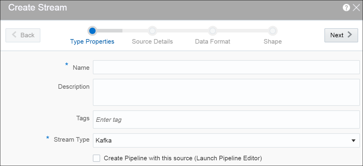
Provide details for the following fields on the Type Properties page and click Next:
-
Name — name of the stream
-
Description — description of the stream
-
Tags — tags you want to use for the stream
-
Stream Type — select suitable stream type. Supported types are File, GoldenGate, JMS, and Kafka.
-
-
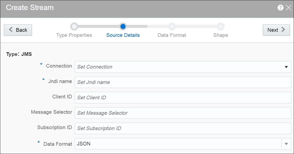
Provide details for the following fields on the Source Details page and click Next:
When the stream type is File:
-
File Path or URL — the location of the file that you want to upload
-
Read whole content — select this option if you want to read the whole content of the file
-
Number of events per batch — the number of events that you want to process per batch
-
Loop — select this option if you want to process the file in a loop
-
Data Format — the format of the data. The supported types are: CSV and JSON.
When the stream type is GoldenGate:
-
Connection — the connection for the stream
-
Topic name — the topic name that receives events you want to analyze
-
Data Format — the format of the data. The supported types are: CSV, JSON, AVRO. AVRO is a data serialization system.
When the stream type is JMS:
-
Connection — the connection for the stream
-
Jndi name — the Jndi that reads messages from topics, distributed topics, queues and distributed queues
-
Client ID — the client to be used for durable subscriber
-
Message Selector — the message selector to filter messages. If your messaging application needs to filter the messages it receives, you can use a JMS API message selector, which allows a message consumer to specify the messages it is interested in. Message selectors assign the work of filtering messages to the JMS provider rather than to the application.
A message selector is a
Stringthat contains an expression. The syntax of the expression is based on a subset of the SQL92 conditional expression syntax. The message selector in the following example selects any message that has aNewsTypeproperty that is set to the value'Sports'or'Opinion':NewsType = ’Sports’ OR NewsType = ’Opinion’The
createConsumerandcreateDurableSubscribermethods allow you to specify a message selector as an argument when you create a message consumer. -
Subscription ID — the subscription id for durable selector
-
Data Format — the format of the data. The supported types are: CSV, JSON, AVRO, MapMessage. MapMessage is supported only for JNDI based streams.
A MapMessage object is used to send a set of name-value pairs. The names are String objects, and the values are primitive data types in the Java programming language. The names must have a value that is not null, and not an empty string. The entries can be accessed sequentially or randomly by name. The order of the entries is undefined.
When the stream type is Kafka:
-
Connection — the connection for the stream
-
Topic name — the topic name that receives events you want to analyze
-
Data Format — the format of the data within the stream. The supported types are: CSV, JSON, AVRO.
-
-
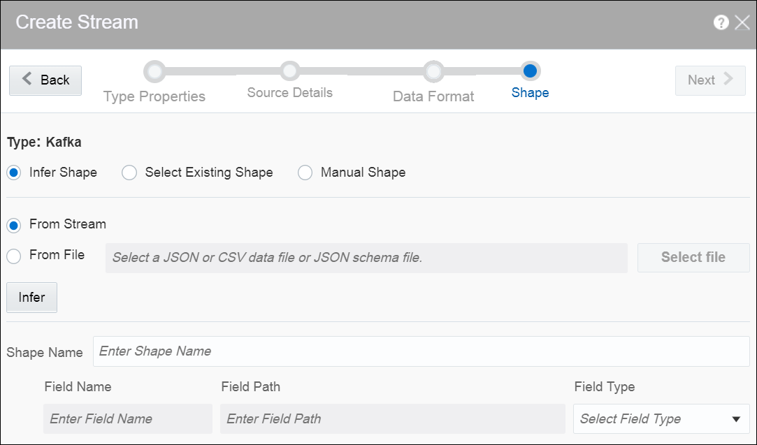
Select one of the mechanisms to define the shape on the Shape page:
-
Infer Shape — detects the shape automatically from the input data stream.
You can infer the shape from Kafka, JSON schema file, or CSV message/data file. You can also save the auto detected shape and use it later.
-
Select Existing Shape — lets you choose one of the existing shapes from the drop-down list.
-
Manual Shape — populates the existing fields and also allows you to add or remove columns from the shape. You can also update the datatype of the fields.
-
A stream is created with specified details.
CSV Data for Pre-defined Formats
When your data format is CSV, select a predefined format based on the variations of CSV data that differs due to the originating source of these CSV. The following table describes the CSV data for each of these predefined formats:
| CSV Predefined Format | Description |
|---|---|
|
|
Standard comma separated format, as for |
|
|
Excel file format (using a comma as the value delimiter). |
|
|
Default |
|
|
Default |
|
|
Default |
|
|
Default |
|
|
Comma separated format as defined by |
|
|
Tab-delimited format |
Capabilities of JMS Source
The capabilities of JMS Source are listed in the following table:
| Capability | Description | Comments |
|---|---|---|
|
Ability to connect to JMS Cluster |
JMS consumer should be able to connect to JMS cluster and handle JMS server fail-over |
|
|
Message Format support |
Map and TextMessage (JSON, CSV and AVRO) |
Does not support xml and object |
|
Message selector |
JMS message selector to use to filter messages. Only messages that match the selector will produce events. |
|
|
Re-connection |
Reconnect to JMS server or JMS cluster |
|
|
Read messages from queue/distributed queue |
|
|
|
Read messages from topic |
Read messages from JMS topic. By default the subscriber is non-durable |
|
|
Support for Durable subscriber |
A durable subscriber registers a durable subscription by specifying a unique identity that is retained by the JMS provider. If the consumer reconnects to JMS topic, it would read messages from where it last read. |
|
|
T3 Support |
Weblogic JMS Protocol |
|
JMS Server Clean Up
When you create a JMS stream and select the durable subscription option (by providing client ID and subscription ID value), Oracle Stream Analytics creates the durable subscription (if not already present) when the pipeline using this stream is running. When you come out of the pipeline or unpublish the pipeline(or kill the running pipeline), the durable subscription remains on the JMS Server. It is advisable to delete the durable subscription from the JMS Server and clean up the resources, if you do not intend to publish this pipeline anymore.
Creating a Reference
The reference defines a read-only source of reference data to enrich a stream. A stream containing a customer name could use a reference containing customer data to add the customer’s address to the stream by doing a lookup using the customer name.
A database reference is a reference to specified table in the database. With cache enabled for database reference, when the values gets pulled from database, they are maintained in coherence cache for reference from where they can be served on next request. A database reference requires a database connection.
A coherence reference can be any external cache defined in coherence cluster that can have data from an external system.
To create a reference:
-
Navigate to Catalog.
-
Select Reference in the Create New Item menu.
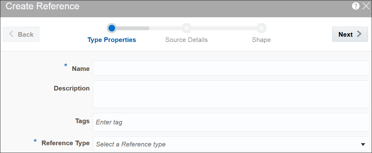
-
Provide details for the following fields on the Type Properties page and click Next:
-
Name — name of the reference
-
Description — description of the reference
-
Tags — tags you want to use for the reference
-
Reference Type — the reference type of the reference. The supported reference types are: Coherence and Database.
-
-
Provide details for the following fields on the Source Details page and click Next:
When the reference type is Coherence, enter or select appropriate values for:
-
Connection — the connection for the coherence reference
-
Cache name — the name of the cache to enable caching for better performance at the cost of higher memory usage of the Spark applications. Caching is supported only for single equality join condition. When you update the cache, the application will receive the updated data very quickly.
Coherence reference has data in key-value pairs. Key is object type and value is
Map<String,Object>.Map<String,Object>is map of attribute names and values, attributes list should match with external event type. In this release, only external schema for key and value s supported.When the reference type is Database Table, enter or select appropriate values for:
-
Connection — the connection for the database reference
-
Enable Caching — select this option if you want to enable caching
-
Expiry Delay — the amount of time from last update that entries will be kept by the cache before being marked as expired. Any attempt to read an expired entry will result in a reloading of the entry from the configured cache store. This field is enabled only when caching is enabled.
-
-
Provide details for the following fields on the Shape page and click Save:
When the reference type is Coherence:
-
Select Existing Shape — select a shape that you want to use for the reference
Remember:
Ensure that you do not use any of the CQL reserved words as the column names. If you use the reserved keywords, you cannot deploy the pipeline. -
Manual Shape — select this option if you want to define your own shape
Note:
When you load coherence data, ensure that you include precision and scale for number type. Only when these values are specified, the join works. For example,NamedCache cache = CacheFactory.getCache("externalcachetimestamp"); java.math.BigDecimal big10 = new java.math.BigDecimal("10",new MathContext(58)).setScale(56, RoundingMode.HALF_UP); Map<String,Object> order1 = new HashMap<String, Object>(); order1.put("strValue", "Test"); order1.put("intervalValue", "+000000002 03:04:11.330000000"); order1.put("orderTag", big10); cache.put(big10,order1);When the reference type is Database Table:
-
Shape Name — select a shape that you want to use for the reference
-
When the datatype of the table data is not supported, the table columns do not have auto generated datatype. Only the following datatypes are supported:
-
numeric -
interval day to second -
text -
timestamp(without timezone) -
date time(without timezone)Note:
Thedatecolumn cannot be mapped totimestamp. This is a limitation in the current release.
A reference is created with the specified details.
Limitations of Coherence as Reference
With coherence as reference, there are a few limitations:
-
You cannot test the connection
-
You need to specify the cache name manually
-
Only equal operator is allowed while establishing a correlation with coherence reference
-
You must use manual shape
Creating a Dashboard
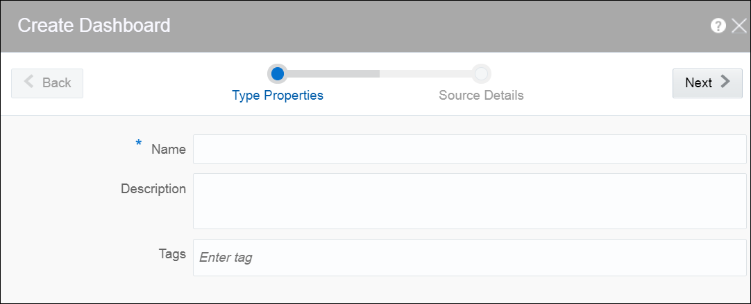
Dashboard is a visualization tool that helps you look at and analyze the data related to a pipeline based on various metrics like visualizations. A dashboard can have visualizations created out of cubes as well.
Dashboard is an analytics feature. You can create dashboards in Oracle Stream Analytics to have a quick view at the metrics.
To create a dashboard:After you have created the dashboard, it is just an empty dashboard. You need to start adding visualizations to the dashboard.
Editing a Dashboard
To edit a dashboard:
-
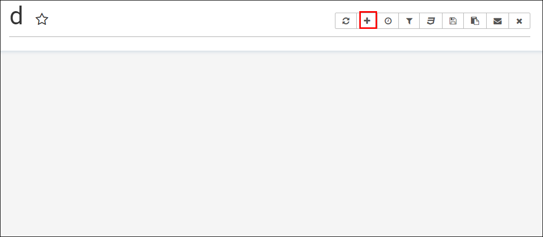
Click the required dashboard in the catalog.
The dashboard opens in the dashboard editor.
-
Click the Add a new visualization icon to see a list of existing visualizations. Visualizations from the pipelines and as well as from the cube explorations appear here. Go through the list, select one or more visualizations and add them to the dashboard.
-
Click the Specify refresh interval icon to select the refresh frequency for the dashboard. This is applicable only for cube based visualizations not applicable for streaming charts created out of pipeline.
This just a client side setting and is not persisted with the Superset Version
0.17.0. -
Click the Apply CSS to the dashboard icon to select a CSS. You can also edit the CSS in the live editor.
You can also see the active filter applied to the dashboard by clicking the Active dashboard filters icon. You can save the link to the dashboard or email the link to someone using the Copy the link to the clipboard and Email the link icons respectively.
-
Click the Save icon to save the changes you have made to the dashboard.
-
Hover over the added visualization, click the Explore chart icon to open the chart editor of the visualization.

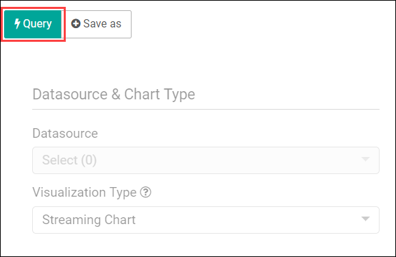
Description of the illustration explore_chart.pngYou can see the metadata of the visualization. You can also move the chart around the canvas, refresh it, or remove it from the dashboard.
A cube exploration looks like the following:
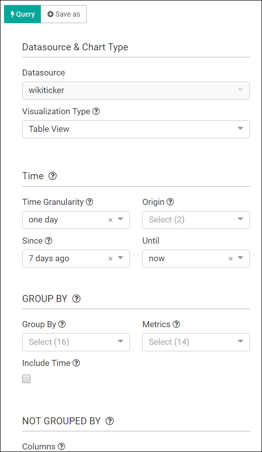
Description of the illustration cube_exploration.pngThe various options like time granularity, group by, table timestamp format, row limit, filters, and result filters add more granularity and details to the dashboard.
-
Click Save as to make the following changes to the dashboard:
-
Overwrite the visualization
-
Overwrite the current visualization with a different name
-
Add the visualization to an existing dashboard
-
Add the visualization to a new dashboard
-
Creating a Cube
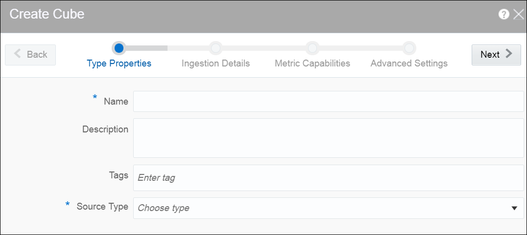
Cube is a data structure that helps in quickly analyzing the data related to a business problem on multiple dimensions.
To create a cube:
Creating a Target
The target defines a destination for output data coming from a pipeline.
To create a target:
-
Navigate to Catalog.
-
Select Target in the Create New Item menu.
-
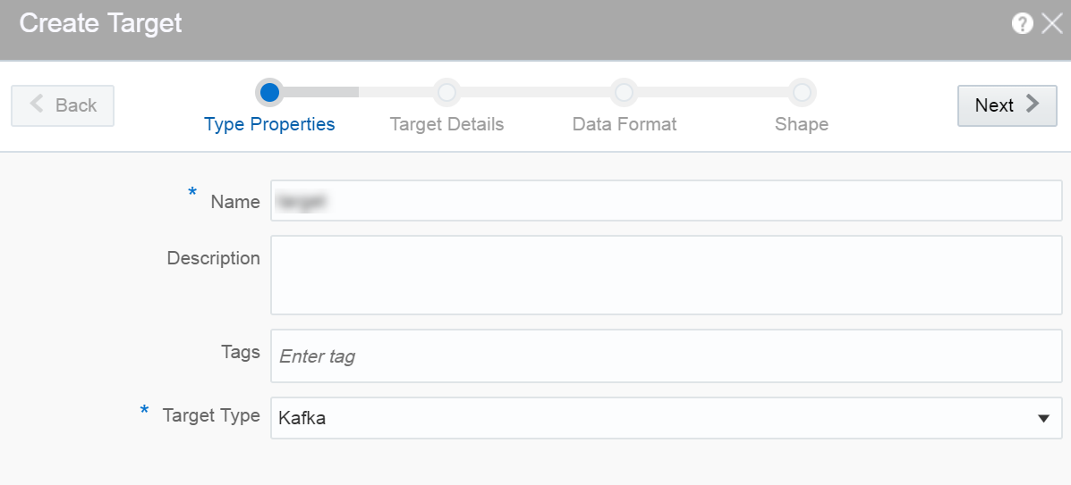
Provide details for the following fields on the Type Properties page and click Save and Next:
-
Name — name of the target
-
Description — description of the target
-
Tags — tags you want to use for the target
-
Target Type — the transport type of the target. Supported types are JMS, Kafka and Rest. The target is a sink for the output event. Each type of target is a different sink system and therefore different configuration parameters are required for different types.
-
-
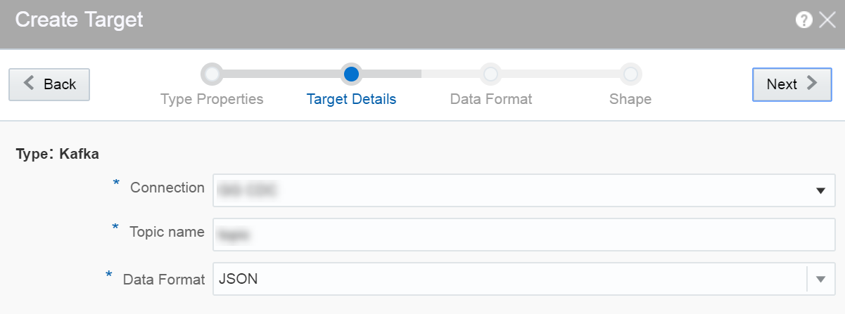
Provide details for the following fields on the Target Details page and click Next:
When the target type is JMS:
-
Connection — the connection for the target
-
Jndi name — the topic or queue name defined in Jndi to be used in the target
-
Data Format — select a suitable data format. This is a mandatory field. The supported data format types are: CSV and JSON.
When the target type is Kafka:
-
Connection — the connection for the target
-
Topic Name — the Kafka topic to be used in the target
-
Data Format — select a suitable data format. This is a mandatory field. The supported data format types are: CSV and JSON.
When the target type is REST:
-
URL — enter the REST service URL. This is a mandatory field.
-
Custom HTTP headers — set the custom headers for HTTP. This is an optional field.
-
Batch processing — select this option to send events in batches and not one by one. Enable this option for high throughput pipelines. This is an optional field.
-
Data Format — select a suitable data format. This is a mandatory field.
Click Test connection to check if the connection has been established successfully.
Testing REST targets is a heuristic process. It uses proxy settings. The testing process uses GET request to ping the given URL and returns success if the server returns
OK (status code 200). The return content is of the type ofapplication/json. -
-
Provide details for the following fields on the Data Format page and click Next:
When the data format type is CSV:
-
CSV Predefined Format — select a predefined CSV format. This supported formats are: Excel, InfomixUnload, InfomixUnloadCsv, MySQL, PostgreSQLCsv, PostgreSQLText.
-
Create the header row — select this option if you want to create a header row in the target.
When the data format type is JSON:
-
Create nested json object — select this option if you want a nested json object to be created for the target

Description of the illustration create_target_dataformat.png
-
-
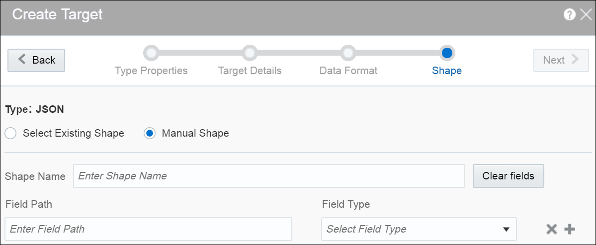
Select one of the mechanisms to define the shape on the Shape page and click Save:
-
Select Existing Shape lets you choose one of the existing shapes from the drop-down list.
-
Manual Shape populates the existing fields and also allows you to add or remove columns from the shape. You can also update the datatype of the fields.
-
A target is created with specified details.
Creating Target from Pipeline Editor
Alternatively, you can also create a target from the pipeline editor. When you click Create in the target stage, you are navigated to the Create Target dialog box. Provide all the required details and complete the target creation process. When you create a target from the pipeline editor, the shape gets pre-populated with the shape from the last stage.
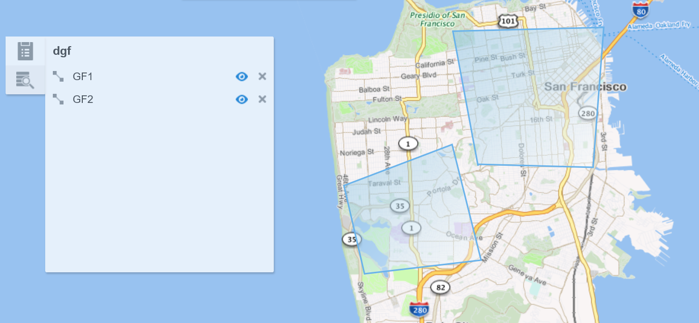
Creating a Geo Fence
Geo fences are further classified into two categories: manual geo fence and database-based geo fence.
Create a Manual Geo Fence
To create a manual geo fence:
-
Navigate to the Catalog page.
-
Click Create New Item and select Geo Fence from the drop-down list.
The Create Geo Fence dialog opens.
-
Enter a suitable name for the Geo Fence.
-
Select Manually Created Geo Fence as the Type.
-
Click Save.
The Geo Fence Editor opens. In this editor you can create the geo fence according to your requirement.
-
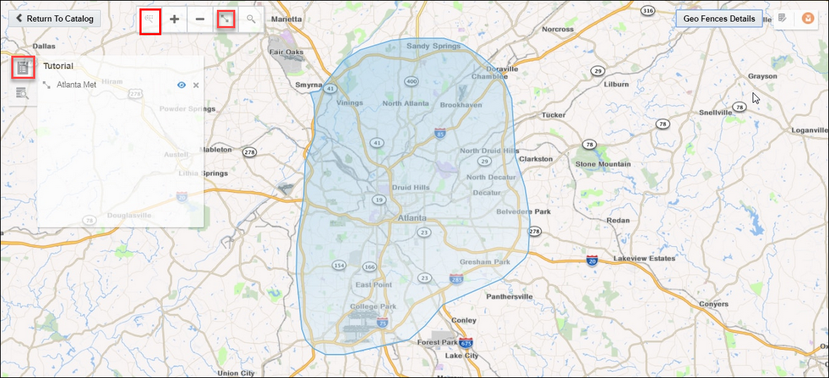
Within the Geo Fence Editor, Zoom In or Zoom Out to navigate to the required area using the zoom icons in the toolbar located on the top-left side of the screen.
You can also use the Marquee Zoom tool to zoom a specific area on the map. You can mark an area using the marquee zoom and that area in map is zoomed.
-
Click the Polygon Tool and mark the area around a region to create a geo fence.
-
Enter a name and description, and click Save to save your changes.
Update a Manual Geo Fence
To update a manual geo fence:
-
Navigate to the Catalog page.
-
Click the name of the geo fence you want to update.
The Geo Fence Editor opens. You can edit/update the geo fence here.
Search Within a Manual Geo Fence
You can search the geo fence based on the country and a region or address. The search field allows you search within the available list of countries. When you click the search results tile in the left center of the geo fence and select any result, you are automatically zoomed in to that specific area.
Delete a Manual Geo Fence
To delete a manual geo fence:
-
Navigate to Catalog page.
-
Click Actions, then select Delete Item to delete the selected geo fence.
Create a Database-based Geo Fence
To create a database-based geo fence:
-
Navigate to Catalog page.
-
Click Create New Item and then select Geo Fence from the drop-down list.
The Create Geo Fence dialog opens.
-
Enter a suitable name for the geo fence.
-
Select Geo Fence from Database as the Type.
-
Click Next and select Connection.
-
Click Next.
All tables that have the field type as
SDO_GEOMETRYappear in the drop-down list. -
Select the required table to define the shape.
-
Click Save.
Note:
You cannot edit/update database-based geo fences.Delete a Database-based Geo Fence
To delete a database-based geo fence:
-
Navigate to Catalog page.
-
Click Actions and then select Delete Item to delete the selected geo fence.
Display the Map Using Tile Layers
Tile layer is the base map that provides immediate geographic context. Tiles are stored in the map tile server. <ph ishcondition="Product_Family=Cloud" varref="streaming">Stream Analytics</ph><ph ishcondition="Product_Family=OnPremise" varref="osa">Oracle Stream Analytics</ph> supports two types of tile layers. Open Street Maps tile layer is a free map. And, Elocation tile layer is an Oracle tile layer. These tile layers contains huge amount of data pertaining to:
-
Roads, railways, waterways, etc.
-
Restaurants, shops, stations, ATMs, and more
-
Walking and cycling paths
-
Buildings, campuses, etc.
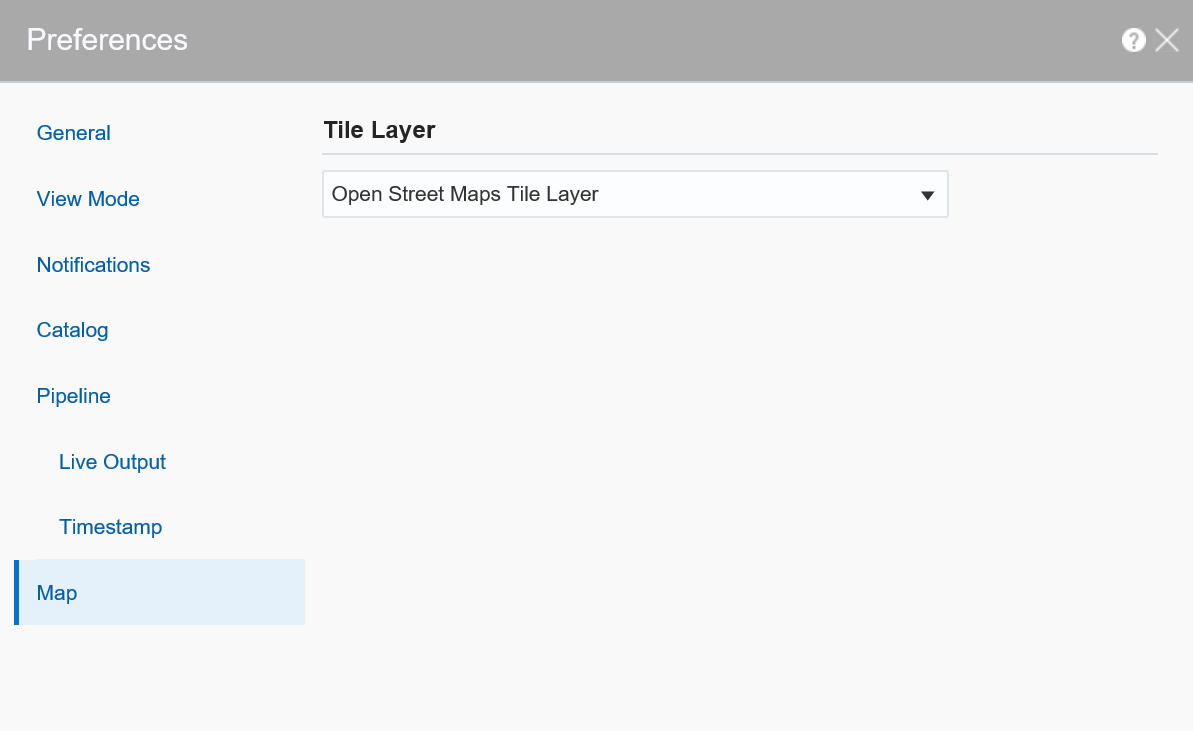
You can choose if you would like to see the map in Elocation tile layer or Open Street Maps tile layer. To set your preference:
-
Click the user name in the top right corner of the screen.
-
Click Preferences. The Preferences page opens.
-
Click Map.
-
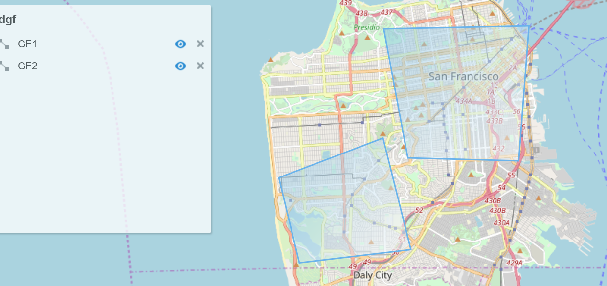
Under Tile Layer, choose Open Street Maps Tile Layer option from the drop-down list.
-
Click Save. The map looks like this:
-
To display the map in Elocation tile layer, follow steps 1 to 3.
-
From the Tile Layer drop-down list, choose Elocation Tile Layer.
-
Click Save. The map looks like this:
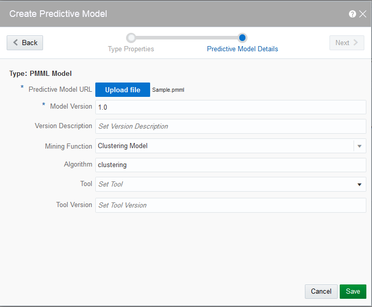
Creating a Predictive Model
Limited Support for Predictive Models
The menu commands for creating Predictive Models and Scoring Stages are marked Beta, for example, Predictive Model (Beta). The Beta label indicates that the functionality has been tested, but is not fully supported. The import and scoring of Predictive Models might contain undocumented limitations and you should use them as is.
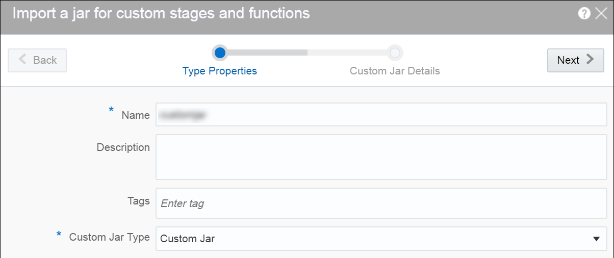
Creating a Custom Jar
A custom jar is a user-supplied Jar archive containing Java classes for custom stage types or custom functions that will be used within a pipeline.
Creating a Pipeline
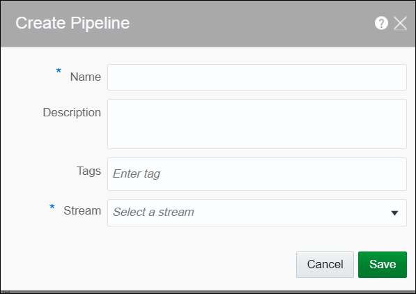
A pipeline is a Spark application where you implement your business logic. It can have multiple stages such as a query stage, a pattern stage, a business rule stage, a query group stage, a custom stage and many more.
To create a pipeline:
-
Navigate to Catalog.
-
Select Pipeline in the Create New Item menu.
-
Provide details for the following fields and click Save:
-
Name — name of the pipeline
-
Description — description of the pipeline
-
Tags — tags you want to use for the pipeline
-
Stream — the stream you want to use for the pipeline
-
A pipeline is created with specified details.
Configuring a Pipeline
You can configure the pipeline to use various stages like query, pattern, rules, query group, scoring, and custom stage from custom jars.
Pipeline Editor
The canvas on which you edit/update a pipeline and add different stages to the pipeline is called Pipeline Editor.
The pipelines in Oracle Stream Analytics can vary from being very simple to highly complex. Complex pipelines have various stages branching out from each/any stage of the pipeline. In other words, you can add any type of stage to any of the existing stage in the pipeline.
You can delete any stage that does not have any children without breaking the pipeline. You can expand/collapse a pipeline, switch the layout of the pipeline to vertical or horizontal, and zoom in or zoom out the pipeline. You can adjust the pipeline pane, editor pane, and the live output table pane using the resizing arrows.

Description of the illustration expand_collapse_pipeline.png
The pipeline editor allows you to see the relationship and dependencies between various stages of the pipeline.
Working with Live Output Table
The streaming data in the pipeline appears in a live output table.
Hide/Unhide Columns
In the live output table, right-click columns and click Hide to hide that column from the output. To unhide the hidden columns, click Columns and then click the eye icon to make the columns visible in the output.
Select/Unselect the Columns
Click the Columns link at the top of the output table to view all the columns available. Use the arrow icons to either select or unselect individual columns or all columns. Only columns you select appear in the output table.
Pause/Restart the Table
Click Pause/Resume to pause or resume the streaming data in the output table.
Perform Operations on Column Headers
Right-click on any column header to perform the following operations:
-
Hide — hides the column from the output table. Click the Columns link and unhide the hidden columns.
-
Remove from output — removes the column from the output table. Click the Columns link and select the columns to be included in the output table.
-
Rename — renames the column to the specified name.
-
Function — captures the column in Expression Builder using which you can perform various operations through the in-built functions.
Add a Timestamp
Include timestamp in the live output table by clicking the clock icon in the output table.
Reorder the Columns
Click and drag the column headers to right or left in the output table to reorder the columns.
Adding a Query Stage
You can include simple or complex queries on the data stream without any coding to obtain refined results in the output.
- Open a pipeline in the Pipeline Editor.
- Right-click the stage after which you want to add a query stage, click Add a Stage, and then select Query.
- Enter a Name and Description for the Query Stage.
- Click Save.
Adding and Correlating Sources and References
You can correlate sources and references in a pipeline.
Adding Filters
You can add filters in a pipeline to obtain more accurate streaming data.
Using the Expression Builder
You can perform calculations on the data streaming in the pipeline using in-built functions of the Expression Builder.
Oracle Stream Analytics supports various functions. For a list of supported functions, see Understanding Expression Builder Functions.
Note:
Currently, you can use expressions only within a query stage.Adding a Constant Value Column
A constant value is a simple string or number. No calculation is performed on a constant value. Enter a constant value directly in the expression builder to add it to the live output table.
Using Functions
You can select a CQL Function from the list of available functions and select the input parameters. Make sure to begin the expression with =”. Click Apply to apply the function to the streaming data.
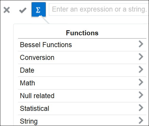
Description of the illustration list_of_functions.png
You can see custom functions in the list of available functions when you add/import a custom jar in your pipeline.
Adding Visualizations
Visualizations are graphical representation of the streaming data in a pipeline. You can add visualizations on all stages in the pipeline except a target stage.
Creating Visualization - Area Visualization
Area visualization represents data as a filled-in area. Area visualization requires at least two groups of data along an axis. The X-axis is a single consecutive dimension, such as a date-time field, and the data lines are unlikely to cross. Y axis represents the metrics (measured value). X axis can also have non date-time categories. This visualization is mainly suitable for presenting accumulative value changes over time.
Creating Visualization - Bar Visualization
Bar visualization is one of the widely used visualization types which represents data as a series of vertical bars. It is best suited for comparison of the values represented along y axis where different categories are spread across x axis. In a Bar visualization vertical columns represent metrics (measured values). The horizontal axis displays multiple or non-consecutive categories.
Creating Visualization - Bubble Visualization
A bubble chart is a good option when you want to add an additional dimension to a scatter plot chart. Scatter charts compare two values, but you can add bubble size as the third variable in a bubble chart and thus enable comparison. A good example to use bubble chart is to show marketing expenditures vs revenue vs profit.
Creating Visualization - Geo Spatial Visualization
Geo Spatial visualization allows displaying location of an object on a geo fence and takes user to the area where events are occurring. User can configure visualization to specify latitude, longitude, identifier etc. Customization of visualization by specifying different pins like arrows with different colors based on certain condition is also allowed.
Creating Visualization - Line Visualization
Line visualization represents data as a line, as a series of data points, or as data points that are connected by a line. Line visualization require data for at least two points for each member in a group. The X-axis is a single consecutive dimension, such as a date-time field, and the data lines are likely to cross. X axis can also have non date-time categories. Y axis represents the metrics (measured value). It is preferred to use line visualization when data set is continuous in nature. It is best suited for trend-based plotting of data over a period of time.
Creating Visualization - Pie Visualization
A pie chart is a circular graph that represents statistical data in slices. The size of each slice is proportional to the quantity of the value it represents.
Creating Visualization - Scatter Visualization
Scatter charts are primarily used for correlation and distribution analysis. This type of chart is good for showing the relationship between two different variables where one correlates to another.
Creating Visualization - Stacked Bar Visualization
A stacked visualization displays sets of values stacked in a single segmented column instead of side-by-side in separate columns. It is used to show a composition. Bars for each set of data are appended to previous sets of data. The size of the stack represents a cumulative data total.
Creating Visualization - Thematic Map
A thematic map is used to represent a particular theme in data connected to a geographical area. This type of map depicts the political, cultural, agricultural, sociological, and many other aspects of the geographic region, be it a city, state, country, ore region.
Updating Visualizations
You can perform update operations like edit and delete on the visualizations after you add them.
You can open the visualization in a new window/tab using the Maximize Visualizations icon in the visualization canvas.
Edit Visualization
To edit a visualization:
-
On the stage that has visualizations, click the Visualizations tab.
-
Identify the visualization that you want to edit and click the pencil icon next to the visualization name.
-
In the Edit Visualization dialog box that appears, make the changes you want. You can even change the Y Axis and X Axis selections. When you change the Y Axis and X Axis values, you will notice a difference in the visualization as the basis on which the graph is plotted has changed.
Change Orientation
Based on the data that you have in the visualization or your requirement, you can change the orientation of the visualization. You can toggle between horizontal and vertical orientations by clicking the Flip Chart Layout icon in the visualization canvas.
Delete Visualization
You can delete the visualization if you no longer need it in the pipeline. In the visualization canvas, click the Delete icon available beside the visualization name to delete the visualization from the pipeline. Be careful while you delete the visualization, as it is deleted with immediate effect and there is no way to restore it once deleted.
Delete All Visualizations
You can delete all the visualizations in the stage if you no longer need them. In the visualization canvas, click the Delete All icon to delete all the visualizations of the stage at one go. Be careful while you delete the visualizations, as the effect is immediate and there is no way to restore the deleted visualizations.
Adding a Pattern Stage
Patterns are templatized stages. You supply a few parameters for the template and a stage is generated based on the template.
For detailed information about the various type of patterns, see Patterns.
To add a pattern stage:Adding a Rule Stage
Using a rule stage, you can add the IF-THEN logic to your pipeline. A rule is a set of conditions and actions applied to a stream.
- Open a pipeline in the Pipeline Editor.
- Right-click the stage after which you want to add a rule stage, click Add a Stage, and then select Rule.
- Enter a Name and Description for the rule stage.
- Click Add a Rule.
- Enter Rule Name and Description for the rule and click Done to save the rule.
- Select a suitable condition in the IF statement, THEN statement, and click Add Action to add actions within the business rules.
Adding a Query Group Stage
A query group stage allows you to use more than one query group to process your data - a stream or a table in memory. A query group is a combination of summaries (aggregation functions), group-bys, filters and a range window. Different query groups process your input in parallel and the results are combined in the query group stage output. You can also define input filters that process the incoming stream before the query group logic is applied, and result filters that are applied on the combined output of all query groups together.
A query group stage of the stream type applies processing logic to a stream. It is in essence similar to several parallel query stages grouped together for the sake of simplicity.
A query group stage of the table type can be added to a stream containing transactional semantic, such as a change data capture stream produced, to give just one example, by the Oracle GoldenGate BigData plugin. The stage of this type will recreate the original database table in memory using the transactional semantics contained in the stream. You can then apply query groups to this table in memory to run real-time analytics on your transactional data without affecting the performance of your database.
Adding a Scoring Stage
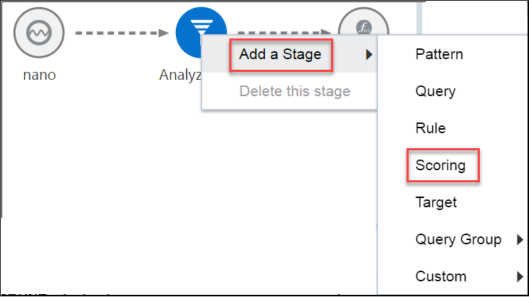
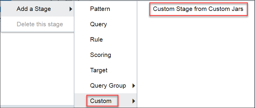
Adding a Custom Stage
You can add filters in a pipeline to obtain more accurate streaming data.
Adding a Target Stage
- Open the required pipeline in Pipeline Editor.
- Right-click the stage after which you want to add a scoring stage, click Add a Stage, and then select Target.
- Enter a meaningful name and suitable description for the scoring stage and click Save.
- In the stage editor, select a target that suits your requirement and start mapping the fields.
- If the existing target does not suit your requirement of if there is no existing target, click Create Target to create a target.
Configuring a Target
Target defines a destination for output data coming from a pipeline.
- Open a pipeline in the Pipeline Editor.
- Select the target node in the pipeline.
- Select a target for the pipeline from the drop-down list.
- Map each of the Target Property and Output Stream Property.
You can also directly create the target from within the pipeline editor. See Creating a Target for the procedure. You can also edit an existing target.
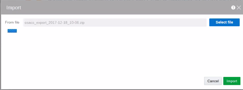
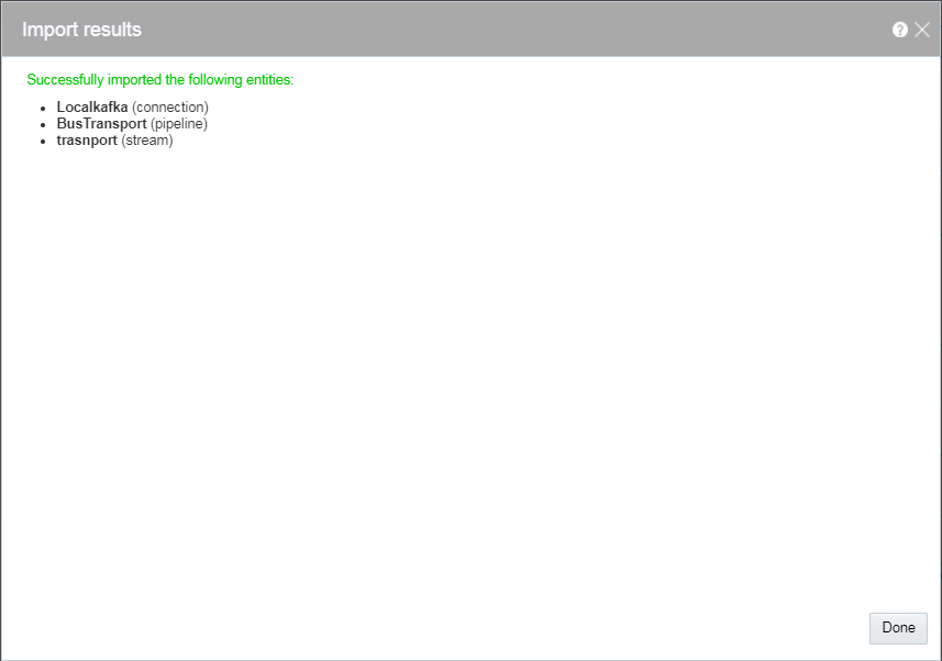
The pipeline is configured with the specified target.Exporting and Importing a Pipeline and Its Dependent Artifacts
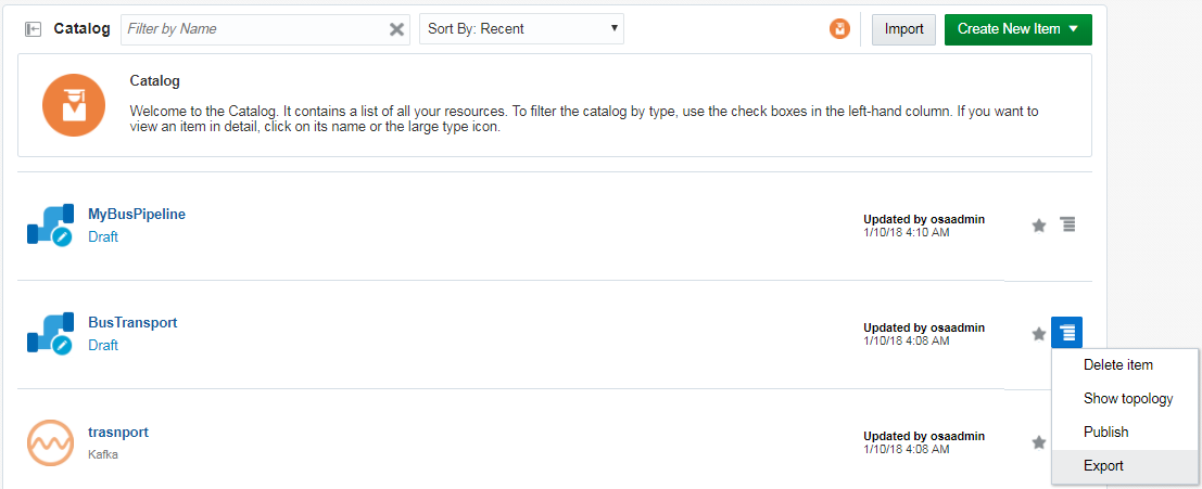
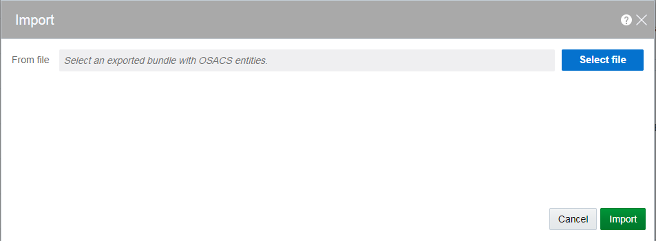
The export and import feature lets you migrate your pipeline and its contents between Oracle Stream Analytics systems (such as development and production) in a matter of few clicks. You also have the option to migrate only select artifacts. You can import a pipeline developed with the latest version of Oracle Stream Analytics. On re-import, the existing metadata is overwritten with the newly imported metadata if the pipeline is not published. You can delete the imported artifacts by right-clicking them and selecting Delete.
-
Cubes
-
Dashboards
-
Custom Stages
-
Visualizations
-
File Streams
-
Predictive Models
Publishing a Pipeline
You must publish a pipeline to make the pipeline available for all the users of Oracle Stream Analytics and send data to targets.
A published pipeline will continue to run on your Spark cluster after you exit the Pipeline Editor, unlike the draft pipelines which are undeployed to release resources.
To publish a pipeline:
Using the Topology Viewer
Topology is a graphical representation and illustration of the connected entities and the dependencies between the artifacts.
The topology viewer helps you in identifying the dependencies that a selected entity has on other entities. Understanding the dependencies helps you in being cautious while deleting or undeploying an entity. Oracle Stream Analytics supports two contexts for the topology — Immediate Family and Extended Family.
You can launch the Topology viewer in any of the following ways:
-
Select Show topology from the Catalog Actions menu to launch the Topology Viewer for the selected entity.

Description of the illustration show_topology_catalog_actions_menu.png -
Click the Show Topology icon in the Pipeline Editor.

Description of the illustration show_topology_exploration_editor.png
Click the Show Topology icon at the top-right corner of the editor to open the topology viewer.By default, the topology of the entity from which you launch the Topology Viewer is displayed. The context of this topology is Immediate Family, which indicates that only the immediate dependencies and connections between the entity and other entities are shown. You can switch the context of the topology to display the full topology of the entity from which you have launched the Topology Viewer. The topology in an Extended Family context displays all the dependencies and connections in the topology in a hierarchical manner.
Note:
The entity for which the topology is shown has a grey box surrounding it in the Topology Viewer.Immediate Family
Immediate Family context displays the dependencies between the selected entity and its child or parent.
The following figure illustrates how a topology looks in the Immediate Family.
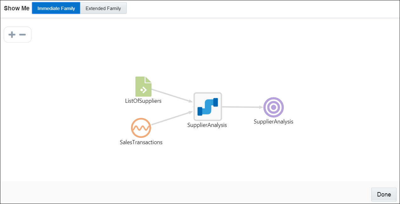
Description of the illustration topology_viewer_immediate.png
Extended Family
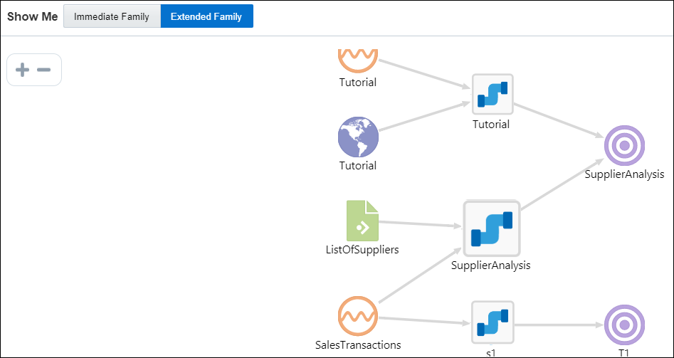
Extended Family context displays the dependencies between the entities in a full context, that is if an entity has a child entity and a parent entity, and the parent entity has other dependencies, all the dependencies are shown in the Full context.
The following figure illustrates how a topology looks in the Extended Family.
