27 Using Pivot Table Components
pivotTable and pivotFilterBar components to display data in pivot tables using simple UI-first development. The chapter defines the data requirements, tag structure, and options for customizing the look and behavior of the components.If your application uses the Fusion technology stack, then you can also use data controls to create pivot tables. JDeveloper provides a wizard for data binding and configuring your pivot table. For more information, see the "Creating Databound Pivot Table and Pivot Filter Bar Components" chapter of Developing Fusion Web Applications with Oracle Application Development Framework.
This chapter includes the following sections:
About the Pivot Table Component
ADF DVT Pivot tables display data in a grid layout with unlimited layers of hierarchically nested row header cells and column header cells. Similar to spreadsheets, pivot tables provide the option of automatically generating subtotals and totals for grid data.
A pivot table allows users to pivot or reposition row or column header data labels and the associated data layer from one location on the row or column edge to another to obtain different views of data, supporting interactive analysis.
A pivot filter bar is a component that can be added to a pivot table to provide the user with a way to filter pivot table data in layers not displayed in one of the row or column edges of the pivot table. Users can also drag and drop these layers between the pivot filter bar and the associated pivot table to change the view of the data. A pivot filter bar can also be used to change the graphical display of data in a graph.
Pivot Table and Pivot Filter Bar Component Use Cases and Examples
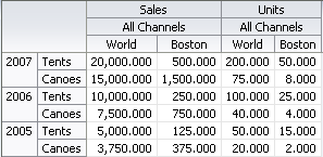
A pivot table displays a grid of data with rows and columns. Figure 27-1 shows a pivot table with multiple attributes nested on its rows and columns.
Figure 27-1 Sales Pivot Table with Multiple Rows and Columns
Description of "Figure 27-1 Sales Pivot Table with Multiple Rows and Columns"
Pivot table data cells support other data display components such as sparkcharts, gauges, and graphs. Figure 27-2 shows a pivot table with sparkcharts illustrating data trends over time in a data cell.
Figure 27-2 Pivot Table with Sparkcharts Stamped in Data Cells

Description of "Figure 27-2 Pivot Table with Sparkcharts Stamped in Data Cells"
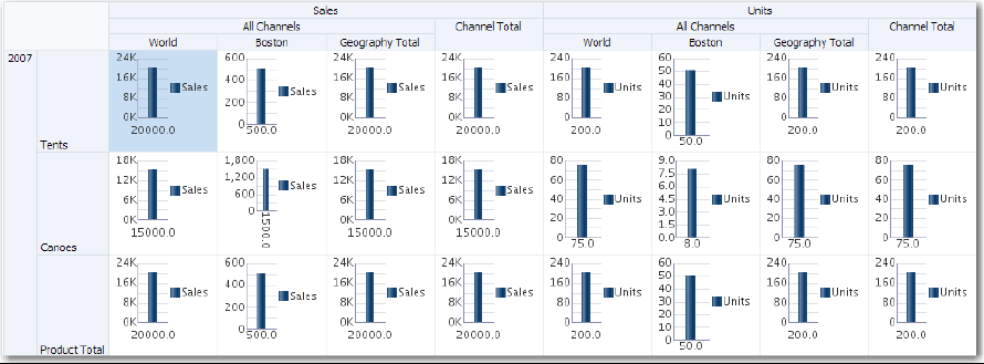
Figure 27-3 shows a pivot table with graphs stamped in data cells.
Figure 27-3 Pivot Table with Graphs Stamped in Data Cells
Description of "Figure 27-3 Pivot Table with Graphs Stamped in Data Cells"
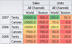
Header and data cells in pivot tables can be customized to display image, icons or links, and to display stoplight and conditional formatting. Figure 27-4 shows a pivot table with conditional formatting to display levels of sales performance.
Figure 27-4 Conditional Data Cell Formatting
Description of "Figure 27-4 Conditional Data Cell Formatting"
A pivot filter bar is a component that can be associated with a pivot table to provide the user with a way to filter pivot table data in layers not displayed in the row or column edges of the pivot table. Users can also drag and drop these layers between the pivot filter bar and the associated pivot table to change the view of the data. Figure 27-5 shows a pivot filter bar associated with a pivot table.
Figure 27-5 Pivot Filter Bar Component Associated with Pivot Table

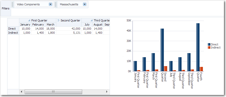
A pivot filter bar can also be used to change the display of data in a graph associated with the pivot table. Figure 27-6 shows a filtered view of quarterly sales data displayed simultaneously in a pivot table and on a bar graph.
Figure 27-6 Pivot Filter Bar Associated with Pivot Table and Graph
End User and Presentation Features of Pivot Table Components
The ADF Data Visualization pivot table component provides a range of features for end users, such as pivoting, sorting columns, and selection of one or more rows, columns, or cells, and then executing an application defined action on the selection. It also provides a range of presentation features, such as unlimited layers of hierarchically nested row header and column header cells.
Pivot Filter Bar
The data filtering capacity in a pivot table can be enhanced with an optional pivot filter bar. Zero or more layers of data not already displayed in the pivot table row edge or column edge are displayed in the page edge.
Figure 27-7 shows a pivot filter bar with Quarter and Month layers that can be used to filter the data displayed in the pivot table.
Figure 27-7 Pivot Filter Bar with Data Layer Filters

Description of "Figure 27-7 Pivot Filter Bar with Data Layer Filters"
Pivoting
You can drag any layer in a pivot table to a different location on the same edge, to the opposite edge, or to the associated pivot filter bar (if present), to change the view of the data in the pivot table. Any layer in a pivot filter bar can be dragged to a different location within the pivot filter bar, or to the row or column edge of the pivot table. This operation is called pivoting and is enabled by default.
When you move the mouse over a layer, the layer's pivot handle and an optional pivot label are displayed. If you move the mouse over the pivot handle, the cursor changes to a four-point arrow drag cursor. You can then use the handle to drag the layer to the new location. If you move the mouse over a layer on the row edge, the pivot handle appears above the layer, as shown in Figure 27-8.
Figure 27-8 Display of Pivot Handle on the Row Edge
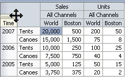
If you move the cursor over a layer in the column edge, the pivot handle appears to the left of the layer, as shown in Figure 27-9.
Figure 27-9 Display of Pivot Handle on the Column Edge
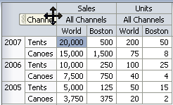
If, in Figure 27-8, you drag the pivot handle of the Time (Year) layer from the row edge to the column edge between the Measure (Sales) layer and the Channel layer, the pivot table will change shape as shown in Figure 27-10.
Figure 27-10 Sales Pivot Table After Pivot of Year

You can customize pivoting to disable pivot labels and pivoting. If both are disabled, the pivot handle does not display when mousing over the layer.
Editing Data Cells
Pivot tables can contain both read-only and editable data cells. Editable cells are those containing an input component, for example, af:inputText or af:comboBox.
When a pivot table containing editable cells is initially displayed, the first data cell is selected and the pivot table is open for editing. Users can initiate editing anywhere in the pivot table by clicking in a cell to edit or overwrite the cell value. Clicking in editable cells enables the user to identify a specific location within the cell, and then navigate within that cell using the arrow keys. Any edit performed on an editable cell can be reverted by pressing Esc.
Note:
Pressing Esc will not revert a value selected in a list of values component, for example af:inputComboboxListOfValues, since the value is submitted immediately when the dropdown is closed.
Figure 27-11 shows a pivot table data cell open for direct editing.
Figure 27-11 Data Cell Open for Direct Editing

Data cells selected for dropdown list editing are displayed as shown in Figure 27-12.
Figure 27-12 Data Cell Open for Dropdown List Editing

While in editing mode, you can navigate through pivot table data cells using Tab or Enter. To quickly navigate to the cell below or above the currently selected cell, use Ctrl+arrow keys. When using the Enter key to navigate, an active link will automatically be launched for a cell containing an active link. When using Tab or Shift+Tab to navigate, data cells containing multiple editable components, as in the case of both an af:inputDate and date picker in the same cell, the Tab highlights each editable component in turn. When tabbing through the last column of the pivot table, the first column of the next row is highlighted, and when Shift-Tabbing through the first column in the pivot table, the last column of the previous row is highlighted.
Once editing mode is initiated, users can navigate through read-only data cells to editable data cells, maintaining the editing mode. While an editable cell is selected, you can select other cells using Ctrl or Shift+click without enabling editing in the new cells and maintaining editing in the original cell.
Note:
-
You can customize the submission of the modified data cell values. The
ValueSubmitPolicyattribute has two possible values,ImmediateandLazy. WithImmediate, the value is instantly submitted when the user navigates to another cell. WithLazy, the value is not submitted until the user navigates to another cell that requires a fetch, or the user performs an action that sends a request to the server to submit the updated values. -
In order to temporarily or permanently write values back to a set of cells within a cube, called a writeback, the pivot table must be bound to a data control or data model that supports writeback operations. A pivot table row set based data control is transformed into a cube that supports writeback operations.
Data and Header Sorting
Pivot tables support sorting of data within the pivot table. When sorting is enabled, ascending and descending sort icons are displayed as the user hovers the mouse over the innermost layer of the column header.
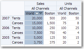
By default, the sortMode attribute of the pivotTable component is set to grouped, effectively sorting the data grouped by the second-to-innermost layer of the row edge. Figure 27-13 shows the data in the World Sales column sorted descending, where the products within each year are grouped and thereby also sorted descending.
Figure 27-13 Ascending and Descending Sorting Icons in a Pivot Table
You can also sort data display by column and row headers using context menu options. Setting the sort order on the column or row headers configures all the columns and rows in that layer to be similarly sorted. Figure 27-14 shows a pivot table with the US City column headers sorted Left to Right with a context menu option to change the sort order to Right to Left.
Figure 27-14 Pivot Table Column Header Sorting
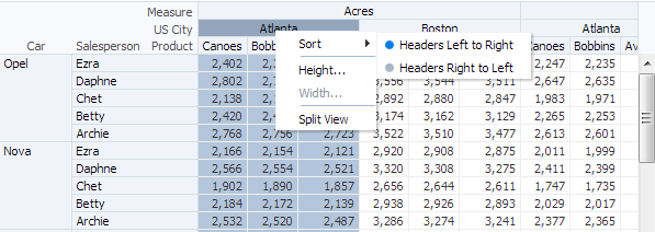
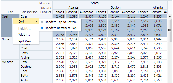
Figure 27-15 shows a pivot table with the Car row sorted with headers from Bottom to Top with a context menu option or change the sort to Top to Bottom.
Figure 27-15 Pivot Table Row Header Sorting
Drilling
Pivot tables support two types of drilling including insert drilling, and filter drilling. With insert drilling, the expand operation reveals the detail data while preserving the sibling and aggregate data. With filter drilling, the expand operation displays the detail data only, filtering out sibling and aggregate data.
For example, Figure 27-16 and Figure 27-17 illustrate how drilling is used to display product data within each year; revealing that the 2007 total sales number of 52,500 is composed of 25,500 for tents and 27,000 for canoes. This total contributes to the aggregated total of all sales for all years of 128,172. Figure 27-16 shows a pivot table using insert drilling with the total number of 52,500 displayed alongside the detail numbers. The data for other years and the aggregated total for all years is also available.
Figure 27-16 Pivot Table with Insert Drilling Enabled
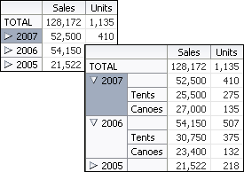
Figure 27-17 shows a pivot table using filter drilling with only the detail numbers are displayed. The numbers for other years, and the aggregated total for all years is filtered out.
Figure 27-17 Pivot Table with Filter Drilling Enabled

At runtime, a drill icon is enabled in the parent attribute display label for both types of drilling.
If you do not perform a pivot operation, then the drill operation will remain for the life of the session. However, in the case of pivoting a drilled child attribute away from a parent attribute, you can configure the desired behavior using Oracle MDS (Metadata Services) customization. For information about creating customizable applications using MDS, see the "Customizing Applications with MDS" chapter of Developing Fusion Web Applications with Oracle Application Development Framework.
Scrolling and Page Controls
Pivot tables support both on-demand data scrolling and fixed page controls in order to support large data sets while maintaining performance.
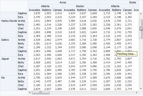
While scrolling, only the data that is scrolled into view in the pivot table is loaded. As the user scrolls vertically or horizontally, data is fetched for the portion of the pivot table that has scrolled into view, and data that is no longer needed is discarded. Figure 27-18 shows a pivot table with a large data set using on-demand data scrolling.
Figure 27-18 On-Demand Data Scrolling in a Pivot Table
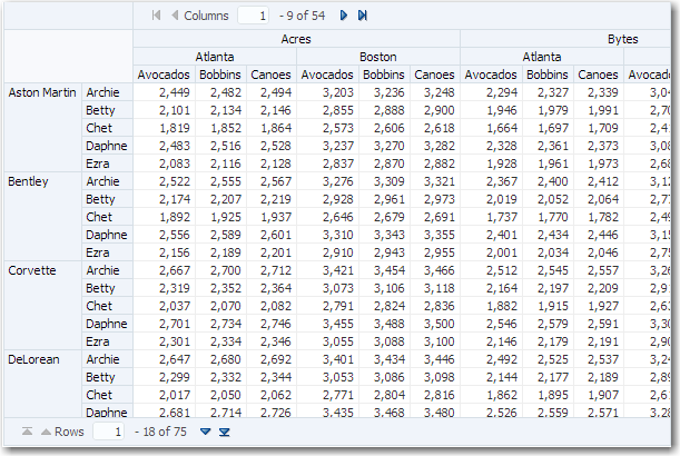
Instead of scrollbars, you can configure a page control to navigate large data sets in pivot tables for desktop applications and for mobile browsers on touch devices. For example, the page control for columns display at the top of the pivot table and the page control for rows displays at the foot of the pivot table as shown in Figure 27-19.
Figure 27-19 Pivot Table Column and Row Page Controls
By default, on desktop devices, tables render a scroll bar that allows the user to scroll through all rows. On tablet devices, instead of a scroll bar, the table is paginated and displays a footer that allows the user to jump to specific pages of rows. You can change the default (auto) value by setting the ScrollPolicy attribute to either scroll or page based on the type of device.
You can customize the initial display of the pivot table by specifying the starting visible row or column data cell or header layer. Use startRow and startColumn attributes to specify the first visible row and column of data. Use rowHeaderStartLayer and columnHeaderStartLayer attributes to specify the first visible row or header layer. Upon initial display of the pivot table, the scrollbar or page control will automatically be positioned for these attribute settings.
Persistent Header Layers
You can configure pivot tables to always display the labels that appear above each row header layer and beside each column header layer.
This is useful when displaying large data sets to keep the column and row header labels in view with the data. To configure persistent display of the row and column header labels for the pivotTable component, set the layerLabelMode attribute to rendered.
Split View of Large Data Sets
Pivot tables displaying large data sets can be configured to support a user defined split view of the data. In a split view the pivot table is split into multiple panes vertically and/or horizontally, facilitating a side-by-side viewing of rows or columns not located next to each in the table.
When enabled, a listener is notified after a split is successfully added or removed from the pivot table. For example, you might want to keep the aggregate level year information viewable while scrolling through the weeks at the end of the year at the same time.
By default, the option to split or unsplit a view of the data is available from any pivot table header or data cell context menu. Users can split columns, rows, or rows and columns to define the viewable panes of the pivot table. The portion of the available space allocated to each pane is determined by the scroll position of the cell on which the Split View command is invoked.
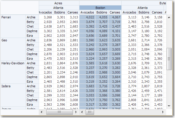
To split only columns, select the column header cell for the column that should be the first column of the second pane, and in the context menu select Split View. Figure 27-20 shows a columns only split view pivot table data.
Figure 27-20 Column Only Split View of Pivot Table Data
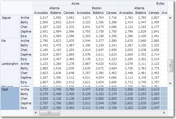
To split only rows, select the row header cell for the row that should be the first row of the second pane, and in the context menu select Split View. Figure 27-21 shows a row only split view of pivot table data.
Figure 27-21 Row Only Split View of Pivot Table Data
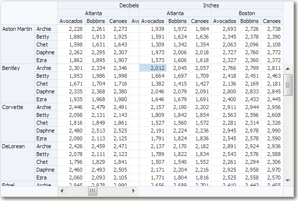
To split both rows and columns, select the data cell that should be the first cell of the last pane, and in the context menu select Split View. Figure 27-22 shows a row and column split view of pivot table data.
Figure 27-22 Row and Column Split View of Pivot Table Data
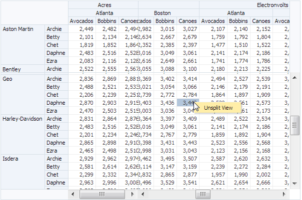
To return the pivot table from a split view to its original configuration, select any cell, and in the context menu select Unsplit View as illustrated in Figure 27-23.
Figure 27-23 Pivot Table Unsplit View Command
Sizing
The pivot table autosizes rows, columns, and layers within the space allowed when the pivot table is initially displayed. These rows, columns, and layers can be manually resized.
The default size of a pivot table is a width of 300 pixels and a height of 300 pixels. At runtime, you can change the size of rows, columns, or layers by dragging the row, column, or layer separator to a new location. Position the cursor in the row or column header on the separator between the row, column, or layer you want to resize and the next row, column, or layer. When the cursor changes to a double-sided arrow, click and drag the row, column, or layer dotted line separator to the desired location. Figure 27-24 shows the double-sided arrow and dotted line resize indicators.
Figure 27-24 Pivot Table Resize Indicators

When you resize rows, columns, or layers, the new sizes remain until you perform a pivot operation. After a pivot operation, the new sizes are cleared and the pivot table rows, columns, and layers return to their original sizes.
If you do not perform a pivot operation, then the new sizes remain for the life of the session. However, you cannot save these sizes through MDS (Metadata Services) customization.
Header Cell Word Wrapping
Pivot cells support word wrapping for header cells. By default, the text in header cell labels do not wrap if the text is longer than the default size of the header cell.
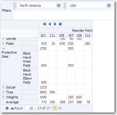
For long header labels you can set the headerCell component whitespace attribute to normal to enable word wrapping. The default value is noWrap. Figure 27-10 shows a pivot table with row header cells wrapped to accommodate long text labels for Protective Gear and its drilled Black Hawk Knee Pads and Black Hawk Elbow Pads header cells.
Figure 27-25 Pivot Table Header Cell Word Wrapping
Active Data Support (ADS)
Pivot tables and pivot filter bars support ADS by sending a Partial Page Refresh (PPR) request when an active data event is received.
The PPR response updates the pivot table and pivot filter bar values as follows:
-
If the ADS event results in an update to the value of one or more existing pivot table data cells, the values are updated in place.
-
If the ADS event results in an insert or delete of a row or column, or multiple rows or columns, the entire pivot table is refreshed to display the change.
-
ADS is only supported for a single stamped
af:outputTextordvt:sparkChartcomponent in a data cell. -
If an event arrives while the pivot table is in an operation such as a pivot, the event is buffered so that it can be applied after the operation is completed; except in the case where the event is older that the data that the pivot operation just fetched, in which case the event is discarded.
For additional information about using the Active Data Service, see Using the Active Data Service with an Asynchronous Backend.
Additional Functionality for the Pivot Table Component
You may find it helpful to understand other ADF Faces features before you implement your pivot table component. Additionally, once you have added a pivot table component to your page, you may find that you need to add functionality such as validation and accessibility.
Following are links to other functionality that pivot table components can use:
-
You may want a pivot table to refresh a header cell, a data cell, or the entire pivot table to show new data based on an action taken on another component on the page. For more information, see Rerendering Partial Page Content.
-
Personalization: If enabled, users can change the way the pivot table displays at runtime, and those values will not be retained once the user leaves the page unless you configure your application to allow user customization. For information, see Allowing User Customization on JSF Pages.
-
Accessibility: Pivot table and pivot filter bar components are accessible, as long as you follow the accessibility guidelines for the component. See Developing Accessible ADF Faces Pages.
-
Touch devices: When you know that your ADF Faces application will be run on touch devices, the best practice is to create pages specific for that device. For additional information, see Creating Web Applications for Touch Devices Using ADF Faces.
-
Skins and styles: You can customize the appearance of pivot table and pivot filter bar components using an ADF skin that you apply to the application or by applying CSS style properties directly using a style-related property (
styleClassorinlineStyle). For more information, see Customizing the Appearance Using Styles and Skins. -
Content Delivery: You can configure your pivot table and pivot filter bar to fetch data from the data source immediately upon rendering the components, or on a second request after the components have been rendered using the
contentDeliveryattribute. For more information, see Content Delivery. -
Automatic data binding: If your application uses the Fusion technology stack, then you can create automatically bound pivot tables based on how your ADF Business Components are configured. JDeveloper provides a wizard for data binding and configuring your pivot table. For more information, see the "Creating Databound Pivot Table and Pivot Filter Bar Components" chapter of Developing Fusion Web Applications with Oracle Application Development Framework.
Note:
If you know the UI components on your page will eventually use ADF data binding, but you need to develop the pages before the data controls are ready, then you should consider using placeholder data controls, rather than manually binding the components. Using placeholder data controls will provide the same declarative development experience as using developed data controls. For more information, see the "Designing a Page Using Placeholder Data Controls" chapter of Developing Fusion Web Applications with Oracle Application Development Framework.
Additionally, data visualization components share much of the same functionality, such as how data is delivered, automatic partial page rendering (PPR), image formats, and how data can be displayed and edited. For more information, see Common Functionality in Data Visualization Components.
Using the Pivot Table Component
To use the ADF DVT Pivot Table component, add the pivot table to a page using the Component Palette window. Then define the data for the pivot table and complete the additional configuration in JDeveloper using the tag attributes in the Properties window.
Pivot Table Data Requirements
You can use any row set (flat file) data collection to supply data to a pivot table. The pivot table component uses a data model to display and interact with data.
The specific data model is oracle.adf.view.faces.bi.model.DataModel.
Pivot tables require that the value attribute is set in JDeveloper. If you are using UI-first development, the value of the value attribute must be stored in the pivot table's data model or in classes and managed beans.
Configuring Pivot Tables
The pivot table (pivotTable) component has two child components, a header cell (headerCell) and a data cell (dataCell). The pivot filter bar (pivotFilterBar) is a sibling component that can be associated with the pivot table. These components are defined by several configurable elements.
The prefix dvt: occurs at the beginning of each pivot table and pivot filter bar component name indicating that the component belongs to the ADF Data Visualization Tools (DVT) tag library.
Pivot tables display data in a grid layout with unlimited layers of hierarchically nested row header cells and column header cells. Figure 27-26 shows a pivot table and its associated pivot filter bar displaying the sales of electronic equipment.
Figure 27-26 Electronic Sales Pivot Table
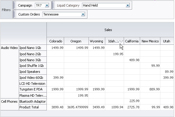
Pivot table and pivot filter bar components are defined by the following terms using the Electronic Sales Pivot Table in Figure 27-26:
-
Edges: The axes in pivot tables, including:
-
Row edge: The vertical axis to the left or right for right-to-left display of the body of the pivot table. In Figure 27-26, the row edge contains two layers, Product Category and Product, and each row in the pivot table represents the combination of a particular category and a particular product.
-
Column edge: The horizontal axis above the body of the pivot table. In Figure 27-26, the column edge contains two layers, Measure and US State, and each column in the pivot table represents the combination of a particular measure value (Sales or Units), and a particular geographic location (US State).
-
Page edge: The edge represented by the pivot filter bar, whose layers can be filtered or pivoted with the layers in the row and column edges.
-
-
Layers: Nested attributes that appear in a single edge. In Figure 27-26, the following two layers appear in the column edge: Measure and Geography (Sales and US State). The following two layers appear in the row edge: Category and Product (Product Category and Product).
-
Header cell: The labels that identify the data displayed in a row or column. Row header cells appear on the row edge, and column header cells appear on the column edge. In the sample, header cells include Cell Phones, iPod Speakers, Sales, and Colorado.
-
Data cell: The cells within the pivot table that contain data values, not header information. In the sample, the first data cell contains a value of 1,499.99.
-
QDR (Qualified Data Reference): A fully qualified data reference to a row, a column, or an individual cell. For example, in Figure 27-26, the QDR for the first data cell in the pivot table must provide the following information:
-
Category=Audio Video
-
Product=iPod Nano 1Gb
-
Measure=Sales
-
Geography=Colorado
Likewise, the QDR for the first row in the pivot table, which is also the QDR of the "iPod Nano 1Gb" header cell, contains the following information:
-
Category=Audio Video
-
Product=iPod Nano 1Gb
Finally, the QDR for the "Sales" header cell contains the following information:
-
Measure=Sales
-
How to Add a Pivot Table to a Page
When you are designing your page using simple UI-first development, you use the Components window to add a pivot table to the page. Once the pivot table is added to your page, you can use the Properties window to specify data values and configure additional display attributes for the pivot table.
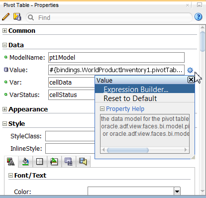
In the Properties window you can use the dropdown menu for each attribute field to display a property description and options such as displaying an EL Expression Builder or other specialized dialogs. Figure 27-27 shows the dropdown menu for a pivot table component value attribute.
Figure 27-27 Pivot Table Value Attribute Dropdown Menu
Note:
If your application uses the Fusion technology stack, then you can use data controls to create a pivot table and the binding will be done for you. JDeveloper provides a wizard for data binding and configuring your pivot table. For more information, see the "Creating Databound Pivot Table and Pivot Filter Bar Components" chapter of Developing Fusion Web Applications with Oracle Application Development Framework.
Before you begin:
It may be helpful to have an understanding of how pivot table attributes and child tags can affect functionality. For more information, see Configuring Pivot Tables.
You may also find it helpful to understand functionality that can be added using other ADF Faces features. For more information, see Additional Functionality for the Pivot Table Component.
To add a pivot table to a page:
Configuring Pivot Table Display Size and Style
You can configure the pivot table, pivot filter bar, header cell and data cell's size and style using the inlineStyle or styleClass attributes.
Both attributes are available in the Style section in the Properties window for the dvt:pivotTable, dvt:pivotFilterBar, dvt:headerCell, or dvt:dataCell component. Using these attributes, you can customize stylistic features such as fonts, borders, and background elements.
You can also configure header cell and data cell child components using their styling attributes. For example, you can use custom CSS styling with inlineStyle and contentStyle attributes of a data cell af:outputText and af:inputText respectively:
<dvt:pivotTable id="goodPT"
                value="#{richPivotTableModel.dataModel}"
                var="cellData"
                varStatus="cellStatus">
  <dvt:dataCell id="dc1">
    <af:switcher id="sw1" facetName="#{richPivotTableModel.stampFacet}">
      <f:facet name="outputText">
        <af:outputText id="ot1" value="#{cellData.dataValue}"
                       inlineStyle="#{myBean.textStyle}"/>
      </f:facet>
      <f:facet name="inputText">
        <af:inputText id="ot2" value="#{cellData.dataValue}"
                      contentStyle="#{myBean.textStyle}" />
      </f:facet>
        </af:switcher>
    </dvt:dataCell>
  </dvt:pivotTable>
Pivot tables and pivot filter bars also support skinning to customize many aspects of the display of data and header cells and labels, and pivoting and sorting icons.
For the complete list of pivot table skinning keys, see the Oracle Fusion Middleware Data Visualization Tools Tag Reference for Oracle ADF Faces Skin Selectors. For additional information about customizing your application using skinning and styles, see Customizing the Appearance Using Styles and Skins.
The page containing the pivot table may also impose limitations on the ability to change the size or style. For more information about page layouts, see Organizing Content on Web Pages.
What Happens When You Add a Pivot Table to a Page
When a pivot table component is inserted into a JSF page using the Components window, a basic pivot table tag is added to the source code as follows:
<dvt:pivotTable id="pt1"/>
If you have not already done so, you can then use the Components window to insert a header cell and data cell. Configure the cell content through stamping. For more information, see Configuring Header and Data Cell Stamps.
A Create Pivot Table wizard provides declarative support for data-binding and configuring the pivot table. In the wizard pages you can:
-
Specify the initial layout of the pivot table
-
Associate and configure a pivot filter bar
-
Specify alternative labels for the data layers
-
Configure insert or filter drilling
-
Define aggregation of data values
-
Configure category and data sorting
For more information, see the "Creating Databound Pivot Tables" chapter of Developing Fusion Web Applications with Oracle Application Development Framework.
What You May Need to Know About Displaying Large Data Sets
When you are developing an ADF Faces web application, by default pivot tables use a vertical or horizontal scroll bar for displaying rows over the size of the data being fetched. Alternatively, you can configure a vertical or horizontal page control that allows users to jump to specific pages of rows as illustrated in Figure 27-19. To configure a page control for desktop devices, set the pivotTable component scrollPolicy attribute to page.
By default, when rendered on mobile devices, pivot tables use a page control for displaying rows over the size of the data being fetched. For pivot tables to display on a mobile device, you must:
-
Place the pivot table component within a flowing container (that is, a component that does not stretch its children). For more information about flowing container components, see Geometry Management and Component Stretching.
-
Leave the
scrollPolicyattribute set toauto(default for this setting on mobile devices is paginated display of the pivot table).
If the pivot table is not in a flowing container, or if those attributes are not set correctly, the pivot table will display a scroll bar instead of pages.
Note:
For row-based data sets with more than 1000 rows, pre-calculate the summary data in the database to limit the number of rows sent to the pivot table, and thereby reduce resources necessary for data aggregation. You can tune your view object to set how data is retrieved from the database. Use the default setting of All Rows in batches of 1. For more information, see "Consider the Appropriate Tuning Setting for Every View Object" in Developing Fusion Web Applications with Oracle Application Development Framework.
You can also specify the number of columns and rows in a data fetch block by setting the columnFetchSize and rowFetchSize attributes of the dvt:pivotTable component.
What You May Need to Know About Pivot Tables on Touch Devices
The ADF Faces framework is optimized to run in mobile browsers such as Safari. The framework recognizes when a mobile browser on a touch device is requesting a page, and then delivers only the JavaScript and peer code applicable to a mobile device. However, while a standard ADF Faces web application will run in mobile browsers, because the user interaction is different and because screen size is limited, when your application needs to run in a mobile browser, you should create touch device-specific versions of the pages. For more information, see Creating Web Applications for Touch Devices Using ADF Faces.
What You May Need to Know About Skinning and Customizing the Appearance of Pivot Tables
For the complete list of pivot table skinning keys, see the Oracle Fusion Middleware Documentation Tag Reference for Oracle Data Visualization Tools Skin Selectors. To access the list from JDeveloper, from the Help Center, choose Documentation Library, and then Fusion Middleware Reference and APIs. For additional information about customizing your application using skins, see Customizing the Appearance Using Styles and Skins.
Configuring Header and Data Cell Stamps
Each immediate child of a ADF DVT Pivot Table component must be either a headerCell or dataCell component. The pivot table can contain at most one headerCell and at most one dataCell component. These components make it possible to customize the cell content through stamping.
When you use stamping, child components are not created for every header cell or data cell in a pivot table. Rather, the content of the component is repeatedly rendered, or stamped, once per cell.
Each time a header or data cell is stamped, the value for the current cell is copied into a var property, and additional data for the cell is copied into a varStatus property. These properties can be accessed in EL expressions inside the header or data cell component, for example, to pass the cell value to a stamped af:outputText component. Once the pivot table has completed rendering, the var and varStatus properties are removed, or reverted back to their previous values.
Using var and varStatus Properties
Pivot table var and varStatus properties are used to access cell data in stamped dataCell and headerCell components. The var property names the EL expression variable used to reference cell data within pivot table data cell stamps. In the stamped dataCell or headerCell component, the var property must be referenced and followed by a metadata keyword.
Table 27-1 shows the metadata keywords supported for data cells in a rowset data model.
Table 27-1 Supported Metadata Keywords for Data Cells
| Keyword | Description |
|---|---|
|
|
Most frequently useful keyword. Returns the data value |
|
|
Returns a number that is the maximum and minimum, respectively, for the measure of the cell across the values in the cube. |
|
|
Returns a Boolean |
|
|
If the cell is an aggregate, returns a |
|
|
If the cell is an aggregate, returns the |
|
|
Returns a |
|
|
Returns a String representing the name of the rowset attribute from which the value comes. |
|
|
Returns the row data model's ADF Model row key, |
|
|
Returns the ADF Model key path object. |
Table 27-2 shows the metadata keywords supported for header cells in a rowset data model.
Table 27-2 Supported Metadata Keywords for Header Cells
| Keyword | Description |
|---|---|
|
|
Most frequently useful keyword. Returns the data value |
|
|
Returns the String value of the header cell. Also available in cubic data models. |
|
|
Returns the String label for the header cell. Also available in cubic data models. |
|
|
Returns a Boolean |
|
|
Returns an Integer value representing the drill state of the current header cell, if applicable. 0 indicates "not drillable", 1 indicates "drillable", and 2 indicates "drilled". Also available in cubic data models |
|
|
Returns the String attribute column of the header cell. |
|
|
Returns a String representing the name of the layer containing the header cell. |
|
|
Returns a String representing the label (if any) for the layer containing this header cell. May fall back to |
The optional varStatus property names the EL expression variable used to provide contextual information about the state of the component. In stamped dataCell or headerCell components, the varStatus property must be referenced and followed by one of the following:
-
members: Valid only for thedataCellcomponent. Provides access to the header cells corresponding to the same row or column as the current data cell. -
model: Returns theDataModelfor this component. -
cellIndex: Returns the cell index for this component. -
cellKey: Returns the cell key for this component.
For example you can use var and varStatus to access data from a stamped data cell and to format the pivot table based on the header cell stamp:
<dvt:pivotTable
                  id="pivotTable3"
                  value="#{pivotTableMemberFormatting.dataModel}"
                  var="cellData"
                  varStatus="cellStatus">
  <dvt:headerCell>
    <af:switcher
                 facetname="O___b_cellData_layerName__b__"
                 defaultFacet="Other">
      <f:facet name="Product">
        <af:outputText id="ot1"
                       value="#{cellData.dataValue}"
                       inlineStyle="color:#{(cellData.dataValue == 'Canoes' ?
                       'red' : 'blue')};"/>
      </f:facet>
      <f:facet name="Other">
        <af:outputText id="ot2" value="#{cellData.dataValue}"/>
      </f:facet>
    </af:switcher>
  </dvt:headerCell>

  <dvt:dataCell>
    <af:outputText id="ot3" value="#{cellData.dataValue}"
                   inlineStyle="color:#{(cellStatus.members.Product.dataValue ==
                   'Canoes' ? 'red' : 'blue')};"/>
  </dvt:dataCell>
</dvt:pivotTable>
The code sample illustrates the syntax for using each data cell value property as follows:
-
var: [varproperty].[data cell metadata keyword]In the code sample, the value of
af:outputTextis set to#{cellData.dataValue}, the value of the current cell. -
varStatus: [varStatusproperty].[members].[layer name].[header cell metadata keyword]The data cell component value references the pivot table
varStatus(cellStatus) followed bymembersto access the header cells corresponding to the same row or column as the current data cell, followed by the name of the layer (Product) containing the desired header cell, followed by the header cell metadata keyworddataValue.
Using var and varStatus Properties shows the pivot table resulting from the code sample.
Figure 27-28 Pivot Table with Formatting Based Header Cell Stamp
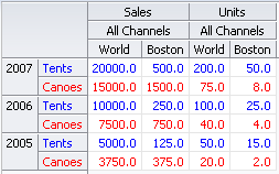
Description of "Figure 27-28 Pivot Table with Formatting Based Header Cell Stamp"
You can also use var and varStatus to stamp sparkcharts in pivot tables: and gauges in pivot tables:
<dvt:pivotTable id="pivotTable1"
                value="#{pivotTableSparkChart.dataModel}"
                var="cellData"
                varStatus="cellStatus">
  <dvt:dataCell>
    <af:switcher id="s2"
                 facetname="O___b_cellData_dataIsTotal__b__"
                 defaultFacet="false">
      <f:facet name="true">
        <dvt:sparkChart id="sc1" shortDesc="Spark Chart"
                        highMarkerColor="#008200"
                        lowMarkerColor="#ff0000">
          <af:iterator id="i1"
                       value="#{cellData.aggregateCollection}"
                       var="sparks" >
            <dvt:sparkItem id="si1"
                           value="#{sparks.dataValue}"/>
          </af:iterator>
        </dvt:sparkChart>
      </f:facet>
      <f:facet name="false">
        <af:outputText id="ot1" value="#{cellData.dataValue}"/>
      </f:facet>
    </af:switcher>
  </dvt:dataCell>

  <dvt:headerCell>
    <af:switcher id="s3"
                 facetname="O___b_cellData_isTotal__b__"
                 defaultFacet="false">
      <f:facet name="true">
        <af:outputText id="ot2" value="Trend"/>
      </f:facet>
      <f:facet name="false">
        <af:outputText id="ot3" value="#{cellData.dataValue}"/>
      </f:facet>
    </af:switcher>
  </dvt:headerCell>
</dvt:pivotTable>
The resulting pivot table is shown in Figure 27-2.
You can also use var and varStatus to stamp gauges in pivot tables:
<dvt:pivotTable
                id="pivotTable2"
                value="#{pivotTableGauge.dataModel}"
                var="cellData"
                varStatus="cellStatus">
  <dvt:dataCell>
    <dvt:gauge id="g1" shortDesc="Gauge"
               imageWidth="80" imageHeight="80" imageFormat="PNG_STAMPED"
               value="#{cellData.dataValue}"
               minValue="#{cellData.dataCubeMin}"
               maxValue="#{cellData.dataCubeMax}"/>
  </dvt:dataCell>
</dvt:pivotTable>
The resulting pivot table is displayed in Figure 27-3.
How to Configure Header and Data Cell Stamps
Only certain types of child components are supported by header cells or data cells. For example, each header cell can contain read-only components. Each data cell can contain read-only or input components, including all components with no activity and most components that implement the EditableValueHolder or ActionSource interfaces.
Header cells and data cells should have only one child component. If multiple children are desired, they should be wrapped in another component. If no layout is desired, af:group can be used, which simply renders its children without adding layout, and is consequently lightweight. If layout is desired, a layout component like af:panelGroupLayout can be used instead. For more information, see Grouping Related Items.
Data cell editing is enabled by using an input component as the child component of dataCell. At runtime you can open the cell for editing by clicking the cell in the pivot table. For more information, see Editing Data Cells.
You can configure header cell stamping using af:switcher to vary the type of stamped component by layer name, that is, a different content for Geography, Channel, and so on using components as children of headerCell:
<dvt:pivotTable id="goodPT"
                inlineStyle="width:100%;height:600px;"
                binding="#{editor.component}"
                contentDelivery="immediate"
                value="#{pivotTableHeaderCellDemo.dataModel}"
                headerFormat="#{pivotTableHeaderCellDemo.getHeaderFormat}"
                dataFormat="#{pivotTableHeaderCellDemo.getDataFormat}"
                var="cellData"
                varStatus="cellStatus"
                summary="pivot table">
  <dvt:headerCell id="goodHC>
    <af:switcher id="sw" facetName="#{cellData.layerName}" defaultFacet="Other">
      <f:facet name="Geography">
        <af:group id="g1">
          <af:icon id="idicon11" name="info" shortDesc="Icon" />
          <af:outputText  value="#{cellData.dataValue}" id="ot11"
                          shortDesc="#{cellData.dataValue}" />
        </af:group>
      </f:facet>
      <f:facet name="Channel">
        <af:group id="g2">
          <af:panelGroupLayout id="pgl2" layout="vertical">
          <af:link shortDesc="Sample Link"
                   icon="/images/pivotTableCSVDemo/smily-normal.gif"
                   hoverIcon="/images/pivotTableCSVDemo/smily-glasses.gif"
                   id="cil1"/>
          <af:outputText  value="#{cellData.dataValue}" id="ot1" />
        </af:group>
        <af:button text="Go to Tag Guide page" immediate="true"
                          action="guide" id="cb1"/>
          </af:panelGroupLayout>
      </f:facet>
      <f:facet name="Product">
        <af:panelGroupLayout id="pgl3" layout="vertical">
          <af:outputText value="#{cellData.dataValue}" id="ot12" />
          <af:button text="Go to Tag Guide page" immediate="true"
                                                        action="guide" id="cb2"/>
        </af:panelGroupLayout>
      </f:facet>
      <f:facet name="Other">
        <af:link text="#{cellData.dataValue}"
                        shortDesc="#{cellData.dataValue}" immediate="true"
                        action="guide" id="idlink11"/>
      </f:facet>
    </af:switcher>
  </dvt:headerCell>
</dvt:pivotTable>
Figure 27-29 shows the resulting pivot table for the code sample.
Figure 27-29 Pivot Table Header Cell Stamps
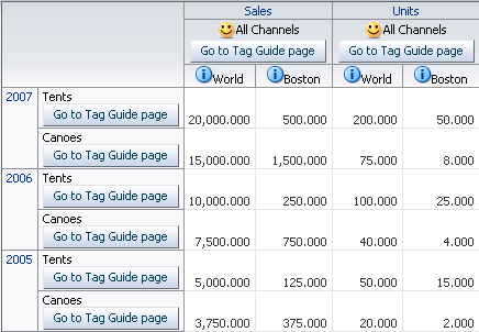
Description of "Figure 27-29 Pivot Table Header Cell Stamps"
You can configure data cell stamping using af:switcher to vary the type of stamped component by measure, that is, a different content for Sales, Weight, and so on using components as children of dataCell:
<dvt:pivotTable id="goodPT" var="cellData" varStatus="cellStatus">
  <dvt:dataCell>
    <af:switcher id="sw" facetName="#{cellStatus.members.MeasDim.value}"
                 defaultFacet="Other">
      <f:facet name="Sales">
        <af:inputText id="idinputtext1" value="#{cellData.dataValue}"   />
      </f:facet>
      <f:facet name="Units">
        <af:inputText id="idinputtext2" value="#{cellData.dataValue}"   >
          <af:validateLength maximum="6" minimum="2" />
        </af:inputText>
      </f:facet>
      <f:facet name="Weight">
        <af:outputText id="idoutputtext1" value="#{cellData.dataValue}" />
      </f:facet>
      <f:facet name="Color">
        <af:selectOneChoice id="idselectonechoice"
                            value="#{cellData.dataValue}" label="Color">
          <af:selectItem label="red" value="red" shortDesc="shortDesc sample"/>
          <af:selectItem label="coffee" value="coffee"
                         shortDesc="Sample shortDesc text"/>
          <af:selectItem label="milk" value="milk"
                         shortDesc="Another shortDesc sample"/>
        </af:selectOneChoice>
      </f:facet>
      <f:facet name="Available">
        <af:selectBooleanCheckbox id="idselectbooleancheckbox"
                                  label="Availability" text="Item Available"
                                  autoSubmit="true"
                                  value="#{cellData.dataValue}"/>
      </f:facet>
      <f:facet name="Supply Date">
        <af:inputDate id="idinputdate1" value="#{cellData.dataValue}"
                      label="Change Date:" simple="true" >
          <af:validateDateTimeRange maximum="2020-12-31" minimum="1980-12-31" />
        </af:inputDate>
      </f:facet>
      <f:facet name="Link">
        <af:link text="#{cellData.dataValue}" immediate="true"
                        action="guide" id="idlink"/>
      </f:facet>
      <f:facet name="Size">
        <af:inputComboboxListOfValues label="Size"id="idInputComboboxListOfValues"
                                   value="#{cellData.dataValue}"
                                   searchDesc="Search Size"
                                   model="#{pivotTableEditBean.listOfValuesModel}"
                                   columns="3"   />
      </f:facet>
      <f:facet name="Other">
        <af:outputText id="idoutputtext2" value="#{cellData.dataValue}"   />
      </f:facet>
    </af:switcher>
  </dvt:dataCell>
</dvt:pivotTable>
Figure 27-30 shows the resulting pivot table for the code sample.
Before you begin:
It may be helpful to have an understanding of how pivot table attributes and child tags can affect functionality. For more information, see Configuring Pivot Tables.
You should already have a pivot table on your page. If you do not, follow the instructions in this chapter to create a pivot table. For more information, see How to Add a Pivot Table to a Page.
To add and configure a header or data cell stamp:
- In ADF Data Visualization page of the Components window, from the Pivot Table panel, drag and drop a Header Cell or Data Cell onto the pivot table in the visual editor.
- In the Structure window, right-click the dvt:headerCell or dvt:dataCell and choose insert inside Header Cell or insert inside Data Cell > ADF Data Visualization Components or ADF Faces.
- In the Insert Item dialog, select the component you wish to stamp in the header or data cell.
- In the Structure window, select the component you inserted, and in the Properties window, set the component attributes.
Using Pivot Filter Bars
You can enhance the data filtering capacity in a pivot table by adding an ADF DVT Pivot Filter Bar. Any data layers specified in the pivot table can be moved to or specified in the filter bar to filter the displayed data.
Zero or more layers of data not already displayed in the pivot table row edge or column edge are displayed in the page edge. Figure 27-31 shows a pivot filter bar with Quarter and Month layers that can be used to filter the data displayed in the pivot table.
Figure 27-31 Pivot Filter Bar with Data Layer Filters

Description of "Figure 27-31 Pivot Filter Bar with Data Layer Filters"
You can also change the display of data in the pivot table by pivoting layers between the row, column, or page edges. Use the pivot handle to drag the layers between the edges as desired. Figure 27-32 shows the modified pivot table and pivot filter bar when the Channel data layer is pivoted to the page edge.
Figure 27-32 Pivot Table and Pivot Filter Bar After Pivot
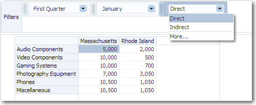
Description of "Figure 27-32 Pivot Table and Pivot Filter Bar After Pivot"
You can style pivot filter bars using inlineStyle and styleClass attributes and skinning keys. See Configuring Pivot Table Display Size and Style.
Using a Pivot Filter Bar with a Pivot Table
You can use a pivot filter bar component, pivotFilterBar, to work with a pivot table component, pivotTable, by configuring the data model and associated properties to work with both components:
<dvt:pivotFilterBar id="pf1" value="#{binding.pt.pivotFilterBarModel}"
     modelName="pt1Model"/>
<dvt:pivotTable id="pt1" value="#{binding.pt.dataModel}"  modelName="pt1Model"
     partialTriggers="pf1"/>
You can associate a pivot filter bar with a pivot table in any of the following ways:
-
Create a pivot table using the Data Controls Panel.
When you drag a data collection from the Data Controls Panel to create a pivot table on your page, the Select Display Attributes page of the Create Pivot Table wizard provides the option to create a pivot filter bar to associate with the pivot table. You can choose to specify zero or more attributes representing data layers in the page edge. The data model and associated properties are automatically configured for you. For detailed information, see the "Creating Databound Pivot Tables" section in Developing Fusion Web Applications with Oracle Application Development Framework.
-
Add a pivot filter bar to a pivot table bound to data.
In the ADF Data Visualizations page of the Components window, from the Pivot Table panel, you can drag a
pivotFilterBarelement adjacent to apivotTableelement that has been bound to a data collection and the data binding will be done for you. -
Add a pivot filter bar to a pivot table not bound to data.
In the ADF Data Visualizations page of the Components window, from the Pivot Table panel, you can drag a
pivotFilterBarelement adjacent to apivotTableelement that has not been bound to a data collection. In this instance, you must configure the data model and associated properties in order for the pivot filter bar to work with the pivot table.
Using a Pivot Filter Bar with a Graph
You can use a pivot filter bar to filter the graphical display of data in a graph. For example, you can shows a filtered view of quarterly sales data displayed in both a pivot table and on a graph as illustrated in Figure 27-6.
Use partial page rendering (PPR) to configure the pivot filter bar as a trigger with a pivot table and a graph as targets. Once PPR is triggered, any component configured to be a target will be rerendered. You configure a component to be a target by setting the partialTriggers attribute to the relative ID of the trigger component. For information about relative IDs, see Locating a Client Component on a Page. For more information about PPR, see Rerendering Partial Page Content.
For example, to configure the pivot table and graph in Figure 27-6:
<dvt:pivotFilterBar id="pfb1" binding="#{editor.component}"
                    value="#{pivotFilterBar.queryDescriptor}" modelName="model1"
                    styleClass="AFStretchWidth"/>
<af:panelGroupLayout layout="horizontal" id="pgl2">
  <f:facet name="separator" >
    <af:separator id="s2"/>
  </f:facet>
    <af:spacer width="25px" id="s3"/>
      <dvt:pivotTable id="pt1" inlineStyle="width:400px" partialTriggers="::pfb1"
                      value="#{pivotFilterBar.dataModel}" modelName="model1"
                      summary="Quarterly Sales Pivot Table"/>
    <af:spacer width="50px" id="s4"/>
      <dvt:barGraph id="bar1" partialTriggers="::pfb1 ::pt1"
                    value="#{pivotFilterBar.dataModel}" shortDesc="Quarterly Sales
                        Bar Graph"/>
</af:panelGroupLayout>
What You May Need to Know About Skinning and Customizing the Appearance of Pivot Filter Bars
For the complete list of pivot filter bar skinning keys, see the Oracle Fusion Middleware Documentation Tag Reference for Oracle Data Visualization Tools Skin Selectors. To access the list from JDeveloper, from the Help Center, choose Documentation Library, and then Fusion Middleware Reference and APIs. For additional information about customizing your application using skins, see Customizing the Appearance Using Styles and Skins.
Adding Interactivity to Pivot Tables
ADF DVT Pivot tables and pivot filter bars support multiple user operations, including data selection, exporting to an spreadsheet, and displaying in printable mode.
Using Selection in Pivot Tables
Selection in a pivot table allows a user to select one or more cells in a pivot table. Only one of the three areas including the row header, column header, or data cells can be selected at one time.
An application can implement features such as displaying customized content for a context menu, based on currently selected cells. For example, to get the currently selected header cells:
UIPivotTable pt = getPivotTable()
if (pt == null)
    return null;
HeaderCellSelectionSet headerCells = null;
if (pt.getSelection().getColumnHeaderCells().size() > 0) {
    headerCells = pt.getSelection().getColumnHeaderCells();
} else if (pt.getSelection().getRowHeaderCells().size() > 0) {
    headerCells = pt.getSelection().getRowHeaderCells();
}
At runtime, selecting a data cell highlights the cell, as shown in Figure 27-11.
Figure 27-33 Selected Data Cell
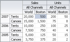
Using Partial Page Rendering
You can update pivot tables, data cells, and header cells by using partial page rendering (PPR). For example, you may display totals in a pivot table when triggered by a checkbox. PPR allows individual components on a page to be rerendered without the need to refresh the entire page. For more information about PPR, see About Partial Page Rendering.
Note:
By default, ADF pivot tables support automatic PPR, where any component whose values change as a result of backend business logic is automatically rerendered. If your application uses the Fusion technology stack, you can enable the automatic partial page rendering feature on any page. For more information, see the "What You May Need to Know About Partial Page Rendering and Iterator Bindings" section in Developing Fusion Web Applications with Oracle Application Development Framework.
For a component to be rerendered based on an event caused by another component, it must declare which other components are the triggers. Use the partialTriggers attribute to provide a list of IDs of the components that should trigger a partial update of the pivot table. The pivot table listens on the trigger components and if one of the trigger components receives an event that will cause it to update in some way, the pivot table is also updated.
For example, you can update a pivot table by displaying the totals when a checkbox is triggered using the triggering component ID as the partialTriggers value.
<dvt:pivotTable id="goodPT"
    value="#{richPivotTableModel.dataModel}"
    partialTriggers="showTotals"/>

  <af:selectBooleanCheckbox id="showTotals" autoSubmit="true" label="Show Totals"
    value="#{richPivotTableModel.totalsEnabled}"/>
Exporting from a Pivot Table
You can export the data from a pivot table to a Microsoft Excel spreadsheet. You create an action source, such as a button or link, add a exportPivotTableData component, and associate it with the data you wish to export. You can configure the component so that the entire pivot table will be exported, or so that only the rows, columns, or data cells selected by the user will be exported. For example, Figure 27-34 shows a pivot table that includes button components that allow users to export the data to an Excel spreadsheet.
Figure 27-34 Pivot Table with Export to Excel Buttons
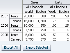
Description of "Figure 27-34 Pivot Table with Export to Excel Buttons"
At runtime, when the user clicks the button, by default all the rows and columns are exported in an Excel format written to the file specified in the filename attribute of the component. Alternatively, you can configure the exportPivotTableData component so that only user selections are exported, by setting the exportedData attribute to selected. For example, for the Export to Excel buttons:
<dvt:pivotTable id="pivotTableToExport"
               binding="#{editor.component}"
               contentDelivery="immediate"
               value="#{pivotTableExport.dataModel}" summary="pivot table"/>

<h:panelGrid id="pfl" columns="2" cellpadding="3">
  <af:button text="Export All" id="exportAll">
    <dvt:exportPivotTableData exportedId="pivotTableToExport" type="excelHTML"
                              exportedData="all" filename="all.xls"
                              title="All pivotTable data"/>
  </af:button>
  <af:button text="Export Selected" id="exportSelected">
    <dvt:exportPivotTableData exportedId="pivotTableToExport" type="excelHTML"
                              exportedData="selected" filename="selected.xls"
                              title="Selected pivotTable data"/>
  </af:button>
</h:panelGrid>
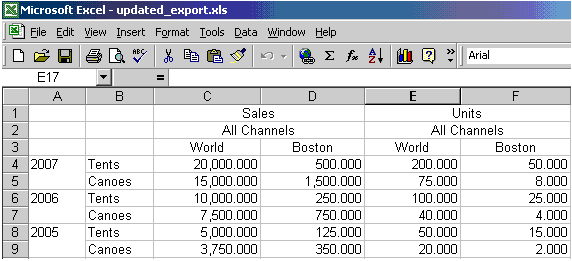
Figure 27-35 shows the resulting Excel spreadsheet when the Export All button is clicked.
Figure 27-35 Pivot Table Export to Excel Spreadsheet
Note:
You may receive a warning from Excel stating that the file is in a different format than specified by the file extension. This warning can be safely ignored.
Displaying Pivot Tables in Printable Pages
ADF Faces allows you to output your JSF page from an ADF Faces web application in a simplified mode for printing. For example, you may want users to be able to print a page (or a portion of a page), but instead of printing the page exactly as it is rendered in a web browser, you want to remove items that are not needed on a printed page, such as scrollbars and buttons. For information about creating simplified pages for these outputs, see Using Different Output Modes .
When a pivot table and pivot filter bar is displayed on a JSF page to be output in printable pages:
-
All data cells in the pivot table are displayed.
-
Limited client interactivity including cell select and row or column resizing is supported.
-
Pivoting, drilling, and sorting operations are not supported.
-
Context menus including the ability to resize rows or columns is not supported.
-
If configured, the pivot table data filter displayed in the pivot filter bar will be displayed, although the contents cannot be changed.
Formatting Pivot Table Cell Content With CellFormat
Although a less preferred strategy, you can use a CellFormat method expression as an alternative to declaratively styling header and data cell stamps in ADF DVT Pivot Tables.
For more information about using inlineStyle and styleClass attributes. See Configuring Pivot Table Display Size and Style.
All cells in a pivot table are either header cells or data cells. Before rendering a cell, the pivot table calls a method expression. You can customize the content of pivot table header cells and data cells by providing method expressions for the following attributes of the pivotTable component:
-
For header cells, use one of the following attributes:
-
headerFormat: Use to create formatting rules to customize header cell content. -
headerFormatManager: Use only if you want to provide custom state saving for the formatting rules of the application's pivot table header cells.
-
-
For data cells, use one of the following attributes:
-
dataFormat: Use to create formatting rules to customize data cell content. -
dataFormatManager: Use only if you want to provide custom state saving for the formatting rules of the application's pivot table data cells.
-
Using a CellFormat Object for a Data Cell
To specify customization of the content of a data cell, you must code a method expression that returns an instance of oracle.dss.adf.view.faces.bi.component.pivotTable.CellFormat.
An instance of a CellFormat object lets you specify an argument to change the CSS style of a cell. For example, you might use this argument to change the background color of a cell.
-
Converter: An instance of
javax.faces.convert.Converter, which is used to perform number, date, or text formatting of a raw value in a cell. -
CSS style: Used to change the CSS style of a cell. For example, you might use this argument to change the background color of a cell.
-
CSS text style: Used to change the CSS style of the text in a cell. For example, you might use this argument to set text to bold.
-
New raw value: Used to change the cell's underlying value that was returned from the data model. For example, you might choose to change the abbreviated names of states to longer names. In this case, the abbreviation NY might be changed to New York.
To create an instance of a CellFormat object for a data cell:
Specifying a Cell Format
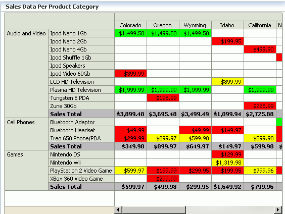
You can apply header and data cell formatting styles to emphasize aspects of the data displayed in the pivot table. Figure 27-36 shows a pivot table with sales totals generated for products and for product categories. In the rows that contain totals, this pivot table displays text against a shaded background, a style change. This change shows in both the row header cells and the data cells for the pivot table. The row headers for totals contain the text "Sales Total."
The pivot table also shows stoplight and conditional formatting of data cells. For more information, see Configuring Stoplight and Conditional Formatting Using CellFormat .
Figure 27-36 Sales Data Per Product Category
Description of "Figure 27-36 Sales Data Per Product Category"
For example, you can use this code to produce the required custom formats for the sales totals, but not for the stoplight formatting:
public CellFormat getDataFormat(DataCellContext cxt)
{
    CellFormat cellFormat = new CellFormat(null, null, null);
    QDR qdr = cxt.getQDR();
    //Obtain a reference to the product category column.
    Object productCateg = qdr.getDimMember("ProductCategory");
     //Obtain a reference to the product column.
    Object product = qdr.getDimMember("ProductId");

     if (productCateg != null && productCateg.toString().equals("Sales Total"))
      {
      cellFormat.setStyle("background-color:#C0C0C0");
      }
     else if (product != null && product.toString().equals("Sales Total")
      {
       cellFormat.setStyle("background-color:#C0C0C0");
      }
    return cellFormat;
}


public CellFormat getHeaderFormat(HeaderCellContext cxt)
{
  if (cxt.getValue() != null)
   {
    String header = cxt.getValue().toString();
    if (header.equals("Sales Total"))
     {
        return new CellFormat(null, "background-color:#C0C0C0");
      }
    }
    return null;
  }
The example includes the code for method expressions for both the dataFormat attribute and the headerFormat attribute of the dvt:pivotTable tag. If you want to include stoplight formatting in the pivot table, you might want to include the code from Configuring Stoplight and Conditional Formatting Using CellFormat .
Configuring Stoplight and Conditional Formatting Using CellFormat
Stoplight and conditional formatting of the cells in a pivot table are examples of customizing the cell content. For this kind of customization, an application might prompt a user for a high value and a low value to be associated with the stoplight formatting.
Generally three colors are used as follows:
-
Values equal to and above the high value are colored green to indicate they have no issues.
-
Values above the low value but below the high value are colored yellow to warn that they are below the high standard.
-
Values at or below the low value are colored red to indicate that they fall below the minimum acceptable level.
Figure 27-36 shows data cells with stoplight formatting for minimum, acceptable, and below standards sales for States.
For example, you can use this code to performs stoplight formatting in a pivot table that does not display totals:
public CellFormat getDataFormat(DataCellContext cxt)
{
   //Use low and high values provided by the application.
  double low = m_rangeValues.getMinimum().doubleValue() * 100;
  double high = m_rangeValues.getMaximum().doubleValue() * 100;

  CellFormat cellFormat = new CellFormat(null, null, null);

 // Create stoplight format
 if (isStoplightingEnabled())
 {
   String color = null;
   Object value = cxt.getValue();
   if (value != null && value instanceof Number)
   {
       double dVal = ((Number)value).doubleValue();
       if (dVal <= low)
       {
         color = "background-color:" + ColorUtils.colorToHTML(m_belowColor) + ";";
       }
       else if (dVal > low && dVal <= high)
       {
         color = "background-color:" + ColorUtils.colorToHTML(m_goodColor) + ";";
       }
       else if (dVal > high)
       {
         color = "background-color:" + ColorUtils.colorToHTML(m_aboveColor) + ";";
       }
    }
    cellFormat.setStyle(color);
  }
    return cellFormat;
}
If you want to do stoplight formatting for a pivot table that displays totals, then you might want to combine the code from Specifying a Cell Format (which addresses rows with totals) with the code for stoplight and conditional formatting.
