Use Dashboard Filters
You can add dashboard filters to your canvases to enable end users to select and change the values they want to see in the visualizations.
About Dashboard Filters
Dashboard filters provide filter controls for consumers on an individual canvas.
As an author, you usually add and set filters in the filter bar to broadly limit the data in your workbook, see Use the Workbook Filter Bar. You can then add and configure dashboard filters on each canvas to allow consumers to select their own filter values to change the data in the visualizations.
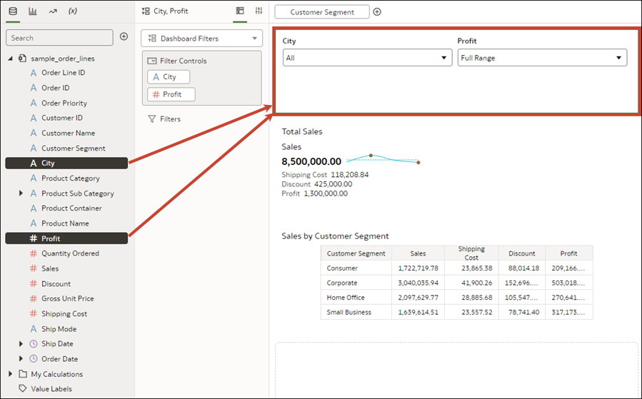
Dashboard filters are contained in the Dashboard Filters visualization. After you add the Dashboard Filters visualization to the canvas, you can then drag and drop columns to this visualization to create dashboard filters. Oracle Analytics assigns default properties based on the column you chose to create the filter but you can modify the filter's properties to better suit the data and improve the user experience.
Add Dashboard Filters
Use the Dashboard Filters visualization to create and configure your dashboard filters.
- On the Home page, hover over a workbook, click Actions, then select Open.
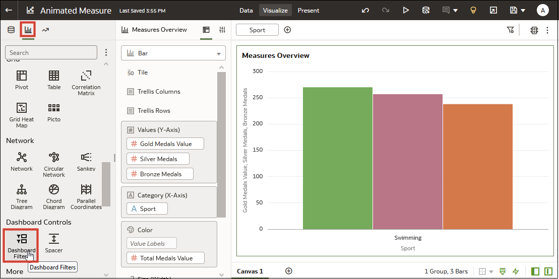
- In the Visualizations Panel, click Visualizations, scroll to Dashboard Controls, and drag Dashboard Filters to the canvas.
- In the Data Panel, click Data and drag one or more columns to the new dashboard filters visualization to create the dashboard filter controls.
- Optional: Click a filter control to open the Filter dialog, then select the data values filter on.
- Click Save.
Specify Limit Values for Dashboard Filters
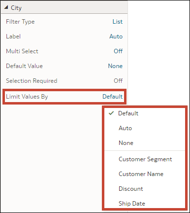
You can specify how a dashboard filter gets its selection values, for example from the workbook filter bar or other dashboard filters.
- On the Home page, hover over a workbook, click Actions, then select Open.
- Click the dashboard filters visualization to select it.
- Click Properties to open the Properties panel, then click Filter Controls.
- Locate and expand the filter you want to set the limit by for.
- Click the Limit Values By field and select how you want
to limit the filter's selection values.
- Click Save.
Apply a Dashboard Filter to Visualizations on the Canvas
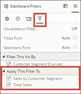
When you add a dashboard filter, Oracle Analytics applies it to all visualizations on the canvas. You can specify which of the visualizations you want to apply the dashboard filter to.
- On the Home page, hover over a workbook, click Actions, then select Open.
- Click the dashboard filters visualization to select it.
- Click Properties to open the Properties panel, then click Filters.
- In the Apply This Filter To section, select the visualizations that you want the filter to apply to.
- Click Save.
Filter a Dashboard Filter Visualization by Other Filters
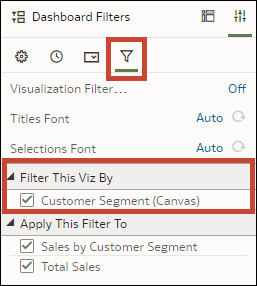
When you add a dashboard filter visualization, Oracle Analytics applies all of the workbook's existing dashboard filters and any filters in the filter bar to it. You can specify which of the filters you want to apply to the new dashboard filter.
- On the Home page, hover over a workbook, click Actions, then select Open.
- Click the dashboard filters visualization to select it.
- Click Properties to open the Properties panel, then click Filters.
- In the Filter This Viz By section, select the filters you want to apply to the dashboard filter.
- Click Save.
Change the Orientation of Dashboard Filters
Where you add a dashboard filters visualization to the canvas determines if the filter controls are displayed horizontally or vertically.
- On the Home page, hover over a workbook, click Actions, then select Open.
- Click the dashboard filters visualization to select it.
- Click Properties to open the Properties pane, then click General.
- Click the Orientation field and select an orientation.
- Click Save.
Change the Dashboard Filter Style
You can choose how you want the filter controls in the dashboard filters visualization to display to provide a canvas layout and filter experience that works best for your users.
- Standard
- Filter Chip
- On the Home page, hover over a workbook, click Actions, then select Open.
- Click the dashboard filters visualization to select it.
- Click Properties to open the Properties pane, then click General.
- Click the Filter Style field and select a style.
- Click Save.
Use a Parameter as a Dashboard Filter Control
You can use a parameter as a dashboard filter control to select and change the dimension and measure column values for the visualizations on a canvas.
Note:
Adding a parameter as a dashboard filter control functions as a column selector, it doesn't filter data.- On the Home page, hover over a workbook, click Actions, then select Open.
- In the Data panel, click Visualizations, scroll to the Dashboard Controls section, and drag Dashboard Filters to the canvas.
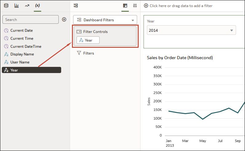
- In the Data panel, click Parameters, and drag and drop a parameter to Filter Controls in the Dashboard Filter visualization's grammar panel.
- Click Save.
Filter and Animate Visualizations using a Slider Dashboard Filter
You can add a slider dashboard filter to a workbook canvas and animate visualizations to show how the data changes relative to a specified dimension. Consumers can select a dimension value interactively, or automatically play through dimension values, similar to a time-lapse video or animation.
As another example, you might analyze Olympic medals between 2000 and 2012 in an animation showing the numbers changing over the years.
Before you can create a slider dashboard filter, you need to have one or more visualizations on your canvas for which the dimension, in this case, Year, can be used as a filter. Each visualization must include the same dimension data.
For this example, to filter on Year so that you can analyze Olympic medal data between year 2000 and year 2012, you need to add Year to your dashboard filter visualization.
- On the Home page, hover over a workbook, click Actions, then select Open.
- In the Data panel, click Visualizations, scroll to the Dashboard Controls section, and drag Dashboard Filters to the canvas.
- In the Data panel, click Data, and drag a dimension-based data element to the new dashboard filters visualization.
- Click Properties to open the Properties pane, then click Filter Controls.
- Locate and expand the filter you just added.
- Click the Filter Type field and select Slider.
- Click the Play field to turn auto-play on or off.
- If you enabled play, in the slider filter control, click Play to see how your visualizations play with the default settings.
