Build a Visualization by Adding Data
This topic describes how to add data to a visualization.
Create the Best Visualization For Selected Data Elements
When you select data elements in the Data Panel, Oracle Analytics can create the best visualization for you.
- On the Home page, hover over a workbook, click Actions, then select Open.
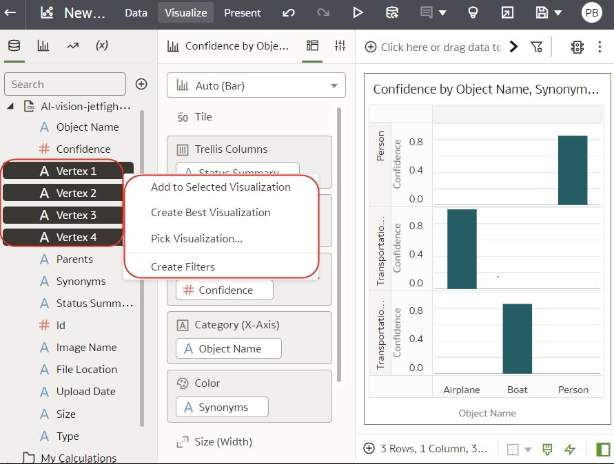
- Select the data you want to visualize by selecting one or more data elements on the Data Panel , right-click, and then click Create Best Visualization.
Add Data to a Visualization
After you’ve selected the datasets for your workbook, you can begin to add data elements such as measures and attributes to visualizations.
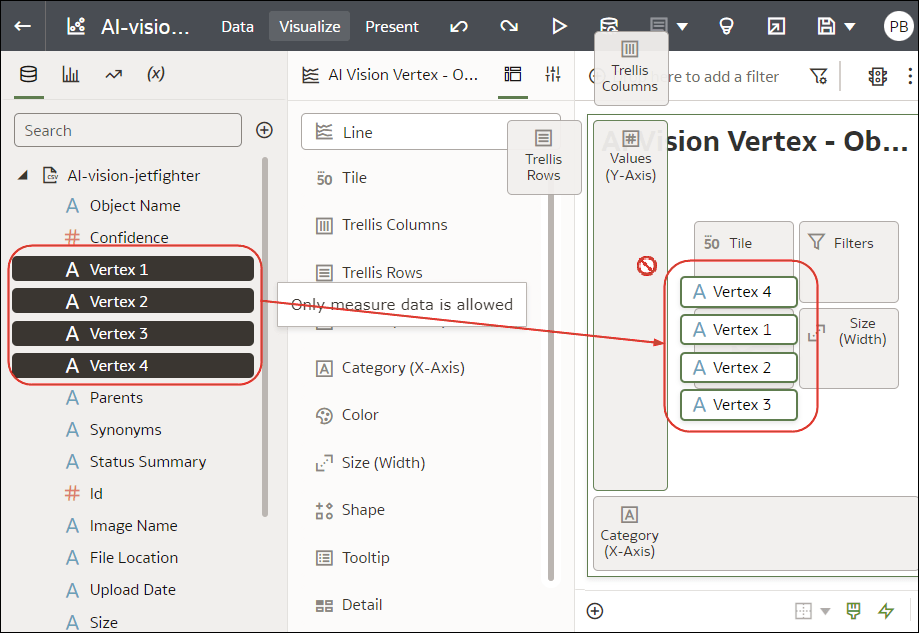
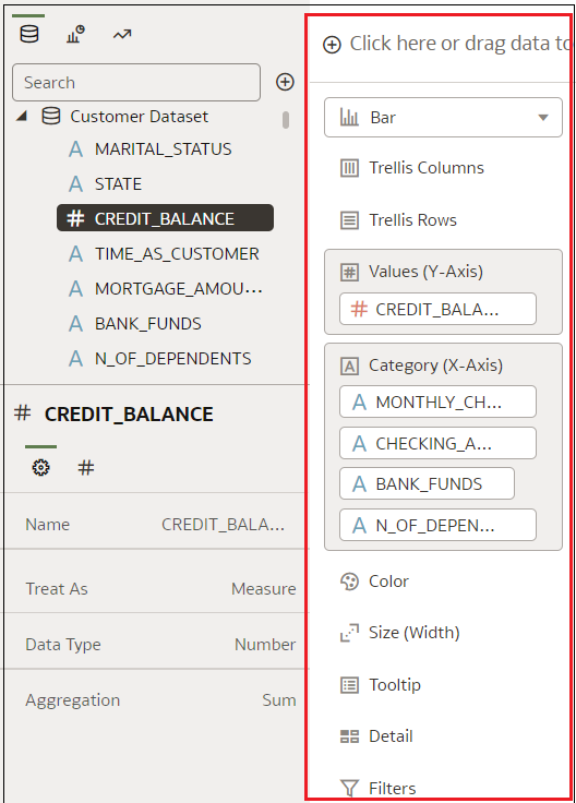
You can select compatible data elements from the datasets and drop them onto the Grammar Panel in the Visualize canvas. Based on your selections, visualizations are created on the canvas. The Grammar Panel contains sections such as Columns, Rows, Values, and Category.
- On the Home page, hover over a workbook, click Actions, then select Open.
- If you created a workbook, then add a dataset to it.
- Select the data you want to visualize by selecting one or more data elements on the Data Panel and then using one of the following methods:
- Right-click, and click Add to Selected Visualization.
- Right-click, select Pick Visualization, and select a visualization type (for example, a table or heat map).
- Drag and drop them onto the visualization canvas or the Grammar Panel.
- Right-click, and click Add to Selected Visualization.
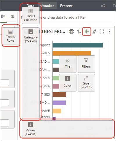
- To help you understand the components of a visualization, hover over it and click Show Assignments to annotate the visualization components, for example, the X-Axis and Y-Axis of a chart.
- Use the Grammar Panel to configure visualization components (for example, add, remove, re-order).
- If a dataset is augmented with knowledge enrichments, you'll see knowledge enrichments in the element tree displayed just like regular data elements in the dataset. In this example, the Oracle Analytics administrator has added Population and other city-related data to Oracle Analytics. When you create a workbook based on the CITY dataset, you can add population and other data elements directly to your visualization.
Create a Visualization from Another Visualization
You can create a visualization by dragging and dropping columns from one visualization to a new visualization.
Using this method helps you to model a new visualization based on an existing one by selecting columns directly from the existing visualization.
- On the Home page, hover over a workbook, click Actions, then select Open.
- Click Edit to enter the workbook in author mode.
- Select the visualization you want to use as the source for creating a visualization.
- Click Grammar at the top of the Grammar Panel to display the Grammar pane.
- Drag and drop a column in the Grammar pane to the edge between visualizations to create a visualization on the canvas.
- Select the source visualization and drag and drop more columns to the new visualization.
Choose the Tooltips to Display in a Visualization
When you hover over a data point in a visualization, a tooltip displays and provides specific information about the data point. You can choose to see all tooltips or only the measures included in the Tooltip section of the Grammar Panel.
- You can drag and drop only measure columns to the Tooltip section in the Grammar Panel.
- The Tooltip section in the Grammar Panel doesn't display for all visualization types.
Customize Visualization Tooltips
You can customize a visualization's tooltip to change the format of column names and column values, and you can add and format additional columns, parameters, and text to display to users.
- On the Home page, hover over a workbook, click Actions, then select Open.
- Click Edit and select a visualization on the canvas.
- Click Properties.
- Go to the Tooltip field.
- Click All Data and select Custom to customize a tooltip.
- Click Custom or the pencil icon
 to update a customized tooltip.
- Customize the tooltip text, formatting, data, or parameters.
- Optional: Click Preview to see what your updates look like.
- Click OK.
Using Knowledge Enrichments in the Workbook Editor
Knowledge enrichments enable you to augment the data in your visualizations with data from other sources. For example, if you have a list of cities, knowledge enrichments might provide information about population number, size of city, location.
Take advantage of System Knowledge and Custom Knowledge updates in Oracle Analytics directly in the workbook editor to create data-rich visualizations.
In the workbook editor Data Panel, you'll see knowledge enrichments in the element tree displayed just like regular data elements in the dataset. In this example, workbook editors can add the knowledge enrichments "Population" and other city-related data to a workbook. When you create a workbook based on the dataset that contains CITY, you can add population and other data elements directly to your visualization.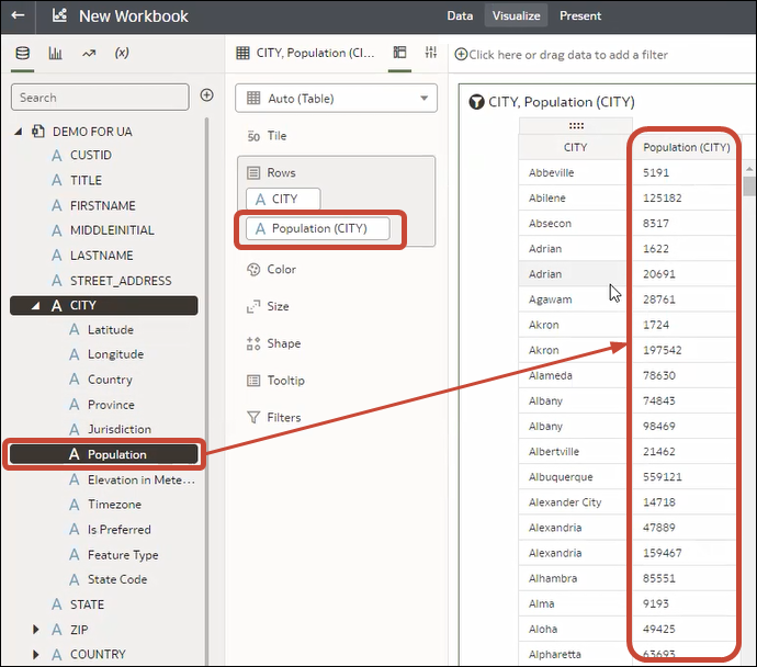
Description of the illustration add-custom-enrichments-data-panel.png
Knowledge Enrichments are usually enabled by default, but if you own a dataset or have editing privileges for it, you can enable or disable them. See Enable Knowledge Enrichments in the Workbook Editor.
