Using Accessibility Features Within the Oracle Financial Services Communication Cloud Services
This section discusses accessibility features within the Oracle Financial Services Communication Cloud Service.
Navigation While Editing
Oracle Financial Services Communication Cloud Service provides the following keyboard interactions to navigate within the application.
Global Navigation Bar
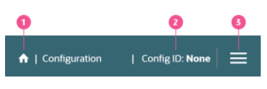
Figure 10-3 Global Navigation Bar
| Sr.No | Target | Key/Action |
|---|---|---|
| 1 | Home Icon | Tap Tab to focus on the Home icon. Tap Enter to navigate to the Dashboard page |
| 2 | Config ID | Tap Tab to focus on Config ID. Tap Enter to open the Config ID Quick Access panel. |
| 3 | Menu | Tap Tab to focus on the Hamburger menu icon. Tap Enter to open the main navigation menu. |
Jump Menu
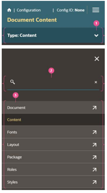
Figure 10-4 Jump Menu
| Sr.No | Target | Key/Action |
|---|---|---|
| 1 | Jump menu | Tap Tab to focus on the dropdown text. Tap down arrow key DownArrow to open the options list. |
| 2 | Search bar | Tap Tab to focus on the search textbox. Type a keyword and then Tab to search from the set of available options. |
| 3 | Option list | Tap Tab to focus on the first option list item. Tap DownArrow to move to the next option or UpArrow to move to the previous option. Tap Enter to select the option. |
More Menu
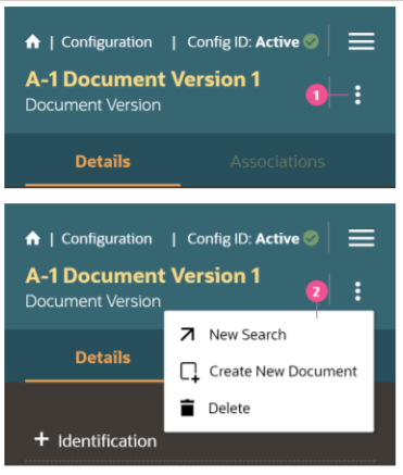
Figure 10-5 More Menu
| Sr.No | Target | Key/Action |
|---|---|---|
| 1 | More menu icon | Tap Tab to focus on the More menu icon. Tap DownArrow arrow key to open the dropdown options list |
| 2 | Option list | Tap DownArrow to move to the next option. Tap Enter to select the option. |
Search Bar
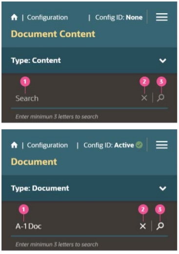
Figure 10-6 Search Bar
| Sr.No | Target | Key/Action |
|---|---|---|
| 1 | Search bar | Tap Tab to focus on the textbox. Enter the search text. The clear (x) and search (magnifying glass) icons are enabled after typing 3 or more letters. |
| 2 | Clear icon | When the clear icon (x) is disabled there is no focus. When clear icon is enabled Tap Tab to focus on the clear icon. Tap Enter to clear the text |
| 3 | Search icon | When the search icon (magnifying glass) is disabled there is no focus. When search icon is enabled Tap Tab to focus on the search icon. Tap Enter to initiate the text search. |
Chip
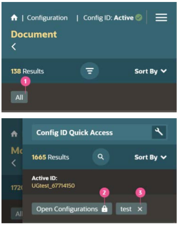
Figure 10-7 Chip
| Sr.No | Target | Key/Action |
|---|---|---|
| 1 | Chips with no icon | Chips with no icon are not actionable and will not have focus. |
| 2 | Chips with a lock icon | Chips with a lock icon are not actionable and will not have focus |
| 3 | Chips with a clear (x) icon | Chips with the clear icon (x) are actionable. Tap Tab to focus on the icon. Tap Enter to clear this chip filter from the search criteria. |
List with Snapshot and More menu
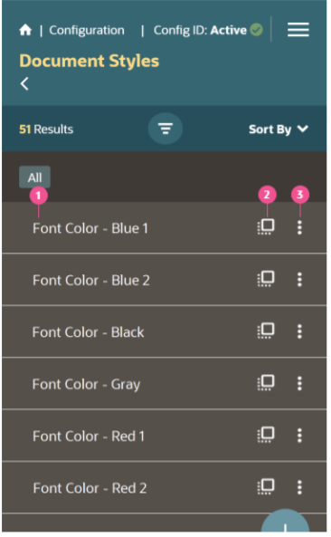
Figure 10-8 List with Snapshot and More menu
| Sr.No | Target | Key/Action |
|---|---|---|
| 1 | List items | Tap Tab to focus on the list item. Tap DownArrow to move to the next list item or UpArrow to move to the previous list item. |
| 2 | Snapshot icon | Tap F2 to access the Snapshot icon. Tap Enter to open the snapshot dialog. |
| 3 | More menu | Tap Tab to focus on the More menu. Tap DownArrow to open the options list for the More menu. Tap DownArrow to move to the next menu option or UpArrow to move to the previous menu option. Tap Enter to select the menu option. Tap Esc to navigate back to the list item / parent list |
List with Expand/Collapse, Snapshot and More menu
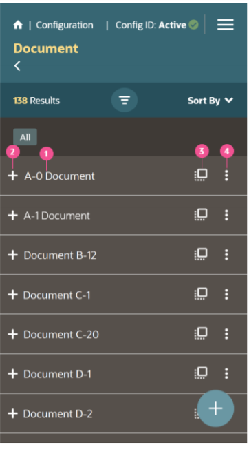
Figure 10-9 List with Expand/Collapse, Snapshot and More menu
| Sr.No | Target | Key/Action |
|---|---|---|
| 1 | List items | Tap Tab to focus on the list item. Tap DownArrow to move to the next list item or UpArrow to move to the previous list item. |
| 2 | Expand/ Collapse icon | Tap F2 to access the plus icon. Then Tap Enter to navigate to next screen. |
| 3 | Snapshot icon | Tap F2 to access the Snapshot icon. Tap Enter to open the snapshot dialog. |
| 4 | More menu | Tap Tab to focus on the More menu. Tap DownArrow to open the options list for the More menu. Tap DownArrow to move to the next menu option or UpArrow to move to the previous menu option. Tap Enter to select the menu option. Tap Esc to navigate back to the list item / parent list |
List with Snapshot and Radio button
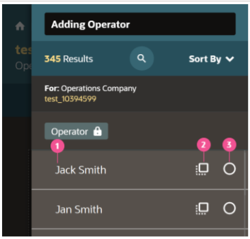
Figure 10-10 List with Snapshot and Radio button
| Sr.No | Target | Key/Action |
|---|---|---|
| 1 | List items | Tap Tab to focus on the list item. Tap DownArrow to move to the next list item or UpArrow to move to the previous list item. |
| 2 | Snapshot icon | Tap F2 to access the Snapshot icon. Tap Enter to open the snapshot dialog. |
| 3 | Radio button | Tap Tab to focus on the radio button. Tap Shift + Space to select the radio button. Tap Esc to navigate back to the list item / parent list |
List with Snapshot and Radio button
Figure 10-11 List with Snapshot and Radio button
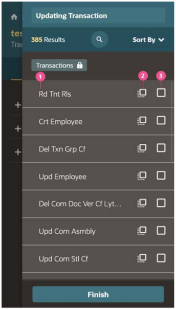
| Sr.No | Target | Key/Action |
|---|---|---|
| 1 | List items | Tap Tab to focus on the list item. Tap DownArrow to move to the next list item or UpArrow to move to the previous list item. |
| 2 | Snapshot icon | Tap F2 to access the Snapshot icon. Tap Enter to open the snapshot dialog. |
| 3 | Checkbox | Tap Tab to focus on the checkbox. Shift+Space to select the checkbox. Tap Esc to navigate back to the list item / parent list |
List with Radio button
Figure 10-12 List with Radio button
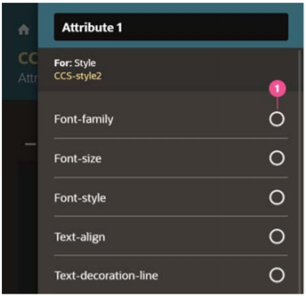
| Sr.No | Target | Key/Action |
|---|---|---|
| 1 | Radio button | Tap Tab to focus on the list item. Tap DownArrow or UpArrow to select one radio option. |
List with Checkbox
Figure 10-13 List with Checkbox
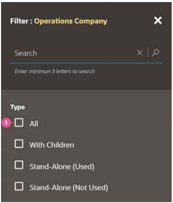
| Sr.No | Target | Key/Action |
|---|---|---|
| 1 | Checkbox | Tap Tab to set focus on the list item. Tap Tab to navigate to the next list or Shift+Tab to navigate to the previous list item. Tap Space to select the checkbox option. |
Hierarchy with a List view and Tree view
Figure 10-14 Hierarchy with a List view and Tree view
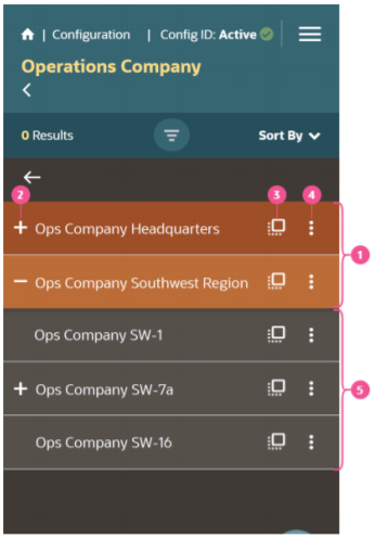
| Sr.No | Target | Key/Action |
|---|---|---|
| Rows with an orange background are in a ‘list view’. Rows with a gray background (below the list section) are in a ‘tree view'. | ||
| 1 | List items | Tap Tab to focus on the list item. Tap DownArrow to move to the next list item or UpArrow to move to the previous list item. |
| 2 | Expand/ Collapse row | To expand or collapse a row, Tap F2 to access the plus icon (+). Then Tap Enter to expand/collapse the selected item's hierarchy. |
| 3 | Snapshot icon | Tap F2 to access the Snapshot icon. Tap Enter to open the snapshot dialog. |
| 4 | More menu | Tap Tab to focus on the More menu. Tap DownArrow to open the options list for the More menu. Tap DownArrow to move to the next menu option or UpArrow to move to the previous menu option. Tap Enter to select the menu option. |
| 5 | Tree view | Tap Tab to focus on the list item. Tap RightArrow to expand the tree view. Tap Tab to navigation to the Snapshot icon and More menu. Tap Esc to navigate back to the list item / parent list |
Cards - Associations
Figure 10-15 Cards - Associations
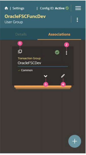
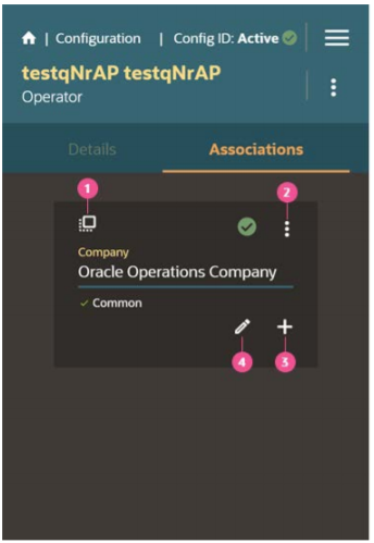
Figure 10-16 Cards - Associations
| Sr.No | Target | Key/Action |
|---|---|---|
| 1 | Snapshot | Tap F2 to access the Snapshot icon. Tap Enter to open the snapshot dialog |
| 2 | More menu | Tap Tab to focus on the More menu. Tap DownArrow to open the options list for the More menu. Tap DownArrow to move to the next menu option or UpArrow to move to the previous menu option. Tap Enter to select the menu option. |
| 3 | Add | Tap Tab to access the Add icon (+). Then Tap Enter to open the manage associations dialog. |
| 4 | Edit | Tap Tab to access the Edit icon (pencil). Then Tap Enter to open the capture info dialog. |
| 5 | Expand/ Collapse icon | Tap Tab to access the Expand/Collapse icon (chevron), Tap Tab. Then Tap Enter to expand the card stack. |
Tab Bar
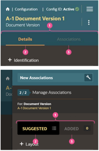
Figure 10-17 Tab Bar
| Sr.No | Target | Key/Action |
|---|---|---|
| 1 | Tab bar | Tap the Tab key to focus on the active tab. |
| 2 | Active Tab | Tap RightArrow arrow to move the focus to inactive tab. |
| 3 | Inactive Tab | Tap Enter to activate the tab. |
Menu Element
Table 10-2 Menu Item
| Key | Action |
|---|---|
| Enter or Space | Invoke the focused menu item's action. |
| UpArrow | Move focus to the previous menu item, wrapping around at the top. |
| DownArrow | Move focus to the next menu item, wrapping around at the bottom. |
| Home | Move focus to the first menu item. |
| End | Move focus to the last menu item. |
| Shift + F10 | Open the context menu. |
Table 10-3 Menu Item in Top-level Menu
| Key | Action |
|---|---|
| Esc | Close the menu and move focus to the launcher. |
List View element
Table 10-4 Menu Item
| Key(s) | Action |
|---|---|
| F2 | Enters Actionable mode. This enables keyboard action on elements inside the item, including navigate between focusable elements inside the item. |
| Esc | Exits Actionable mode |
| Tab | When in Actionable Mode, navigates to next focusable element within the item. If the last focusable element is reached, shift focus back to the first focusable element. When not in Actionable Mode, navigates to next focusable element on page (outside ListView). |
| Shift+Tab | When in Actionable Mode, navigates to previous focusable element within the item. If the first focusable element is reached, shift focus back to the last focusable element. When not in Actionable Mode, navigates to previous focusable element on page (outside ListView). |
| DownArrow | Move focus to the item below. |
| UpArrow | Move focus to the item above. |
| LeftArrow | When display in card layout, move focus to the item on the left |
| RightArrow | When display in card layout, move focus to the item on the right. |
| Shift+DownArrow | Extend the selection to the item below |
| Shift+UpArrow | Extend the selection to the item above. |
| Shift+LeftArrow | When display in card layout, extend the selection to the item on the left. |
| Shift+RightArrow | When display in card layout, extend the selection to the item on the right. |
| Shift+F10 | Launch the context menu if there is one associated with the current item. |
| Enter | Selects the current item. No op if the item is already selected. |
| Space | Toggles to select and deselect the current item. If previous items have been selected, deselects them and selects the current item. |
| Shift+Space | Selects contiguous items from the last selected item to the current item. |
| Ctrl+Space | Toggles to select and deselect the current item while maintaining previous selected items. |
| Ctrl+X | Marks the selected items to move if reorder is enabled. |
| Ctrl+C | Marks the selected items to copy if reorder is enabled. |
| Ctrl+V | Paste the items that are marked to directly before the current item (or as the last item if the current item is a folder). |
Table 10-5 Group Item
| Key(s) | Action |
|---|---|
| LeftArrow | Collapse the current item if it is expanded and is collapsible. For non-hierarchical data, do nothing |
| RightArrow | Expand the current item if it has children and is expandable. For non-hierarchical data, do nothing. |
Tab Bar element
Table 10-6 List Item
| Key(s) | Action |
|---|---|
| Enter or Space | Selects list item. |
| UpArrow | Moves focus to the previous visible list item. |
| DownArrow | Moves focus to the next visible list item |
| RightArrow (LeftArrow in RTL) | For horizontal tab bar, focus will be moved to next visible item. |
| LeftArrow (RightArrow in RTL) | For horizontal tab bar, focus will be moved to previous visible item. |
| Home | Moves focus to the first visible list item. |
| End | Moves focus to the last visible list item. |
| F2 | If focus is on a list item, Taping F2 will make its contents accessible using TAB. |
| Esc | When F2 mode is enabled, Tap Esc to exit F2 mode |
| Ctrl+X | Marks the current item to move if reorderable is enabled. |
| Ctrl+V | Paste the item that are marked to directly before the current item |
| DELETE | Delete the current item. |
| Enter or Space | Open menu. Refer menu button touch documentation. Note: This is applicable only for Horizontal Tab Bar when overflow is set to popup. |
Table 10-7 Overflow Menu button
| Key(s) | Action |
|---|---|
| Enter or Space | Collapse the current item if it is expanded and is collapsible. For non-hierarchical data, do nothing. |
You can access more details at Oracle JavaScript Extension Toolkit (JET) Keyboard and Touch Reference, which lists the keyboard and touch gestures for all Oracle JET components.