Using Communication Cloud Service to Create Accessible Documents
This section provides information on document design considerations (package, content, etc.) that may impact the accessibility of documents produced by the Oracle Financial Services Communication Cloud Service.
Document Accessibility Considerations
- People with low vision can view the screen with the help of technologies such as large screens, screen magnifiers, zoom text, optical enlargers, etc.
- For low vision or blind users, the document should be able to be read aloud by assistive technology such as a screen reader, which speaks content using a Text-To-Speech (TTS) engine.
- For users who are unable to use a mouse, including the screen reader users, the document should be able to be accessed by keyboard-only.
- For people with low or color vision deficiencies, the proper color contrast ratio should be maintained to make the document accessible.
Alternative Text
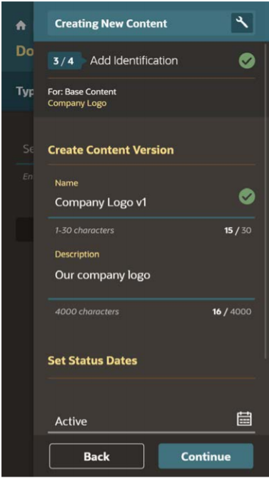
Screen readers may read alternative text, if present, to provide information about non-text content such as graphics. Communication Cloud Service enables users to specify alternate text on objects such as graphics. This alternate text is then embedded in the HTML output.
Alternative text attributes are automatically applied to graphics using the graphic Description supplied by the user during configuration.
Figure 12-1 Alternative Text

Color Contrast
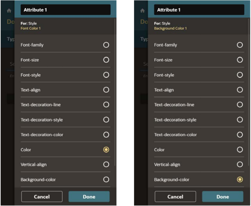
Color should not be used as the only way to convey meaning. For example, users with color vision deficiencies may not able to distinguish warning text that is in red from non-warning text that is not red. The best option is to use meaningful text along with color. In a warning text, for example, the word Warning could be included to identify warning text from non warning text. Also, there must be contrast between foreground and background colors to display the text correctly when rendered on a background with a different color.
- Font Color is the color of the text (letters).
- Background Color is the color of the space around the letters.
Black and White. Black and white creates the highest contrast possible.
Figure 12-2 Color Contrast

Embedded Font
Consider the fonts used to generate the output. Select clear, readable fonts in an appropriate size for readability.
When a font has high readability, embedding fonts ensures that all recipients will be able to display in the HTML as intended. Avoid embedding fonts with poor readability.
The Communication Cloud Service always embeds fonts in the HTML output.
Additional Tips for Accessibility
In addition to the configuration, settings presented herein there are also various layout and design considerations that can impact the accessibility of documents produced by Oracle Financial Services Communication Cloud Service.
- Do not use ASCII characters to render drawings or figures such as “:-)” or “-->” or a series of characters such as “---- -----------”. Screen Readers may read these without interpretation. So the user may hear “dash dash greater than” rather than the arrow (-->) that was intended.
- Ensure hyperlinks are underlined so that a user who can’t distinguish the color knows they are links.
- Avoid abbreviations and acronyms unless so common, they’re considered as part of the language. Define or explain an abbreviation on the first time you use it.
- Avoid making explicit reference to mnemonics.
- Descriptions for alternate text should be concise. The World Wide Web Consortium (W3C) recommends 100 or fewer characters for alternate text.
- It is a good idea to end the alternate text with a punctuation mark so that voice synthesizers pause for short time and therefore help comprehension.