7 My Spend
This topic provides the systematic instructions to user for viewing user's spending patterns.
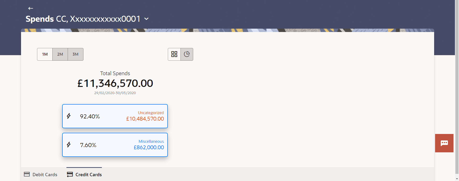
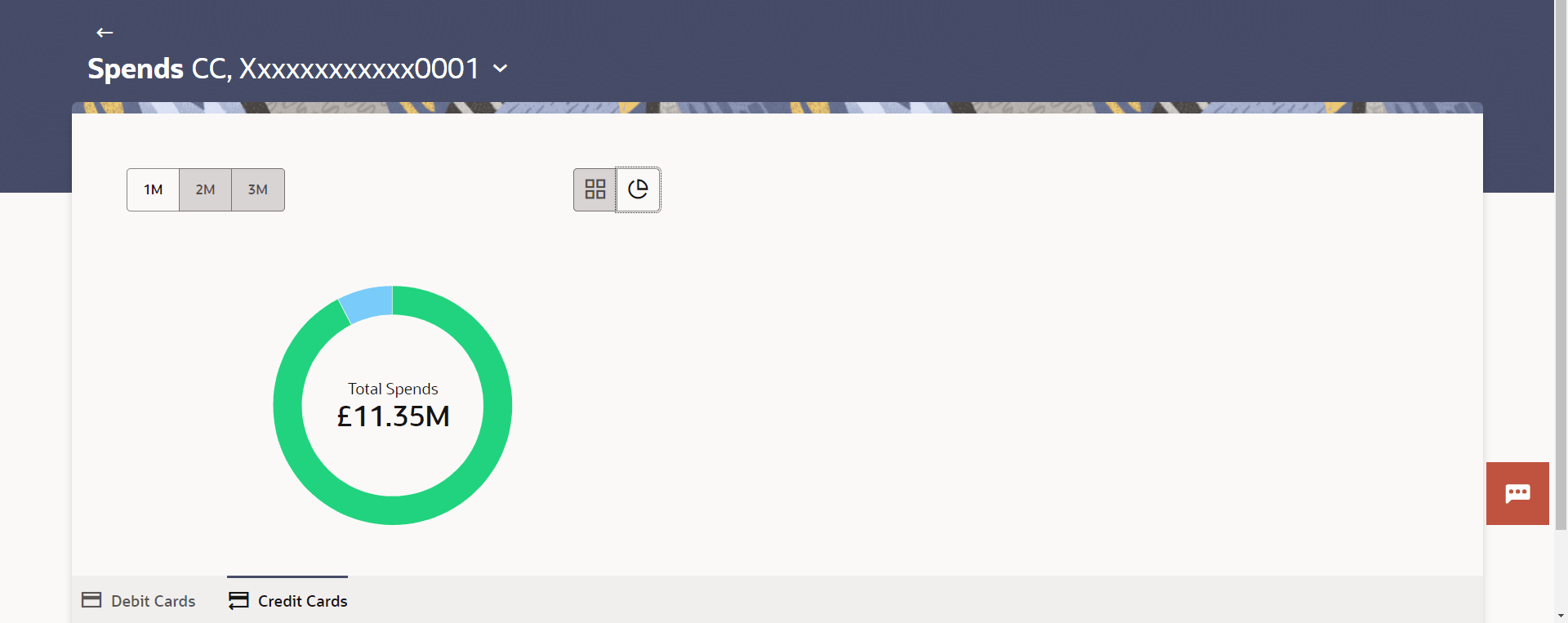
It displays a holistic view of the overall spends across 1,2, and 3months. It visualizes spending patterns through a donut chart, categorizing expenditures associated with the card.
It also highlights the category with the highest expenditure for that period. Users can
choose between ![]() (list) and
(list) and ![]() (graph) view options to examine their spending. In
(graph) view options to examine their spending. In ![]() (list) view, expenditures are displayed in a tabular format, while
(list) view, expenditures are displayed in a tabular format, while ![]() (graph) view presents the data as a donut chart. When hovering over the chart,
users can see detailed spend information for specific categories, including both the
percentage and the amount.
(graph) view presents the data as a donut chart. When hovering over the chart,
users can see detailed spend information for specific categories, including both the
percentage and the amount.
To view spends on the card:

