Exadata Fleet Aggregated Capacity
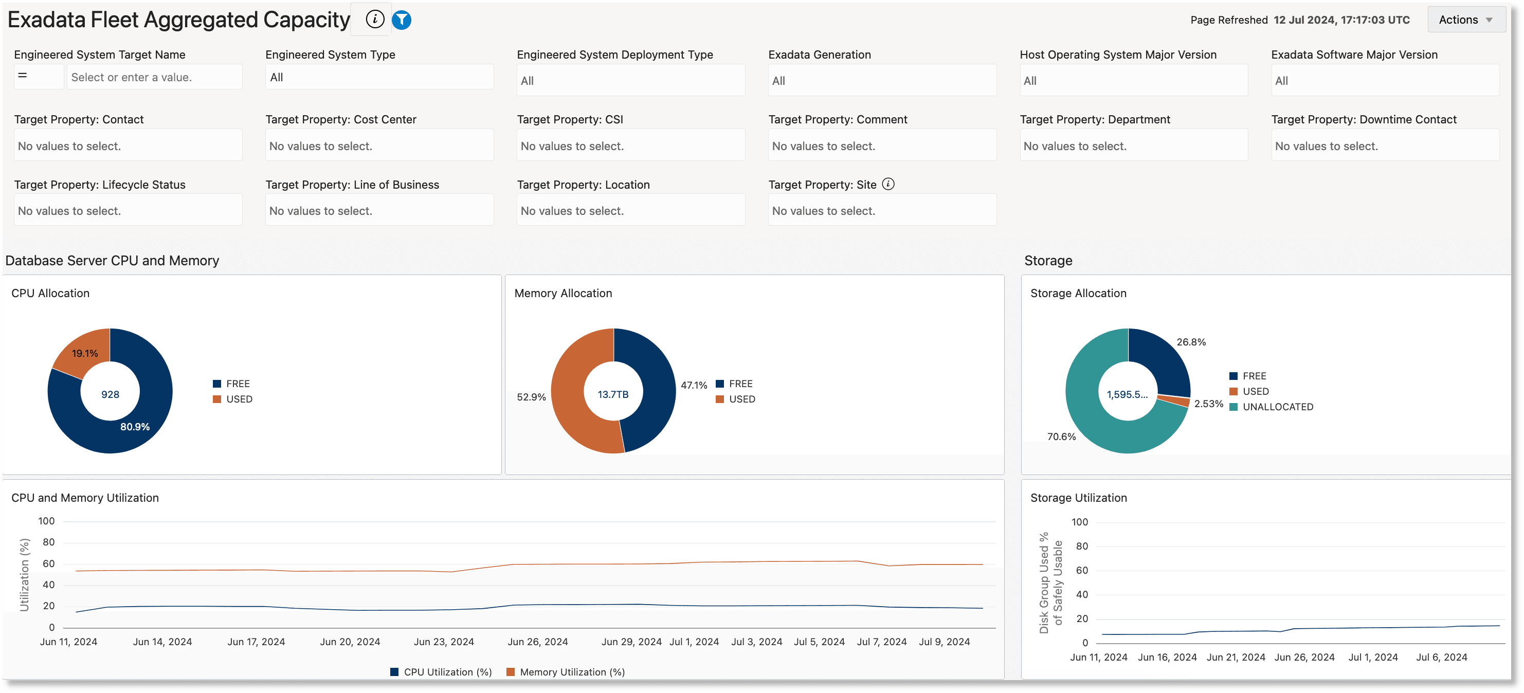
The Exadata Fleet Aggregated Capacity dashboard summarizes the capacity averaged over the last 31 days for the Exadata and Recovery Appliance fleet or filtered subset of the fleet. It provides a high-level summary of fleet resource usage indicating overall average utilization.
This dashboard is organized into two sections:
Database Server CPU and Memory, and Storage

The ring charts in these sections summarize the average CPU, memory and storage resource allocation across the Engineered System fleet over the last 31 days.
- CPU Allocation: Shows total, free and used CPU on the database servers
- Memory Allocation: Shows total, free, and used memory on the on the database servers
- Storage Allocation: Shows total, free and used storage space on the disk groups across all the ASM clusters
The line charts below the ring charts illustrate the utilization trend of these resources for the last 31 days, aggregated across all the Engineered Systems. Analyze these charts in conjunction with each other to understand the resource usage. For instance, if the ring charts show low storage utilization but the corresponding line chart shows peaks of high storage utilization over the last 31 days, it may warrant deeper investigation into whether storage has recently been cleaned up. Further insight as to which systems have contributed to the high usage could be obtained by going to the Exadata Fleet Capacity and Exadata Fleet Component Capacity dashboards. Conversely, if the ring charts show low storage utilization and the line charts also show low average storage utilization over the last 31 days, it may broadly indicate that this subset of Engineered Systems can accommodate more data storage.
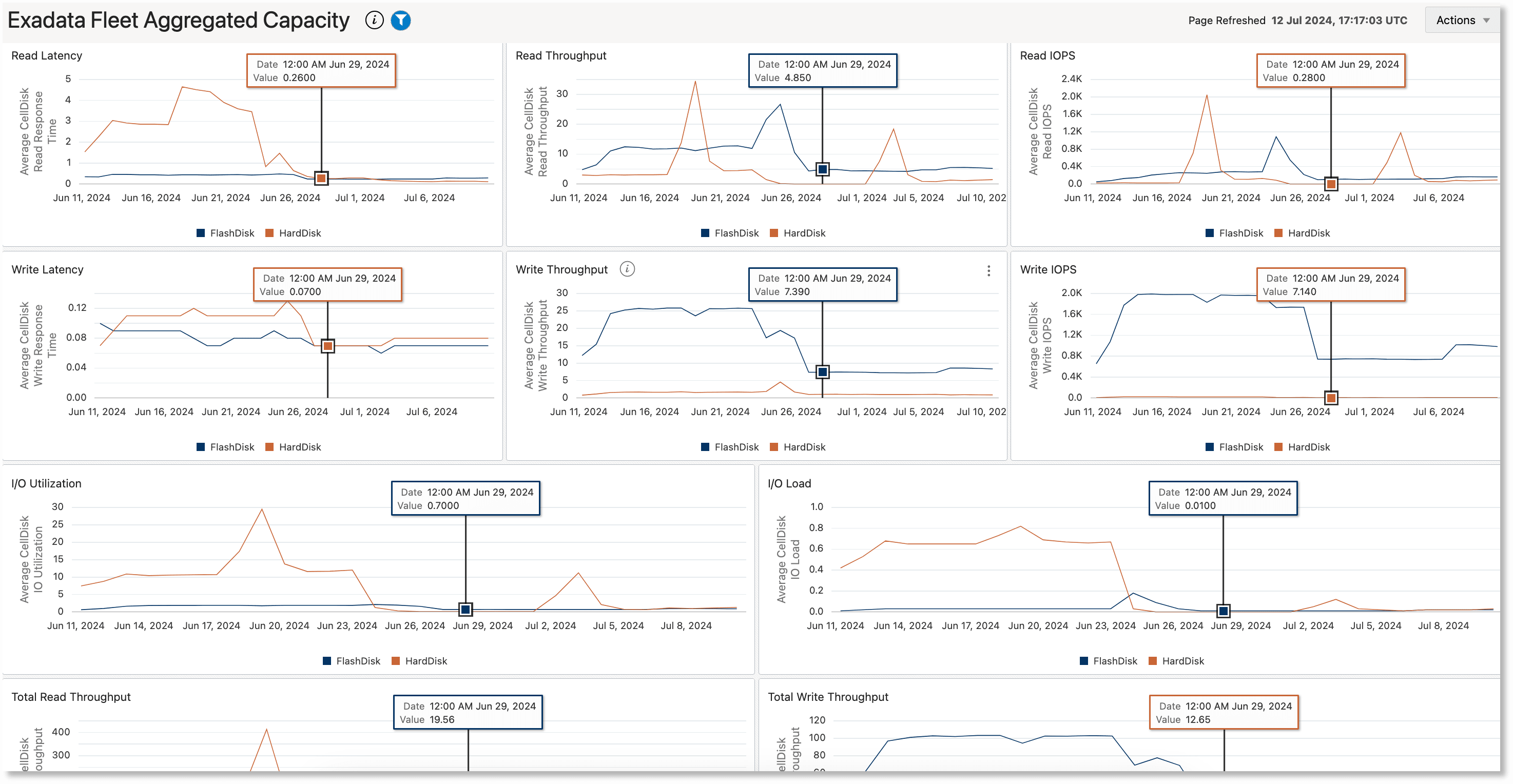
Storage Server I/O
This section consists of line charts that help in visually correlating key storage server performance indicator metrics like disk read/write latency, throughput and IOPS, I/O load, and I/O utilization. All the charts in this section have congruous timelines. The metric values on all the charts for a specific time can be viewed together by moving the cursor to a position on any of the charts. Correlating these metrics can be especially helpful in performance diagnostics; for example, to determine whether time periods with high latencies can be correlated to time periods of high I/O load.
