- Guide
- Using Oracle Spatial Studio
- Visualization in Oracle Spatial Studio
- Styling a Map Layer
- Applying a Render Style For a Point Layer
3.10.4.1 Applying a Render Style For a Point Layer
- Circle (default)
- Symbol
- Heatmap
- Cluster
The following steps enable you to apply your preferred render style option.
- Click
 against the map layer in the Layers tab of the Layers
List.
 - Select Settings in the context menu.
- Configure Style and select a Render Style option
from the drop-down list.By default, a point map layer always uses Circle to represent the data points.
Note:
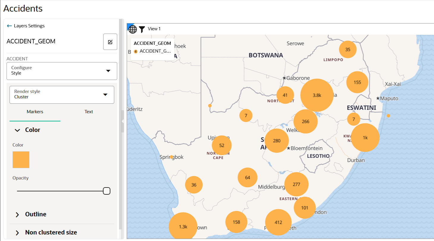
Each render style has its own settings.- If you select Cluster as the render style option,
the data points on your map are shown clustered depending on the cluster
circle size.
Optionally, you can change the color and the style of the text labels representing the number of points in each cluster.
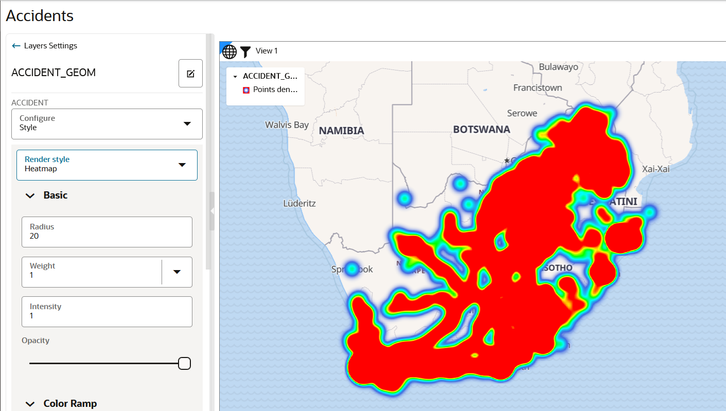
- If you select Heatmap as the render style option,
the data points on your map are rendered with continuous colors based on
the concentration of points as shown:
Note:
Hot colors represent concentration of points, and cool colors represent sparsity of points.Also, you can further customize the Heatmap visualization by changing the Radius or Weight (or both) in the Basic settings panel shown in the preceding figure. The following describes more about these parameters:
- Radius: This value defines (in pixel) how far each data point contributes to (influences) the heat of its surrounding area. Its contribution drops to zero for any area beyond this radius with the data point at the center.
- Weight: This value defines how much weight a data point contributes to the heat. The default value is set to 1 which means all data points contribute equally to the heat. If you select a numeric column (with zero or positive values) in the Weight drop down list, then that value determines the weight contributed by a data point to the heat calculation. For instance, if a data point’s weight column has a value of 5, then it is contributing to the heat as if there are five data points at that location (each with the default weight of 1). However, if the weight column contains a negative value, then note that the result is not predictable.
- Intensity: This value should always be 1.
Tip:
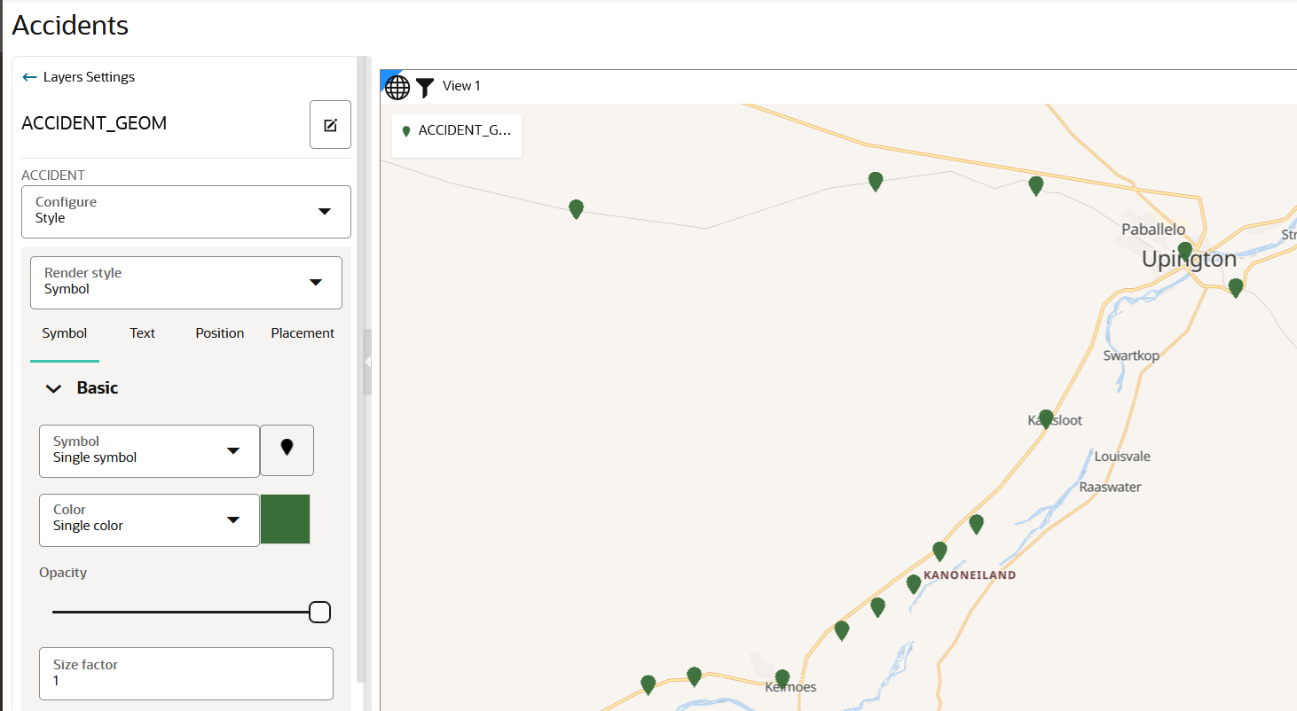
It is recommended that you reduce the default value of the Radius parameter to observe a more localized view of point concentrations. - If you select Symbol as the
render style option, the data points on your map are rendered with your
chosen symbol as shown:
Tip:
You can optionally select a color for your symbol.You can customize the symbol used to represent the data points by clicking the image button next to the Symbol drop-down list. Spatial Studio provides several built-in sets of symbols and also supports custom map symbols (icons).
The map layer gets rendered with the appropriate style. - If you select Cluster as the render style option,
the data points on your map are shown clustered depending on the cluster
circle size.
Parent topic: Styling a Map Layer


