The Properties Pane
The Page Designer's Properties pane displays the properties of a component that is currently selected on the canvas or in Code view and can be used to set metadata attributes such as ID, display name, and description. It also provides various properties to customize a component's layout, style, and behavior.
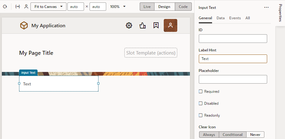
Component properties are organized in tabs in the Properties pane and can vary depending on the component. For example, here's the Properties pane of an input text component, showing the General, Data, Events, and All tabs; some components such as a table or list view collection component have an additional Quick Starts tab: 
Description of the illustration component-properties-pane.png
| Properties Tab | Description |
|---|---|
| General |
Contains the most important properties of the selected component, such as layout and style. The slot value of a component inside a parent component's slot also shows here. Select the sub-component added to a slot (for example, a button's icon) and change its slot value to move it from the startIcon slot to the endIcon slot. This way, you can modify the slots of dropped components without accessing the HTML code. The slot used by the sub-component is also visible in the sub-component's All tab and can be modified there (for example, to bind it to a variable). |
| Data |
Contains properties that are expected to be bound to data. The General tab and All tab also contain properties that can be bound to variables and expressions. |
| Events |
Used to bind a component’s events to trigger action chains that define its behavior (for example, to open a URL when a button is clicked). See Start an Action Chain From a Component. |
| All |
Contains more advanced component properties and shows all properties, including custom properties. Custom properties are those not defined in component metadata, for example, data-* attributes, and can be added by clicking + next to General Attributes. |
| Quick Starts |
Contains a list of Quick Start wizards available for the component. When you add a collection component such as a table or list, this tab contains a list of wizards to help you add some actions that are typically associated with the component, such as mapping the collection to data and adding Create and Detail pages. |
You can toggle Properties to hide or show the Properties pane.
Variables Picker
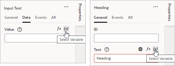
When working with a component's properties, you can bind a variable to the component, populating it with the data stored in the variable. For example, you might bind an Input Text component to a particular field from a REST endpoint, or bind a Heading component to a variable. To do this, you use the Variables picker, which you access by clicking the ![]() icon that appears when you hover over a property.
icon that appears when you hover over a property.
Here's an example of how you can bind a component to a variable:
Expression Editor
Some properties accept expressions that resolve to a single value at runtime. An expression is a string enclosed in [[...]], indicating that it should be evaluated. It can include variables, operators, functions, system properties, and the like.
To easily define expressions, use the Expression editor, which you access by clicking the ![]() icon that appears when you hover over a property that supports expressions.
icon that appears when you hover over a property that supports expressions.
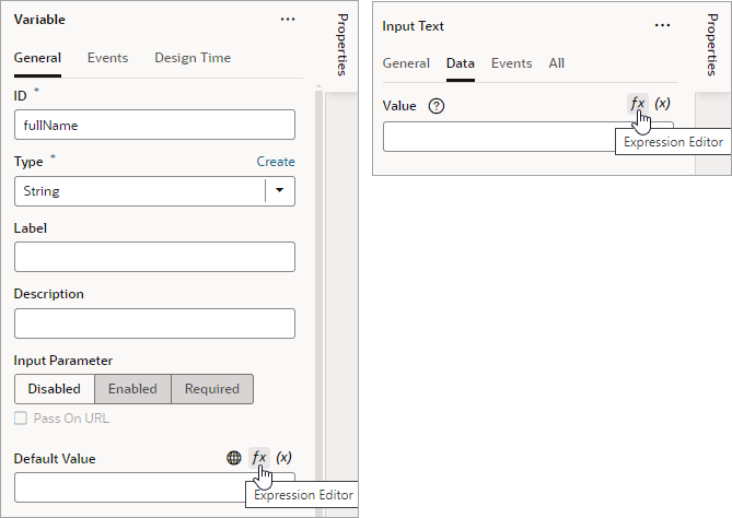
While expressions can be defined for a variety of tasks, they are commonly used to set the default value on a variable (shown here on the left) or to bind a UI control to its data (shown on the right): 
Description of the illustration props-visapp-expressioneditor.png
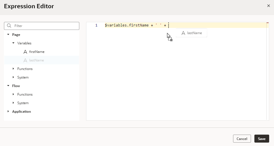
For example, here's how you can define an expression to display a user's full name in an Input Text component, based on the firstName and lastName variables:
members with a field count and you need to display a message when there are more than 10 members. In JavaScript, you might code it like this: members.count > 10 ? 'too many members (current value=' + members.count + ' while max value is 10)' : 'within reason'<oj-bind-text value="[[ $variables.members.count > 10 ? 'too many members (current value=' + $variables.members.count + ' while max value is 10)' : 'within reason' ]]"></oj-bind-text>| Use Case | JavaScript Expression | Expression in Visual Builder |
|---|---|---|
To concatenate the firstName and lastName variables:
|
firstName + ' ' + lastName |
$page.variables.firstName + ' ' + $page.variables.lastName |
To check whether employee and job are not null or undefined, before trying to access jobTitle:
|
employee?.job?.jobTitle |
$variables.employee?.job?.jobTitle |
To calculate the total price of a row based on its price and quantity:
|
row.price * row.quantity |
$current.row.price * $current.row.quantity |
For help with standard expression syntax, see Expressions and Operators. For details on how to write efficient expressions when a referenced field might not be available or the field's value could be null, see How Do I Write Expressions If a Referenced Field Might Not Be Available Or Its Value Could Be Null?

