Adding Data Elements to Drop Targets

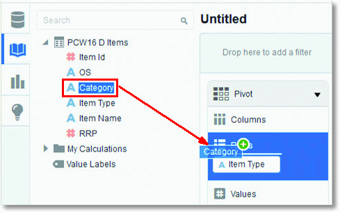
After you select the data sources for your project, you can begin to add data elements such as measures and attributes to visualizations.
Description of GUID-423B1D42-AB5E-4DB0-B9F3-23ADEE5B7CCB-default.gif follows
Description of the illustration GUID-423B1D42-AB5E-4DB0-B9F3-23ADEE5B7CCB-default.gif

Note:

To toggle the Explore pane on or off, click the Explore button on the project toolbar.

Here are some of the ways you can add data elements to drop targets:

  • You can drag and drop one or more data elements from the Data Elements pane to drop targets in the Explore pane or double-click data elements in the Data Elements pane to add them.

    The data elements are automatically positioned in the best drop target in the Explore pane, and the visualization type may also change to optimize the visualization layout.

    Description of GUID-B8056354-F36F-4DDC-9E09-B98B2660BBA2-default.gif follows
    Description of the illustration GUID-B8056354-F36F-4DDC-9E09-B98B2660BBA2-default.gif

    Note:

    You can press the Ctrl key to select multiple data elements at a time.
  • You can replace a data element in the Explore pane by dragging it from the Data Elements pane and dropping it over an existing data element already in the Explore pane.
  • You can swap data elements in the Explore pane by dragging a data element already inside the pane and dropping it over another data element in the pane.
  • You can remove a data element from the Explore pane by clicking the X in the data element token.

Note:

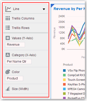
If you add an attribute to the Color drop target, you only see discrete colors displayed in the canvas, whereas if you add a measure to that drop target, it only displays shades of a single color. When you perform these same actions on a Pivot visualization, the result is a heat map. For more information, see Working With Color.

Note:

If you add multiple measures to the Values drop target, most of the visualizations display in a discrete color for each measure.