7 Creating and Using Business Views
This chapter describes how to create and format different types of Oracle Business Activity Monitoring (Oracle BAM) views, which display data fetched by business queries and key performance indicators (KPIs).
This chapter includes the following sections:
Understanding Business Views
A business view or view is a visual representation of data fetched by a business query or one or more KPIs.
In most views, numeric data fields, called measures, are grouped by non-numeric data fields, called dimensions. For example, sales, a measure, can be grouped by country, a dimension. An aggregation is a computation based on multiple values in a data field, such as a sum or average.
Note:
The underlying query determines the order in which a view displays multiple measures or dimensions. See Creating Business Queries for more information.
Table 7-1 lists view categories and view types within each category.
Oracle BAM uses various view types based on Oracle Application Development Framework’s Data Visualization Tools (DVT). They are:
-
Graph Views
-
Chart Views
-
Table Views
-
Gauge Views
-
Geo Map View
-
Treemap View
-
KPI Watchlist View
Area Chart, Bar Chart, Horizontal Bar Chart, Line Chart, Pie Chart, Combo Chart, Scatter Chart, and Bubble Chart views are collectively called chart views. There are corresponding graph view variations of each of these views.
Some graph views are switchable. They can be changed to a compatible type. Provided that queries are compatible, some views are switchable with each other. These are Area, Bar, Horizontal Bar, Line, Pie, and Combo views. Gauge views are switchable within the category.
You can format views in many ways, changing colors, fonts, labels, thresholds, and other properties. See Formatting Business Views for more information.
You can configure view characteristics that can be changed dynamically at runtime. You can configure how users can display more detailed data, which is called drilling. You can configure actions that the end user can perform on the view. You can also configure active data, which changes the query on which the view is based to a continuous query. See Runtime Interactions with Business Views for more information.
Table 7-1 Business View Categories and Types
| Icon | Category | Business View Types | Business Query Requirements | Recommended If |
|---|---|---|---|---|
|
|
Area |
Area Stacked Area Area Chart |
Group SQL Query |
The X-axis is a single consecutive dimension, such as a datetime field, and the data lines are unlikely to cross. |
|
|
Bar |
Bar Dual-Y Bar Stacked Bar Dual-Y Stacked Bar Bar Chart |
Group SQL Query |
The horizontal axis displays multiple or non-consecutive dimensions. |
|
|
Horizontal Bar |
Horizontal Bar Dual-Y Bar Stacked Bar Dual-Y Stacked Bar Horizontal Bar Chart |
Group SQL Query that does not use a time series |
The vertical axis displays multiple or non-consecutive dimensions. |
|
|
Line |
Line Dual-Y Line Stacked Line Dual-Y Stacked Line Line Chart |
Group SQL Query |
The X-axis is a single consecutive dimension, such as a datetime field, and the data lines are likely to cross. |
|
|
Pie |
Pie Multiple Pie Ring Multiple Ring Pie Chart |
Group SQL Query |
You are analyzing a single measure by a single dimension, or for a Multiple variation, several measures by the same dimension, and your data has no negative values. |
|
|
Combo |
Combo Graph Combo Chart |
Group SQL Query |
You are comparing very different measures. |
|
|
Table |
List Action List Collapsed List Pivot Table |
List and Action List: Flat SQL Query Collapsed List: Group SQL Query with one or more aggregation types, one or more measures, and one or more dimensions Pivot Table: Group SQL Query with one or more aggregation types, one or more measures, and two or more dimensions |
You want to display exact numbers instead of a graph, or to show data in tabular format. |
|
|
KPI Watchlist |
KPI Watchlist |
One or more Realtime or Scheduled KPIs |
You are interested in a set of related critical measures. |
|
|
Gauge |
Dial Dial with Thresholds Arrow Statusmeter Vertical Statusmeter Circular Status Meter Horizontal Status Meter |
Group SQL Query with no dimensions |
You are interested in the aggregated value of a single critical measure. |
| Geo Map |
Point Theme Color Theme GPS Theme |
Point Theme: Flat SQL Query with address and country code fields or latitude and longitude fields, and one measure GPS Theme: Flat SQL Query with latitude and longitude fields and one measure Color Theme: Flat SQL Query, one measure, see Table 7-6 for location fields |
Geography is especially important in analyzing a measure. |
|
|
|
Scatter |
Scatter Graph Scatter Chart |
Group SQL Query with at least two measures |
You are interested in the relationship between two measures. |
|
|
Bubble |
Bubble Graph Bubble Chart |
Group SQL Query with at least three measures |
You are interested in the relationship between three measures. |
|
|
Treemap |
Treemap |
Tree Model Query |
Dimensions are hierarchical, for example: country, state or province, and city. |
Business View Prerequisites and Uses
Business View prerequisites are tasks you must complete before you create a business view, to ensure its smooth functioning.
Before you can create a business view, you must do the following:
-
Add to your project the data object containing the data the view will display. For more information about projects, see Planning and Creating Projects. For more information about data objects, see Working with Data Objects.
-
If you are creating a KPI Watchlist type view, create one or more KPIs on which to base the view. For more information about KPIs, see Creating KPIs.
-
If you are creating any other view, create a business query on which to base the view. See the Business Query Requirements column in Table 7-1 for the type of query to create. See Creating Business Queries for more information about queries.
You cannot use a Continuous Query in any view. However, you can make data active in most views. See Using Active Data for more information.
After you create business views, you can use them in the following ways:
- In a dashboard
-
A dashboard contains a group of related business views. To display data to users, a view must be included in a dashboard. See Creating Dashboards for more information.
You can use a bottom-up approach and create views before creating a dashboard. Or you can use a top-down approach and create a dashboard before creating the views within it. See Creating a Dashboard and Adding Views and Choosing Bottom-Up or Top-Down Project Building Steps for more information.
- With a parameter
-
Business views do not interact with parameters directly. However, you can filter query data using a user-specified parameter value, which changes the data displayed in views that are included in a dashboard. See Creating Parameters for more information.
Views do not interact with Alerts. However, you can configure view-specific actions. See Using Actions in Business Views for more information.
If you are using Oracle JET visualizations to view business views, ensure that you use value formatting on Table business views for the values to reflect correctly as described in a data object. This is because the precision for decimal figures extends to only three decimal points. If you have more, you must use value formatting to render them as defined.
Creating Business Views
This section describes how to create and use each of the views in Oracle BAM.
This section contains the following topics:
Creating Chart and Graph Business Views
-
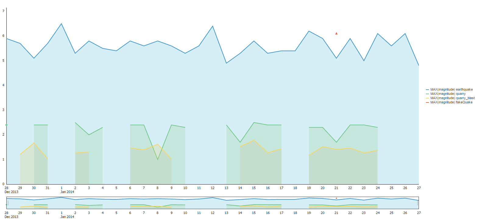
Sliding zoom wheel at the bottom of a Chart view. For bar, line, area, and combo charts, you can use the preview control located below the chart to narrow down the X-axis range and display data for the selected range.
-
Hide and show behavior: You can click legend buttons to hide or show selected groups or series from the chart.
-
“Intelligent” time axis layout: When the X-axis of a bar, line, area, or combo chart is based on time value, the DVT chart will make decisions on the spacing between neighboring groups.
For example, consider the time groups: 1st-January, 1st February, and 1st November. Because the time interval between 1st-January and 1st-February is much lesser than the time interval between 1st February and 1st November, the 1st and 2nd groups will be located much closer to each other than the 2nd and 3rd groups. Also, the number of group labels for time groups shown on the X-axis will vary based on the selected data range. For example, if you view chart data for entire range, the X-axis labels will show only the year. If you zoom in on a subset of the data, you will start to see months and days.
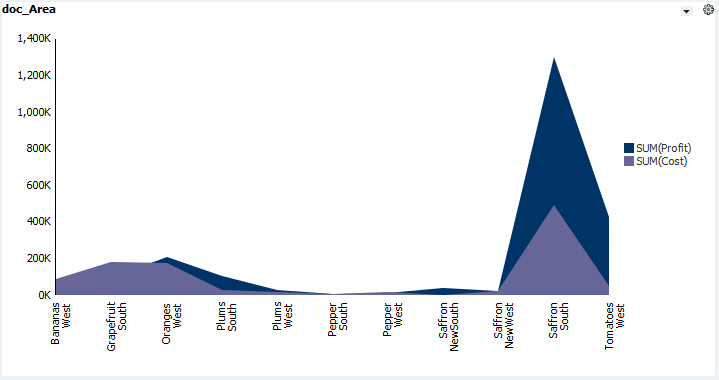
An Area view shows a graphed line of values with the area filled in for visual comparison.
In comparison with the graph view, here’s what the Chart view looks like:
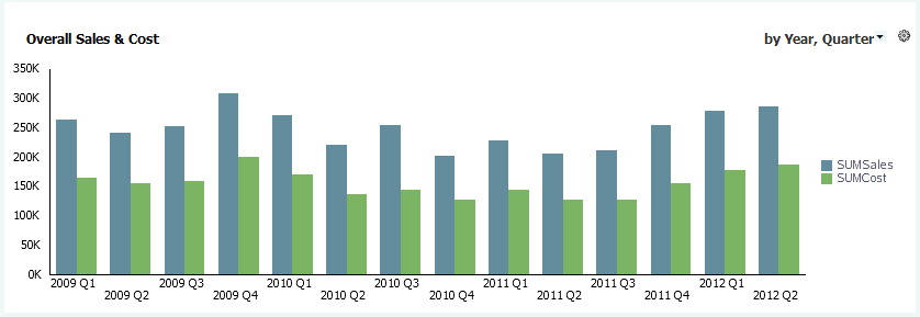
A Bar view shows vertical columns to represent summarized values.
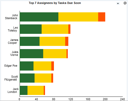
A Horizontal Bar view shows horizontal columns to represent summarized values.
In a Horizontal Bar chart, the X-axis is vertical and the Y-axis is horizontal, unlike the standard convention. This is necessary because you can switch from one graph view to another and retain the axis properties.
A Line view shows a graphed line of values or compared values.
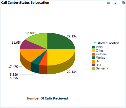
A Pie view displays values in segments of a circle.
If your data contains negative values, no pies are displayed.
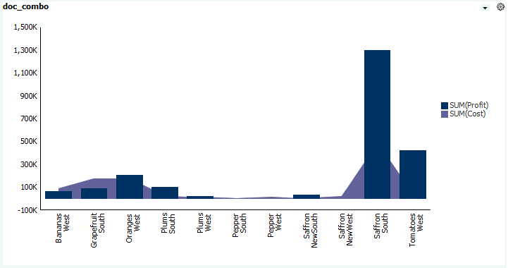
A Combo view shows a combination of values as areas, bars, and lines in the same view.
Note:
If the data is not continuous, or if the underlying query uses a Legend, using a Bar or Horizontal Bar graph is recommended. Null values in Area, Line, and Combo graphs can result in missing lines.
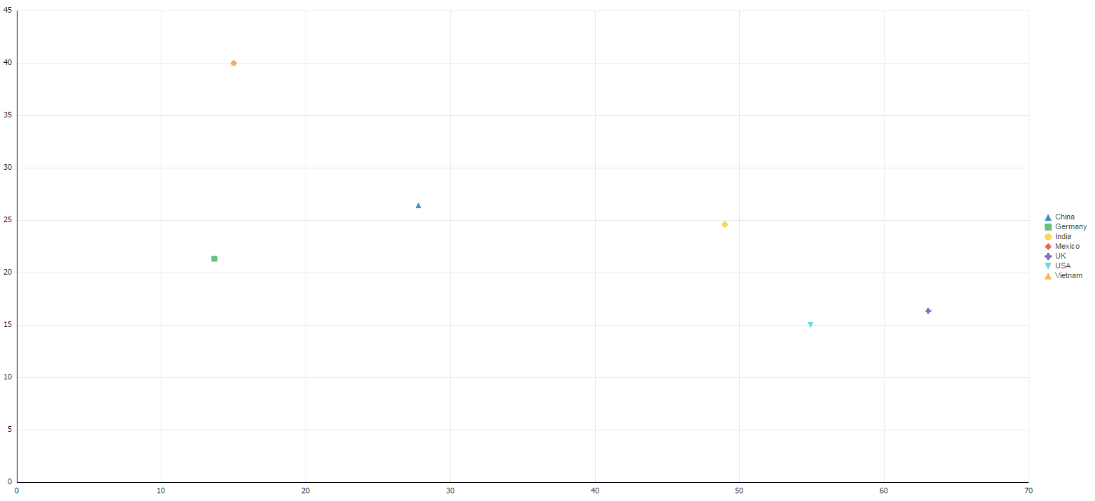
Scatter views are like Bubble views, except that X,Y coordinates appear as points that vary in shape and color, instead of bubbles. Except for the selection of a Bubble Size data field, the steps to create a Scatter view are the same as those to create a Bubble view.
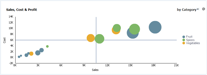
Here is an example of a Bubble Graph view.
If you use a Bubble Chart and the Bubble Size attribute is a negative value, the corresponding bubble is not displayed.
There are common variations among the view types:
-
A Dual-Y view has two Y-axes, one on the left and another on the right.
-
A Stacked view displays sets of values stacked in a single segmented column instead of side-by-side in separate columns. Figure 7-4 shows a stacked horizontal bar chart with segmented bars.
-
A Dual-Y Stacked view is a combination of Dual-Y and Stacked.
Note:
If a measure in an Area chart is hidden behind another measure, changing the order of measures in the underlying query or switching to a Stacked Area chart is recommended.
Note:
When using multiple measures, you can sort which columns should appear first. The order will change how business view legends, bar graph and chart grouping-orders, and stacked charts display.A view displays data from a Group SQL Query. See Creating a Group SQL Query for more information.
Although the views have differences when displayed, the steps to create any view are the same. In general, one graph view can be switched to any other. Note that Chart Switching does not apply to DVT-based chart views. Chart switching has some limitations:
-
Charts that use Active Data can only be switched to basic chart types, not variations such as Dual-Y or Stacked. See Using Active Data for more information.
-
Charts based on queries that use time series cannot be switched to any Horizontal Bar type. See Using a Time Group or a Time Series for more information.
-
If you switch to a Pie chart and your data contains negative values, no pies are displayed.
Creating a Business View: Steps
You can create views from the Designer page.
To create a view:
-
Go to the Designer page.
-
Click Business Views in the left panel navigator, or right-click Business Views and select the Create menu item.
The Business Views dialog opens.
-
Type a Name and optionally edit the Display Name.
The Name is case sensitive, must begin with a letter, and may consist only of letters, numbers, and the underscore character. It may have up to 128 characters. It cannot be changed after the view is created.
The Display Name is case sensitive and may contain any characters except the forward slash (
/), which indicates a folder path. It may have up to 128 characters. It can be changed at any time. -
Select a Category.
-
Select a thumbnail representing the desired view type.
-
Click Create.
A tab opens for the new view, with a visual preview using generic data.
-
Select a query from the Query drop-down list. Only Group SQL Queries are listed.
The preview changes to reflect the data fields fetched by the query.
-
To change the formatting of the view, click Properties. See these sections for details about formatting properties that apply to chart views:
To save the properties you have edited, click Apply.
-
To add runtime interactions to the view, click Runtime-Interaction. See these sections for details about runtime interactions that apply to chart views:
-
Click Save.
The preview changes to reflect changed property and runtime settings.
Note:
Views do not re-save properly after query is changed if view tab stays open while you make the query changes.Creating Table Business Views
This section provides information about creating Table views. It contains the following topics:
Understanding Table Business Views
A Table view displays data values in table format. The following Table view types are available in Oracle BAM:
A List displays a list you can sort. It displays data from a Flat SQL Query.
An Action List has values in one or more columns that are editable. It also displays insert, update, and delete operations on the data object without requiring a refresh. It displays data from a Flat SQL Query.
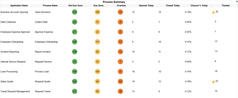
A Collapsed List displays rows of aggregated data values grouped by one or more dimensions. You can also apply color-coded thresholds for data values. It displays data from a Group SQL query with one or more aggregation types, one or more measures, and one or more dimensions.
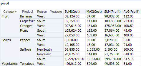
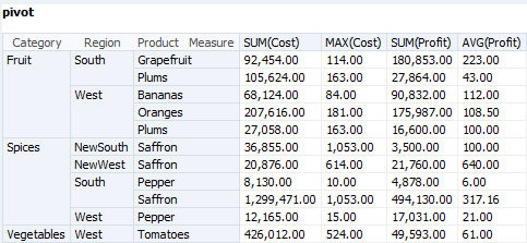
A Pivot Table combines rows and columns to display a multi-dimensional view of aggregated data values. A Pivot Table is summarized vertically and horizontally for columns and rows. It displays data from a Group SQL query with one or more aggregation types, one or more measures, and two or more dimensions.
*List views include all Table views except Pivot Tables, which are List, Action List, and Collapsed List. *List views share some features not common to Pivot Tables.
You cannot switch from one Table view type to another.
Note:
Table business views imported from previous Oracle BAM releases may have improper alignment, value and color formatting. To fix this, either manually update all previous business view properties, or simply click Save to allow them to retain the default formatting.See Creating a Flat SQL Query and Creating a Group SQL Query for more information.
Creating Table Business Views: Steps
The steps to create any Table view are similar. Differences between the view types are noted.
To create a Table view:
Adjusting Column Width in Table Business Views
If the values in a column are wider than the column width, you can change the width manually in the view by dragging the separator between the column headers.
The Resizing Layout property is enabled by default. This allows you to resize columns in a List, Action List, or Collapsed List while editing it.
Reordering Columns in Table Business Views
The Reordering Layout property is enabled by default. This allows you to rearrange the order of columns in a List, Action List, or Collapsed List while viewing it in the BAM Viewer (the Home page).
Sorting Data in Table Business Views
For a List, Action List, or Collapsed List, click on the column header of the field you want to sort. An up or down arrow appears next to the column header to indicate whether this field is sorted in ascending or descending order.
To configure Pivot Table sorting:
- From the view tab, click Properties.
- Click Data.
- For each data field in the Sorting table, select Ascending or Descending from the drop-down list.
- Click Apply.
Selecting Editable Fields in an Action List
Editable fields are what distinguish an Action List from a regular List.
To enable editing of data fields:
- From the view tab, click Properties.
- Click Editable Fields.
- Check the box for each desired field.
- Click Apply.
When you view the Action List in the BAM Viewer (the Home page), values in editable field columns appear in text boxes. You can edit each table cell as needed. To enable these edits to be saved, you must configure a Save action. See Using Actions in Business Views for more information.
Note:
Custom Actions are now supported in Action Lists and you may experience errors if they have not placed the jar files in a location which can be accessed by Oracle BAM.To Enable or Disable Pivot Table Features
A Pivot Table view has features not present in the other Table views.
To Pivot the View of Data
-
In the view tab, click and drag a heading from a column location to a row location.
The current row headings are highlighted to indicate to where the heading will be moved.
-
Release the mouse button to drop the heading in the new location.
The data displayed reflects the updated combination of row and column headings.
Figure 7-12 shows a pivot table before pivoting.
Figure 7-13 shows a pivot table after pivoting. The Region column has been moved between the Category and Product columns.
Creating KPI Watchlist Business Views
A KPI Watchlist displays the following information for one or more key performance indicators (KPIs):
-
KPI lists KPI names.
-
Risks lists the color-coded status of risk indicators associated with each KPI.
-
Actual shows the most recent KPI value.
-
Today shows a line graph of the last ten KPI values. Older KPI values are on the left and newer values are on the right.
-
Target shows a horizontal bar that compares the current KPI value to a target value.
See Creating KPIs for more information about how to create KPIs.
To create a KPI Watchlist view:
Creating Gauge Business Views
A gauge view displays a single value as a position on a dial or meter, or a number next to a color-coded shape.
The following gauge view types are available in Oracle BAM:
-
A Dial indicates the current value in a curved numeric marked gauge.
-
A Dial with Thresholds indicates the current value in a curved numeric marked gauge with color-coded low, medium, and high ranges.
-
An Arrow is an arrow shape that is color-coded according to whether the value is low, medium, or high. The direction of the arrow indicates whether the current value is higher (up), the same (right), or lower (down) than the previous value.
-
A Statusmeter indicates the current value in a horizontal numeric marked gauge with color-coded low, medium, and high ranges.
-
A Vertical Statusmeter indicates the current value in a vertical numeric marked gauge with color-coded low, medium, and high ranges.
-
A Circular Statusmeter Gauge indicates the current value in a circular gauge representing the numerical sum along a circular axis.
-
A Horizontal Statusmeter Gauge indicates the current value in a horizontal gauge representing the numerical sum along a horizontal axis.
By default, color codes for value ranges are green for low, yellow for medium, and red for high. See Gauge Thresholds Properties for more information.
A gauge view displays data from a Group SQL Query with no dimensions. See Creating a Group SQL Query for more information.
Although you can only use a KPI directly in a KPI Watchlist view, you can use the Group SQL Query on which a Scheduled KPI is based in a Gauge type view. Creating a Scheduled KPI.
Although Gauge views have differences when displayed, the steps to create them are the same, and any one can be switched to any other.
To create a Gauge view:
Creating Geo Map Business Views
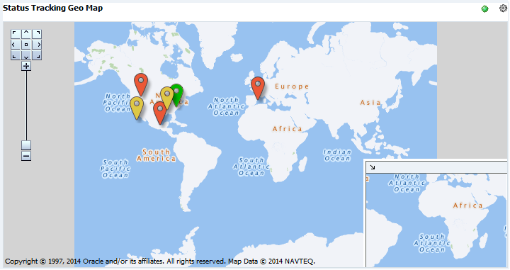
A Geo Map view displays values of a measure by location. The following Geo Map view types are available in Oracle BAM:
-
A Point Theme represents static locations as points on a map. It displays data from a Flat SQL Query that must include address and country code fields or latitude and longitude fields, and one measure.
-
A Color Theme represents geographic regions as colors on a map. It displays data from a Flat SQL Query that must include a location field and one measure.
-
A GPS Theme represents moving locations tracked by GPS as points on a map. It displays data from a Flat SQL Query that must include latitude and longitude fields and one measure.
Latitude and longitude values must be valid. Invalid values result in data points plotted at random locations.
You cannot switch from one Geo Map view type to another.
See Creating a Flat SQL Query for more information about flat queries.
To create a Geo Map view:
Creating Scatter and Bubble Business Views
Bubble views are like Scatter views, except that X,Y coordinates appear as bubbles that vary in size. Except for the selection of a Bubble Size data field, the steps to create a Bubble view are the same as those to create a Scatter view.
A Scatter or Bubble view displays data from a Group SQL Query. See Creating a Group SQL Query for more information.
To create a Scatter or Bubble view:
Creating Treemap Business Views
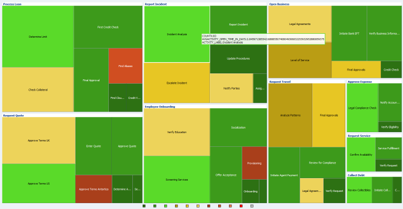
In a Treemap view, hierarchical data groupings are arranged in rectangles within rectangles. For example, a hierarchy might consist of the country, state or province, and city. The count of sales might determine the size of the rectangles, and the sum of sales might determine their colors.
Figure 7-18 shows a Treemap view from one of the preassembled dashboards in the Process Analytics project. See Bottleneck Analysis of Open Processes Dashboard for more information.
A Treemap view displays data from a Tree Model Query. See Creating a Tree Model Query for more information.
To create a Treemap view:
Formatting Business Views
Formatting includes tasks such as adding display titles, formatting text and colors, and changing value formats.
This section provides detailed information about specific optional formatting choices available for each view in Oracle BAM.
Many formatting features apply to specific view types only. Because each of the view types has different characteristics and structures, formatting options change depending on the view type.
KPI Watchlist views have no formatting properties.
To edit the formatting properties of a view, click Properties in the view tab.
Some properties require saving for the changes to reflect. To save the properties you have edited, do one of the following:
-
For properties without the Save Required icon, click Apply.
-
For properties with the Save Required icon, click Apply, click Close, and click Save.
This section contains the following topics:
General Properties
General formatting properties are shared by all views of a particular type. Common general properties are shared by most view types.
To edit the general formatting properties of a view, click Properties in the view tab, then click General.
This section contains the following topics:
General Properties for Business Views
Table 7-2 describes general formatting properties.
Table 7-2 General Properties
| Property | Description | Applies To |
|---|---|---|
|
Predefined Style |
Specifies the overall color scheme: Default, Blues, Greens, (Green, Yellow, Red), or Alta. Also lists custom color themes set using the ColorThemes data object. | All charts and graphs. |
|
Hover Behavior |
Specifies whether a mouse-over on a dataset will dim other datasets. The default value is none. | Area Chart, Bar Chart, Horizontal Bar Chart, Line Chart, Combo Chart, Bubble Chart. |
|
Stack |
Specifies whether stacking should be enabled. The default value is off. | Area Chart, Bar Chart, Horizontal Bar Chart, Line Chart. |
|
Description |
Specifies a text description of the view. Applies to all view types that have formatting properties. |
Area, Bar, Horizontal Bar, Line, Bubble, Combo, Scatter Graphs and Charts. List Views. |
|
Empty Text |
Specifies the text displayed when a chart element or table cell is empty because no data exists. The default text is |
Area, Bar, Horizontal Bar, Line, Pie, Combo, Scatter, and Bubble Graphs and Charts. List Views. |
|
Display Border |
Specifies whether a view has a border. The default is No. Applies to Area, Scatter, Bubble, List, and Gauge views, in both graph and chart views. |
Area, Bar, Horizontal Bar, Line, Pie, Combo, Scatter, and Bubble Graphs and Charts. List Views. |
|
Border Color |
Specifies a border color if Display Border is set to Yes. Click the down arrow to display a palette. The default is white. Applies to chart, Scatter, Bubble, List, and Gauge views. |
Area, Bar, Horizontal Bar, Line, Pie, Combo, Scatter, and Bubble Graphs and Charts. List Views. |
|
Display Fill |
Specifies whether the graph area of a view has a fill color. The default is No. Applies to chart, Scatter, Bubble, List, and Gauge views. |
Area, Bar, Horizontal Bar, Line, Pie, Combo, Scatter, and Bubble Graphs and Charts. List Views. |
|
Fill Color |
Specifies a fill color if Display Fill is set to Yes. Click the down arrow to display a palette. The default is white. Applies to chart, Scatter, Bubble, List, and Gauge views. |
Area, Bar, Horizontal Bar, Line, Pie, Combo, Scatter, and Bubble Graphs and Charts. List Views. |
|
3D Effect |
Converts the business view into a 3D visualization. | Area, Bar, Horizontal Bar, Line, Pie, Combo, Scatter, and Bubble Graphs. Pie Chart. |
Other formatting properties are elaborated in the subsequent sections.
Scatter and Bubble General Properties
Table 7-3 describes the Scatter and Bubble general formatting properties. Area Chart, Bar Chart, Horizontal Bar Chart, Line Chart, Pie Chart, Combo Chart, Scatter Chart, and Bubble Chart category views are collectively called chart views.
Table 7-3 Scatter and Bubble General Properties
| Property | Description |
|---|---|
| Hover Behavior | Specifies whether a mouse-over on a dataset will dim other datasets. The default value is none. |
List General Properties
Table 7-4 describes the general formatting properties common to all Table views except Pivot Tables, which are List, Action List, and Collapsed List.
Table 7-4 List General Properties
| Property | Description |
|---|---|
|
Apply Same Fill Color |
Specifies that all columns have the same fill color if checked. The default is unchecked. If checked, click the down arrow to display a palette. The default color is white. |
|
Column Fill Color |
Specifies the fill color of the named column. Displayed only if Apply Same Fill Color is unchecked. Click the down arrow to display a palette. The default color is white. |
Gauge General Properties
| Property | Description |
|---|---|
| Gauge Value Font | Specifies a font for the values used in the gauge. The default is Helvetica. |
| Font size | Specifies a font size with the option for increments and decrements. The default value is 50. |
| BIU | Specifies if the text should be in Bold, Italics, or Underline. |
| Font Color | Specifies a font color. The default is black. |
| Indicator Color | Specifies a color for the indicator. Used only in Circular and Horizontal Status Meter Gauges. |
| Indicator Border Color | Specifies a color for the border of the indicator. Used only in Circular and Horizontal Status Meter Gauges. |
| Threshold Display | Specifies where and how the threshold values are indicated. You can choose from On Indicator, Current on Plot Area, and All on Plot Area. On Indicator displays the current threshold along the indicator. Current on Plot Area displays only the current threshold along the indicator. All on Plot Area displays all thresholds along the indicator. The default is All on Plot Area. |
| Plot Area | Specifies if the plot area is On or Off. The default is On. |
| Scale | Specifies what scale to use for a value. You can choose from Auto, None, Thousand, Million, Billion, Trillion, and Quadrillion. The default is Thousand. |
| Format Field as (or Format Metric Value Field as for Gauge business views) | Specifies the data value formatting: None, HTML, Number, Currency, or Percent. HTML is only for text fields in *List views. Number, Currency, and Percent are only for numeric fields. The default is None, which removes all formatting information from the view. This property does not affect views in currently open dashboards in the BAM Viewer (Home page) and is activated after the view is saved. |
| No of Digits After Decimal | Specifies the number of decimal places if Format Field as is Number, Currency, or Percent. The default is 2. |
| Negative Number Format | Specifies the format for negative numbers if Format Field as is Number, Currency, or Percent: –1234.00, 1234.00, 1234.00–, or (1234.00). The default is –1234.00. |
| Use Digit Grouping Symbol | Specifies whether digits are grouped by thousands if Format Field as is Number. The default is Yes. |
| Currency | Specifies a currency text string if Format Field as is Currency. The default is blank. |
Note:
When the On Indicator option is selected from the Threshold Display drop-down, the colors defined on the Thresholds tab will be used and the Indicator Color on the General tab will be ignored.General Properties Specific to Pivot Table Business Views
Table 7-5 describes the general formatting properties specific to Pivot Table views.
Table 7-5 Pivot Table General Properties
| Property | Description |
|---|---|
|
Pivot Enable |
Enables pivoting of columns and rows if checked (the default). |
|
Header Background Color |
Specifies a background color for headers. Specify a hexadecimal or RGB color code or click the down arrow to display a palette. The default is white. |
|
Data Background Color |
Specifies a background color for data. Specify a hexadecimal or RGB color code or click the down arrow to display a palette. The default is white. |
General Properties Specific to Geo Map Business Views
All Geo Map views have a Base Map general property set to WORLD_MAP. All other Geo Map general properties are theme-specific.
There is only one additional general property for Geo Map views with a GPS Theme. Point Graphics specifies the image file used for points on the map. The default is Ball_Orange.
Table 7-6 describes the general formatting properties specific to Geo Map views with a Point Theme.
Table 7-6 Geo Map Point Theme General Properties
| Property | Description |
|---|---|
|
Red Min |
Specifies the low end of the value range for red points on the map. The default is 0.0. |
|
Red Max |
Specifies the high end of the value range for red points on the map. The default is 100.0. |
|
Red Image |
Specifies the image file used for red points on the map. The default is |
|
Orange Min |
Specifies the low end of the value range for orange points on the map. The default is 100.0. |
|
Orange Max |
Specifies the high end of the value range for orange points on the map. The default is 200.0. |
|
Orange Image |
Specifies the image file used for orange points on the map. The default is |
|
Green Min |
Specifies the low end of the value range for green points on the map. The default is 200.0. |
|
Green Max |
Specifies the high end of the value range for green points on the map. The default is 300.0. |
|
Green Image |
Specifies the image file used for green points on the map. The default is |
Table 7-7 describes the general formatting properties specific to Geo Map views with a Color Theme.
Table 7-7 Geo Map Color Theme General Properties
| Property | Description |
|---|---|
|
Theme Name |
Specifies the theme for the colored regions: |
|
Theme Location Column |
Specifies the name of the data field for the regions. The values in this column must exactly match the values in the Flat SQL Query location field. The values in this column must also be unique for a given location, or the same data might be plotted in multiple locations. If Theme Name is If Theme Name is If Theme Name is |
|
Bucket Count |
Specifies the number of color-coded ranges for data values. |
|
Min Color |
Specifies a color for the lowest bucket. Specify a hexadecimal color code or click the down arrow to display a palette. The default is red. Intermediate buckets have intermediate colors. |
|
Max Color |
Specifies a color for the highest bucket. Specify a hexadecimal color code or click the down arrow to display a palette. The default is green. Intermediate buckets have intermediate colors. |
Label, Text, Title, and Value Properties
Most views have a title, legend titles, axis labels, data labels, and other text elements. Different views have different text elements and text formatting options, but each option functions in the same way in all views where it is present.
To edit the text properties of a view, click Properties in the view tab, then click Text.
*List views have their own text properties. See Text Properties.
Treemap views have their own label properties. See Labels Properties.
Table 7-8 describes the common text formatting properties.
Table 7-8 Common Text Formatting Properties
| Property | Description |
|---|---|
|
Text |
Specifies the text to be displayed. For text elements that are not editable, such as pie slice labels, no text field is provided. |
|
Font |
Select a font from the drop-down list. The default is Tahoma. |
|
Font Size |
Specifies the point size of the font. The default is 11. |
|
B I U |
Specifies whether text is bold, italic, underlined, or a combination. The default is plain text. |
|
Text Color |
Specifies the text color. Click the down arrow to display a palette. The default is black. |
|
Align |
Specifies the text alignment. Click the down arrow and select Left, Center, or Right. The default is Left. |
|
Automatic Rotation |
Specifies whether text is automatically rotated to fit: No Auto Rotation (the default), Auto Rotate 90 Degrees, or Auto Rotate 270 Degrees. |
|
Text Direction |
Specifies whether text is always rotated: No Rotation (the default), Rotate 90 Degrees, or Rotate 270 Degrees. |
|
Label Text |
Specifies the data field label text in chart, Scatter, or Bubble views. The default is the data field name. |
| Footnote Text | Specifies text to be shown below the chart or graph. It can be aligned as needed. |
Table 7-9 describes the common value formatting properties.
Table 7-9 Common Value Formatting Properties
| Property | Description |
|---|---|
|
Format Field as (or Format Metric Value Field as for Gauge business views) |
Specifies the data value formatting: None, HTML, Number, Currency, or Percent. HTML is only for text fields in *List views. Number, Currency, and Percent are only for numeric fields. The default is None, which removes all formatting information from the view. This property does not affect views in currently open dashboards in the BAM Viewer (Home page) and is activated after the view is saved. |
|
No of Digits After Decimal |
Specifies the number of decimal places if Format Field as is Number, Currency, or Percent. The default is 2. |
|
Negative Number Format |
Specifies the format for negative numbers if Format Field as is Number, Currency, or Percent: |
|
Use Digit Grouping Symbol |
Specifies whether digits are grouped by thousands if Format Field as is Number. The default is Yes. |
|
Currency |
Specifies a currency text string if Format Field as is Currency. The default is blank. |
Axis Properties
You can format any axis of any of the following view types:
-
Area
-
Bar
-
Horizontal Bar
-
Line
-
Combo
-
Dial
-
Statusmeter
-
Scatter
-
Bubble
In a Horizontal Bar chart, the X-axis is vertical and the Y-axis is horizontal, unlike the standard convention. This is necessary because you can switch from one chart view to another and retain the axis properties.
As an alternative for a Y-axis, you can accept the default automatic axis formatting, which adjusts the axis based on active data.
To edit the axis properties of a view, click Properties in the view tab, then click Axis, X-Axis, Y-Axis, Y1-Axis, or Y2-Axis, depending on the view type.
This section contains the following topics:
Axis Properties Specific to Dial and Statusmeter Business Views
Table 7-10 describes the axis formatting properties for Dial and Statusmeter view types.
Table 7-10 Dial and Statusmeter Axis Formatting Properties
| Property | Description |
|---|---|
|
Display Major Tick Marks |
Specifies whether to display major ticks. The default is Yes. |
|
Tick Interval |
Specifies the interval between ticks. The default is 0.0. |
|
Tick Color |
Specifies the tick color. Click the down arrow to display a palette. The default is black. |
|
Display Minor Tick Marks |
Specifies whether to display minor ticks. The default is No. |
|
Tick Label |
Formats the tick label text. See Label_ Text_ Title_ and Value Properties for more information. |
|
Display Label |
Specifies how the axis is labeled: (Minimum, maximum, and increments) (the default), Increments, Minimum and maximum values, Actual metric value, No tick labels, or Threshold values. |
|
Angle Extent |
Specifies the number of degrees that a Dial view spans. The default is 180. |
X-Axis Properties
Table 7-11 describes the X-axis formatting properties. Not all views with an X-axis have all these properties.
Table 7-11 X-Axis Formatting Properties
| Property | Description |
|---|---|
|
Title |
Specifies a title for the axis. See Label_ Text_ Title_ and Value Properties for more information. |
|
Axis Width |
Specifies the width of the axis in pixels. The default is 1. |
|
Axis Color |
Specifies the axis color. Click the down arrow to display a palette. The default is black. |
|
Major Tick Width |
Specifies the width of the major ticks in pixels. The default is 1. |
|
Major Tick Color |
Specifies the major tick color. Click the down arrow to display a palette. The default is black. |
|
Major Tick Line Style |
Specifies the major tick line style (dash pattern) for major ticks. The default is solid (no dashes). |
|
Major Tick Style |
Specifies the major tick style: None (the default), Auto, Extended, Grid, Inside Axis, Span Across Axis, or Outside Axis. |
|
Tick Label |
Formats the tick label text. See Label_ Text_ Title_ and Value Properties for more information. |
|
Select Groups to format for horizontal fields |
Specifies the dimensions to which the tick formatting applies. |
Y-Axis Properties
Table 7-12 describes the Y-axis formatting properties. Not all views with a Y-axis have all these properties.
Table 7-12 Y-Axis Formatting Properties
| Property | Description |
|---|---|
|
Title |
Specifies a title for the axis. See Label_ Text_ Title_ and Value Properties for more information. |
|
Axis Width |
Specifies the width of the axis in pixels. The default is 1. |
|
Axis Color |
Specifies the axis color. Click the down arrow to display a palette. The default is black. |
|
Auto Axis |
Adjusts the axis based on the data if checked. The default is checked. |
|
Axis Min |
Specifies a minimum value for the axis if Auto Axis is not checked. The default is 0, for no minimum. |
|
Axis Max |
Specifies a maximum value for the axis if Auto Axis is not checked. The default is 0, for no maximum. |
|
Axis Increment Minor |
Specifies a minor increment for the axis if Auto Axis is not checked. The default is 0, for no set increment. |
|
Axis Increment Major |
Specifies a major increment for the axis if Auto Axis is not checked. The default is 0, for no set increment. |
|
Major Tick Width |
Specifies the width of the major ticks in pixels. The default is 1. |
|
Major Tick Color |
Specifies the major tick color. Click the down arrow to display a palette. The default is black. |
|
Major Tick Line Style |
Specifies the major tick line style (dash pattern) for major ticks. The default is solid (no dashes). |
|
Major Tick Style |
Specifies the major tick style: None (the default), Auto, Extended, Grid, Inside Axis, Span Across Axis, or Outside Axis. |
|
Minor Tick Width |
Specifies the width of the minor ticks in pixels. The default is 1. |
|
Minor Tick Color |
Specifies the minor tick color. Click the down arrow to display a palette. The default is black. |
|
Minor Tick Line Style |
Specifies the minor tick line style (dash pattern) for major ticks. The default is solid (no dashes). |
|
Minor Tick Style |
Specifies the minor tick style: None (the default), Auto, Extended, Grid, Inside Axis, Span Across Axis, or Outside Axis. |
|
Tick Label |
Formats the tick label text. See Label_ Text_ Title_ and Value Properties for more information. |
|
Format Field as |
Specifies the Y-axis data field to which to apply value formatting. See Table 7-9 for more information. |
Legend Properties
You can format the legend of any of the following view types:
-
Area
-
Bar
-
Horizontal Bar
-
Line
-
Pie
-
Combo
-
Gauge
-
Scatter
-
Bubble
To edit the legend properties of a view, click Properties in the view tab, then click Legend.
Table 7-13 describes the legend formatting properties.
Table 7-13 Legend Formatting Properties
| Property | Description |
|---|---|
|
Display Legend |
Specifies whether the legend is displayed or hidden. |
|
Display Border |
Specifies whether a legend has a border. The default is No. |
|
Border Color |
Specifies a border color if Display Border is set to Yes. Click the down arrow to display a palette. The default is white. |
|
Display Fill |
Specifies whether a legend has a fill color. The default is No. |
|
Fill Color |
Specifies a fill color if Display Fill is set to Yes. Click the down arrow to display a palette. The default is white. |
|
Legend Position |
Specifies whether the legend is on the left, right, bottom, or top side of the view. The default position is on the right side. |
|
Graph Type |
Specifies the graph type of each data field for a Combo view: Bar Graph, Line Graph, Area Graph, Curve Line, Centered Stepped Line, Stepped Line, or Default. By default, each data field is assigned a type in the above order. |
Target Properties
A target line makes it easy to compare a process you are tracking to a goal. You can add a target line to any of the following view types:
-
Area
-
Bar
-
Horizontal Bar
-
Line
-
Combo
-
Scatter
-
Bubble
For a Horizontal Bar type view, the target line is vertical. For the other types, the target line is horizontal.
To edit the target properties of a view, click Properties in the view tab, then click Target.
Table 7-14 describes the target line formatting properties.
Table 7-14 Target Line Formatting Properties
| Property | Description |
|---|---|
|
Display Line |
Specifies whether the target line is displayed. The default is No. |
|
Value |
Specifies the value of the target line on the Y-axis. The default is zero. |
|
Text |
Specifies a text label for the target line. |
|
Line Width |
Specifies the width of the target line in pixels. The default is 1. |
|
Line Color |
Specifies the target line color. Click the down arrow to display a palette. The default is red. |
|
Line Style |
Specifies the target line style (dash pattern). The default is solid (no dashes). |
|
Show in Legend |
Specifies whether the target line and its text label are included in the legend. The default is No. |
Animation Properties
You can add animation to any of the following view types:
-
Area
-
Bar
-
Horizontal Bar
-
Line
-
Pie
-
Combo
-
Gauge
-
Scatter
-
Bubble
To edit the animation properties of a view, click Properties in the view tab, then click Animation.
This section contains the following topics:
Chart Animation Properties
Table 7-15 describes the animation formatting properties for chart, Scatter, and Bubble views.
Table 7-15 Chart Animation Formatting Properties
| Property | Description |
|---|---|
|
Series Rollover Effect |
Specifies whether rolling the mouse over a legend item or a series in the view highlights the series: None or Highlight. The default is Highlight. |
|
Animation on Transition |
Specifies whether animation occurs when a view is rendered: None or Auto. The default is None. |
Gauge Animation Properties
Table 7-15 describes the Gauge animation formatting properties.
Table 7-16 Gauge Animation Formatting Properties
| Property | Description |
|---|---|
|
Animation on Data Change |
Specifies whether animation occurs when data changes: Active (default), None, or Auto. Active animates only Active Data changes. Auto animates all data changes. |
|
Animation Display Duration: Time |
Specifies the animation display duration in milliseconds: 1000 to 1500. The default is 1000. |
|
Animation on Transition |
Specifies whether animation occurs when a view is rendered: None or Auto. The default is None. |
Slice Properties
Slice properties apply only to Pie views.
To edit the Pie slice properties of a view, click Properties in the view tab, then click Slice.
Table 7-17 describes the Pie slice formatting properties.
Table 7-17 Pie Slice Formatting Properties
| Property | Description |
|---|---|
|
Slice Label Text Format |
Formats the slice label text. See Label, Text, Title, and Value Properties for more information. |
|
Slice Behavior |
Specifies whether you can explode slices when viewing the Pie view in the BAM Viewer (Home page). Explode moves one slice at a time, Explode All moves all slices out, and None disables exploding slices. The default is None. |
|
Slice Label Position |
Specifies where slice labels are positioned: Outside with Feeler, No Labels, Outside without Feeler, Inside, or Outside with Feeler (if needed). The default is Outside with Feeler. |
|
Slice Label |
Specifies the slice label text: Percentage, Slice Name, Value, or Slice Name and Value. The default is Percentage. |
Note:
The DVT—based pie charts do not support formatting of slice labels. As a result, you might see a large number of decimal points when the option Slice Name and Value is used.Text Properties
Text properties described here apply only to *List views.
For descriptions of text formatting properties for other views, see Label, Text, Title, and Value Properties..
To edit the text properties of a List view, click Properties in the view tab, then click Text.
Table 7-18 describes the text formatting properties.
Table 7-18 Text Formatting Properties
| Property | Description |
|---|---|
|
Table Title |
Formats the table title. See Label, Text, Title, and Value Properties for more information. |
|
Table Text |
Formats the table text. See Label, Text, Title, and Value Properties for more information. |
|
Column Header Visible |
Specifies that column headers are visible if checked. The default is checked. |
|
Column Header Display Text |
Specifies the column header text. The default is the data field name. |
|
Column Header Fill Color |
Specifies the column header fill color. Click the down arrow to display a palette. The default is white. |
|
Select table columns to format |
Specifies the column to which to apply value formatting. See Table 7-9 for more information. |
Layout Properties
Layout properties apply to *List and Treemap views.
To edit the layout properties of a view, click Properties in the view tab, then click Layout.
This section contains the following topics:
List Layout Properties
Table 7-19 describes the *List layout formatting properties. Row Selection does not apply to Collapsed List views.
Table 7-19 List Layout Formatting Properties
| Property | Description |
|---|---|
|
Horizontal Grid |
Displays horizontal grid lines if checked. |
|
Vertical Grid |
Displays vertical grid lines if checked. |
|
Row Banding Interval |
Specifies the number of unbanded rows between banded rows. The default is 1. |
|
Column Banding Interval |
Specifies the number of unbanded columns between banded columns. The default is 0, for no column banding. |
|
Resizing |
Enables column resizing if checked. |
|
Reordering |
Enables reordering of columns if checked. |
|
Row Selection |
Specifies how many rows can be selected: none, single, or multiple. The default is single. |
|
Column Stretching |
Specifies which columns can be stretched when the view is resized: none, multiple, or last. The default is none. |
|
Column Visibility |
Specifies which columns are displayed. Check a column name to display it. By default, all columns are displayed. |
Treemap Layout Properties
Layout Options determines how the rectangle hierarchy in a treemap is arranged:
-
Squarified makes all the rectangles at all levels as square as possible. This is the default.
-
Slice and Dice Horizontal orders rectangles alphanumerically by node label from left to right.
-
Slice and Dice Vertical orders rectangles alphanumerically by node label from top to bottom.
Editable Fields Properties
Editable field properties apply only to Action List views.
To edit the editable field properties of a view, click Properties in the view tab, then click Editable Fields.
Editable Fields determines which columns have editable data values. Check a column name to make its data values editable. By default, no columns have editable data values.
Editable fields are only useful when combined with actions. See Using Actions in Business Views for more information.
Note:
If the number of editable fields multiplied by the number of rows in your action list is over 10000, you will get an error when you use this view in a dashboard.Pivot Table Data Properties
Data properties apply only to Pivot Table views.
To edit the data properties of a view, click Properties in the view tab, then click Data.
Table 7-20 describes the data formatting properties.
Table 7-20 Data Formatting Properties
| Property | Description |
|---|---|
|
Sorting |
Specifies how label text is sorted: Ascending or Descending. The default is Ascending. |
|
Aggregate Position |
Specifies where additional aggregate values are positioned: None, After, or Before. The default is None. |
|
Aggregate Function |
Specifies a category aggregate function: Sum, Average, Count, Maximum, or Minimum. The default is Sum. |
Thresholds Properties
Threshold properties apply only to Collapsed List, Gauge, and Treemap views.
To edit the threshold properties of a view, click Properties in the view tab, then click Thresholds.
This section contains the following topics:
Collapsed List Thresholds Properties
Table 7-21 describes the Collapsed List threshold formatting properties.
Table 7-21 Collapsed List Thresholds Formatting Properties
| Property | Description |
|---|---|
|
Data Field |
Specifies data field on which color-coded threshold values are based. This can be a measure field such as Sales or a dimension field such as Product. |
|
Use and Format BG Color |
Specifies thresholds for cell background colors if checked. The default is checked. |
|
Use and Format Graphics |
Specifies thresholds for cell status graphics if checked. The default is checked. |
|
Hide Column Data |
Lets you choose whether to render column data with the image, or just the image when you use images in thresholds. The default is unchecked. |
|
Threshold Values |
Specifies the colon-separated low and high thresholds of a data value range, for example |
|
Threshold Color |
Specifies the cell background color for a data value range. Click the down arrow to display a palette. |
|
Threshold Image |
Specifies the cell status graphic for a data value range. Click Select Image to display a menu of choices. Select Upload Image from this menu to add your own graphic. Type a path to a graphic file or click Browse to open a file chooser. Then click OK. |
|
Overflow Color |
Specifies the cell background color for values above the highest threshold. Click the down arrow to display a palette. |
|
Underflow Color |
Specifies the cell background color for values below the lowest threshold. Click the down arrow to display a palette. |
|
Image Position |
Specifies the position of cell status graphics: Left or Right. The default is Left. |
Gauge Thresholds Properties
Table 7-22 describes the Gauge threshold formatting properties.
Table 7-22 Gauge Thresholds Formatting Properties
| Property | Description |
|---|---|
|
Minimum Value |
Specifies the minimum value for the low value range and for display on a Dial or Statusmeter axis. The default is 0.0. |
|
Maximum Value |
Specifies the maximum value for the high value range and for display on a Dial or Statusmeter axis. The default is 100.0. |
|
Threshold 1 Value |
Specifies the maximum value for the low value range. The default is 33.33. |
|
Threshold 1 Color |
Specifies the low value color. Click the down arrow to display a palette. The default is green. |
|
Threshold 2 Value |
Specifies the maximum value for the medium value range. The default is 66.66. |
|
Threshold 2 Color |
Specifies the medium value color. Click the down arrow to display a palette. The default is yellow. |
|
Threshold 3 Value |
Specifies the maximum value for the high value range. This is the same as the Maximum Value and is read-only. |
|
Threshold 3 Color |
Specifies the high value color. Click the down arrow to display a palette. The default is red. |
Treemap Thresholds Properties
Table 7-23 describes the Treemap threshold formatting properties.
Table 7-23 Treemap Thresholds Formatting Properties
| Property | Description |
|---|---|
|
Color |
Specifies data field on which color-coded threshold values are based. This can be a measure field such as Sales or a dimension field such as Product. |
|
Hierarchy Level |
Specifies the grouping data field in the hierarchy having the rectangles to which threshold colors are applied. For example, if the hierarchy consists of country, state or province, and city, you can apply color coding to only one of those levels. |
|
Linear Thresholds |
Specifies that thresholds are linear and use light to dark shades of the same color. |
|
Max Value |
Enter the maximum value for the data label between |
|
Min Value |
Enter the minimum value for the data label between |
|
Buckets |
Specifies the number of data partitions between the Max Value and the Min Value. For example, if Max Value is |
|
Base Color |
Specifies the color for values within a Linear Threshold. Click the down arrow to display a palette. |
|
Custom Thresholds |
Specifies that thresholds are not linear and can use unrelated colors. |
|
Threshold Values |
Specifies the comma-separated low and high thresholds of a data value range for Custom Thresholds. Click the Add icon to add a new range. |
|
Threshold Color |
Specifies the color of a data value range for Custom Thresholds. Click the down arrow to display a palette. |
|
Overflow Color |
Specifies the color for values above the highest threshold. Click the down arrow to display a palette. |
|
Underflow Color |
Specifies the color for values below the lowest threshold. Click the down arrow to display a palette. |
|
No Value |
Specifies the color for a rectangle corresponding to a group with no data values. Click the down arrow to display a palette. |
|
Reversed |
This check box reverses the order of your linear thresholds properties. For example, if you set a base color #C0EFFF with min=0, max=7, and buckets=7, you get threshold colors where #COEFFF is near 0, and the darker colors are near 7. Using the Reversed check box would reverse that order, so #COEFFF would appear when the value is near 7, and lightest when near 0. |
Note:
Oracle recommends that you always set Treemaps thresholds before viewing dashboards to show color gradations and precise legend values.Node Depth Properties
Node depth properties apply only to Treemap views.
To edit the node depth properties of a view, click Properties in the view tab, then click Node Depth.
Depth of nodes during initial rendering determines how many levels of the hierarchy are initially displayed. The default is 2.
Labels Properties
Label properties described here apply only to Treemap views.
For descriptions of label formatting properties for other views, see Label, Text, Title, and Value Properties.
To edit the label properties of a Treemap view, click Properties in the view tab, then click Labels.
Table 7-24 describes the Treemap label formatting properties.
Table 7-24 Labels Formatting Properties
| Property | Description |
|---|---|
|
Leaf Display |
Specifies the type of label display for the lowest level hierarchical groupings: Node or Off. The default is Node, which places each label within its rectangle. |
|
Group Display |
Specifies the type of label display for all except the lowest level hierarchical groupings: Header, Node, or Off. The default is Header, which places each label above the top left corner of its rectangle. |
|
Horizontal Alignment |
Specifies the horizontal alignment for Node labels: Center, Start, or End. The default is Center. |
|
Vertical Alignment |
Specifies the vertical alignment for Node labels: Center, Top, or Bottom. The default is Center. |
Tooltip Labels Properties
Tooltip Labels properties are specific to Treemap views. You can use this property to configure tooltip text for treemaps.
Tooltip Label properties described here apply only to Treemap views.
For descriptions of label formatting properties for other views, see Label, Text, Title, and Value Properties.
To edit the Tooltip label properties of a Treemap view, click Properties in the view tab, then click Tooltip Labels.
Configuring Tooltip Labels
| Label | Label Text |
|---|---|
| COUNTX | # of Processes |
| AVGDAYS_UNTIL_DUE_DATE | Avg Days Until Due Date |
You can edit label texts for tooltips to suit your project needs.
Note:
These changes work only when you click Save and not when you click Apply.Map Points Properties
Map Points properties are specific to Point Theme and GPS Theme Geo Maps. This tab enables you to set category columns and icons for various points of interest that are displayed on the Geo Map. You can also set custom icons and images for categories.
The Default Map Point Icon drop-down list enables you to select an icon or upload a custom image. The default value is Ball_Orange.
The Category Column drop-down list enables you to select a category
The Map Points table has customizable columns that you can use to add the Category, Min Value, Max Value, and Image. The Category column allows you to specify a string value as the name for a category. Min and Max Value columns allow you to specify a numerical value. If you are specifying a location, you can either enter the latitudes and longitudes or enter an address. When selecting an image, you can either upload one from a local source or specify a remote URL.
Zoom Properties
Zoom properties are specific to all Geo Map views. It provides you with the ability to set zoom levels and initial Geo Map positions using longitude and latitude values.
The Latitude and Longitude fields can contain any numeric value including negative values and decimals. The default value for both is 0.0. Once you set specific values and save the business view, the maps will load the specified coordinates on all subsequent startups. Any value with a special character, which is not a decimal is not allowed in both fields.
The Zoom Level slider allows you to set zoom levels from 0 to 20, with 20 being the maximum level till which you can zoom in.
The changes you make for zoom properties will only take effect once you Save the business view. Clicking Apply will not reflect your changes immediately.
Runtime Interactions with Business Views
This section describes how you can enable end users to change views while viewing them using the BAM Viewer (the Home page), by drilling, performing actions, or making data active.
Note:
Drilling and other runtime interactions are only supported in View mode, and not in the Designer mode.
This section contains the following topics:
Using Drilling
Drilling enables end users using the BAM Viewer (the Home page) to select an item in a series and view data at a more detailed level. You, the designer, configure drilling in the Drilling properties of the view.
You cannot drill in views while you edit them. In the BAM Viewer, active data stops during drilling and then restarts.
This section contains the following topics:
Drilling Down
Drilling down means displaying data one level down the drill path in the same view. Drilling down is an option when all of the following are true:
-
Drill-down is enabled.
It is disabled by default. See Enabling Drilling Down.
-
Data in the view is aggregated.
-
The underlying data object has a hierarchy.
-
The next level down is not the lowest level.
If the next level down is the lowest level, it is only possible to drill through to the actual data rows. In some cases, drill-through is not an option either because it is disabled or unavailable in the view type. See Drilling Through.
The drilling areas include:
-
Points in Area, Line, Combo, Scatter, or Bubble views
-
Bars in Bar, Horizontal Bar, or Combo views
-
Slices in Pie views
-
Nodes in Treemap views
-
Rows in Collapsed List views
To drill down, right-click the point, bar, slice, node, or row and select the drill level from the menu.
Drilling Up
Drilling up means displaying data one level up the drill path. You can only drill up if you have previously drilled down.
To drill up:
-
Right-click the point, bar, slice, node, or row and select the drill level from the menu.
-
Right-click the point, bar, slice, node, or row and select Home to go to the initial drill level of the view.
Note:
If you drill down in an Area, Line, or Combo view to a level at which only one data point is included, no line is drawn, and you cannot drill up. To restore the view, remove the filter that the drilling applies. See Filtering Runtime Data in a View for more information.
Drilling Through
Drilling through means displaying the actual data rows at the lowest level of the drill path in a List view. Drilling through is an option when all of the following are true:
-
Drill-through is enabled.
It is enabled by default. See Enabling Drilling Through to Details.
-
Data in the view is aggregated.
-
If the underlying data object has a hierarchy, the next level down is the lowest level.
For drill-through, the underlying data object need not have a hierarchy defined.
Because drilling down is disabled by default and drilling through is enabled by default, drilling through is the default drilling action.
Treemaps allow drilling down but not drilling through.
To drill through:
-
Right-click the point, bar, slice, or row and select Show Details from the menu.
Drilling Across
Drilling across means opening a target dashboard or URL in a new browser window.
To drill across:
-
Right-click the view and select the target name.
See Configuring Drill-Across Targets for more information.
Enabling Drilling Down
You can configure a Drill Hierarchy for drill-down in the following view types:
-
Area
-
Bar
-
Horizontal Bar
-
Line
-
Pie
-
Combo
-
Collapsed List
-
Scatter
-
Bubble
The underlying data object must have a hierarchy defined. There are two types of hierarchies: normal and datetime-based.
Treemaps have no drill hierarchy configuration because the hierarchy in the underlying Tree Model Query is used for drilling down.
To select a drilling hierarchy:
Enabling Drilling Through to Details
You can drill through from aggregated to detailed data (shown in a List) in the following view types:
-
Area
-
Bar
-
Horizontal Bar
-
Line
-
Pie
-
Combo
-
Collapsed List
-
Gauge
-
Scatter
-
Bubble
The underlying data object need not have a hierarchy defined.
Not all views that allow drilling through to details allow hierarchical drilling. For example, Gauge views allow only drill-through.
Treemaps allow drilling down but not drilling through.
Note:
Drilling through to details for gauge views is enabled through left-clicks, as opposed to right-click drill to details for other view types. Drilling through to details also does not apply to Circular and Horizontal Status Meter Gauges.To enable drilling through to details:
Configuring Drill-Across Targets
You can configure drill-across targets in the following view types:
-
Area
-
Bar
-
Horizontal Bar
-
Line
-
Pie
-
Combo
-
List
-
Action List
-
Collapsed List
-
Scatter
-
Bubble
You open a target dashboard or URL in a new browser window. You can create many drill-across targets for a view.
Drilling across cannot be done from Gauge, Pivot Table, KPI Watchlist, Treemap, or Geo Map views.
To configure a drill-across target:
Using Actions in Business Views
This section describes how to add Action Buttons to views that you create in Oracle BAM. Action Buttons allow view users to refresh the view, add or change data, and ask for confirmation of these actions.
Action Buttons can appear in any view except a KPI Watchlist.
Alerts can also perform actions. See Alert Actions for more information.
To create an Action Button:
Table 7-25 describes the values actions can pass in more detail.
Table 7-25 Values for Actions
| Component | Description |
|---|---|
|
Client Cookie |
Type the value of a cookie that resides on the client where this report is viewed. |
|
Constant Value |
Type a constant value. The value can be any text that complies with the expected data type. For a datetime type, you can type the datetime or use the datetime picker. For example, you can use this option to specify the beginning of a URL, such as |
|
Prompt/Parameter |
Select a parameter from the drop-down list. This option retrieves the current value of a parameter even if it is changed by driving or prompt input. If the current value is empty, default value of the parameter is used. For this option to be usable, the query on which the view is based must reference a parameter in a filter. See Creating Parameters, for more information. |
|
Unique Button Click ID |
A unique ID number is generated and incremented with each button click. Applies to Open Dashboard, Open URL, Insert, and Update actions only. This ID is remembered across dashboards and data objects. It is useful for inserting or updating rows in an action list when you need a unique identifier for each row. |
|
Value from Action List |
Select a column (data field name) from the Action List. Applies to Insert and Update actions only. |
Using Active Data
Active data continuously aggregates data or displays a segment of data within a defined time window. As time passes in a time window, older data is removed from the view and newer data is added.
Active data is supported only for basic Area, Bar, Line, Combo, Pie, Scatter, and Bubble views. None of the other variations of these view types support active data. However, active data is supported for all variations of Gauge views and for Point Theme and GPS Theme Geo Map views.
Active data is not supported for Horizontal Bar, KPI Watchlist, Treemap, or Color Theme Geo Map views.
Active data is not supported for external data objects.
The time zone in your Personalization does not control the time slice for Active Data. Active Data time is based on UTC.
Note:
A time series or group arranges data in a view based on a datetime field, while Active Data focuses on a particular time slice in a data object. These options can coexist in the same view.
If the Use Time Series option groups view values, the view data appears to slide from right to left as time passes. If the Use Time Groups option is selected, there is no sliding effect, but the data displayed in the stationary time groups changes as time passes.
See Using a Time Group or a Time Series for more information about grouping data by datetime values in the query on which a view is based.
To configure Active Data:
Using Time Axis
Editing, Renaming, Deleting, and Securing Business Views
This section contains information on modifying business view properties or deleting them.
You can edit, rename, delete, and secure views just as you can any other Oracle BAM entity.
Editing a Business View
Use the following procedure to open, edit, and save a view. When you edit a view, the changes propagate to all dashboards that include the view.
Note:
If a view no longer works because the underlying query or data object has changed, you must close and reopen the view before you can edit and save it.
To edit a view:
Renaming a Business View
Use the following procedure to change the Display Name of a view.
The Display Name is case sensitive and may contain any characters except the forward slash (/), which indicates a folder path. It may have up to 128 characters. It can be changed at any time.
To rename a view:
When you edit the view, the new Display Name is displayed on the tab. This name is also displayed when you see the view in a dashboard.
However, the internal Name remains unchanged. When you edit the view, this name is displayed on the left in the header.
Deleting a Business View
Use the following procedure to delete a view. The view is removed from any dashboards that reference it.
To delete a view:
Securing a Business View
A view inherits security settings from the project in which it is created. For more information about projects, see Planning and Creating Projects.
To change security settings for a view:
-
In the left navigation pane, click the arrow to the left of Business Views.
All saved views in the current project are displayed in a list.
-
Right-click the view and select Security from the pop-up menu.
The security tab for the view opens.
-
To add a role or group to whom you can explicitly grant or deny permissions, follow these steps:
-
Click the Add icon in the Grant Permissions or Deny Permissions table.
The Add Application Roles, Groups, and Users dialog opens.
See Managing Oracle BAM Users for information about how to add users to roles and groups.
-
Type a Name for the role or group you are adding.
-
Select from the drop-down List: Application Role or Group.
-
Click Search to populate the Available Members list.
-
To add a member to the Selected Members list, select the member and click the single right arrow.
-
To add all members to the Selected Members list, select the member and click the double right arrow.
-
To remove members from the Selected Members list, use the single and double left arrows.
-
When the Selected Members list is final, click OK.
The Add Application Roles, Groups, and Users dialog closes, and the Name you specified appears in the table.
-
-
To remove a role or group, select the table row and click the Remove icon.
-
To grant permissions, select Read, Write, Remove, or Security for the users, roles, and groups listed in the Grant Permissions table.
-
To deny permissions, select Read, Write, Remove, or Security for the users, roles, and groups listed in the Deny Permissions table.
-
Click Save.
