11 Using Input Components and Defining Forms
inputText), select values (such as inputNumber, inputRange, inputColor, inputDate, and select components), edit text (such as richTextEditor), and load files (such as inputFile).
This chapter includes the following sections:
If you want to use an input component that selects from a list of items that may be potentially large, or may represent relationships between objects (such as creating a list to represent an attribute that is a foreign key to another object), then you may want to use a list of values component. For more information about those components, see Using List-of-Values Components.
11.1 About Input Components and Forms
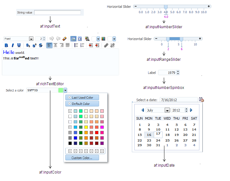
Input components accept user input in a variety of formats. The most common formats are text, numbers, date, and selection lists that appear inside a form and are submitted when the form is submitted. The entered values or selections may be validated and converted before they are processed further. Figure 11-1 shows ADF Faces standard input components.
Figure 11-1 ADF Faces Input Components
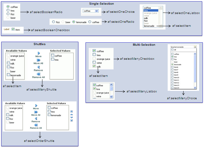
ADF Faces input components also include a number of components that allow users to select one or multiple values, as shown in Figure 11-2.
Figure 11-2 Select Components
11.1.1 Input Component Use Cases and Examples
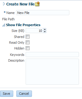
Input components are often used to build forms for user input. For example, the File Explorer application contains a form that allows users to create a new file. As shown in Figure 11-3, input components allow users to enter the name, the size, select permissions, and add keywords, and a description for a file. The Name field is required, as noted by the asterisk. If a user fails to enter a value, an error message is displayed. That validation and associated error message may be configured on the component (by setting the required or requiredMessageDetail attribute), or handled on the server (by setting the showRequired attribute).
Figure 11-3 Form Uses Input Components
The richTextEditor component provides rich text input that can span many lines and can be formatted using different fonts, sizes, justification, and other editing features that may be required when you want users to enter more than simple text. For example, the richTextEditor might be used in a web-based discussion forum, allowing users to format the text that they need to publish, as shown in Figure 11-4.
Figure 11-4 richTextEditor Used in a Discussion Forum
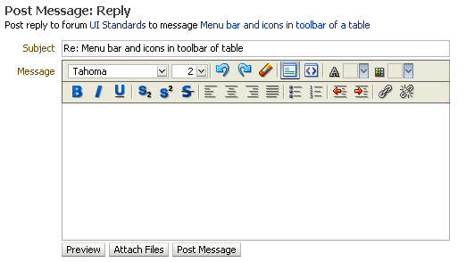
The inputFile component allows users to browse for a local file to upload to the application server. For example, an email message might allow users to attach a file to a message, as shown in Figure 11-5.
Figure 11-5 fileUpload Component
The ADF Faces selection components allows users to make selections from a list of items instead of typing in values. ADF Faces provides both single choice selection lists and multi-choice selection lists. Single-choice lists are used to select one value from a list, such as the desired drink in an online food order, as shown in Figure 11-6.
Figure 11-6 Users Can Select One Value From the selectOneChoice Component
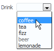
ADF single-selection components include a dropdown list (as shown in Figure 11-6), a list box, radio buttons, and checkboxes.
ADF multi-selection components allow users to select more than one value in a list. For example, instead of being able to select just one drink type, the selectManyChoice component allows a user to select more than one drink, as shown in Figure 11-7.
Figure 11-7 Users Can Select Multiple Values From the selectManyChoice Component
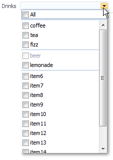
ADF multiple choice components include a dropdown list, checkboxes, a checkbox list, a shuttle, and an ordered shuttle.
Best Practice
You can use either selection lists or list-of-values (LOV) components to display a list. LOV components should be used when the selection list is large. LOV components are model-driven using the ListOfValueModel class and may be configured programmatically using the API. They present their selection list inside a popup window that may also include a query panel. Selection lists simply display a static list of values. LOV components are single select and allow you to select only one option, hence should not be used for multiple selections. For more information about using LOV components, see Using List-of-Values Components.
The form components provide a container for other components. The form component represents a region where values from embedded input components can be submitted. Only one form component per page is supported. ADF Faces also provides the subform component, which adds flexibility by defining subregions whose component values can be submitted separately within a form.
Note:
If you are using an input component that is configured to display a list of suggestions with the af:autoSuggestBehavior tag and uses AdfCustomEvent to send custom event to the server, the server listener will not be executed as af:autoSuggestBehavior tag interrupts the input value life cycle after Apply request value phase and jumps to render response phase.
11.1.2 Additional Functionality for Input Components and Forms
You may find it helpful to understand other ADF Faces features before you implement your input components. Additionally, once you have added an input component or form to your page, you may find that you need to add functionality such as validation and accessibility. Following are links to other functionality that input components can use.
Using parameters in text: You can use the ADF Faces EL format tags if you want text displayed in a component to contain parameters that will resolve at runtime. For more information, see How to Use the EL Format Tags.
Client components: Input components can be client components. To work with the components on the client, see Using ADF Faces Client-Side Architecture .
JavaScript APIs: All input components have JavaScript client APIs that you can use to set or get property values. For more information, see the JavaScript API Reference for Oracle ADF Faces.
Events: Input components fire both server-side and client-side events that you can have your application react to by executing some logic. For more information, see Handling Events.
You can add validation and conversion to input components. For more information, see Validating and Converting Input.
You can display tips and messages, as well as associate online help with input components. For more information, see Displaying Tips, Messages, and Help.
There may be times when you want the certain input components to be validated before other components on the page. For more information, see Using the Immediate Attribute.
You may want other components on the page to update based on selections you make from a selection component. For more information, see Using the Optimized Lifecycle.
You may want to use the
scrollComponentIntoViewBehaviortag with the richTextEditor component to allow users to jump to specific areas in the component. For more information, see How to Use the scrollComponentIntoViewBehavior Tag.You can change the icons used for required and changed notifications using skins. For more information, see Customizing the Appearance Using Styles and Skins.
You can make your input components accessible. For more information, see Developing Accessible ADF Faces Pages.
Instead of entering values for attributes that take strings as values, you can use property files. These files allow you to manage translation of these strings. For more information, see Internationalizing and Localizing Pages.
If your application uses ADF Model, then you can create automatically bound forms using data controls (whether based on ADF Business Components or other business services). For more information, see the "Creating a Basic Databound Page" chapter of Developing Fusion Web Applications with Oracle Application Development Framework.
11.2 Defining Forms
A form is a component that serves as a container for other components. When a submit action occurs within the form, any modified input values are submitted. For example, you can create an input form that consists of input and selection components, and a submit command button, all enclosed within a form. When the user enters values into the various input fields and clicks the Submit button, those new input values will be sent for processing.
By default, when you create a JSF page in JDeveloper, it automatically inserts a form component into the page. When you add components to the page, they will be inserted inside the form component.
Tip:
If you do not already have an af:form tag on the page, and you drag and drop an ADF Faces component onto the page, JDeveloper will prompt you to enclose the component within a form component.
The following example shows two input components and a Submit button that when clicked will submit both input values for processing.
<af:form id="f1">
  <af:panelFormLayout id="pfl1">
    <af:inputText value="#{myBean.firstName}"
                  label="#{FirstName}"
                  id="it1">
    </af:inputText>
    <af:inputText value="#{myBean.lastName}"
                  label="#{LastName}"
                  id="it2">
    </af:inputText>
    <af:button text="Submit" id="b1"/>
  </af:panelFormLayout>
</af:form>
Because there can be only one form component on a page, you can use subforms within a form to create separate regions whose input values can be submitted. Within a region, the values in the subform will be validated and processed only if a component inside the subform caused the values to be submitted. You can also nest a subform within another subform to create nested regions whose values can be submitted. For more information about subforms, see Using Subforms to Create Sections on a Page.
The following example shows a form with two subforms, each containing its own input components and buttons, such as the Submit button. When a Submit button is clicked, only the input values within that subform will be submitted for processing.
<af:form id="f1">
  <af:subform id="s1">
    <af:panelFormLayout id="pfl1">
      <af:inputText value="#{myBean.firstName}"
                    label="#{FirstName}"
                    id="it1">
      </af:inputText>
      <af:inputText value="#{myBean.lastName}"
                    label="#{LastName}"
                    id="it2">
      </af:inputText>
      <af:button text="Submit" id="b1"/>
    </af:panelFormLayout>
  </af:subform>

  <af:subform id="s2">
    <af:panelFormLayout id="pfl2">
      <af:inputText value="#{myBean.primaryPhone}"
                    label="#{PrimaryPhone}"
                    id="it3">
      </af:inputText>
      <af:inputText value="#{myBean.cellPhone}"
                    label="#{CellPhone}"
                    id="it4">
      </af:inputText>
      <af:button text="Submit" id="b2"/>
    </af:panelFormLayout>
  </af:subform>
</af:form>
Aside from the basic button, you can add any other command component within a form and have it operate on any field within the form.
11.2.1 How to Add a Form to a Page
In most cases, JDeveloper will add the form component for you. However, there may be cases where you must manually add a form, or configure the form with certain attribute values.
Before you begin:
It may be helpful to have an understanding of form components. For more information, see Defining Forms.
You may also find it helpful to understand functionality that can be added using other ADF Faces features. For more information, see Additional Functionality for Input Components and Forms.
To add a form to a page:
11.2.2 How to Add a Subform to a Page
You should add subform components within a form component when you need a section of the page to be capable of independently submitting values.
Before you begin:
It may be helpful to have an understanding of forms and subforms. For more information, see Defining Forms.
You may also find it helpful to understand functionality that can be added using other ADF Faces features. For more information, see Additional Functionality for Input Components and Forms.
You must add a form component to the page. For procedures, see How to Add a Form to a Page.
To add subforms to a page:
11.2.3 How to Add a Button to Reset the Form
You add the button component and configure it using af:resetListener to reset other input components to their default values. The reset button will act upon only those components within that form or subform.
Before you begin:
It may be helpful to have an understanding of form components. For more information, see Defining Forms.
You may also find it helpful to understand functionality that can be added using other ADF Faces features. For more information, see Additional Functionality for Input Components and Forms.
To add a button with resetListener to the page:
11.3 Using the inputText Component
Although input components include many variations, such as pickers, sliders, and a spinbox, the inputText component is the basic input component for entering values. You can define an inputText component as a single-row input field or as a text area by setting the rows attribute to more than 1. However, if you want user to enter rich text, consider using the richTextEditor component as described in Using the richTextEditor Component.
You can allow auto-completion for an inputText component using the autoComplete attribute. When set to true, the component remembers previous entries, and then displays those entries when the user types in values that begin to match those entries.
You can hide the input values from being displayed, such as for passwords, by setting the secret attribute to true. Like other ADF Faces components, the inputText component supports label, text, and messages. When you want this component to be displayed without a label, you set the simple attribute to true. Figure 11-8 shows a single-row inputText component.
Figure 11-8 Single-Row inputText Component
You can make the inputText component display more than one row of text using the rows attribute. If you set the rows attribute to be greater than one, and you set the simple attribute to true, then the inputText component can be configured to stretch to fit its container using the dimensionsFrom attribute. For more information about how components stretch, see Geometry Management and Component Stretching. Figure 11-10 shows a multi-row inputText component.
You can add multiple inputText components to create an input form. Figure 11-9 shows an input form using two inputText components.
Figure 11-9 Form Created by inputText Components
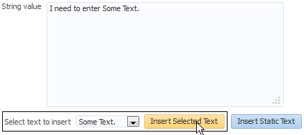
You can also configure an insertTextBehavior tag that works with command components to insert given text into an inputText component. The text to be entered can be a simple string, or it can be the value of another component, for example the selected list item in a selectOneChoice component. For example, Figure 11-10 shows an inputText component with some text already entered by a user.
Figure 11-10 inputText Component with Entered Text
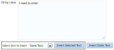
The user can then select additional text from a dropdown list, click the command button, and that text appears in the inputText component as shown in Figure 11-11.
Figure 11-11 inputText Component with Inserted Text
11.3.1 How to Add an inputText Component
You can use an inputText component inside any of the layout components described in Organizing Content on Web Pages.
Before you begin:
It may be helpful to have an understanding of how the attributes can affect functionality. For more information, see Using the inputText Component.
You may also find it helpful to understand functionality that can be added using other ADF Faces features. For more information, see Additional Functionality for Input Components and Forms.
To add an inputText component:
11.3.2 How to Add the Ability to Insert Text into an inputText Component
The insertTextBehavior tag works with command components to insert given text into an inputText component. The text to be entered can be a simple string, or it can be the value of another component, for example the selected list item in a selectOneChoice component. To allow text to be inserted into an inputText component, add the insertTextBehavior tag as a child to a command component that will be used to insert the text.
Note:
The insertTextBehavior tag cancels server-side event delivery automatically; actionListener or action attributes on the parent command component will be ignored. If you need to also trigger server-side functionality, you must add an custom client listener to deliver the server-side event. For more information, see Sending Custom Events from the Client to the Server.
Before you begin:
It may be helpful to have an understanding of how the attributes can affect functionality. For more information, see Using the inputText Component.
You may also find it helpful to understand functionality that can be added using other ADF Faces features. For more information, see Additional Functionality for Input Components and Forms.
Before you add an insertTextBehavior tag, you need to create an inputText component as described in How to Add an inputText Component. Set the clientComponent attribute to true.
To add text insert behavior:
11.4 Using the Input Number Components
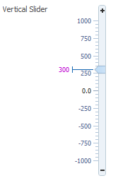
The slider components present the user with a slider with one or two markers whose position on the slider corresponds to a value. The slider values are displayed and include a minus icon at one end and a plus icon at the other. The user selects the marker and moves it along the slider to select a value. The inputNumberSlider component has one marker and allows the user to select one value from the slider, as shown in Figure 11-12 in horizontal layout, and in Figure 11-13 in vertical layout.
Figure 11-12 inputNumberSlider in Horizontal Layout

Figure 11-13 InputNumberSlider in Vertical Layout
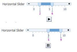
The inputRangeSlider component has two markers and allows the user to pick the end points of a range, as shown in Figure 11-14.
Figure 11-14 inputRangeSlider in horizontal layout

You can also configure the inputNumberSlider and inputRangeSlider components to add a play/pause button that animates the slider across the component's increment values, as shown in Figure 11-15.
Figure 11-15 inputRangeSlider with Play/Pause Button
The inputNumberSpinbox is an input component that presents the user with an input field for numerical values and a set of up- and down-arrow keys to increment or decrement the current value in the input field, as shown in Figure 11-16.
Figure 11-16 inputNumberSpinbox
11.4.1 How to Add an inputNumberSlider or an inputRangeSlider Component
When you add an inputNumberSlider or an inputRangeSlider component, you can determine the range of numbers shown and the increment of the displayed numbers.
Before you begin:
It may be helpful to have an understanding of how the attributes can affect functionality. For more information, see Using the Input Number Components.
You may also find it helpful to understand functionality that can be added using other ADF Faces features. For more information, see Additional Functionality for Input Components and Forms.
To add an inputNumberSlider or inputRangeSlider component:
11.4.2 How to Add an inputNumberSpinbox Component
The inputNumberSpinbox component allows the user to scroll through a set of numbers to select a value.
Before you begin:
It may be helpful to have an understanding of how the attributes can affect functionality. For more information, see Using the Input Number Components.
You may also find it helpful to understand functionality that can be added using other ADF Faces features. For more information, see Additional Functionality for Input Components and Forms.
To add an inputNumberSpinbox component:
11.5 Using Color and Date Choosers
The inputColor component allows users to pick a color from a a palette. It presents a text input field for entering code for colors. It also displays a button for picking colors from a palette in a popup, as shown in Figure 11-17.
Figure 11-17 inputColor Component with Popup chooseColor Component
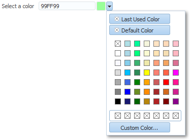
By default, the content delivery for the popup is lazy. When the user clicks the button, the inputColor component receives a PPR request, and rerenders, displaying a chooseColor component in a popup component.
Performance Tip
If the clientComponent attribute on the inputColor component is set to true, then the popup and chooseColor component are delivered immediately. If the color palette is large, this could negatively affect initial page load performance.
The default color code format is the hexadecimal color format. However, you can override the format using a ColorConverter class.
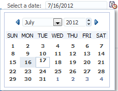
The inputDate component presents a text input field for entering dates and a button for picking dates from a popup calendar, as shown in Figure 11-18. The default date format is the short date format appropriate for the current locale. For example, the default format in American English (ENU) is mm/dd/yy. However, you can override the format using a date-time converter (for more information about using converters, see Adding Conversion).
Figure 11-18 inputDate Component
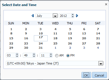
When you add a date-time converter and configure it to show both the date and the time, the date picker is displayed as a modal dialog with additional controls for the user to enter a time. Additionally, if the converter is configured to show a time zone, a time zone dropdown list is shown in the dialog, as shown in Figure 11-19.
Figure 11-19 Modal Dialog When Date-Time Converter Is Used
11.5.1 How to Add an inputColor Component
The inputColor component allows users either to enter a value in an input text field, or to select a color from a color chooser.
Before you begin:
It may be helpful to have an understanding of how the attributes can affect functionality. For more information, see Using Color and Date Choosers.
You may also find it helpful to understand functionality that can be added using other ADF Faces features. For more information, see Additional Functionality for Input Components and Forms.
To add an inputColor component:
11.5.2 How to Add an InputDate Component
The inputDate component allows the user to either enter or select a date.
Before you begin:
It may be helpful to have an understanding of how the attributes can affect functionality. For more information, see Using Color and Date Choosers.
You may also find it helpful to understand functionality that can be added using other ADF Faces features. For more information, see Additional Functionality for Input Components and Forms.
To add an inputDate component:
11.5.3 What You May Need to Know About Selecting Time Zones Without the inputDate Component
By default, the inputDate component displays a drop down list of time zones if the associated converter is configured to do so, for example, if you include the time zone placeholder z in the converter's pattern. The user can only modify the time zone using this list. The list is configured to display the most common time zones.
However, there may be times when you need to display the list of time zones outside of the inputDate component. For example, on a Application Preferences page, you may want to use a selectOneChoice component that allows the user to select the time zone that will be used to display all inputDates in the application. A backing bean would handle the conversion between the time zone ID and the java.util.TimeZone object. Converters for the inputDate instances in the application would then bind the time zone to that time zone object.
You can access this list using either an API on the DateTimeUtils class, or using an EL expression on a component.
Following are the methods on DateTimeUtils class:
getCommonTimeZoneSelectItems (): Returns a list of commonly used time zones.getCommonTimeZoneSelectItems (String timeZoneId): Returns a list of commonly used time zones, including the given time zone if it is not part of the list.
To access this list using EL, use one of the following expressions:
af:getCommonTimeZoneSelectItemsFor example:
<f:selectItems value="#{af:getCommonTimeZoneSelectItems()}" id="tzones2" />af:getMergedTimeZoneSelectItems (id)For example:
<f:selectItems value="#{af:getMergedTimeZoneSelectItems(demoInput.preferredTimeZoneId)}" id="tzones" />
If you will be using an inputDate component and a selection list for its time zone on the same page, you must clear out the local value for the inputDate's time zone to ensure that the value binding for the selection takes precedence. Otherwise, a non-null local value will take precedence, and the inputDate component will not appear to be updated.In the following example, the backing bean has a reference using the binding attribute to the inputDate component. When the user picks a new time zone, the ID is set and the code gets the converter for the inputDate and clears out its time zone. When the page is rendered, since the local value for the converter's time zone is null, it will evaluate #{demoInput.preferredTimeZone} and obtain the updated time zone.
<af:selectOneChoice label="Select a new timezone" id="soc1"
                    value="#{demoInput.preferredTimeZoneId}" autoSubmit="true">
  <f:selectItems
         value="#{af:getMergedTimeZoneSelectItems(demoInput.preferredTimeZoneId)}"
         id="tzones" />
</af:selectOneChoice>
<af:inputDate label="First inputDate with timezone bound" id="bound1"
              partialTriggers="tzpick"  binding="#{demoInput.boundDate1}">
  <af:convertDateTime type="both" timeStyle="full"
                      timeZone="#{demoInput.preferredTimeZone}"/>
</af:inputDate>

DemoInputBean.java
public void setPreferredTimeZoneId(String _preferredTimeZoneId)
{
  TimeZone tz = TimeZone.getTimeZone(_preferredTimeZoneId);
  setPreferredTimeZone (tz);
  this._preferredTimeZoneId = _preferredTimeZoneId;
}

public void setPreferredTimeZone(TimeZone _preferredTimeZone)
{
  this._preferredTimeZone = _preferredTimeZone;
     DateTimeConverter conv1 = (DateTimeConverter)
                              _boundDate1.getConverter();
  conv1.setTimeZone(null);
}
11.5.4 What You May Need to Know About Creating a Custom Time Zone List
The inputDate component can be configured to show a custom list of time zones using the Time Zone List attribute.
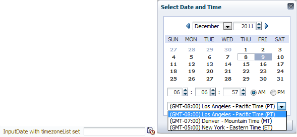
In the following example, the inputDate component uses the custom time zone list defined by the testInput backing bean to show only three US time zones.
<af:inputDate id="idtzl" label="InputDate with timezoneList set"
                          timeZoneList="#{testInput.timezoneList}">
<af:convertDateTime type="both" timeStyle="full" timeZone="#{testInput.timezone}/>
</af:inputDate>


testInput.java
public void setTimezoneList(List<String> _timezoneList)
  {
    this._timezoneList = _timezoneList;
  }
  public List<String> getTimezoneList()
  {
    return _timezoneList;
  }
  private List<String> _timezoneList = new ArrayList<String>
     (Arrays.asList("America/Los_Angeles", "America/Denver", "America/New_York"));
Figure 11-21 illustrates the custom time zone list in the inputDate component defined by the backing bean.
Figure 11-21 Custom Time Zone List in inputDate Component
You can also use the getCustomTimeZoneSelectItems helper EL method to get custom time zones as a list of SelectItems, which can then be used with components like selectOneChoice, as shown in the following example.
<af:selectOneChoice label="Select a timezone" id="soctzlel" value="America/New_York">
<f:selectItems value="#{af:getCustomTimeZoneSelectItems('America/New_York', testInput.timezoneList)}" id="tzonesel" />
</af:selectOneChoice>
Figure 11-22 illustrates the custom time zone list in the selectOneChoice component defined by the getCustomTimeZoneSelectItems method.
Figure 11-22 Custom Time Zone List in selectOneChoice Component

The getCustomTimeZoneSelectItems helper EL method assumes that the input parameter list is sorted by timezone offset. For more information about getCustomTimeZoneSelectItems method, see the ADF Faces API documentation.
11.6 Using Selection Components
The selection components allow the user to select single and multiple values from a list or group of items. ADF Faces provides a number of different selection components, ranging from simple boolean radio buttons to list boxes that allow the user to select multiple items. The list of items within a selection component is made up of a number of selectItem components
All the selection components except the selectItem component delivers the ValueChangeEvent and AttributeChangeEvent events. The selectItem component only delivers the AttributeChangeEvent event. You must create a valueChangeListener handler or an attributeChangeListener handler, or both for them.
The selectBooleanCheckbox component value must always be set to a boolean and not an object. It toggles between selected and unselected states, as shown in Figure 11-23.
Figure 11-23 selectBooleanCheckbox Component
The selectBooleanCheckbox component also provides a third mixed state that indicates that the component is neither selected or cleared, as shown in Figure 11-24. Clicking a mixed state checkbox makes it selected. It toggles between the selected and cleared states, but it does not return to the mixed state by clicking, or any other click action.
Figure 11-24 selectBooleanCheckbox Component in Mixed State
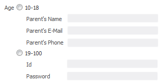
The selectBooleanRadio component displays a boolean choice, and must always be set to a boolean. Unlike the selectBooleanCheckbox component, the selectBooleanRadio component allows you to group selectBooleanRadio components together using the same group attribute.
For example, say you have one boolean that determines whether or not a user is age 10 to 18 and another boolean that determines whether a user is age 19-100. As shown in Figure 11-25, the two selectBooleanRadio components can be placed anywhere on the page, they do not have to be next to each other. As long as they share the same group value, they will have mutually exclusive selection, regardless of their physical placement on the page.
Tip:
Each selectBooleanRadio component must be bound to a unique boolean.
Figure 11-25 selectBooleanRadio Component
You use the selectOneRadio component to create a list of radio buttons from which the user can select a single value from a list, as shown in Figure 11-26.
Figure 11-26 selectOneRadio Component
You use the selectManyCheckbox component to create a list of checkboxes from which the user can select one or more values, as shown in Figure 11-27.
Figure 11-27 selectManyCheckbox Component
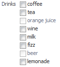
The selectOneListbox component creates a component which allows the user to select a single value from a list of items displayed in a shaded box, as shown in Figure 11-28.
Figure 11-28 selectOneListbox Component

The selectManyListbox component creates a component which allows the user to select many values from a list of items. This component includes an All checkbox that is displayed at the beginning of the list of checkboxes, as shown in Figure 11-29.
Figure 11-29 selectManyListbox Component
The selectOneChoice component creates a menu-style component, which allows the user to select a single value from a dropdown list of items. The selectOneChoice component is intended for a relatively small number of items in the dropdown list.
Best Practice
If a large number of items is desired, use an inputComboboxListOfValues component instead. For more information, see Using List-of-Values Components.
The selectOneChoice component is shown in Figure 11-30.
Figure 11-30 selectOneChoice Component

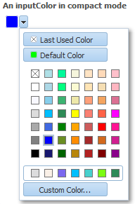
You can configure the selectOneChoice component to display in a compact mode, as shown in Figure 11-31. When in compact mode, the input field is replaced with a smaller icon.
Figure 11-31 selectOneChoice Component in Compact Mode
When the user clicks the icon, the dropdown list is displayed, as shown in Figure 11-32.
Figure 11-32 List for selectOneChoice Component in Compact Mode

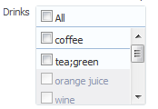
The selectManyChoice component creates a menu-style dropdown component, which allows the user to select multiple values from a dropdown list of items. This component can be configured to include an All selection item that is displayed at the beginning of the list of selection items. If the number of choices is greater than 15, a scrollbar will be presented, as shown in Figure 11-33.
Figure 11-33 selectManyChoice Component

By default, all selectItem child components are built when the selectManyChoice component is built, as the page is rendered. However, if the way the list items are accessed is slow, then performance can be hampered. This delay can be especially troublesome when it is likely that the user will select the items once, and then not change them on subsequent visits.
For example, suppose you have a selectManyChoice component used to filter what a user sees on a page, and that the values for the child selectItem components are accessed from a web service. Suppose also that the user is not likely to change that selection each time they visit the page. By default, each time the page is rendered, all the selectItems must be built, regardless of whether or not the user will actually need to view them. Instead, you can change the contentDelivery attribute on the selectManyChoice component from immediate (the default) to lazy. The lazy setting causes the selectItem components to be built only when the user clicks the dropdown.
For both immediate and lazy, when the user then makes a selection, the values of the selected selectItem components are displayed in the field. However when lazy content delivery is used, on subsequent visits, instead of pulling the selected values from the selectItem components (which would necessitate building these components), the values are pulled from the lazySelectedLabel attribute. This attribute is normally bound to a method that returns an array of Strings representing the selected items. The selectItem components will not be built until the user goes to view or change them, using the dropdown.
Note that there are limitations when using the lazy delivery method on the selectManyChoice component. For more information about content delivery for the selectManyChoice component and its limitations, see What You May Need to Know About the contentDelivery Attribute on the SelectManyChoice Component.
For the following components, if you want the label to appear above the control, you can place them in a panelFormLayout component.
selectOneChoiceselectOneRadioselectOneListboxselectManyChoiceselectManyCheckboxselectManyListbox
For the following components, the attributes disabled, immediate, readOnly, required, requireMessageDetail, and value cannot be set from JavaScript on the client for security reasons (for more information, see How to Set Property Values on the Client):
selectOneChoiceselectOneRadioselectOneListboxselectBooleanRadioselectBooleanCheckboxselectManyChoiceselectManyCheckboxselectManyListbox
11.6.1 How to Use Selection Components
The procedures for adding selection components are the same for each of the components. First, you add the selection component and configure its attributes. Then you add any number of selectItem components for the individual items in the list, and configure those.
Before you begin:
It may be helpful to have an understanding of how the attributes can affect functionality. For more information, see Using Selection Components.
You may also find it helpful to understand functionality that can be added using other ADF Faces features. For more information, see Additional Functionality for Input Components and Forms.
To use a selection component:
11.6.2 What You May Need to Know About the contentDelivery Attribute on the SelectManyChoice Component
When the contentDelivery attribute on the selectManyChoice component is set to immediate (the default), the following happens:
First visit to the page:
The
selectManyChoiceand allselectItemcomponents are built as the page is rendered. This can cause performance issues if there are many items, or if the values for theselectItemcomponents are accessed for example, from a web service.When the
selectManyChoicecomponent renders, nothing displays in the field, as there has not yet been a selection.When user clicks drop down, all items are shown.
When user selects items, the corresponding labels for the selected
selectItemcomponents are shown in field.When page is submitted, values are posted back to the model.
Subsequent visit: The
selectManyChoiceand allselectItemcomponents are built again as the page is rendered. Labels for selectedselectItemcomponents are displayed in field. This will cause the same performance issues as on the first visit to the page.
When the contentDelivery attribute on the selectManyChoice component is set to lazy, the following happens:
First visit to the page:
The
selectManyChoiceis built as the page is rendered, but theselectItemcomponents are not.When the
selectManyChoicecomponent renders, nothing displays in the field, as there has not yet been a selection.When user clicks drop down, the
selectItemcomponents are built. While this is happening, the user sees a "busy" spinner. Once the components are built, all items are shown.When user selects items, the corresponding labels for the selected
selectItemcomponents are shown in field.When page is submitted, values are posted back to the model.
Subsequent visit:
When page is first rendered, only the
selectManyChoicecomponent is built. At this point, the value of thelazySelectedLabelattribute is used to display the selected items.If user clicks drop down, the
selectItemcomponents are built. While this is happening, the user sees a "busy" spinner. Once the components are built, all items are shown.Once the
selectItemcomponents are built, theselectManyChoicecomponent will act as though itscontentDeliveryattribute is set toimmediate, and use the actual value of theselectItemcomponents to display the selected items.
Following are limitations for using lazy content delivery for the selectManyChoice component:
You cannot store the value of the
selectManyChoicein Request scope. On postback, the value attribute is accessed from the model, rather than decoding what was returned from the client. If the value is stored in Request scope, that value will be empty. Do not store the value in Request scope.On postbacks, converters are not called. If you are relying on converters for postbacks, then you should not use lazy content delivery.
The
contentDeliveryattribute is ignored when in screen reader mode. TheselectItemcomponents will always be built when the page is rendered.
11.7 Using Shuttle Components
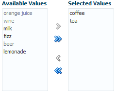
The selectManyShuttle and selectOrderShuttle components present the user with two list boxes and buttons to move or shuttle items from one list box to the other. The user can select a single item or multiple items to shuttle between the leading (Available values) list box and the trailing (Selected values) list box. For either component, if you want the label to appear above the control, place them in a panelFormLayout component.
The selectManyShuttle component is shown in Figure 11-34.
Figure 11-34 selectManyShuttle component
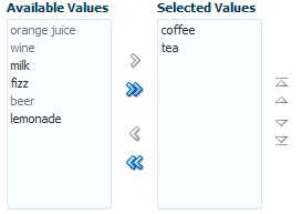
The selectOrderShuttle component additionally includes up and down arrow buttons that the user can use to reorder values in the Selected values list box, as shown in Figure 11-35. When the list is reordered, a ValueChangeEvent event is delivered. If you set the readOnly attribute to true, ensure the values to be reordered are selected values that will be displayed in the trailing list (Selected values).
Figure 11-35 selectOrderShuttle Component
The value attribute of these components, like any other selectMany component, must be a List or an Array of values that correspond to a value of one of the contained selectItem components. If a value of one of the selectItems is in the List or Array, that item will appear in the trailing list. You can convert a selectManyListbox component directly into a selectManyShuttle; instead of the value driving which items are selected in the listbox, it affects which items appear in the trailing list of the selectOrderShuttle component.
Similar to other select components, the List or Array of items are composed of selectItem components nested within the selectManyShuttle or selectOrderShuttle component. The following example shows a sample selectOrderShuttle component that allows the user to select the top five file types from a list of file types.
<af:selectOrderShuttle value="#{helpBean.topFive}"
    leadingHeader="#{explorerBundle['help.availableFileTypes']}"
    trailingHeader="#{explorerBundle['help.top5']}"
    simple="true" id="sos1">
  <af:selectItem label="XLS" id="si1"/>
  <af:selectItem label="DOC" id="si2"/>
  <af:selectItem label="PPT" id="si3"/>
  <af:selectItem label="PDF" id="si4"/>
  <af:selectItem label="Java" id="si5"/>
  <af:selectItem label="JWS" id="si6"/>
  <af:selectItem label="TXT" id="si7"/>
  <af:selectItem label="HTML" id="si8"/>
  <af:selectItem label="XML" id="si9"/>
  <af:selectItem label="JS" id="si10"/>
  <af:selectItem label="PNG" id="si11"/>
  <af:selectItem label="BMP" id="si12"/>
  <af:selectItem label="GIF" id="si13"/>
  <af:selectItem label="CSS" id="si14"/>
  <af:selectItem label="JPR" id="si15"/>
  <af:selectItem label="JSPX" id="si16"/>
  <f:validator validatorId="shuttle-validator"/>
</af:selectOrderShuttle>
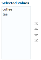
If you set the reorderOnly attribute of a selectOrdershuttle component to true, the shuttle function will be disabled, and only the Selected Values listbox appears. The user can only reorder the items in the listbox, as shown in Figure 11-36.
Figure 11-36 selectOrderShuttle Component in Reorder-Only Mode
11.7.1 How to Add a selectManyShuttle or selectOrderShuttle Component
The procedures for adding shuttle components are the same for both components. First you add the selection component and configure its attributes. Then you add any number of selectItem components for the individual items in the list, and configure those.
Before you begin:
It may be helpful to have an understanding of how the attributes can affect functionality. For more information, see Using Shuttle Components.
You may also find it helpful to understand functionality that can be added using other ADF Faces features. For more information, see Additional Functionality for Input Components and Forms.
To add a selectManyShuttle or selectOrderShuttle component:
11.7.2 What You May Need to Know About Using a Client Listener for Selection Events
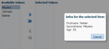
You can provide the user with information about each selected item before the user shuttles it from one list to another list by creating JavaScript code to perform processing in response to the event of selecting an item. For example, your code can obtain additional information about that item, then display it as a popup to help the user make the choice of whether to shuttle the item or not. Figure 11-37 shows a selectManyShuttle component in which the user selects Meyers and a popup provides additional information about this selection.
Figure 11-37 selectManyShuttle with selectionListener
You implement this feature by adding a client listener to the selectManyShuttle or selectOrderShuttle component and then create a JavaScript method to process this event. The JavaScript code is executed when a user selects an item from the lists. For more information about using client listeners for events, see Listening for Client Events.
How to add a client listener to a shuttle component to handle a selection event:
In the following example, AdfShuttleUtils.getLastSelectionChange is called to get the value of the last selected item
function showDetails(event)
{
  if(AdfRichSelectManyShuttle.SELECTION == event.getPropertyName())
  {
    var shuttleComponent = event.getSource();
    var lastChangedValue =    AdfShuttleUtils.getLastSelectionChange(shuttleComponent, event.getOldValue());
    var side = AdfShuttleUtils.getSide(shuttleComponent, lastChangedValue);
    if(AdfShuttleUtils.isSelected(shuttleComponent, lastChangedValue))
    {
      //do something...
    }
    else
    {
      //do something else
    }
    if(AdfShuttleUtils.isLeading(shuttleComponent, lastChangedValue))
    {
      //queue a custom event (see serverListener) to call a java method on the server
    }
  }
}
11.8 Using the richTextEditor Component
The richTextEditor component provides an input field that can accept text with formatting. It also supports label text, and messages. It allows the user to change font name, size, and style, create ordered lists, justify text, and use a variety of other features. The richTextEditor component also can be used to edit an HTML source file. Two command buttons are used to toggle back and forth between editing standard formatted text and editing the HTML source file. Figure 11-38 shows the rich text editor component in standard rich text editing Mode.
Figure 11-38 The richTextEditor Component in Standard Editing Mode

Figure 11-39 shows the editor in source code editing mode.
Figure 11-39 richTextEditor in Source Editing Mode

Other supported features include:
Font type
Font size
Link/unlink
Clear styling
Undo/redo
Bold/italics/underline
Subscript/superscript
Justify (left, middle, right, full)
Ordered/unordered lists
Indentation
Text color/background color
Rich text editing mode / source code editing mode
Rich text editing toolbar inline display mode / popup display mode
The value (entered text) of the rich text editor is a well-formed XHTML fragment. Parts of the value may be altered for browser-specific requirements to allow the value to be formatted. Also, for security reasons, some features such as script-related tags and attributes will be removed. There are no guarantees that this component records only the minimal changes made by the user. Because the editor is editing an XHTML document, the following elements may be changed:
Nonmeaningful whitespace
Element minimization
Element types
Order of attributes
Use of character entities
The editor supports only HTML 4 tags, with the exception of:
Script, noscript
Frame, frameset, noframes
Form-related elements (input, select, optgroup, option, textarea, form, button, label, isindex)
Document-related elements (html, head, body, meta, title, base, link)
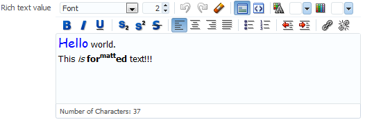
The richTextEditor component provides a footer facet that you can use to display additional information, or to add user interface elements. For example, Figure 11-40 shows the richTextEditor component with a character counter in its footer facet.
Figure 11-40 The richTextEditor Component with Character Counter in Footer Facet
The richTextEditor component also supports tags that pull in content (such as applet, iframe, object, img, and a). For the iframe tag, the content should not be able to interact with the rest of the page because browsers allow interactions only with content from the same domain. However, this portion of the page is not under the control of the application.
While the richTextEditor component does not support font units such as px and em, it does support font size from 1 to 7 as described in the HTML specification. It does not support embed or unknown tags (such as <foo>).
On the client, the richTextEditor component does not support getValue and setValue methods. There is no guarantee the component's value on the client is the same as the value on the server. Therefore, the richTextEditor does not support client-side converters and validators. Server-side converters and validators will still work.
The rich text editor delivers ValueChangeEvent and AttributeChangeEvent events. Create valueChangeListener and attributeChangeListener handlers for these events as required.
You can also configure the richTextEditorInsertBehavior tag, which works with command components to insert given text into the richTextEditor component. The text to be entered can be a simple string, or it can be preformatted text held, for example, in a managed bean.
By default, the toolbar in the richTextEditor component allows the user to change many aspects of the text, such as the font, font size and weight, text alignment, and view mode, as shown in Figure 11-41.
Figure 11-41 Toolbar in richTextEditor Component
Figure 11-42 shows a toolbar that has been customized. Many of the toolbar buttons have been removed and a toolbar with a custom toolbar button and a menu have been added.
Figure 11-42 Customized Toolbar for richTextEditor
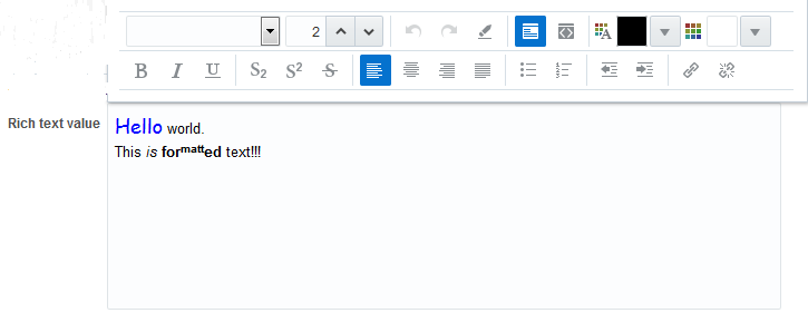
As Figure 11-43 shows, you can configure the toolbar to display in popup mode when displaying the toolbar inline (default behavior) with the richTextEditor is not desired.
Figure 11-43 Toolbar Display Mode Set to Popup
11.8.1 How to Add a richTextEditor Component
Once you add a richTextEditor component, you can configure it so that text can be inserted at a specific place, and you can also customize the toolbar. For more information, see How to Add the Ability to Insert Text into a richTextEditor Component, and How to Customize the Toolbar.
Before you begin:
It may be helpful to have an understanding of how the attributes can affect functionality. For more information, see Using the richTextEditor Component.
You may also find it helpful to understand functionality that can be added using other ADF Faces features. For more information, see Additional Functionality for Input Components and Forms.
To add a richTextEditor component:
Tip:
You can set the width of a richTextEditor component to full width or 100%. However, this works reliably only if the editor is contained in a geometry-managing parent components. It may not work reliably if it is placed in flowing layout containers such as panelFormLayout or panelGroupLayout. For more information, see Geometry Management and Component Stretching.
11.8.2 How to Add the Ability to Insert Text into a richTextEditor Component
To allow text to be inserted into a richTextEditor component, add the richTextEditorInsertBehavior tag as a child to a command component that will be used to insert the text.
Before you begin:
It may be helpful to have an understanding of the rich text editor component. For more information, see Using the richTextEditor Component.
You may also find it helpful to understand functionality that can be added using other ADF Faces features. For more information, see Additional Functionality for Input Components and Forms.
You need to create a richTextEditor component as described in How to Add a richTextEditor Component. Set the clientComponent attribute to true.
To add text insert behavior:
11.8.3 How to Customize the Toolbar
Place the toolbar and toolbar buttons you want to add in custom facets that you create. Then, reference the facet (or facets) from an attribute on the toolbar, along with keywords that determine how or where the contained items should be displayed.
To allow text to be inserted into a richTextEditor component, add the richTextEditorInsertBehavior tag as a child to a command component that will be used to insert the text.
Before you begin:
It may be helpful to have an understanding of the rich text editor component. For more information, see Using the richTextEditor Component.
You may also find it helpful to understand functionality that can be added using other ADF Faces features. For more information, see Additional Functionality for Input Components and Forms.
To customize the toolbar:
11.9 Using File Upload
The inputFile component provides users with file uploading and updating capabilities. This component allows the user to select a local file and upload it to a selectable location on the server (to download a file from the server to the user, see How to Use an Action Component to Download Files).
The inputFile component delivers the standard ValueChangeEvent event as files are being uploaded, and it manages the loading process transparently. The value property of an inputFile component is set to an instance of the org.apache.myfaces.trinidad.model.UploadedFile class when the file is uploaded.
To initiate the upload process you first must configure the page's form to allow uploads. You then create an action component such as a command button, as shown in Figure 11-44, that can be used to upload a file.
Figure 11-44 inputFile Component
Once a file has been uploaded, and so the value of the inputFile is not null (either after the initial load is successful or it has been specified as an initial value), you can create an Update button that will be displayed instead of the Browse button, as shown in Figure 11-45. This will allow the user to modify the value of the inputFile component.
Figure 11-45 inputFile Component in Update Mode
Setting the uploadType attribute to auto or manual displays the progress bar while uploading a file as shown in Figure 11-46.
Figure 11-46 inputFile Component with Progress Bar

You can also specify that the component be able to load only a specific file by setting the readOnly property to true, In this mode, only the specified file can be loaded, as shown in Figure 11-47.
Figure 11-47 inputFile Component in Read-Only Mode
By default, the inputFile component allows upload of one file only, but it can be configured to upload multiple files. Figure 11-48 shows the inputFile component configured to upload multiple files.
Figure 11-48 inputFile Component for Multiple Files
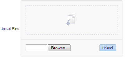
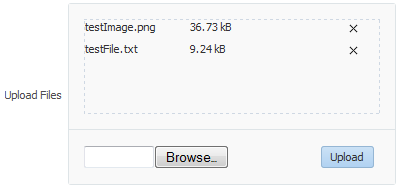
The user can select multiple files in the File Upload dialog that opens through the Browse button, or drag-and-drop multiple files in the drop section of the component. When files appear in the drop section, the user clicks Upload to upload the files, as shown in Figure 11-49.
Figure 11-49 inputFile Component Showing Files Ready to Upload
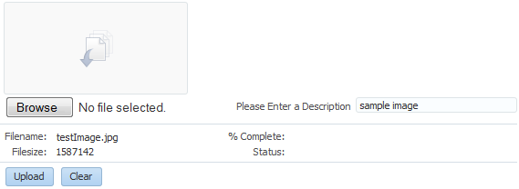
Using Javascript APIs, you can configure the inputFile component to utilize custom user interface elements. For example, Figure 11-50 shows the inputFile component with a description field that the user may use to enter a brief description of the selected file.
Figure 11-50 inputFile Component with Custom User Interface Element
For more information about Javascript APIs that you can use to configure the inputFile component, see the documentation of class AdfFileUploadManager in JavaScript API Reference for Oracle ADF Faces.
The inputFile component can be placed in either an h:form tag or an af:form tag, but in either case, you have to set the form tag to support file upload. If you use the JSF basic HTML h:form, set the enctype to multipart/form-data. This would make the request into a multipart request to support file uploading to the server. If you are using the ADF Faces af:form tag, set usesUpload to true, which performs the same function as setting enctype to multipart/form-data to support file upload.
The ADF Faces framework performs a generic upload of the file. You should create an actionListener or action method to process the file after it has been uploaded (for example, processing xml files, pdf files, and so on).
The value of an inputFile component is an instance of the org.apache.myfaces.trinidad.model.UploadedFile interface. Thus, when the file is uploaded, the value of the inputFile component becomes the instance of org.apache.myfaces.trinidad.model.UploadedFile. Therefore, if you need to access the value (that is, the file itself), you need to use the API for this interface. Accessing the component itself through the binding attribute only accesses the component and not the uploaded file.
Note:
The API of the org.apache.myfaces.trinidad.model.UploadedFile interface lets you get at the actual byte stream of the file, as well as the file's name, its MIME type, and its size. The API does not allow you to get path information from the client about from where the file was uploaded.
The uploaded file may be stored as a file in the file system, but may also be stored in memory; the API hides that difference. The filter ensures that the UploadedFile content is cleaned up after the request is complete. Because of this, you cannot usefully cache UploadedFile objects across requests. If you need to keep the file, you must copy it into persistent storage before the request finishes.
For example, instead of storing the file, add a message stating the file upload was successful using a managed bean as a response to the ValueChangeEvent event, as shown in Example 11-1.
You can also handle the upload by binding the value directly to a managed bean, as shown in Example 11-2.
Note:
If you are using the inputFile component to upload multiple files, note that the return type of event.getNewValue() is List<UploadedFile>, instead of UploadedFile. The value binding for the managed bean is also List<UploadedFile>, not UploadedFile.
Example 11-1 Using valueChangeListener to Display Upload Message
JSF Page Code ----->
<af:form usesUpload="true" id="f1">
  <af:inputFile label="Upload:"
                valueChangeListener="#{managedBean.fileUploaded}" id="if1"/>
  <af:button text="Begin" id="b1"/>
</af:form>

Managed Bean Code ---->
import javax.faces.application.FacesMessage;
import javax.faces.context.FacesContext;
import javax.faces.event.ValueChangeEvent;
import org.apache.myfaces.trinidad.model.UploadedFile;

public class ABackingBean
{
  ...
  public void fileUploaded(ValueChangeEvent event)
  {
    UploadedFile file = (UploadedFile) event.getNewValue();
    if (file != null)
    {
      FacesContext context = FacesContext.getCurrentInstance();
      FacesMessage message = new FacesMessage(
         "Successfully uploaded file " + file.getFilename() +
         " (" + file.getLength() + " bytes)");
      context.addMessage(event.getComponent().getClientId(context), message);
      // Here's where we could call file.getInputStream()
    }
  }
}
Example 11-2 Example 11-13 Binding the Value to a Managed Bean
JSF Page Code ---->
<af:form usesUpload="true">
  <af:inputFile label="Upload:" value="#{managedBean.file}" id="if1"/>
  <af:button text="Begin" action="#{managedBean.doUpload}" id="b1"/>
</af:form>

Managed Bean Code ---->
import org.apache.myfaces.trinidad.model.UploadedFile;public class AManagedBean
{
  public UploadedFile getFile()
  {
    return _file;
  }
  public void setFile(UploadedFile file)
  {
    _file = file;
  }

  public String doUpload()
  {
    UploadedFile file = getFile();
    // ... and process it in some way
  }
  private UploadedFile _file;

}
11.9.1 How to Use the inputFile Component
A Java class must be bound to the inputFile component. This class will be responsible for containing the value of the uploaded file.
Before you begin:
It may be helpful to have an understanding of how the attributes can affect functionality. For more information, see Using File Upload.
You may also find it helpful to understand functionality that can be added using other ADF Faces features. For more information, see Additional Functionality for Input Components and Forms.
To add an inputFile component:
11.9.2 How to Configure the inputFile Component to Upload Multiple Files
Use the uploadType and maximumFiles attributes to configure the inputFile component to upload multiple files.
Before you begin:
It may be helpful to have an understanding of how the attributes can affect functionality. For more information, see Using File Upload.
You may also find it helpful to understand functionality that can be added using other ADF Faces features. For more information, see Additional Functionality for Input Components and Forms.
To configure an inputFile component to upload multiple files:
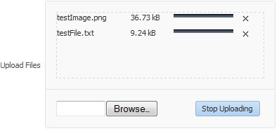
To remove an uploaded file from the drop section, or cancel upload of a file that is being uploaded, click the Cancel icon next to the file name and the progress bar. To cancel upload of all files, click the Stop Uploading button, as shown in Figure 11-51.
Figure 11-51 File Being Uploaded Using inputFile Component
11.9.3 What You May Need to Know About Temporary File Storage
Because ADF Faces will temporarily store files being uploaded (either on disk or in memory), by default it limits the size of acceptable incoming upload requests to avoid denial-of-service attacks that might attempt to fill a hard drive or flood memory with uploaded files. By default, only the first 100 kilobytes in any one request will be stored in memory. Once that has been filled, disk space will be used. Again, by default, that is limited to 2,000 kilobytes of disk storage for any one request for all files combined. Once these limits are exceeded, the filter will throw an EOFException.
Files are, by default, stored in the temporary directory used by the java.io.File.createTempFile() method, which is usually defined by the system property java.io.tmpdir. Obviously, this will be insufficient for some applications, so you can configure these values using three servlet context initialization parameters, as shown in the following example.
  <context-param>
    <!-- Maximum memory per request (in bytes) -->
    <param-name>org.apache.myfaces.trinidad.UPLOAD_MAX_MEMORY</param-name>
    <!-- Use 500K -->
    <param-value>512000</param-value>
  </context-param>
  <context-param>
    <!-- Maximum disk space per request (in bytes) -->
    <param-name>org.apache.myfaces.trinidad.UPLOAD_MAX_DISK_SPACE</param-name>
    <!-- Use 5,000K -->
    <param-value>5120000</param-value>
  </context-param>
  <context-param>
    <!-- directory to store temporary files -->
    <param-name>org.apache.myfaces.trinidad.UPLOAD_TEMP_DIR</param-name>
    <!-- Use a TrinidadUploads subdirectory of /tmp -->
    <param-value>/tmp/TrinidadUploads/</param-value>
  </context-param>
  <context-param>
    <!-- Maximum file size that can be uploaded.-->
    <param-name>org.apache.myfaces.trinidad.UPLOAD_MAX_FILE_SIZE</param-name>
    <!-- Use 5,000K -->
    <param-value>5120000</param-value>
  </context-param>
  <!-- This filter is always required;  one of its functions is
          file upload. -->
  <filter>
    <filter-name>trinidad</filter-name>
    <filter-class>org.apache.myfaces.trinidad.webapp.TrinidadFilter</filter-class>
  </filter>
You can customize the file upload process by replacing the entire org.apache.myfaces.trinidad.webapp.UploadedFileProcessor class with the <uploaded-file-processor> element in the trinidad-config.xml configuration file. Replacing the UploadedFileProcessor class makes the parameters listed in the previous example irrelevant, they are processed only by the default UploadedFileProcessor class.
The <uploaded-file-processor> element must be the name of a class that implements the oracle.adf.view.rich.webapp.UploadedFileProcessor interface. This API is responsible for processing each individual uploaded file as it comes from the incoming request, and then making its contents available for the rest of the request. For most applications, the default UploadedFileProcessor class is sufficient, but applications that need to support uploading very large files may improve their performance by immediately storing files in their final destination, instead of requiring ADF Faces to handle temporary storage during the request.
11.9.4 What You May Need to Know About Uploading Multiple Files
The inputFile component uses HTML 5 to support the drag-and-drop functionality and upload of multiple files. In browsers that do not support HTML 5, a Java applet is used for drag-and-drop functionality and upload of multiple files, as shown in Figure 11-52.
Figure 11-52 inputFile Component in a Non-HTML 5 Browser
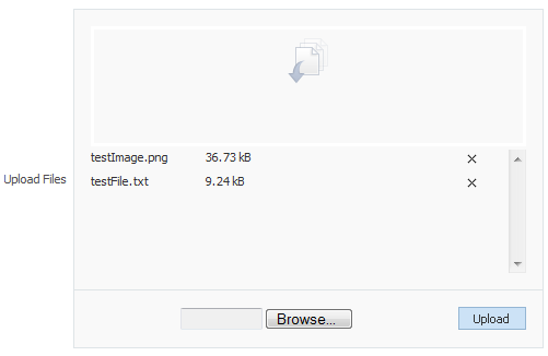
If the browser does not support HTML5 and Java is also not available, then the drop section in the inputFile component is not displayed.
Note:
If you are using OracleAS Single Sign-On (SSO), you might need to configure the mod_osso.conf file that enables single sign-on for Oracle HTTP Server. The file is located at ORACLEOHS_HOME/ohs/conf/, where ORACLEOHS_HOME refers to the home directory of the Oracle HTTP server installation. The configuration is required for the upload applet to function properly in non-HTML5 browsers.
Update the mod_osso.conf file with the following parameters:
OssoSecureCookies off
OssoHTTPOnly Off

Header unset Pragma
OssoSendCacheHeaders off
For more information about OracleAS Single Sign-On, see Securing Applications with Oracle Platform Security Services.
The inputFile component can only upload files that are smaller than 2 GB when in single file upload mode. In multiple file upload mode, the inputFile component can upload files greater than 2 GB, by default, by splitting them into chunks of 2 GB in size. The chunk size can be controlled by the parameter org.apache.myfaces.trinidad.UPLOAD_MAX_CHUNK_SIZE in web.xml whose default and maximum value is 2 GB. For example:
<context-param>
    <!-- Maximum file chunk size that can be uploaded.-->
    <param-name>org.apache.myfaces.trinidad.UPLOAD_MAX_CHUNK_SIZE</param-name>
    <!-- Use 1,000 MB as chunk size -->
    <param-value>1000000000</param-value>
  </context-param>
Note that not all browsers support the uploading of large files using the chunk functionality. For more information, see Release Notes for Oracle for JDeveloper and Application Development Framework (ADF).
After uploading all files, you must ensure that the form is submitted, else the inputFile component data will not be uploaded to the server. If autoSubmit is set to true on the inputFile component, then the form is submitted automatically after all the files have finished uploading. After the form has been submitted, the inputFile component is refreshed and the file list of the drop section becomes empty so that more files can be uploaded. To show the list of uploaded files, add ValueChangeListener or bind the value to a managed bean, as described in Example 11-1.
11.9.5 What You May Need to Know About Customizing User Interface of inputFile Component
You can customize the user interface of the inputFile component with the displayMode attribute. If the displayMode attribute is set to none, no user interface is displayed, and as a developer you will need to create a custom user interface to invoke the APIs to upload files. If the attribute is set to dropArea, a drop area is rendered that supports drag and drop of files, and you will be responsible for adding the rest of the custom user interface. The customized interface of the inputFile component is visible only when it is configured to upload multiple files.
Figure 11-53 shows the inputFile component with different values for displayMode.
Figure 11-53 displayMode Attribute Values for inputFile Component
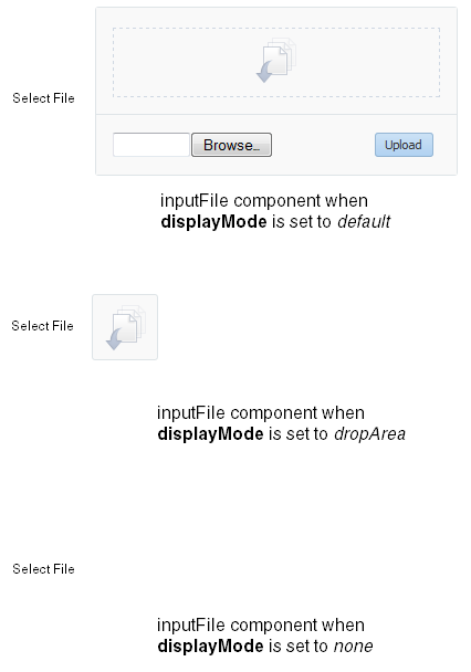
The following example shows an inputFile component with displayMode set to dropArea, and customized to add input fields and buttons to browse and upload files. An additional inputText component is added to enter the description of the uploaded file.
<af:inputFile binding="#{editor.component}" id="bound1" immediate="true"
              maximumFiles="-1"valueChangeListener="#{demoFile.fileUpdate}"
              displayMode="dropArea" uploadType="manual"contentStyle="width:200px;
              height:100px"/>

<af:panelFormLayout maxColumns="2" rows="1">
   <input type="file" id="dmoTpl:cidf1"/>
   <af:inputText clientComponent="true" id="cidd1" label="Please Enter a
   Description"/>
</af:panelFormLayout>

<af:panelFormLayout maxColumns="2" rows="2">
  <af:panelLabelAndMessage for="cidn1" label="Filename:" id="plm1">
    <af:outputText clientComponent="true" id="cidn1"/>
  </af:panelLabelAndMessage>
  <af:panelLabelAndMessage for="cids1" label="Filesize:" id="plm2">
    <af:outputText clientComponent="true" id="cids1"/>
  </af:panelLabelAndMessage>
  <af:panelLabelAndMessage for="cidp1" label="% Complete:" id="plm3">
    <af:outputText clientComponent="true" id="cidp1"/>
  </af:panelLabelAndMessage>
  <af:panelLabelAndMessage for="cidst1" label="Status:" id="plm4">
    <af:outputText clientComponent="true" id="cidst1"/>
  </af:panelLabelAndMessage>
</af:panelFormLayout>

<af:panelFormLayout maxColumns="2" rows="1">
  <af:button id="cup1" text="Upload">
    <af:clientListener method="uploadClick" type="click"/>
  </af:button>
  <af:button id="cl1" text="Clear">
    <af:clientListener method="clearQueue" type="click"/>
   </af:button>
</af:panelFormLayout>
Figure 11-54 shows the inputFile component at runtime.
Figure 11-54 Customized inputFile Component

You can use the JavaScript API methods to customize the behavior of inputFile component. For more information, see the JavaScript API Reference for Oracle ADF Faces.
11.10 Using Code Editor
The af:codeEditor component provides an in-browser code editing solution and enables the user to display and edit program code at runtime in the Fusion web application. The input field of the code editor component accepts text, and provides some common code editing functionalities such as a toolbar, syntactical color coding of keywords, code completion, basic validation, highlighting errors, and a message pane for logs. Using the code editor, the user won't need to run separate IDE software to test program code for errors or warnings.
The code editor component supports Javascript, XML, and Groovy languages, as shown in Figure 11-55.
Figure 11-55 Code Editor Component using Javascript, XML, and Groovy
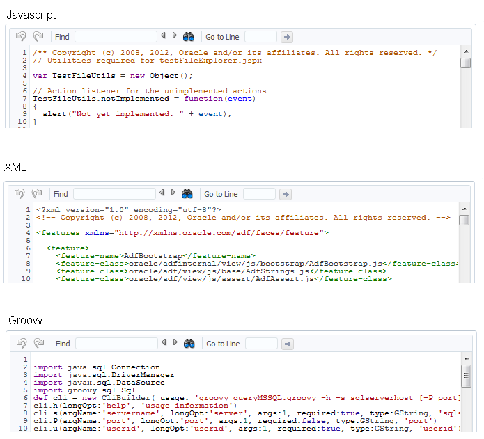
The code editor component provides the following functionalities:
Line numbering
Undo and redo operations (also possible using keyboard shortcuts Ctrl+Z and Ctrl+Y)
Jump to a specific line
Find and replace
Color-coded text
Highlighting syntaxes and search terms
Code completion
Auto-indent
Auto-format
Message pane for error messages
Support for large files with more than thousand lines of code
To add or edit code in code editor, the user can simply click in the editor area and start typing. Control+Spacebar displays a contextual list of hints for code completion. To use other editing features, press F2 to enable edit mode. Once in edit mode, the user can use Tab to indent and Shift+Tab to backward-indent a line of code. With edit mode disabled, Tab and Shift+Tab provide navigation to the next and previous components.
The user can use the toolbar (shown in Figure 11-56) to undo and redo the changes, search and replace text, and jump to a specific line number.
Figure 11-56 Code Editor Toolbar
To search for a string, enter the search term in the Find field, and click Find Next or Find Previous icons to locate the search string in the code editor. Figure 11-57 shows the Find field of the toolbar used to search a string in the code editor.
Figure 11-57 Using the Find Field of Code Editor Toolbar

To search a case sensitive string, or replace a search term, open the Find and Replace dialog from the Find and Replace icon, and perform the operations from the dialog, as shown in Figure 11-58.
Figure 11-58 Using Find and Replace Dialog of Code Editor
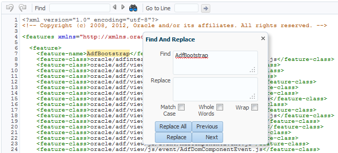
Note:
If the Whole Words checkbox is selected, the Find and Replace dialog cannot search for a non-English string in the editor. However, using the Replace All button, you can replace all instances of the non-English string while the Whole Words checkbox is selected.
To jump to a specific line number, enter the number in the Go to Line field and click Jump to line, as shown in Figure 11-59.
Figure 11-59 Using Go To Line Feature of Code Editor

The code editor component can be configured to list all warnings and errors in a message pane that is also provided with the code editor component. Figure 11-60 shows the message pane listing all XML errors noticed by the XML parser running on the server.
Figure 11-60 Message Pane of Code Editor
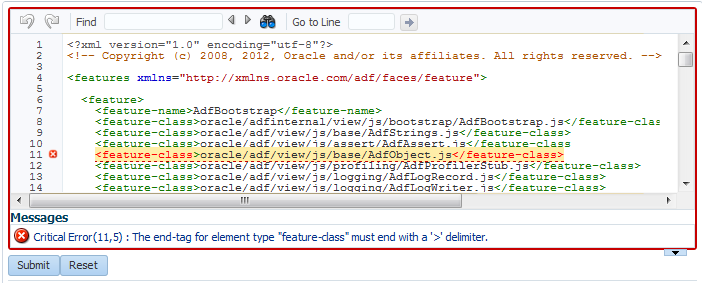
The message pane is a non-editable region that resides below the text area of the code editor. It is used to display code-related status information, such as validation support for code compilation, and any error or warning messages. Clicking a message in the message pane navigates you to the respective code line in the code editor.
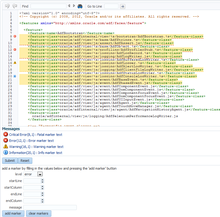
You can also configure the code editor to programmatically add various types of markers. Figure 11-61 shows the code editor with critical error, error, warning, and information markers.
Figure 11-61 Using Markers in Code Editor
11.10.1 How to Add a codeEditor Component
When you add a codeEditor component, use the language attribute to configure the programming language used by the code editor.
Before you begin:
It may be helpful to have an understanding of how the attributes can affect functionality. For more information, see Using Code Editor.
You may also find it helpful to understand functionality that can be added using other ADF Faces features. For more information, see Additional Functionality for Input Components and Forms.
To add a codeEditor component:
