61 Customizing Global Properties, Toolbar, and Menu Bar in the Contributor Interface
You work with the global configuration element (UI/Config/GlobalHtml) to customize the global features (such as global properties, toolbar, and menu bar) of the Contributor interface.
Topics:
61.1 Customizing Global Configuration Properties
Global configuration properties are used to set display conditions for the Contributor interface across all content management sites.
This section includes the following topics:
61.1.1 About the Configuration Properties
The client-side framework retrieves its main configuration settings from the server-side controller element UI/Config/GlobalHtml. This presentation element serves JavaScript code, which is executed by the client-side application at startup. The JavaScript code defines a JavaScript function, whose name is given as a request parameter by the client-side application:
<%@ taglib prefix="cs" uri="futuretense_cs/ftcs1_0.tld"%>
<cs:ftcs>
webcenter.sites['${param.namespace}'] = function (config) {
    config.maxTabCount = 50;
    config.defaultView =  …;
     … merge
}
</cs:ftcs>
The config object is then manipulated as needed in the function body, by setting the properties expected by the client-side application.
In addition, as explained below, the client-side application is capable of retrieving additional configuration properties from the server-side, which allows to merge settings from multiple sources, without having to duplicate the global properties in multiple locations.
61.1.2 Default Configuration Properties That Can Be Modified
The following describes the system-defined configuration properties and indicates which properties can be modified.
Table 61-1 Configuration Properties in UI/Config/GlobalHtml
| Property Name | Description | Values and Examples |
|---|---|---|
|
|
Maximum number of tabs that can remain open simultaneously. A tab is the tab of an open asset. |
Any integer greater than For example:
|
|
|
Indicates whether the default browser context (right-click) menu should be enabled when users work in web mode. |
For example:
|
|
|
Indicates whether web mode should be enabled. When this property is set to By default, this property takes the value of the |
For example:
|
|
|
Indicates whether date-based preview should be enabled. By default, this property takes the value of the |
For example:
|
|
|
Indicates whether preview is allowed. By default, this property takes the value of the Preview method attribute in the Edit Site form (accessible from the Admin interface: Select Admin tab, expand Sites, double-click SampleSite, and select Edit). |
For example:
|
|
|
Defines the preferred view for working with assets (that is, whether assets are viewed, by default, in form mode or web mode). Note: An asset is opened in web mode only if the asset is associated with a default template. |
The expected value is one of the following:
where config.defaultView = {
"default": "form",
"AVIArticle": "web",
"Page/AVISection": "web"
} |
|
|
Defines the list of available toolbar actions for each type of view. |
|
|
|
Used to define the behavior of specific toolbar buttons. |
|
|
|
Defines the list of available actions in the menu bar. |
|
|
|
Registers available implementations of documents. |
Do not modify the value of this property. The only supported value is |
|
|
Registers view implementations. |
Do not modify the value of this property. |
|
|
Registers controller implementations and the set of actions supported by each controller. |
Do not modify the value of this property. |
|
|
Contains the list of roles for the currently logged in user. |
Do not modify the value of this property. |
|
|
Contains the list of asset types that can be edited from the Contributor interface. |
Do not modify the value of this property. |
|
|
Contains the list of asset types that can be searched from the Contributor interface. |
Do not modify the value of this property. |
|
|
Used for security when uploading binary file. |
Do not modify the value of this property. |
|
|
Used for security when uploading binary file. |
Do not modify the value of this property. |
|
|
Defines the list of available actions in the context menu. |
61.1.3 Adding Custom Configuration Properties
In addition to retrieving the global properties, stored in UI/Config/GlobalHtml, the Contributor application attempts to retrieve additional settings in UI/Config/SiteConfig and any element present in UI/Config. Depending on the requirement, this lets you set global properties, or site-specific properties, without having to replicate all the properties defined in UI/Config/GlobalHtml, but only the properties that actually change.
This section includes the following topics:
61.1.3.1 Adding Custom Global Properties
Custom global properties are meant to be shared across all sites on a given content management system. The recommended approach consists of creating a custom configuration element defined as follows:
-
The presentation element name must be
UI/Config/SiteConfigHtml. -
The element code must follow the pattern shown in About the Configuration Properties.
For example, you may want to:
-
Override the value of
maxTabCountfor all sites. -
Override the default view for Page assets.
-
And, define an additional custom property called
foo.
To do this, create an element called CustomElements/UI/Config/SiteConfigHtml, containing the following code:
<%@ taglib prefix="cs" uri="futuretense_cs/ftcs1_0.tld" %>
<cs:ftcs>
webcenter.sites['${param.namespace}'] = function (config) {
    // override existing properties
    config.maxTabCount = 60;
    config.defaultView.Page = "form";

    // add custom properties
    config.foo = "bar";

}
</cs:ftcs>
61.1.3.2 Adding Site-Specific Properties
In some cases, the Contributor interface must be configured differently for each content management site. It is recommended that you override the core controller element called UI/Config/SiteConfig.
To override the UI/Config/SiteConfig core element, create an element as follows:
CustomElements/siteName/UI/Config/SiteConfigHtml
where siteName is the name of the content management site (for instance, avisports).
For example, the avisports demo site enforces web mode as the default mode for assets of type Page and AVIArticle. This is done by defining the JSP element CustomElements/avisports/UI/Config/SiteConfigHtml, and providing the following settings:
<%@ taglib prefix="cs" uri="futuretense_cs/ftcs1_0.tld" %>
<%@ taglib prefix="ics" uri="futuretense_cs/ics.tld" %>
<cs:ftcs>
webcenter.sites['${param.namespace}'] = function (config) {
    // default view modes for avisports
    config.defaultView.Page = "web";
    config.defaultView.AVIArticle = "web";
}
</cs:ftcs>
Loading of Configuration Elements
The global configuration element is always loaded first. Additional configuration elements are loaded in alphabetic order. For instance, using the examples above, configuration properties would be loaded in the following order:
UI/Config/GlobalHtmlUI/Config/SiteConfigHtml
Property Values
The value of some properties is, in some cases, an object. That is:
config.someProperty = {
  foo: "bar",
  x: 123
};
When partially overriding this property, it is important to distinguish between the following types of code:
config.someProperty = {
  x: 3456
};
vs.
config.someProperty.x = 3456;
In the first case, the property foo is overridden as "undefined", whereas in the second case, the original value of foo is preserved.
61.2 Customizing the Toolbar
On the toolbar you can list actions for operating on assets in web mode or form mode. You can customize the toolbar further per asset type and subtype.
Topics:
61.2.1 About Toolbar Customization
The global configuration element (UI/Config/GlobalHtml) describes for each type of view (such as web mode inspect, web mode edit, form mode edit, and form mode inspect), the list of actions to display in the toolbar to the user. This is done through the toolbars property. Its value is an object with the following syntax:
config.toolbars = {
    "viewAlias": [action_1, action_2,  …],
    or:
    "viewAlias": {
        "view_mode_1": [action_1, action_2,  …],
        "view_mode_2": [action_1, action_2,  …]
    }
 …
}
where:
viewAlias indicates for which type of view this toolbar must be used. The alias must match one of the view aliases defined in the config.views section.
action_i is an action name. For standard actions, such as save and approve, the action name is automatically mapped to a given icon, title, alternate text, and so on. For more information about standard actions, custom actions, or customizing the appearance of a custom button, see Examples of Toolbar Customization.
view_mode_i is one of the modes supported by the view (typically, edit or view).
61.2.2 Examples of Toolbar Customization
This section includes the following topics:
61.2.2.1 Customizing the Toolbar with Standard Actions for Web Mode
-
Use the following configuration which determines the toolbar actions that are available in web mode for all asset types:
config.toolbars = {
    ( …)

    "web": {
      "edit": ["form-mode", "inspect", "separator", "save", "preview",
               "approve", "delete", "separator", "changelayout",
               "separator", "checkincheckout", "refresh"],
      "view": ["form-mode", "edit", "separator", "preview", "approve",
               "delete", "separator", "checkincheckout", "refresh"]

    ( …)

}
The above configuration defines two lists of actions (edit and view), corresponding to the asset's views: Edit and Inspect.
Note:
To find the set of standard actions, refer to the list of actions specified in the following properties under the controllers property:
-
fw.ui.document.AssetDocument(all actions supported by assets) -
fw.ui.controller.InsiteController(all actions supported by the view controller)
61.2.2.2 Customizing the Toolbar with Standard Actions for Asset Type and Subtype
Each toolbar configuration can be customized by asset type and subtype by adding a property named:
-
viewAlias/assetType -
viewAlias/assetType/assetSubtype
For example, add the Bookmark/Unbookmark buttons for page assets in web mode.
-
In a custom configuration element (such as
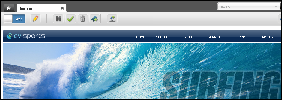
CustomElements/avisports/UI/Config/SiteConfigHtml), add the following property:config.toolbars["web/Page/AVISection"] = { "edit": config.toolbars.web.edit, // reuse default for edit mode "view": ["form-mode", "edit", "separator", "preview", "approve", "delete", "bookmark", "unbookmark", "separator", "checkincheckout", "refresh"] }Inspecting the Surfing Page asset now shows the toolbar.
Note:
Keep in mind the following:
-
We are customizing only the
viewmode. When a Page/AVISection asset is being edited in web mode, the standard toolbar is shown. -
The Bookmark and Unbookmark buttons are not shown simultaneously, because they both depend on the asset's current state (whether it is bookmarked or not).
61.2.2.3 Customizing the Toolbar with Custom Actions
-
To define custom actions add new entries to the
config.toolbarButtonsproperty, as follows:config.toolbarButtons.<customActionName> = { src: <path_to_icon>, onClick: <click_handler> } -
For example, let's define the following
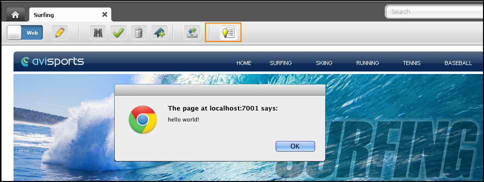
helloWorldcustom action:config.toolbarButtons.helloWorld = { src: 'js/fw/images/ui/ui/toolbarButton/smartlist.png', onClick: function () { alert('Hello World!!'); }, buttonType: 'button' }The
helloWorldaction can now be referenced from a toolbar configuration as follows (we reuse our example from the previous section):config.toolbars["web/Page/AVISection"] = { "view": ["form-mode", "edit", "separator", "preview", "approve", "bookmark", "unbookmark", "separator", "checkincheckout", "separator", "helloWorld", "refresh"], "edit": config.toolbars.web.edit // reuse default web mode toolbar }Note:
In this example, we have added a separator (a vertical line) and the custom button to the toolbar.
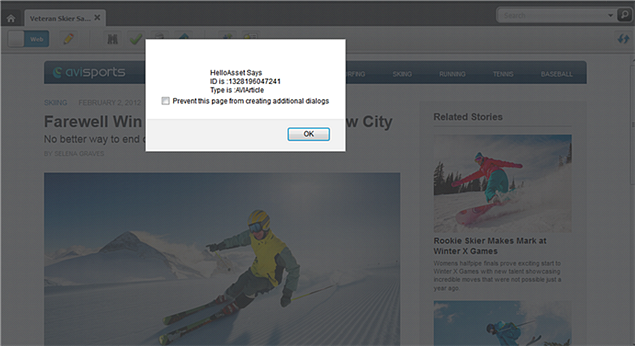
A more elaborate example would involve, for instance, creating a CSElement which outputs an asset's id and type, and then creating a toolbar option that calls the element when clicked. For example:
When the custom helloAsset button is clicked, the CSElement (created in step 1) is called and a dialog box opens providing the asset's name, id, and type:
Figure 61-4 Dialog Box Showing Asset's Name, ID, and Type

Description of "Figure 61-4 Dialog Box Showing Asset's Name, ID, and Type"
61.3 Customizing the Menu Bar
On the menu bar, you can add submenus that let contributors operate on assets of a certain type and subtype. You can make these submenus actionable items, additional menus, or menu separators.
Topics:
61.3.1 About Menu Bar Customization
The menu bar configuration is defined by the config.menubar property:
config.menubar = {
		    "key_i": [
			          //menu_i
			          {
				              "id": "menu_id",
				              "label": "menu_label",
				              "children": [
				                  //submenus
				                  //- actionable menu item
					                  {
						                     label: 'menu_item_label',
						                     action: 'action_name' | click_handler
					                  },
					                  //- deferred pop-up menu
					                  {
						                     label: 'menu_item_label',
						                     deferred: 'controller_element',
						                     cache: true|false
					                  },
					                  //- pop-up menu
					                  {
						                     label: 'menu_item_label',
						                     children: [
							                         // submenu_1
							                         {
								                            label: 'menu_item_label',
								                            action: 'action_name' | click_handler
							                         }'
							                         // submenu_2
							                         {
								                            label: 'menu_item_label',
								                            action: 'action_name' | click_handler
							                         },
							                          …
							                          …
							                          …
						                     ]
					                  },
					                  //- menu item separator
					                  {separator: true}

				              //additional menu_i
               …
               …
               …
              ]
			          }
where:
key_i is one of the following:
-
default: Defines the default menu bar. -
assetType: Defines the customized menu bar for all assets of typeassetType. -
assetType/subtype: Defines the customized menu bar for all assets of typeassetTypeand subtypesubtype.
//menu_i starts a section that describes each top menu, where:
-
menu_idis the identifier of the menu. -
menu_labelis the display name of the menu. -
submenuscan be any of the following:
-
-
An actionable menu item (clicking the menu item produces an action), where:
-
labelspecifies the display name of the menu item. -
actioncan be any action supported by a controller, such aseditandinspect, or a custom click handler (see the customization example in Adding a Custom Action to the Menu Bar).Note:
When a given action is not supported by the current document/view, it is disabled (greyed out) in the menu.
For example, a menu item triggering a
saveaction is defined as follows:{ label: "Save", action: "save" } -
-
A deferred pop-up menu (the pop-up menu is determined dynamically by running a controller element on the server-side), where:
-
labelspecifies the display name of the menu item. -
deferredspecifies a controller element name, such asUI/Data/StartMenu/New. -
cacheis a Boolean value indicating whether the output of the controller element should be cached or not.
For instance, the New pop-up menu, which reads all available start menu items for the current site/user, is defined as follows:
{ label: New, deferred: "UI/Data/StartMenu/New", cache: true } -
-
A pop-up menu (the child menu items are hard wired in the configuration itself).
-
A menu item separator (a horizontal line), which is used to group menu entries together.
-
61.3.2 Adding a Custom Action to the Menu Bar
In this example, we want to add the helloWorld custom action defined in Customizing the Toolbar with Custom Actions to the menu bar (to run the custom onClick handler). Add this action by adding a new entry to the menu bar called Custom Menu, with a single menu item called Hello World, which triggers the custom action. Our steps are the following:
61.4 Customizing Context Menus
On a right-click, a context menu shows options from which contributors choose what they need to work with the objects they right clicked. You can customize the specific items available in a context menu and the order in which the objects are displayed.
To define context menus use the config.contextMenus property:
config.contextMenus = {
   	"default": ["action_1", "action_2", … "action_n"]
   "asset": ["action_1", "action_2", … "action_n"],
   "asset/assetType": ["action_1", "action_2", … "action_n"],
}
where the values are defined as:
-
default: Defines the default list of context menus. Each menu item displayed in the list is anaction. -
asset: Defines the customized list of context menus for all assets. Each menu item displayed in the list is anaction. -
asset/assetType: Defines the customized list of context menu items for the assets of typeassetType. Each menu item displayed in the list is anaction.
An example context menu configuration for the asset type Page:
"asset/Page":["edit", "copy", "preview", "delete", "bookmark", "tagasset"]


