About Charts
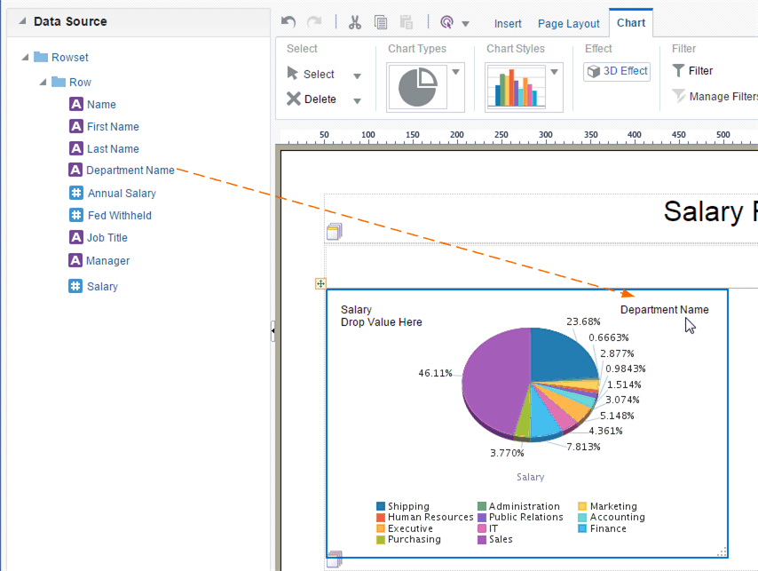
The layout editor supports a variety of chart types and styles to graphically present data in the layout.
After you insert a chart, you can edit the chart properties using the dynamic toolbars or the Properties pane. The Properties pane extends the options from the Chart tab and enables you to enter very specific custom settings for the following:
-
Chart Effect
-
Chart Legend
-
Chart Plot Area
-
Chart Title
-
Chart Label
-
Chart Values
The following Chart Label properties apply to Scatter and Bubble chart types only: Title Font, Title Horizontal Align, Title Text, and Title Visible.
Some font effects such as underline, italic, and bold might not render in PDF output.
The text size for legends, title, and numerical values in Bar charts might be decreased in a PDF output when compared with an interactive output, because the size of the PDF page is lesser than the size of the HTML browser page used for the interactive output.
Insert a Chart
Follow these steps to insert a chart.
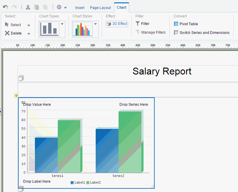
About the Chart Tab
The Chart tab helps you to apply a different chart type, filter the data, manage multiple filters.
The Chart tab enables you to perform the following:
-
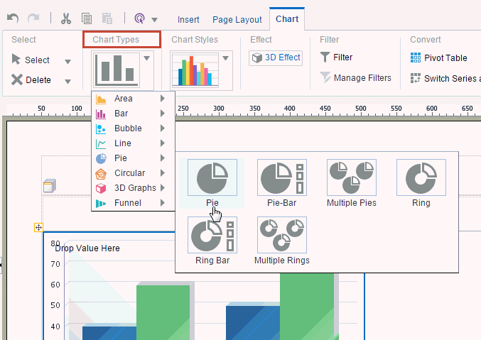
Select a different Chart Type
-
Apply a different Chart Style
-
Enable 3-D effects
-
Filter the data that is displayed in the chart
-
Manage multiple filters
-
Convert the chart to a pivot table or switch the series and dimensions values
Apply and Manage Filters
This section helps you to know how to apply and manage filters.
See About Filters for information on how to apply and manage filters.
Change the Formula Applied to a Chart Measure Field
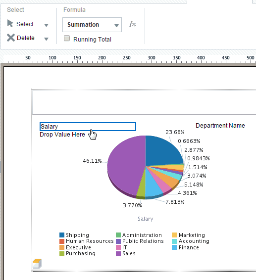
By default, the chart displays a sum of the values of the chart measure. You can change the formula applied to a chart measure field by selecting an option from the Chart Measure Field tab.
Sort a Chart Field
Charts can be sorted by fields.
To sort a field in the chart:
- Select the field to display the Chart Field tab.
- On the Chart Field tab select Sort Ascending or Sort Descending.
- To sort by multiple fields, apply a Priority to each sort field to apply the sort in the desired order.
Use Advanced Chart Features
Create more useful charts by altering their appearance.
The following features enable you to apply additional formatting to your charts:
If you do not select a value for these format options above, the Publisher default system settings are applied.
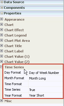
Format Time Series Axis
When the x-axis of your line chart is a date field, Publisher applies a time series format based on the range of the data.
The following illustration shows the time series format options. You can customize the display of the time series in your chart, or turn it off.
To select time series date formatting options for a chart:
Hide Axis Option
You can hide axis labels in reports for certain situations such as when you are working with small charts or visualizing data without values. This option is especially useful for creating reports that evaluate trends.
- On the Properties pane, expand the Chart Label, Chart Value (1) or Chart Value (2) report properties category.
- In Axis Visible, select False.
Format Independent Axis
You can format decimal digits and numbers for each Y axis in a multiple Y-axis report.
- On the Properties pane, expand the Chart Value (1) or Chart Value (2) report category.
- To format axis decimals, in the Axis Decimals field, enter the number of decimals to display for a data element per axis.
- To format data decimals for an axis where the Data Visible property is set to True, enter the number of decimals to display on the axis.
- To apply number formatting to an axis, in the Format field, select one of the following options: General, Percent, or Currency.
- If you select Currency, in the Currency Symbol field, manually enter the currency symbol.
Scale Axis
You can set chart axis scaling as logarithmic or linear in reports.
- On the Properties pane, expand the Chart Value (1) or Chart Value (2) report properties category.
- In the Axis Scaling field, select one of the following options: Logarithmic or Linear.
Format Pie Slice
You can format pie slice charts to display percentages, total actual values, percentages, and labels.
To format pie slices:
- On the Properties pane, expand the Plot Area report property category.
- In the Pie Slice Format field, select one of the following options: Percent, Value, Label, or Label and Percent.
