Use Gauge Visualizations
This topic describes gauge visualizations and how to create and configure them.
About Gauge Visualizations
In Oracle Analytics, you can use a gauge visualization to show how a measure or metric performs against a target, within a specified range, or in comparison to other measures.
You can create a gauge visualization with a measure, or you can create multiple gauges as part of a trellis to monitor multiple measures and dimensions. For example, you might want to see how the total value of a measure column like Sales compares to a target value. You could use a set of gauges to monitor the quantity of products ordered for different product categories.
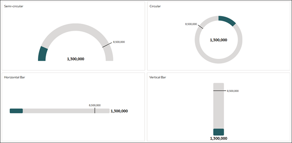
- Semi-circular
- Circular
- Horizontal Bar
- Vertical Bar
For each gauge type, the data is shown as a color within the gauge shape to indicate where the data is within predefined limits.
You can update the gauge visualization properties to show the start and end of the measure's range and customize the formatting, as well as configure the indicator for a target value.
You can use additional measure columns or calculations as start and end values for a range or as a target value to compare your data against. For example, if you want to see how the sales for different shipping modes are performing, you might create a calculation to use as the target sales values for a set of gauges.
This tutorial shows you how to create and customize gauge visualizations. ![]() Tutorial
Tutorial
Create a Gauge Visualization
Add a gauge visualization to your workbook.
- On the Home page, hover over a workbook, click Actions, then select Open.
- In the Data pane, select a measure column, right-click, and then click Pick Visualization.
- Click Gauge
 to add a gauge visualization to the canvas.
 - Click Save.
Add a Target to a Gauge
Add a target value to a gauge so you can see how a measure is performing against a goal.
- On the Home page, hover over a workbook, click Actions, then select Open.
- Click a gauge visualization to select it.
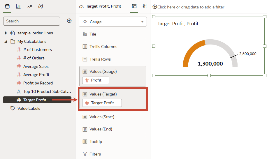
- In the Data pane, drag an appropriate measure or calculation to
Values (Target) in the Grammar
pane.
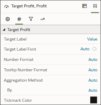
- Click Properties, click Values, then expand the
measure or calculation to modify it.
- Click Value in the Target Label row and select an option.
- Click Auto in the Target Label Font row and configure the font.
- Click the color box in the Tickmark Color row and select a color.
- Click Save.
Configure the Properties for a Gauge
Customize a gauge visualization by updating the properties.
- On the Home page, hover over a workbook, click Actions, then select Open.
- Click a gauge visualization to select it.
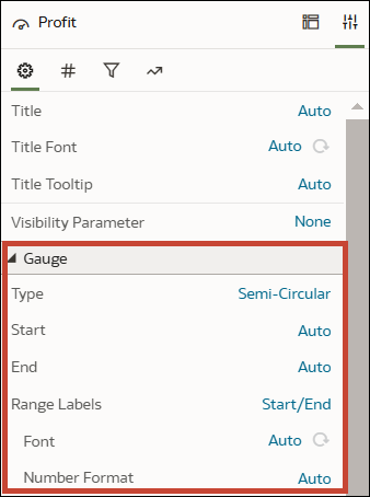
- Click Properties. Expand the Gauge section in the General tab.
- Keep the default semi-circular gauge type or click Semi-Circular in the Type row and select a different option to change the gauge shape:
- Circular
- Horizontal Bar
- Vertical Bar
- Click Auto in the Start row, select Custom, and enter a value.
- Click Auto in the End row, select Custom, and enter a value.
- Click None in the Range Labels row and select:
- Start/End to show the start and end values that are specified in the Start and End properties.
- All to show range values at equal intervals along the gauge, including the start and end values.
- For a Horizontal Bar or Vertical Bar gauge, click Auto in the Length and Thickness rows, then click Custom and enter a value to control the size of the bar.
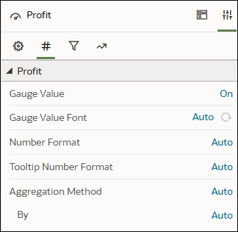
- Click the Values tab and expand the data element that you want to configure.
- Click Save.
Create a Set of Gauges
Create a visualization containing multiple gauges to monitor the performance of a measure for multiple dimensions.
- On the Home page, hover over a workbook, click Actions, then select Open.
- In the Visualizations pane, drag Gauge
 to your canvas.
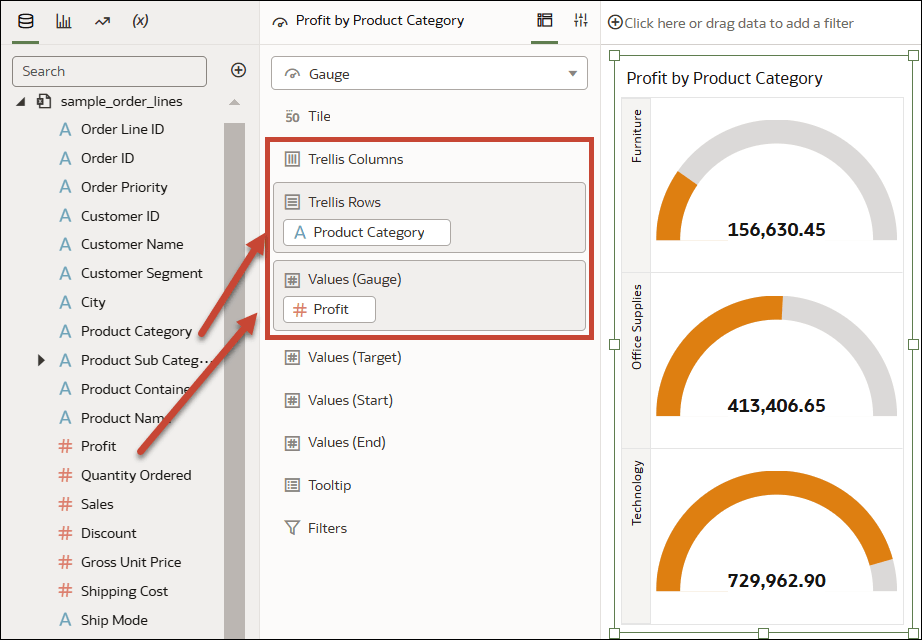
 - In the Data pane, drag a measure column to Values (Gauge) in the Grammar pane.
- In the Data pane, drag an attribute column to Trellis Columns or
Trellis Rows in the Grammar
pane, depending on the orientation you want.
- Click Save.
