Filter and Animate Visualizations Using a Slider Dashboard Filter
You can add a slider dashboard filter to a workbook canvas and animate visualizations to show how the data changes relative to a specified dimension. Consumers can select a dimension value interactively, or automatically play through dimension values, similar to a time-lapse video or animation.
As another example, you might analyze Olympic medals between 2000 and 2012 in an animation showing the numbers changing over the years.
Before you can create a slider dashboard filter, you need to have one or more visualizations on your canvas for which the dimension, in this case, Year, can be used as a filter. Each visualization must include the same dimension data.
For this example, to filter on Year so that you can analyze Olympic medal data between year 2000 and year 2012, you need to add Year to your dashboard filter visualization.
- On your home page, hover over a workbook, click Actions, then select Open.
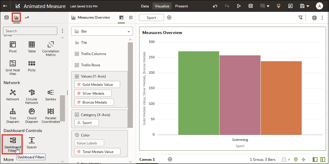
- In the Data panel, click Visualizations, scroll to the Dashboard Controls section, and drag Dashboard Filters to the canvas.
- In the Data panel, click Data, and drag a dimension-based data element to the new dashboard filters visualization.
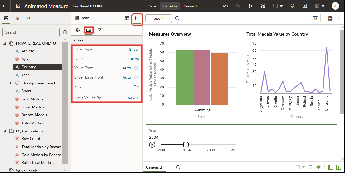
- Click Properties to open the Properties pane, then click Filter Controls.
- Locate and expand the filter you just added.
- Click the Filter Type field and select Slider.
- Click the Play field to turn auto-play on or off.
- If you enabled play, in the slider filter control, click Play to see how your visualizations play with the default settings.

