3 Folder Creation
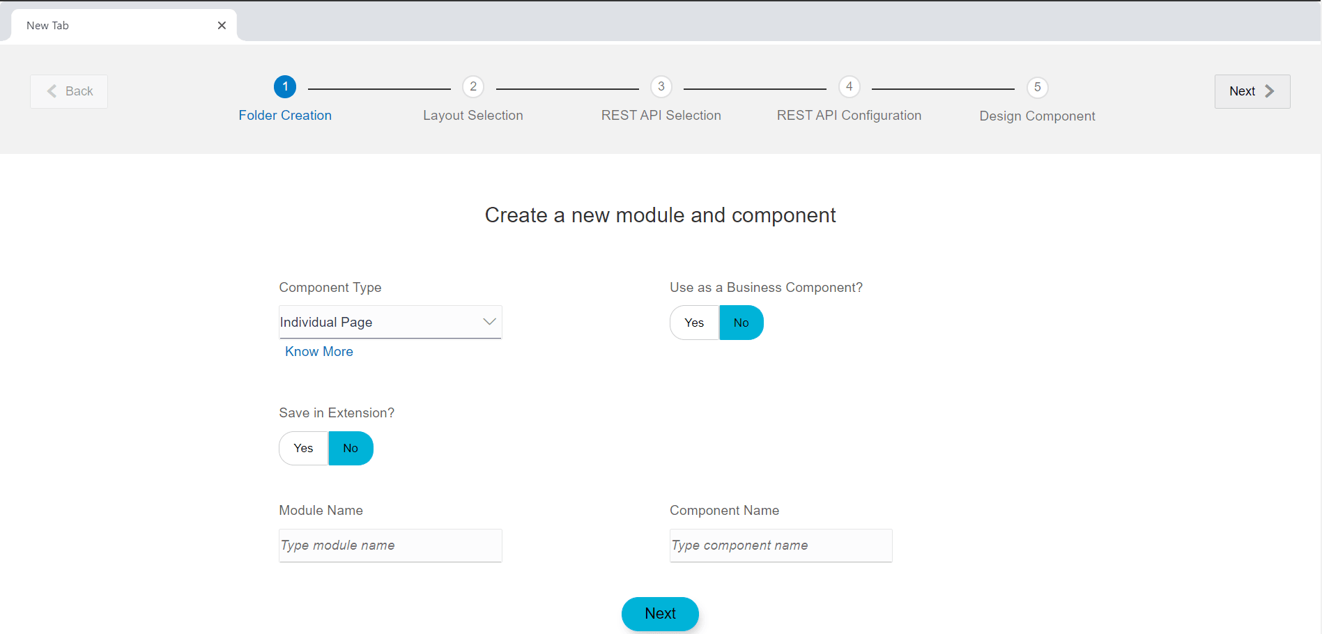
- Module Name:
Module is a category of the screen the user are creating, for e.g. a fund-transfer screen would be of category Payments. So in this case, the module name would be payments. Module consists of various components, which contains the artefacts of the screen the user wants to generate.
- Component Name:
Component name would be the type of screen e.g. Funds transfer, Cheque Book Request, Letter of Credit Initiation, Bill Payment, New Deposit etc.
- Component Type:
Component type is the type screen layout the user wants to be displayed. User can select from the options as Individual page Transaction Page or a Widget. (Explained in the detail below)
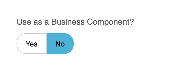
- Use as a Business Component? :
Toggle ‘Yes to make a component as Business component i.e. reusable component
- Save in Extension? :
Toggle ‘Yes to customize OBDX shipped components
Description of the illustration uxextensibility3.png
Following are the different component types and the examples where these are used.
- Individual Page :
Individual page is a stand-alone page that consists of the detailed information for the Selected transaction/component e.g. Account Details (Component) in a standalone page shows the various Balances, transactions and other information of the selected accounts.
In case of individual page, the component can be converted to a business component by toggling the use a Business Component switch
These are Pluggable components whose behavior is common in many other components.
Business components can be created once and plugged any number of times just by drag and dropping it inside the component we want
Business component takes input as an array of parameters it requires to display its contents.
- Flows:
Flows consists of pre-defined multiple pages in accordance to OBDX UI framework. For e.g. A transaction where the customer or user enters information asked on the screen, reviews the same and submit it for further processing. It consists of multiple screens.
In case of such scenario, one must select component type as FLOW.
Types of FLOW supported are:- CREATE:
This is an n-step flow, which is similar to a transaction. The only difference is the initiation page can be any number of pages as per the requirement and not only one. For e.g. first page can comprise of primary details of a customer e.g. name, surname and second page can consist of additional information like address. Review and confirmation page will each consist of a single page only.
Once the flow type is selected as CREATE, additional details are required to be filled such as- Flow name : The name will be the identifier of the entire flow
- Number of Stages : The number of pages before the review screen appears in the flow
- Stages navigation display: The type of navigation control to navigate between the pages
- Confirmation Template: Type of layout for confirmation screen
- Show summary : if summary is to be shown about the progress of the form filled and continue where the user had left the last time, the switch can be toggled to YES
Above mentioned fields cannot be modified once a flow is created.
- CREATE:
- Widget -
Widget is a small section on the screen especially on the Dashboard that displays commonly used functions or important information in a summarized form. The component generated of this type will be shown on the dashboard.
- Partial -
An Independent HTML template which can be reused in different components.
Once the “Component Type” is selected as “Partial”, it will be created in
channel/partials/<module_name>/<partial_name>.html, if Module Name is not entered “Partial” will be created directly in “channel/partials/<partial_name>.html”.
Description of the illustration uxextensibility10.png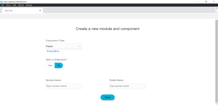
Description of the illustration uxextensibility11.png
