Configure Rules in the Rule Set Editor

If the rules in your component's rule set use conditions, or you want to create rules that use conditions, you need to use the rule set editor.

The rule set editor lists rules defined in the extension dependency under Built-In Rules. You cannot edit the rules under Built-in Rules, but you can copy them to use as the basis for your own rules. The rules that you create and can edit are listed under Extension Rules.

Like business rules, the order in which rules appear in the Extension Rules list is important. However, unlike business rule, rules in rule sets are evaluated at runtime from top to bottom. The first rule where all the conditions are met determines the layout used. None of the rules below it in the list are tested. Keep this in mind as you’re working on the rules.

Let's look at how to create a rule to hide a field when the user is not authenticated.
  1. Open the page you want to modify in the Designer.
  2. Open the rule set editor.

    Locate the component you want to edit in the Properties pane, or select the component on the page to open the component's details pane in the Properties pane.

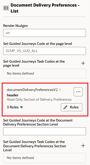
    If the component's rule set has any rules with conditions, you might see something like this in the Properties pane. Click Rules to open the rule set editor:


    In the example above, the rule set has three rules, including the default rule.

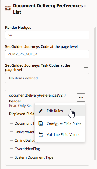
    If you see something like this in the Properties pane, select Edit Rules in the options menu to open the rule set editor:


  3. Create a new rule in the rule set editor.

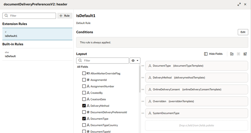
    Let's look at the rule set for a form layout as it appears in the editor:


    The left pane of the editor lists the rule set's rules. A rule set always has one built-in default rule (isDefault) that is always applied. (In this example, the list also contains a rule isDefault1 that is created automatically if you edit the layout in the Properties pane.)

    To the right, the selected rule's conditions are displayed above the list of available fields and the fields displayed with the rule:

    To create a rule:

    • Click Add Rule button in the left pane to create a new extension rule, and then provide a name and description in the popup dialog.
    • Right-click a rule in the list of rules, and then select Duplicate in the popup options menu. Enter a name and description for the new rule in the dialog box.
  4. After you create the rule, position it in the Extension Rules list by grabbing its handle and dragging it into the position you want.
    Rules are evaluated from the top down, so make sure the rules are in the order you want them evaluated.
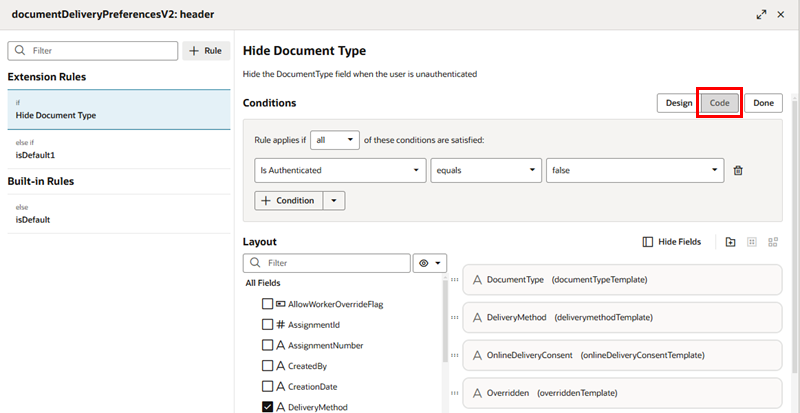
  5. Select the rule in the Extension Rules list, then click Edit to open the condition builder and define its conditions.

    The condition builder is the same one used to create conditions for extension rules in business rules. You can click Code to write the condition in the code editor. If you're not familiar with using the condition builder, see Set Conditions for a Rule.


    Click Done to close the condition builder. Your changes are automatically saved.

  6. In the Layout pane, select the fields you want displayed in the component when the rule is active.

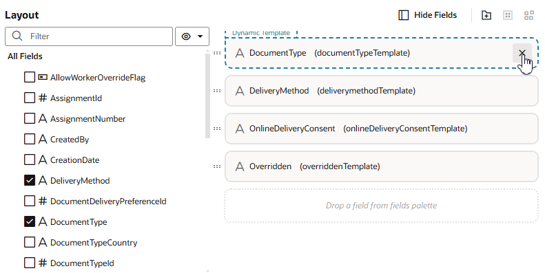
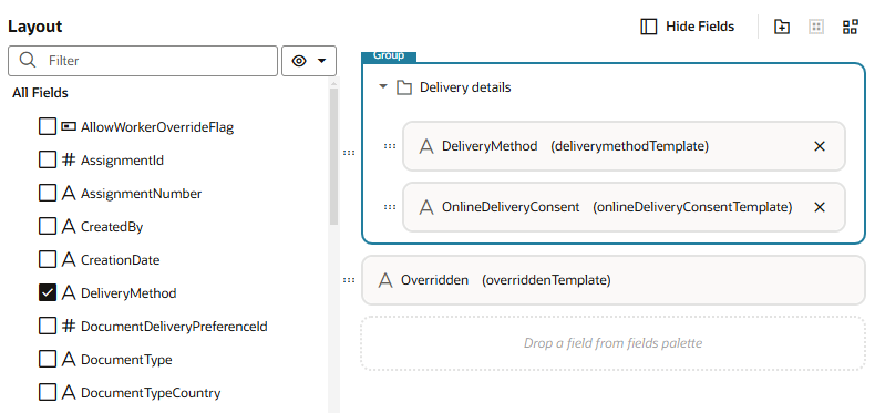
    Add a field or object to a layout by selecting the checkbox next to the field, or by dragging it from the list into the layout. To delete a field, you can deselect its checkbox in the Fields palette, or click X in the layout:


    The layout editor contains a Fields palette listing all the fields that can be displayed in the layout. If the palette is hidden, click Show Fields. You can click Hide Fields in the toolbar to hide the Fields palette.

    The fields you can display in a rule's layout are determined by the fields available from the data resource used by the component. This data resource is defined in the extension dependency. You can choose any of the fields listed in the Fields palette—and the order in which they should appear—but you can't include fields from other data resources.

    To help you locate the fields you might want to add, the Fields palette might contain a Suggested Fields section at the top of the palette. This section lists the fields that have been identified as the most relevant or most important when building your layout.

    You can also filter the list of fields by entering a string in the Filter field at the top of the Fields palette.

  7. (Optional) Group fields by selecting all the fields that you want to include in the group, either by holding down the CMD key (on macOS) or the Ctrl key (on Windows), and then clicking Group Fields in the toolbar.

    The selected fields are grouped under a folder in the list. You can type a name for the new folder in the layout editor:


    You use groups to divide a dynamic form into different sections. Each subsection has a heading based on the group name.

    To ungroup the fields in a group, select the group and then click Ungroup in the toolbar.

  8. Organize the order that fields and groups are displayed in the component by dragging its handle and dragging it into position in the layout.

    Note:

    When the rule's conditions are met, you can see the changes you make to the page in the Designer. (You need a browser window wide enough so that the page is visible on the left, next to the editor.)
  9. Click X at the top of editor to close it.