Use the Page Designer
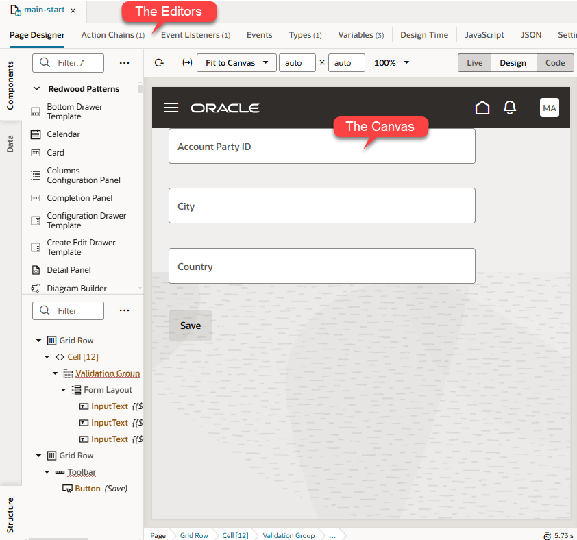
There are several editors available to you in the Designer—such as Actions, Event Listeners, and so on—but the one you'll likely use most frequently is the Page Designer. The Page Designer opens when you click a page (or fragment) in the Navigator's App UI pane:

Description of the illustration designercanvasandeditors1.png
Along the top of the Page Designer you can see a toolbar, which lets you configure the Page Designer itself:
| Toolbar Item | Description |
|---|---|
| Reloads the page. | |
| Opens a dialog box for entering input parameters for the page. | |
| Opens a menu for selecting the screen size represented by the canvas. The default, Fit to Canvas, resizes the canvas to take up all the available space between the left and right panes. Use the Custom option to set the minimum and maximum values for viewport resolution, thus resizing the canvas to whatever size you want. | |
| Shows or hides a mobile device's bezel (the border between a device's screen and its frame). | |
| Opens a dialog box for changing the magnification of the canvas. | |
Toggles between Live, Design, and Code views.
Tip: Hold the Ctrl key (Cmd on Mac) to momentarily switch between Live and Design views. Make sure the cursor is on the canvas, then hold the Ctrl key. For example, you can check the values in a drop-down menu by simply holding the Ctrl key and clicking the menu on the canvas. |
|
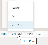
At the bottom of the canvas (not in the toolbar), a breadcrumb path displays a hierarchical list of links for a selected component to indicate its placement in the page's structure. Hover over ... (the last link in the breadcrumb path) to navigate to the component's children. You can also view and switch to a component's siblings: Simply hover over a link in the breadcrumb path, then select the component you want to switch to from the menu:  Clicking a component in the breadcrumb path selects that component on the canvas and in Structure view and lets you view its details in the Properties pane. To hide the breadcrumbs (shown by default), select Hide Breadcrumbs in the context menu. |
|
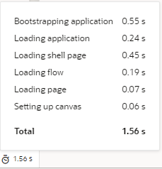
Displays the time taken to render and display the page in the canvas. Clicking the icon will show a breakdown of how long different tasks (such as bootstrapping and loading a shell page) take in order to display the page, as shown in this example:  Rendering is done in runtime execution mode, with the Page Designer serving the resources needed to display the page. Because each resource is requested in a different phase of runtime initialization, the time between these resource requests is measured and summarized. This information can thus help you isolate runtime issues that may cause your app to load slowly. For example, if a page takes time because of long REST calls, you might decide to defer the calls or run them in parallel. If the page contains runtime errors, an error message will show instead. Click the message to get details about the errors and resolve them for the page to render correctly. |
The Page Designer offers several different ways for you to interact with your page. Specifically, you can:
- Drag and drop components on to the page, then associate them with data, using the Components palette;
- Work with page components from a hierarchical perspective, in Structure view;
- Start with the data, then decide how to represent the data in the user interface, using the Data palette.
- Work with the code directly, by clicking Code in the Page Designer toolbar.
Hint: You can hide or show any of these panes by clicking the Components, Data, or Structure tab.