The Components Palette
The Components palette contains UI components and organizational elements that leverage the Oracle JavaScript Extension Toolkit (JET) to help you build pages. To add a component to a page, simply drag it from the palette onto the canvas.
Components by default show in list view and are organized by categories. You can scroll to locate a component, although it’s simpler to use the Filter field. Hover your cursor over a component’s Info icon to get hints about the component.
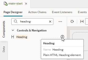
Description of the illustration page-designer-palette-appui.png
JET Core Pack components, written entirely using the VComponent API and the JET Virtual DOM architecture, are available for use in your extensions. See Work With JET Core Pack Components on how you can take advantage of them in your pages.
For ease of use, all JET components show in the Components palette, including those without design-time properties. These components show under the Advanced category and typically require you to manually code different aspects of their functionality. Use tooltips to access JET documentation on how to use these advanced components.
Click Components to show or hide the Components palette.
If you want to customize the palette’s default settings, click Components Menu (  ):
):
- To view components laid out as a grid, select Grid (default is List).
-
To always show components in every category, select Expand All; to hide them, select Collapse All (default is Expanded By Default).
If you want to change the default view with components collapsed, deselect Expanded By Default. Changing this setting when working in a page editor won’t change your current view, but it will take effect when you open a new editor. To change this setting in your current view, use Expand All and Collapse All.
- To hide categories and view all components in a flat list, deselect Show Categories.
You can also:
- Click Get Components to access your instance’s Component Exchange, from which you can add JET web components to your page.
- Click Show Deprecated to view components that have been deprecated (badged
 for easier identification). Deprecated components are flagged in your App UI’s audit and are retained only to allow existing App UIs to continue to run. It’s recommended that you move away from these components as soon as possible. Use the component’s tooltip to view details of the version it was deprecated in, as well as a suitable alternative.
 - Click Show Maintenance to view components in maintenance mode (badged
 for easier identification). As with deprecated components, you should transition away from components in maintenance mode as they will eventually be deprecated. Use the component’s tooltip to view a suitable alternative.