Edit the Website
Open the newly created website in Site Builder by selecting it and choosing Open from the menu bar or right-click menu. In Site Builder, set the switch ![]() to Edit mode. Enter a name for the update and click OK.
to Edit mode. Enter a name for the update and click OK.
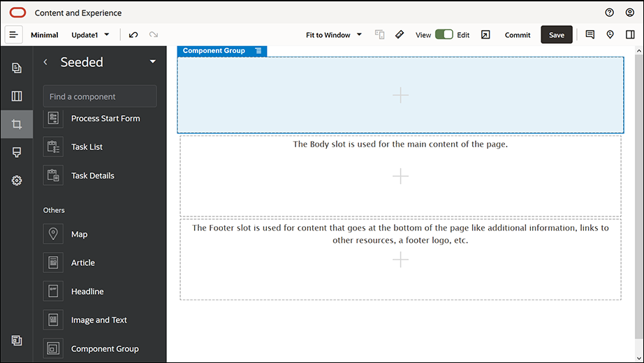
In edit mode, you’ll see that the website has three slots, which are areas available on the page (depending on the page layout). Hover over each + on the page to see slots such as Header, Body, and Footer.
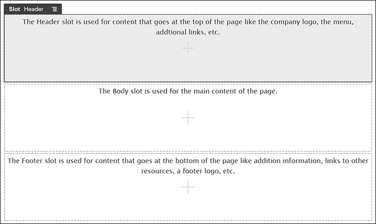
Description of the illustration slots.png
We generally use the Header slot to display the company’s logo, the navigation menu, and so on. We use the Body slot for the main content of the page, and the Footer slot for copyright information, social media links, and any additional information.
First, let’s build the home page. This is what the home page will look like once it's completed:
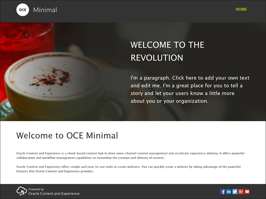
Description of the illustration minimal_home.png
- In the left sidebar, click
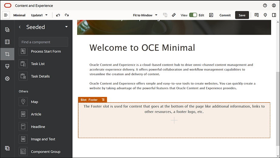
 and then click Seeded to show the list of out-of-the-box components available with Oracle Content Management.
- In the left sidebar, look for an out-of-the-box component called Component Group. Drag and drop it into the Header slot.
- Click the component group's menu icon
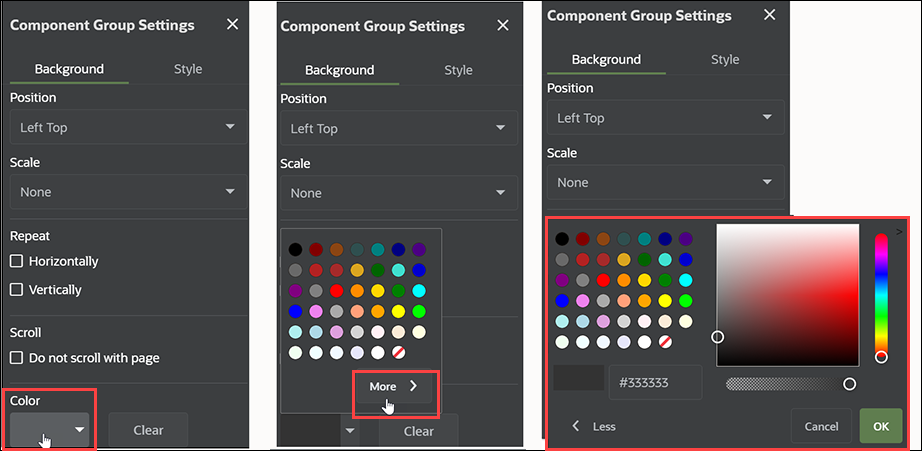
 and then click Settings. In the settings, click the Color drop-down list (available at the bottom of the settings list) and then click More. Enter #333333 and click OK.
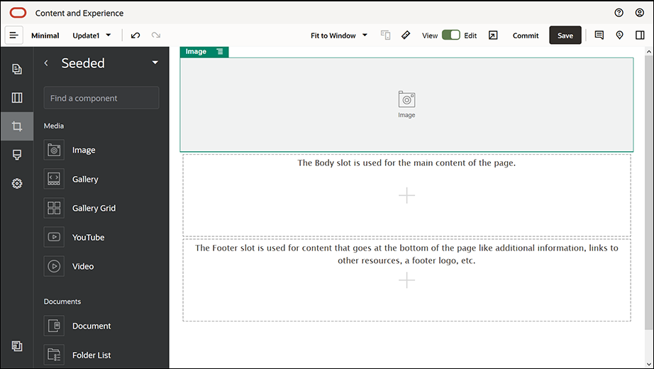
- Drag and drop an Image component into the component group.
- Click the Image component’s menu icon
 and then click Settings. Complete the settings in the General tab.
Property Value Select Logo.png from the Minimal-Images folder Alignment Left Width Deselect Set Width Top 1.2vw Bottom 30px Left 6vw Right 0 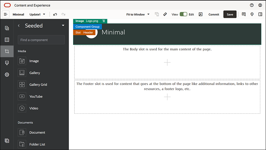
Description of the illustration 3_header_slot.png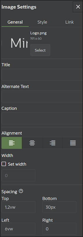
Description of the illustration image_settings.png - Let's link this logo image to the home page. Complete the Image component’s settings in the Link tab.
Property Value Select Link Type Site Page Page HOME Target Open in Same Window - In the left sidebar, click
 and click Custom to show the list of custom components.
- Now, let’s add a navigation menu to the home page using the Minimal-NavMenu custom component. Drag and drop a Minimal-NavMenu component into the component group, to the right side of the Image component. Click the title of the Minimal-NavMenu component to make sure its parent is the component group you added earlier. This is a useful way to see where any component resides within the structure of the web page.
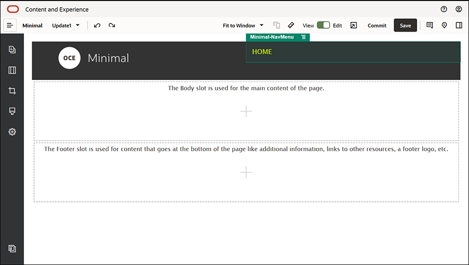
Description of the illustration 4_header_slot.pngComplete its settings in the General tab.
Property Value Alignment Right Top 1.2vw Bottom 0 Left 0 Right 6vw - Now, the header is ready. Let’s save this component group as a custom component group so that we can use it later in the other website pages. Click the title of the component group, then click its menu icon
 , and then click Save. In the Save Component Group dialog, in the Name field, enter "Minimal-Header" and then click Save.
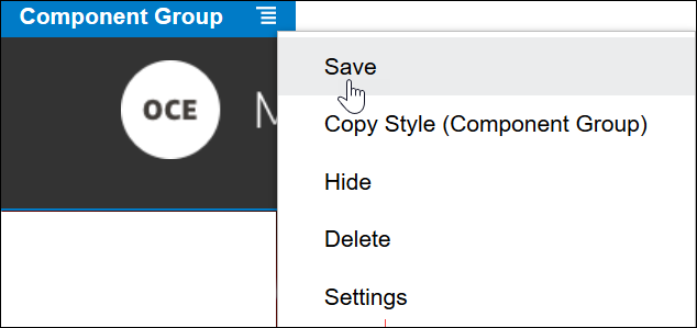
Description of the illustration component_group_save.pngThe following image shows the parent structure for the Image component in the Header slot:Tip:
If you click the component group and you see the Image or Minimal-NavMenu component title rather than the component group title, click the Image or Minimal-NavMenu component title again and then you’ll see the component group’s title. Now, you can click the component group’s title and perform the above step. - Click Save in the upper right of Site Builder to save your changes. The Header slot should now look like the following image:
- In the left sidebar, click
 and then click Seeded.
- From the left sidebar, drag and drop a Component Group into the Body slot. We’ll create a banner using this component group and the components (which we’ll be adding into it).
- In the left sidebar, click
 .
.
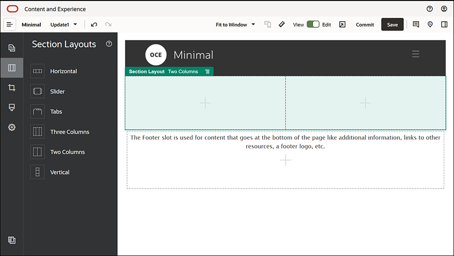
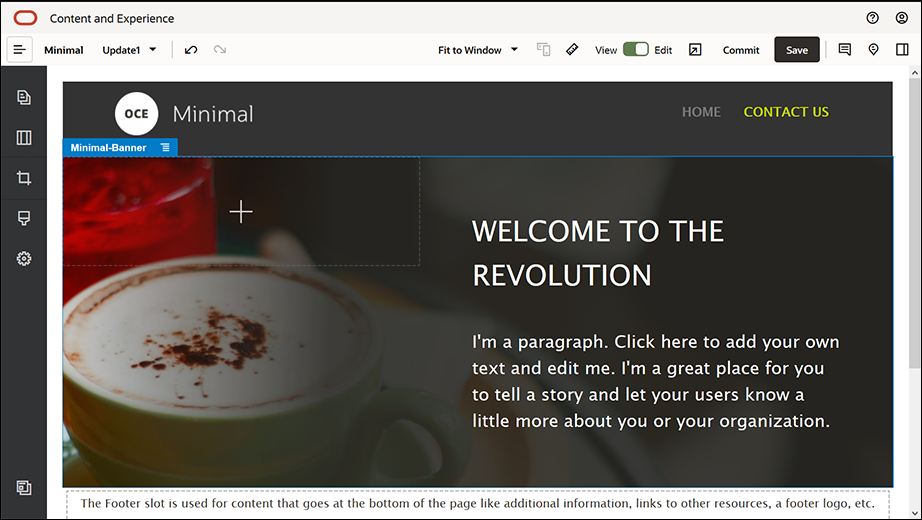
- Drag and drop a Two Columns section layout into the component group.
- Complete the section layout's settings in the General tab. Click Custom Settings to specify the following settings.
Property Value First Column Width (%) 43 Second Column Width (%) 57 Responsive Breakpoint (pixels) 1,023 Responsive Behavior Hide the first column Complete the settings in the Background tab:
Property Value Image Banner1.jpg from the Minimal-Images folder Position Center Center Scale Stretch - In the left sidebar, click
 to see the list of seeded components.
- From the list of seeded components, drag and drop a Title component into the second column of the Two Columns layout.
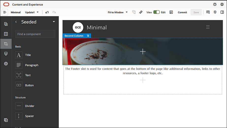
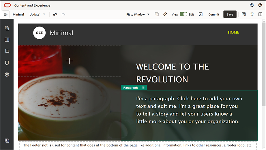
Description of the illustration 2_body_slot.png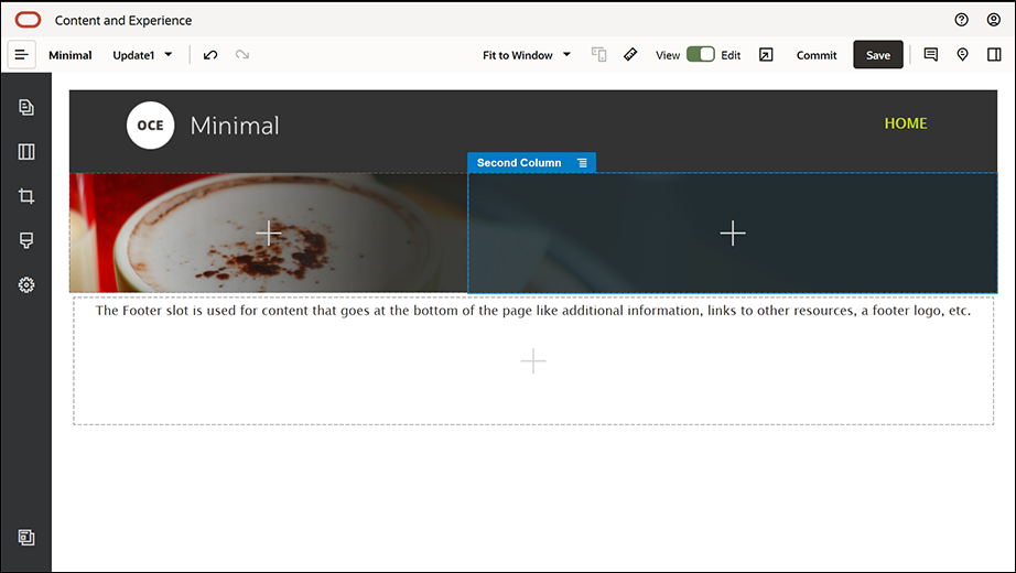
Description of the illustration 3_body_slot.png - Click in the Title component and enter "WELCOME TO THE REVOLUTION". Select the text and set its font color to White in the text editor. Complete the title component's settings in the General tab.
Property Value Top 6vw Bottom 1.8vw Left 6vw Right 6vw - From the list of seeded components in the left sidebar, drag and drop a Paragraph component below the Title component, within the second column of the Two Columns layout. Complete its settings in the General tab.
Property Value Top 1.8vw Bottom 6vw Left 6vw Right 6vw - Click in the Paragraph component and enter the following text:
"I'm a paragraph. Click here to add your own text and edit me. I'm a great place for you to tell a story and let your users know a little more about you or your organization."
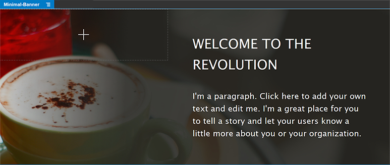
Select the text and set its size to 24 in the text editor. Also, set its font color to White in the text editor. - Now, the banner is ready. Let’s save this component group as a custom component group so that we can use it later in the other website pages. Click the component group's menu icon
 and then click Save. In the Save Component Group dialog, in the Name field, enter "Minimal-Banner" and then click Save. You’ll notice that the name (Minimal-Banner) now shows up for the component group.
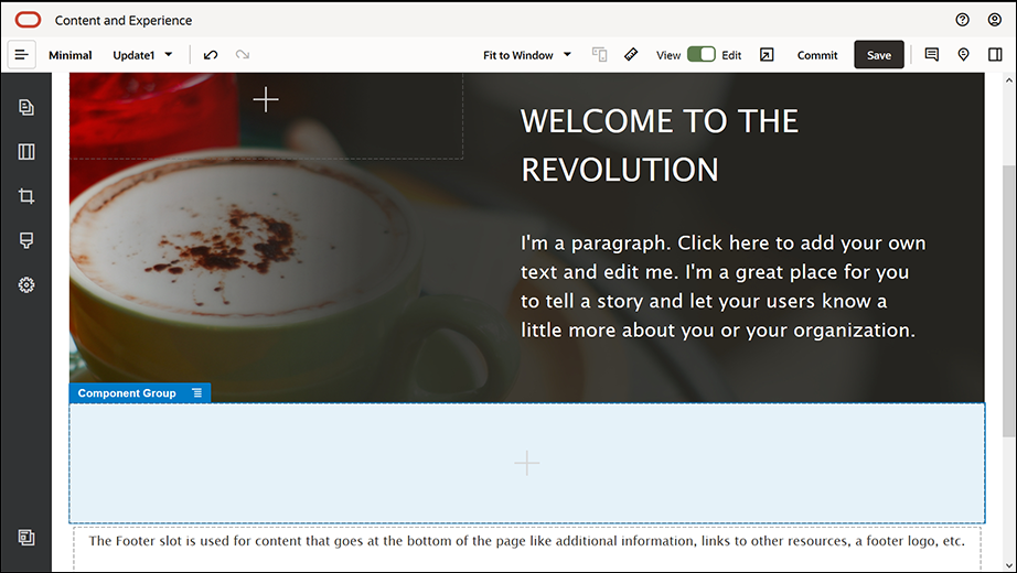
- From the left sidebar, drag and drop another Component Group into the Body slot, below the Minimal-Banner component group you’ve already added.
- Drag and drop a Title component into the component group.
- Click in the Title component and enter "Welcome to OCE Minimal".
- Complete the title component's settings in the General tab.
Property Value Top 3vw Bottom 1.8vw Left 6vw Right 6vw 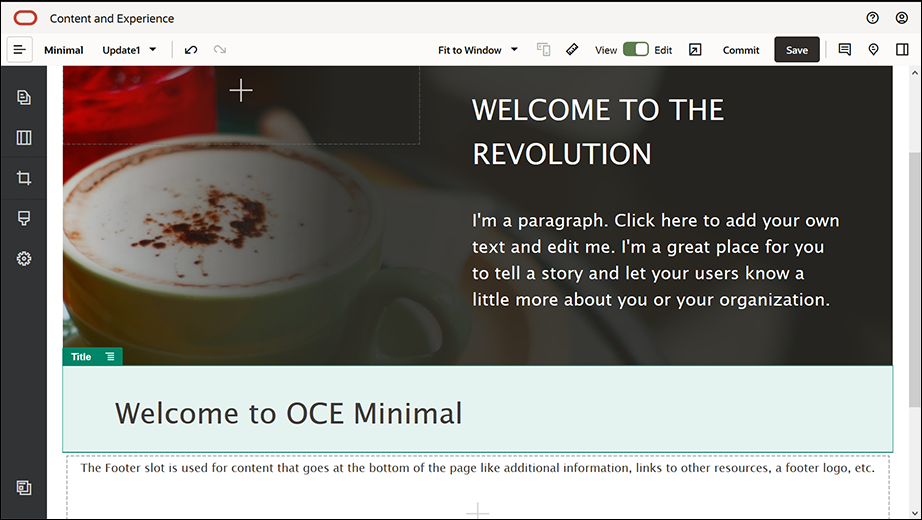
Description of the illustration 6_body_slot.png - From the left sidebar, drag and drop a Paragraph component below the Title
component, into the component group. Click in the Paragraph component and
enter the following text:
"Oracle Content Management is a cloud-based content hub to drive omni-channel content management and accelerate experience delivery. It offers powerful collaboration and workflow management capabilities to streamline the creation and delivery of content."
"Oracle Content Management offers simple and easy-to-use tools to create websites. You can quickly create a website by taking advantage of the powerful features that Oracle Content Management provides."
- Complete the Paragraph component's settings in the General tab.
Property Value Top 20px Bottom 50px Left 6vw Right 6vw 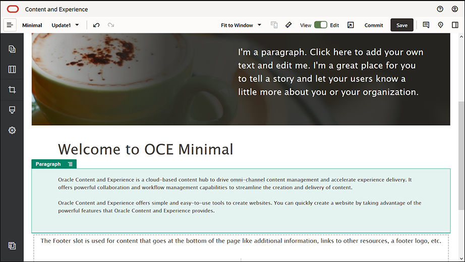
Description of the illustration 7_body_slot.png - We’ve completed the body slot. Let’s save the component group as a custom component group so that we can use it later in the other website pages. Click the component group's menu icon
 and then click Save. In the Save Component Group dialog, in the Name field, enter "Minimal-Body" and then click Save.
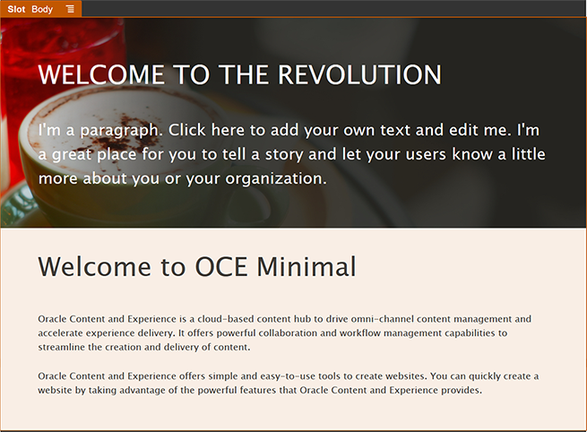
- Click Save in the upper right of Site Builder to save your changes. The Body slot should now look like the following image:
- From the left sidebar, drag and drop a Component Group into the Footer slot. In the component group’s settings, set the Color field to #333333.
- Drag and drop an Image component into the component group and complete its settings in the General tab.
Property Value Select Powered_by_OCE.png from the Minimal-Images folder Alignment Left Width Deselect Set Width Top 0.9vw Bottom 0.9vw Left 6vw Right 0 - From the left sidebar, drag and drop a Social Bar component into the component group, to the right side of the Image component.
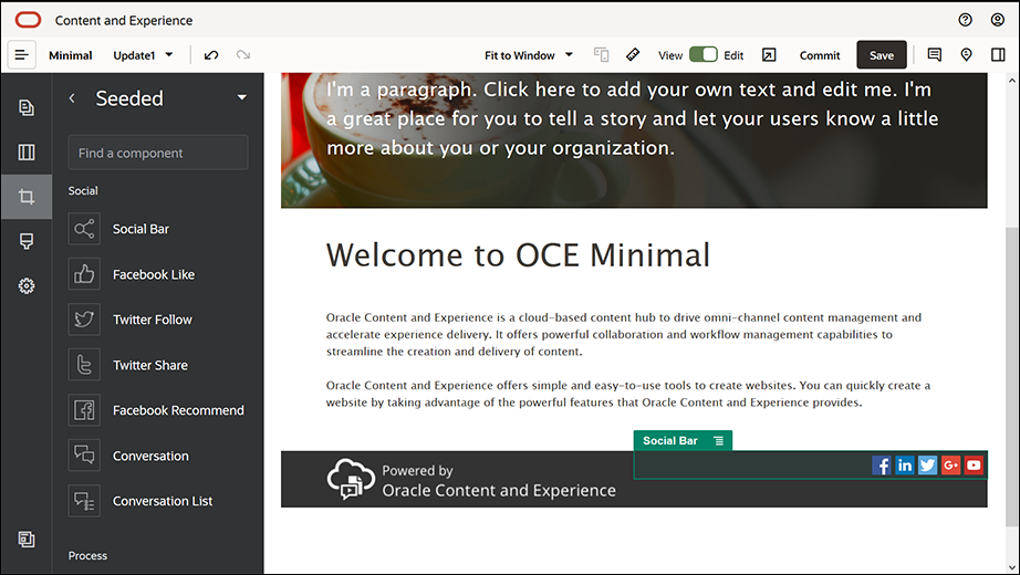
Description of the illustration 2_footer_slot.pngComplete the settings for the Social Bar component in the General tab.
Property Value Top 1.8vw Bottom 1.8vw Left 0.3vw Right 6vw In the General tab, click Icons and then click an icon name to complete the settings.
Property Value URL - https://www.facebook.com/Oracle/ (for Facebook)
- https://www.linkedin.com/company/oracle/ (for LinkedIn)
- https://twitter.com/Oracle (for Twitter)
- https://www.youtube.com/oracle/ (for YouTube)
Target Open in New Window - Now, the footer is ready. Let’s save this component group as a custom component group so that we can use it later in the other website pages. Click the component group's menu icon
 and then click Save. In the Save Component Group dialog, in the Name field, enter "Minimal-Footer" and then click Save. The component group should look like:
- Click Save in the upper right of Site Builder to save your changes.
Preview the first page of your website by clicking ![]() in the upper right of Site Builder. The website is still not published and cannot be viewed by others now.
in the upper right of Site Builder. The website is still not published and cannot be viewed by others now.
You've completed creating the HOME page. Let's build the CONTACT US page. This is what the contact page will look like once it's completed:
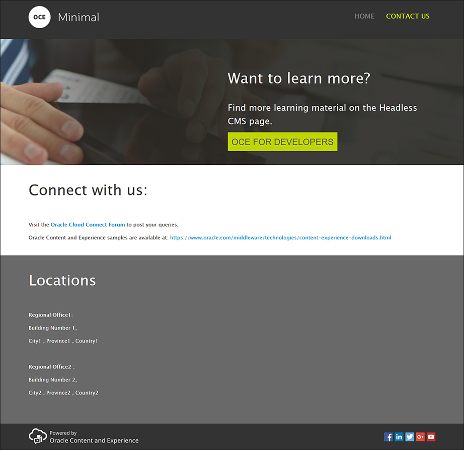
Description of the illustration minimal_site_contact.png
- In the left sidebar, click
 and then click Add Page.
- Enter "CONTACT US" in the Page Name field and click Close. You've added a new page to your website.
- In the left sidebar, click
 and then click Custom.
- Drag and drop a Minimal-Header component (which you created and saved earlier) into the Header slot.
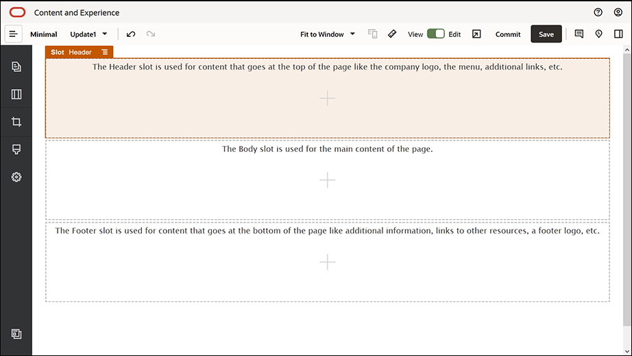
Description of the illustration 1_contact_us.png
Description of the illustration new_menu.pngNotice that the Minimal-NavMenu component has automatically picked up the new CONTACT US page you just created.
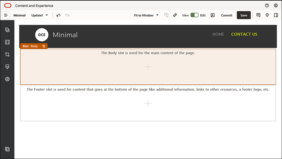
Description of the illustration 2_contact_us.png - From the left sidebar, drag and drop a Minimal-Banner component into the Body slot.
- Let’s modify the banner so that it looks different from the HOME page’s banner and suits the CONTACT US page. Within the component group, modify the settings for the Two Columns section layout:
In the Background tab, in the Image field, click Select Image and then select Banner2.jpg from the Minimal-Images folder you created earlier in Documents.
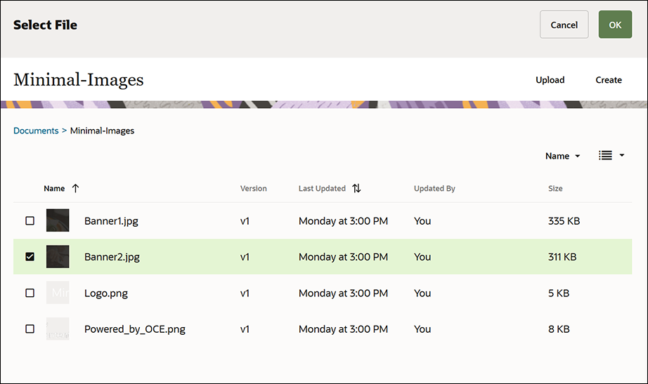
Description of the illustration 5_contact_us.png - Within the Two Columns section layout, modify the text in the Title and Paragraph components.
- Enter "Want to learn more?" in the Title component.
- Enter "Find more learning material on the Headless CMS page." in the Paragraph component.
- In the left sidebar, click
 and then click Seeded.
- The image for CONTACT US page has a button called OCE FOR DEVELOPERS as part of the banner, so let’s add this button to the banner. Within the Minimal-Banner component group, drag and drop a Button component into the second column of the Two Columns section layout (below the recently added Paragraph component). Complete the Button component’s settings in the General tab.
Property Value Label OCE FOR DEVELOPERS Top 0.3vw Bottom 3vw Left 6vw Right 0.3vw In the Style tab, select Customize and complete the settings.
Property Value Background Color #c0d600 Font - Enter 24 as the size.
- Enter color #58595b.
Border None Hover Color - Set BACKGROUND to #e1fa00.
- Set FONT to #58595b.
- Set BORDER to #2222dd.
Corners 0 Complete the settings in the Link tab.
Property Value Select Link Type Web Page URL http://www.oracle.com/pls/topic/lookup?ctx=cloud&id=content-cloud-headless Target Open in New Window 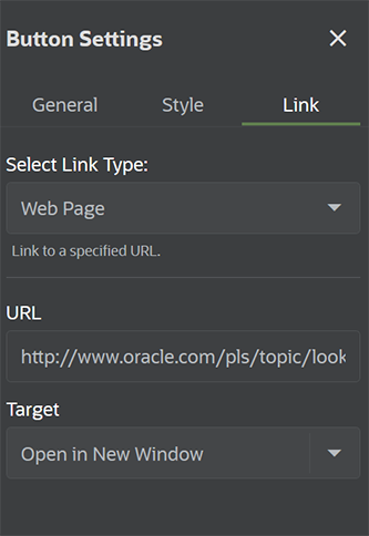
Description of the illustration button_settings.png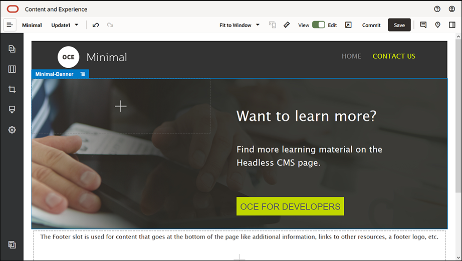
Description of the illustration 4_contact_us.png - In the left sidebar, click
 and then click Custom.
- Drag and drop a Minimal-Body component below the Minimal-Banner component, into the Body slot.
- Within the Minimal-Body component, modify the text in the Title and Paragraph components.
- Enter "Connect with us:" in the Title component.
- Enter details such as an email address and other support-related links in the Paragraph component:
"Visit the Oracle Cloud Connect Forum to post your queries."
"Oracle Content Management samples are available at: https://www.oracle.com/middleware/technologies/content-experience-downloads.html"
- From the left sidebar, drag and drop another Minimal-Body component into the Body slot, below the Minimal-Body component you added earlier.
- In the component group’s settings, in the Background tab, set the Color field to #696969.
- Within the Minimal-Body component, modify the Title and Paragraph components.
- Enter "Locations" in the Title component. Select the text and set its font color to White in the text editor.
- Enter the following text in the Paragraph component.
"Regional Office1:
Building Number 1,
City1, Province1, Country1
Regional Office2:
Building Number 2,
City2, Province2, Country2"
- Now, let’s add the footer to the CONTACT US page. Drag and drop a Minimal-Footer component into the footer slot.
- Click Save in the upper right of Site Builder to save your changes.
Preview the website by clicking ![]() in the upper right of Site Builder to make sure everything looks good. Make sure the logo image on the CONTACT US page takes you back to the home page when clicked. Test the menu to make sure the navigation between the website pages works correctly.
in the upper right of Site Builder to make sure everything looks good. Make sure the logo image on the CONTACT US page takes you back to the home page when clicked. Test the menu to make sure the navigation between the website pages works correctly.
Your website is ready to be published.
