Tour the Designer
A visual application is your ticket to the Designer, a declarative environment that you use to design and develop apps within your visual application.
The Designer has five distinct areas (as highlighted in this image):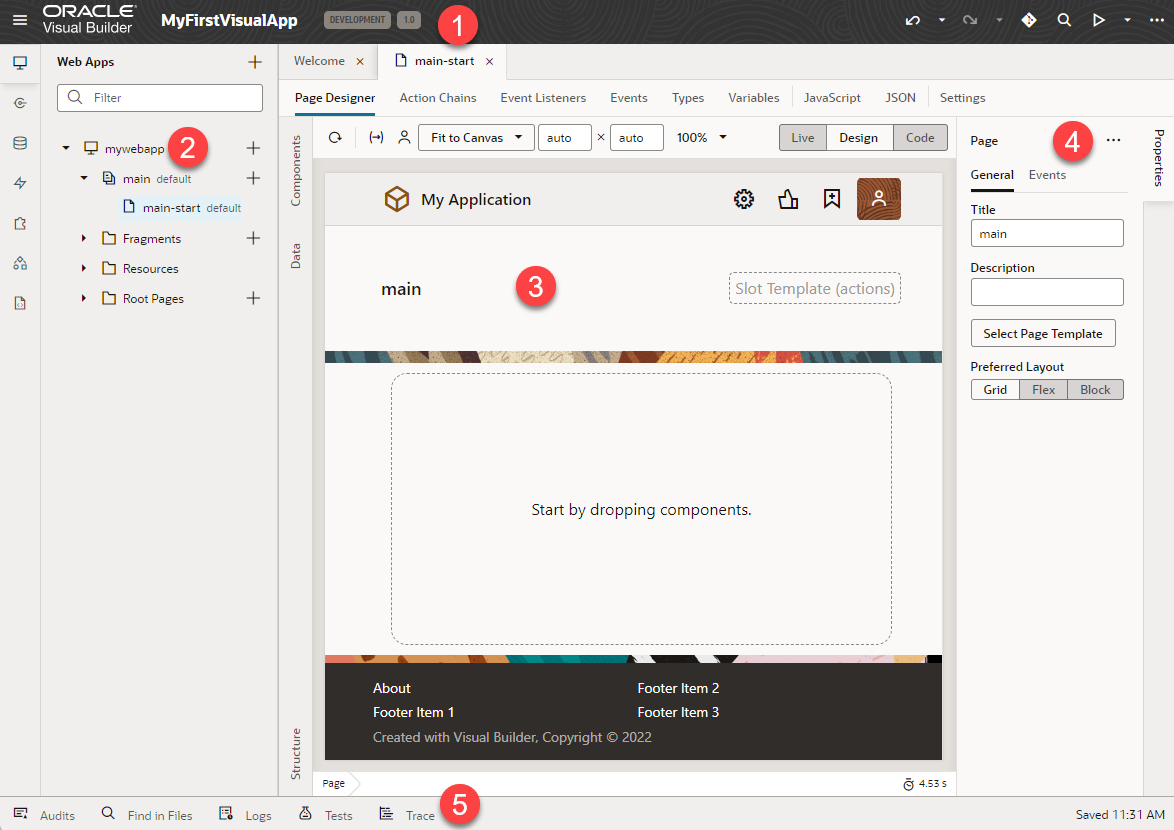
Description of the illustration newvisapp.png
| Label | Element |
|---|---|
| 1 | Header |
| 2 | Navigator |
| 3 | Canvas/Editors |
| 4 | Properties pane |
| 5 | Footer |
Let's take a look at each of these areas to learn more about what each one does.
The Header
| Label/Icon | Element | Description |
|---|---|---|
| Toggle main menu | Open a side panel, where you can select All Applications to go to the Home page. If you're an administrator, you'll see additional options to manage Settings and Certificates. You can also click |
|
| MyFirstVisualApp | Visual app name | Name of the visual application you're working with. |
| Development, Stage, or Live | Status indicator | Status of the visual application. |
| 1.0 | Version | Version of the visual application. |
| Undo | Undo one or more of your changes. To undo your most recent change, click Undo (hover your cursor over the icon to view the action that will be undone). To undo multiple changes, click the Undo drop-down list and select the actions you want to undo. For example, selecting the Insert Heading action in this image will remove the heading and undo other changes you made after adding the heading: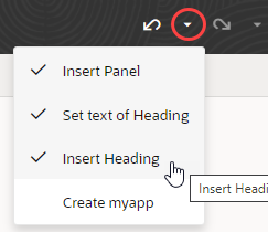 Tip: You can undo up to 10 of your changes at a time (your last 500 actions are stored in the browser and will be lost if you clear the browsing cache). To undo more than 10 actions, simply undo a few items, then open the drop-down list again. |
|
| Redo | Redo one or more changes after undoing them. To redo your most recent change, click Redo (hover your cursor over the icon to view the action that will redone). To redo multiple changes, click the Redo drop-down list and select the actions you want to redo. For example, selecting the Set text of Heading action in this image will revert two of the previously undone actions: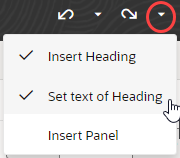 |
|
| Git | Integrate your visual application with a Git repository. | |
| Go to File | Search your application's sources by file name. When you first click Go to File, your most recently used files show. If the file you're looking for isn't listed, start typing the name of the name in the search box, then select the file you want in the suggestions. | |
| Preview | Use the Preview icon to see how your pages look and behave in a browser. Typically, you'd use Preview mode, but you can also use the Debug Preview mode to debug issues with your application. | |
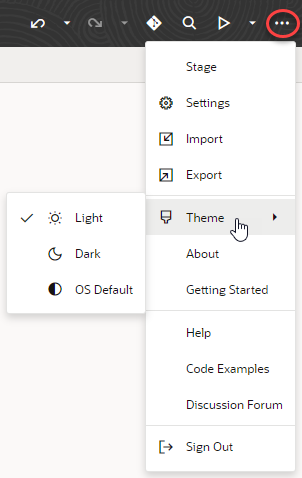
| Menu | Open a menu containing the Share, Import, and Export actions, as well as options to open the Settings editor. You can also navigate to the Visual Builder Help Center and discussion forum. |
The Navigator
| Icon | Element | Description |
|---|---|---|
| Web Apps | This is where you:
|
|
| Services |
To interact with external REST APIs in your visual app, you can create connections to the services that provide access to these API endpoints. You also have access to a catalog of predefined services through backends such as Oracle Cloud Applications and Oracle Integration. The Oracle Cloud Applications backend, for example, exposes REST APIs—from Human Capital Management, Sales, and more—that your visual app can consume right out of the box. You can also connect to services that aren't listed in this catalog. See Manage Service Connections. |
|
| Business Objects | Business objects are custom data objects that implement your app's business logic. Your visual app can access and interact with the business objects you create through REST endpoints that Visual Builder generates for you. By default, this data is stored in an embedded database associated with your environment's Visual Builder instance. See Work With Business Objects. | |
| Layouts | A Layout represents a set of data fields that can appear in one or more related dynamic components, like a table or form. Create a new Layout here by choosing a data source, then defining the rule set that governs how that data looks and behaves. See How to Create Layouts With Dynamic Components. | |
| Components | The Components tab helps you to install and manage custom web components that you download from the Component Exchange, a repository of components that can be installed in your Visual Builder instance. See Work with the Component Exchange. | |
| Source | Although the Designer is primarily a visual editor, you can always work with source code if you prefer. See Work With Code. |
The Canvas/Editors
The canvas, which appears to the right of the Navigator when you open a page, is where you do the bulk of your work in Visual Builder. When you open a page, you'll see different editors along the top to help you modify and create artifacts used in the page, like Page Designer, Actions, Event Listeners, and so on: 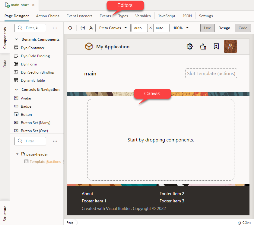
Description of the illustration canvas-editors.png
Depending on which aspect of the page you're customizing or building, Visual Builder invokes the proper editor to provide the experience you need, and displays that editor in the canvas. Perhaps the most important editor is the Page Designer, described in detail in Use the Page Designer.
All of the changes you make through the editors—the Page Designer, Actions, Event Listeners, etc.—are saved as JSON, which you can access through the JSON pane, next to Settings. In addition, you can use the JavaScript pane to enter any custom functions you may need. For details about the different editors, see Which Editor Do I Use?.
Tip:
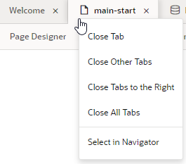
When working with multiple artifacts (pages, flows, business objects, and so on), each artifact opens as a separate tab on the tab bar. Here's how you can better manage these in your work area:- Right-click a tab to see options to close the particular tab, close other tabs, close tabs to the right, or close all tabs. You can also use this menu to select a particular tab in the Navigator:
If the tabs overflow available space on the tab bar, click
 at the edge of the tab bar and select the tab you want to open. Note that the active tab always stays in focus.
- Right-click the empty space on the tab bar and select the option to reopen closed tabs. Recently closed tabs are saved in session history, so you can keep reopening tabs until you get to the one you want.
The Properties Pane
As the name suggests, the Properties pane lets you specify the properties that control the appearance and behavior of whatever is currently selected in the canvas. While you're in the Variables editor, for example, you use the Properties pane to set the variable's default value, type, and other attributes. When you click a component on a page in the Page Designer, the Properties pane is immediately updated to reflect the component's properties. Depending on the component, the Properties pane might display additional tabs for modifying the component’s attributes or its behavior.
When you add a collection component to the canvas, like a table or list, you'll see a Quick Start tab added to the Properties pane: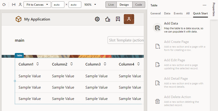
Description of the illustration propertiespane.png
To hide or show the Properties pane, just click the tab itself.
The Footer
At the bottom of the Designer, you have several tools that can help you debug your visual application:
| Element | Description |
|---|---|
| Audits | Scan your visual application's code for errors and warnings. Your code is scanned when you open the Audits pane. See Audit Application Code. |
| Find in Files | Search your application's Git repository for a text string. |
| Logs | View build logs when a visual application is staged or published. See Troubleshoot Build Issues.
Also, enable logging to assist with debugging when developing rules for a business object. See Enable Logging for Scripting Events. |
| Tests | Run all test cases defined for action chains in a visual app and run them to make sure code changes haven’t broken any functionality. See Use the Tests Footer in a Visual Application. |
| Trace | Enable tracing of a business object's endpoint requests to diagnose performance bottlenecks. See Enable Tracing to Monitor Endpoint Calls. |
Color Theme
Visual Builder, by default, uses a light theme based on Redwood to set the color palette for your work environment. You can personalize this theme to switch to a dark theme or sync with your OS settings.
- Click Menu in the upper right corner of the Designer.
- Select Theme, then choose an option:
- Select Dark to use a dark color display, more suited for low-light conditions. This option switches the background and text used in all the editors, except the Page Designer canvas, where application pages continue to display against a lighter background with dark text.
- Select OS Default to inherit the theme used in your operating system's settings. If your system settings are configured to use dark mode, the Designer will also use those settings.
- If you changed the default, select Light to switch back to a lighter background with dark text display.
If you want to change the way your app appears to users, you can customize the app's theme to render its components against a dark background, even let your users choose between a Light or Dark theme. See Customize a Web App's Appearance.
