Customize How a Fragment Variable is Displayed in the Properties Pane
Customize the UI component displayed for fragment input parameters in the Properties pane, which can make the task of editing those parameters in the Page Designer easier.
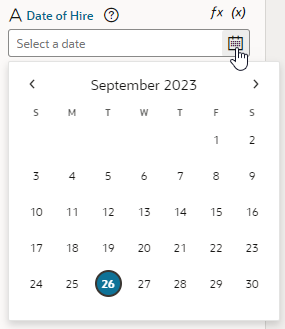
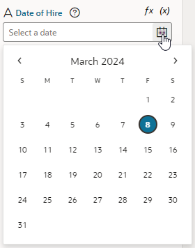
When working with a fragment in the Page Designer, the fragment's Properties pane by default displays text field components for editing the values of fragment variables enabled as input parameters. For some input parameters, a different UI component can make editing the parameter easier or more intuitive. For example, if a parameter is used to specify a date, a Date Picker component might be easier to use than a text field. To do this, you customize the fragment variable, so that a date picker shows instead of a text field when the fragment's input parameters are edited in the Page Designer: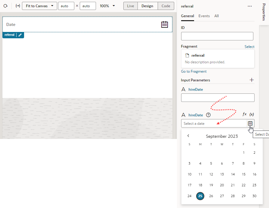
Description of the illustration fragment-variable-pi.png
Note:
Some UI customization options are not available in the Design Time tab. You'll need to edit the JSON directly to configure these advanced options. See Customize Fragment JSON with Metadata for a list of options.Customize a Variable in the Variables Editor
- Open the fragment's Variables editor.
- Select the variable or constant you want to customize.
- Open the variable or constant's Design Time tab in the Properties pane.
- Select properties to customize how the component for editing the variable will look in the Page Designer.
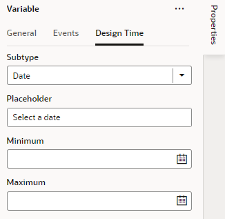
The properties you see in the Design Time tab will depend upon the variable's type, and the Subtype property you select in the tab. For example, if Date is selected as the Subtype for a string-type variable, you'll see fields for setting the date's Minimum and Maximum limits:
Note:
Some subtypes are used to set the binding type and do not directly affect how the variables are displayed in the Properties pane. For details on using Dynamic Field, Dynamic Field Array, Dynamic Container, and Dynamic Layout Context, see Set the Binding Type for Variables in Dynamic Components. For details on using Business Object Value and Business Object Value Reference, see Resolve Expressions in Page Properties Based on Fragment Data.Here are steps for some common customization options for string-, object-, and number-type variables and constants:Tip:
When working with string variables and constants, you have the option of adding translation metadata if you want a particular variable (or constant) to display the translation icon on the Page Designer's Properties pane to support translation.Customization Option Steps in Design Time Tab Result in Page Designer To display a color picker: For a string-type variable or constant:-
In the Design Time tab, select the Subtype as Color.
-
Optional: In the Placeholder field, specify a hint text for the variable; for example, Choose a color.
-
Optional: Switch to the General tab and set these additional properties:
-
In the Label field, enter a user-friendly name for the variable.
-
In the Default Value property, use the color picker to set a default color.
-

Description of the illustration fragment-variable-custompropertiespane.pngTo display a date or date-and-time picker: For a string-type variable or constant:-
In the Design Time tab, select the Subtype as Date or Date Time.
-
Optional: In the Placeholder field, specify a hint text for the variable; for example, Select a date.
-
Optional: In the Minimum field, set the bottom (inclusive) limit of a date or date-and-time range for the value in the Properties pane.
-
Optional: In the Maximum field, set the top (inclusive) limit of a date or date-and-time range for the value in the Properties pane.
-
Optional: Switch to the General tab, then in the Label field, enter a user-friendly name for the variable.
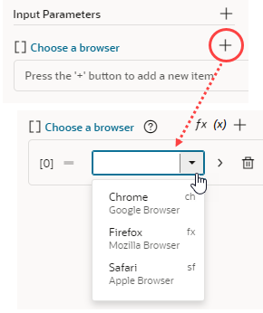
To display a drop-down menu containing an array of possible values: For a string-type variable or constant:-
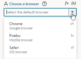
In the Design Time tab, select the Subtype as Enum Values.
-
Optional: In the Placeholder field, specify a hint text for the variable; for example, Select the default browser.
-
Click
 next to Enum Values, enter the Label, Value, and Description for your first value. For example, you might enter Chrome as the label, ch as the value, and Google Browser as the description. Click Create.
If you want to make changes, click
 , update the values, and click Save. Click
  to delete a value.
To reorder your list, drag the
 next to the value and drop it where you want it.
-
Repeat step c to create your entire list of values.
-
Optional: Switch to the General tab, then in the Label field, enter a user-friendly name for the variable.
Description of the illustration fragment-variable-enumvaluepng.pngTo display a drop-down list of values retrieved from a service, such as a REST endpoint: For a string-type variable or constant:-
In the Design Time tab, select the Subtype as LOV.
-
Optional: In the Placeholder field, specify a hint text for the variable; for example, Select an option from the list.
- Click Select Endpoint and choose the endpoint whose response is used to provide the list of values. The REST endpoint must already be set up and available to your application. The endpoint response must also be in JSON format.
-
When the REST call requires input and URI parameters, click the associated Assign or Not Mapped link and map the parameters to the value they should be replaced with. The value can be a Visual Builder constant.
If the path and URI parameters depend on other constants (for example, your REST service uses the result of an earlier selection as part of its own request), use expression notation in the parameter values to indicate which constant values to use. You'll need to do this in the source JSON. For example, you would use the following expression to instruct a service request to use the current value of the "dept" constant as the value for the path parameter "department":"pathParameters": { "department": "[[ $constants.dept ]]" }When writing the expression:- Use simple direct references. Calculated expressions such as
"[[ $constants.dept + "_" ]]"do not work as expected. - Use constants; variables cannot be used.
- Make sure the referenced constants are accessible to the application making the LOV service call.
- Use simple direct references. Calculated expressions such as
- If your endpoint response is not an array, in the Items Path, specify a dot-separated path from the root of the response object to the array containing the list of values. If your response is an array, you can leave this field empty.
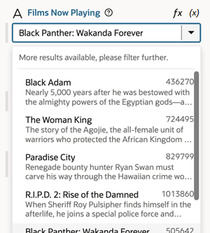
For example, you would enter results when the response is not an array, as shown here:
{
   "now": {
     "type": "string",
     "description": "wow",
     "defaultValue": "505642",
     "input": "none",
     "@dt": {
       "label": "Films Now Playing",
       "subtype": "lov",
       "valueOptions": {
         "service": {
           "request": {
             "endpoint": "movies/getNowPlaying",
             "uriParameters": {
                 "api_key": "4174b7d9a7b4bf87342c98e2289c6ee6"
      }
           },
           "response": {
             "itemsPath": "results",
             "mapping": {
               "value": "id",
               "label": "title",
               "description": "overview"
             }
           }
         }
       }
     }
   }
}
If your endpoint comes from business objects you've defined, you would enter items.
- In the Value field, specify the field from the response object to use as the actual value of the variable or constant, for example, id.
- Optional: In the Label field, enter the field from the response object to use as the primary display name of the item, for example, title. It can also be an array of field names, for example, ["firstName", "lastName"].
- Optional: In the Description field, enter the field from the response object to use as the item description, for example, overview.
To display a time picker: For a string-type variable or constant:-
In the Design Time tab, select the Subtype as Time.
-
Optional: In the Placeholder field, specify a hint text for the variable; for example, Select a time.
-
Optional: In the Minimum property, set the bottom (inclusive) limit of a time range for the value in the Properties pane.
-
Optional: In the Maximum property, set the top (inclusive) limit of a time range for the value in the Properties pane.
-
Optional: Switch to the General tab, then in the Label field, enter a user-friendly name for the variable.
To display a drop-down menu with a list of time zones: For a string-type variable or constant:-
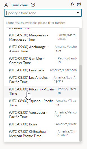
In the Design Time tab, select the Subtype as Time Zone.
-
Optional: In the Placeholder field, specify a hint text for the variable; for example, Select a time zone.
-
Optional: Switch to the General tab, then in the Label field, enter a user-friendly name for the variable.
Description of the illustration fragment-variable-timezone.pngTo limit the input values to a number in a range: For a number-type variable or constant:-
In the Design Time tab, specify a hint text for the variable, for example, Enter Quantity, in the Placeholder field.
-
Optional: In the Minimum and Maximum properties, set the inclusive bottom and top limits of a range for the value in the Properties pane; for example, to limit the input value to a number in the range 0 - 99.
-
Optional: Switch to the General tab, then in the Label field, enter a user-friendly name for the variable.

Description of the illustration fragment-variable-number.pngTo display an endpoint picker, allowing users to select an endpoint, input parameters, and query, sort, and other Call REST action options: For an object-type variable or constant:-
In the Design Time tab, select the Subtype as Endpoint.
-
Optional: To filter endpoints available in the endpoint picker by REST action type, select one or more of the predefined filters in Endpoint Action Hint. For example, to only list
Get OneREST calls, select Get One. -
Optional: To filter endpoints available in the endpoint picker by service connection type, select one or more of the predefined filters in Service Type. For example, to only list service connections using an ADF Describe, select ADF Describe.
-
Optional: Switch to the General tab, then in the Label field, enter a user-friendly name for the variable.
Note:
The Placeholder field does not take effect in the Properties pane when you use the Endpoint subtype.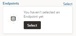
Description of the illustration fragment-variable-endpoint.pngClicking Select launches a Configure Endpoint wizard in which fragment users can select a suitable endpoint and choose its URI parameters.Tip:
If you cannot find the endpoint you want or prefer to manually set up your endpoint, click the Manual Setup of Endpoint icon ( ) in the wizard, then select from the available endpoints and confgure its URI parameters.
-
"variables": {
    "hireDate": {
      "type": "string",
      "input": "fromCaller",
   "@dt": {
        "label": "Date of Hire"
        "subtype": "date",
        "valueOptions": {
          "placeholder": "Select a date"
     }
   }
},
Customize Fragment JSON with Metadata
- Open the fragment's JSON editor.
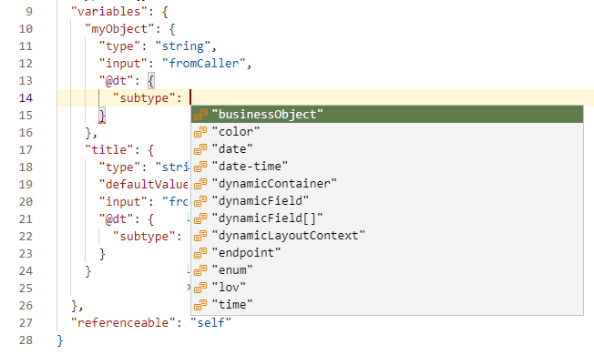
- Update the variable or constant's definition by setting the
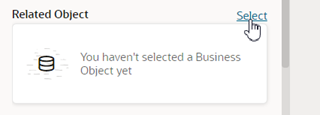
@dtelement, then use thesubtypeproperty to specify the component you want displayed in the Page Designer. The JSON editor displays a hint to help you select the value for thesubtypeproperty:For example, here's how you can show a component for selecting a business object by setting thesubtypeproperty tobusinessObject:"myObject": { "type": "string", "input": "fromCaller", "@dt": { "subtype": "businessObject", "label": "Related Object" } },You can also use the
labelproperty to change the variable's display name in the Properties pane.The Properties pane in the Page Designer will now show a component for selecting a business object and the new display name for the variable wherever the fragment is used.
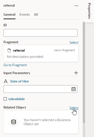
Description of the illustration fragment-variable-bo.png
For more details about the JET components and properties, see JET metadata in Oracle JavaScript Extension Toolkit documentation.
Property Options for Variable Metadata
The following table describes the metadata properties that you can use in JSON to customize how fragment variables are displayed in the Properties pane:
| Property | Type | Description |
|---|---|---|
label |
string | Use this property to specify a user-friendly name for the variable. |
subtype |
Available subtypes:
Other subtypes are also available, but they are used to set the binding type and do not affect how the variables are displayed in the Properties pane. For details on using |
Use this property to create a more specific type of customizer for simple types. For example, you can choose Most simple customizations can be configured from the Design Time tab (see Customize a Variable in the Variables Editor). |
valueOptions |
object | The valueOptions available to you depend on the selected subtype. When no subtype is selected, the only valueOptions is placeholder. See the tables below for a list of valueOptions properties.
|
Property Options for Fragment Metadata
The valid subtype and valueOptions properties you can use depend on the variable's type. For example, the color subtype can only be applied to variables that are strings. This section describes the subtype and valueOptions properties that are valid for each type.
Subtypes and valueOptions for objects
When the variable type is object, the following table describes the subtype and valueOptions that can be used:
| Subtype | valueOptions | Usage |
|---|---|---|
dynamicContainer |
section |
The only
valueOption for the dynamicContainer subtype is section:You create the metadata for dynamic container sections in the parent container. Use |
| empty | fields |
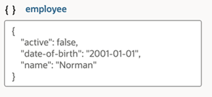
When no subtype is selected, you can use the Note: This property is only supported for displaying the first level of object fields.You can specify an array of fields of the associated variable or constant that you want displayed in-line in the Properties pane when editing the object's values. You can customize how each field is displayed by using When using the You can use the following field properties:
A variable described with the following metadata:
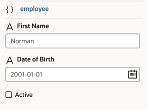
would look similar to this in the Properties pane when displayed with the default text area: The
fields property can be used to customize how the object is displayed:The customized object would look similar to this in the Properties pane: |
Subtypes and valueOptions for arrays
When the variable type is array, the following table describes the subtype and valueOptions that can be used:
| Subtype | valueOptions | Usage |
|---|---|---|
enum |
|
Use
enum to display a drop-down menu showing all values for each item in the array. The only valueOptions property for the enum subtype is values. In addition to a value, each item in the array can have an optional label and description.The Properties pane will show a drop-down menu that can have items with descriptions: If you are using an array of primitives (say,
string[])), you can use enum to display a drop-down menu showing all values for each item in the array:The Properties pane will show a drop-down menu with the three values for each item in the array: |
| empty |
|
When no subtype is selected, the only |
Subtypes and valueOptions for booleans
When the variable type is boolean, there are no subtype or valueOptions. Variables with a boolean type are displayed as switch components in the Properties pane.
Subtypes and valueOptions for numbers
When the variable type is number, you can use the Design Time tab to configure the subtype and valueOptions. See Customize a Variable in the Variables Editor.
Subtypes and valueOptions for strings
When the variable type is string, you can use the Design Time tab to configure the subtype and valueOptions for simple customization options. See Customize a Variable in the Variables Editor.
subtype and valueOptions that can be used in JSON to configure advanced options for string-type variables:
| Subtype | valueOptions | Usage |
|---|---|---|
empty |
|
Use the If a default value is supplied by the fragment variable, then that default value is used as the default placeholder. If both a placeholder value is used and the default value is specified, then the placeholder will be used. An example of values for the
placeholder and translatable properties: |
businessObject |
|
Use the
businessObject subtype to display a business object picker in the Properties pane.The Properties pane displays a component for selecting a business object: Note: Theplaceholder valueOption is not displayed in the Properties pane when you use the businessObject subtype.
|
