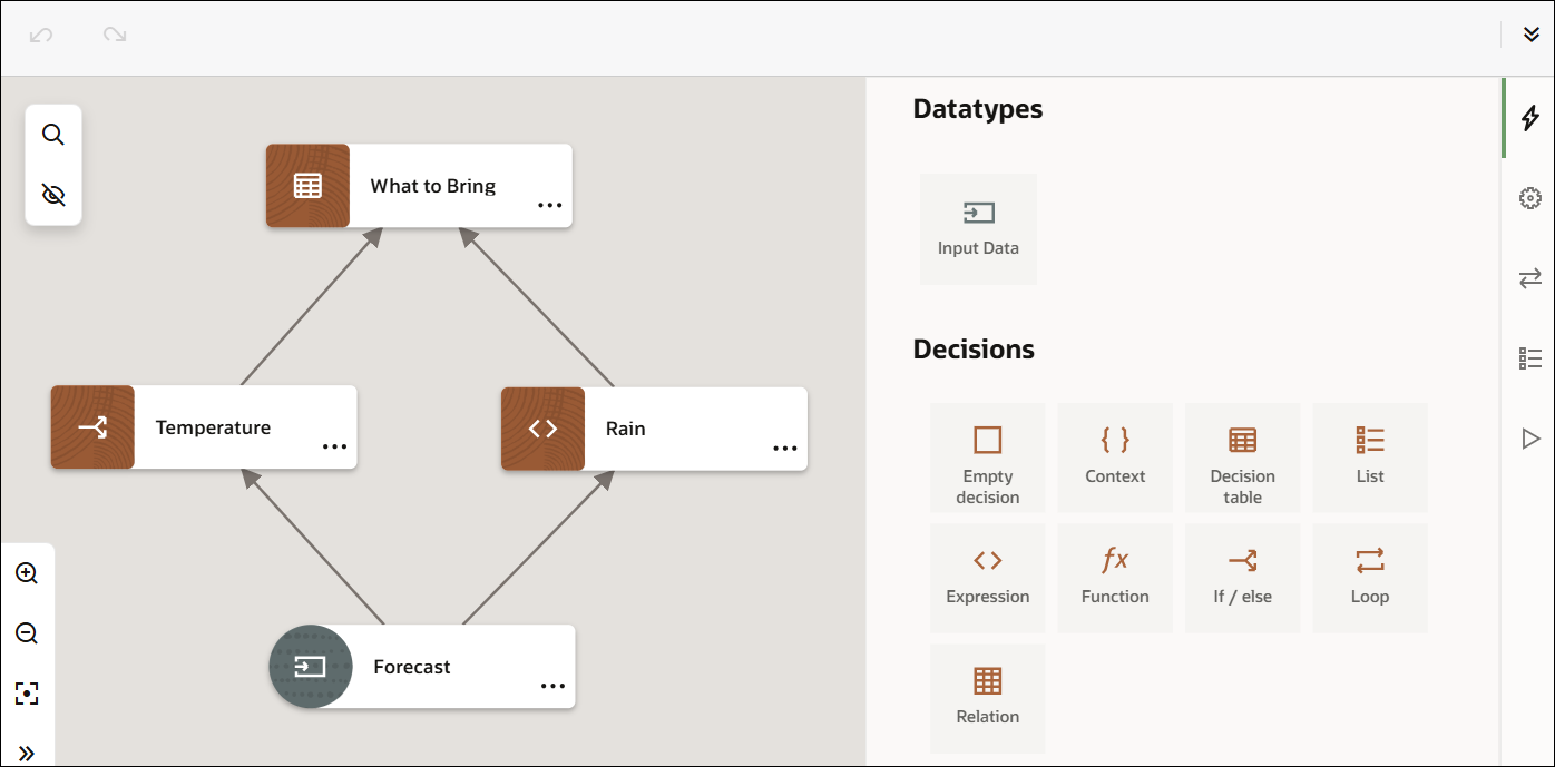
Decision Designer Components
The decision designer features a toolbar, sidebar, canvas, and overview panel to assist you in creating decisions.
Toolbar
The toolbar offers basic editing and designer-resizing controls.
| Toolbar Icon | Name | Description |
|---|---|---|
|
|
Undo |
Reverts the last action. |
|
|
Redo |
Repeats the last action. |
|
|
Designer toggle |
Expands or retracts the decision designer. |
Sidebar
The sidebar offers controls to access different aspects of decision modeling. Each of these controls functions as a toggle, enabling you to view or hide the corresponding panel.
| Sidebar Icon | Name | Description |
|---|---|---|
|
|
Palette |
Opens the diagram palette with the input data element and all decision types. From the palette, drag and drop elements onto the canvas to use them in your diagram. See Add Decisions and Create Input Data. |
|
|
Services |
Opens the Services panel, where you can create decision services. |
|
|
Types |
Opens the Types panel, where you can define a new type definition. |
|
|
Test decision model |
Opens the Test Decision Model panel. |
|
|
Properties |
Opens the Properties panel, where you can edit a node's properties. Note: This icon appears on the sidebar when you select an input or decision node on the canvas, and it opens the corresponding properties panel when clicked.See Add Decisions and Create Input Data. |
|
|
View or edit decision logic |
Opens the decision logic page, where you can view or edit a decision's logic. Note: This icon appears on the sidebar when you select a decision node on the canvas, and it opens the corresponding logic page when clicked. |
Canvas
The decision canvas is the central area where you can create a diagram that represents your decision model, using the elements in the palette.
Additionally, the canvas provides the following two functions:
| Canvas Icon | Name | Description |
|---|---|---|
|
|
Search |
Searches for a decision node on the canvas using the name you enter. |
|
|
Enable highlight mode toggle |
When enabled, highlights the node you select on the canvas. |
Canvas Overview
The canvas overview panel, located at the bottom-left corner, provides a quick overview of your entire canvas. You can collapse or expand it as needed.
It contains the following controls:
| Canvas Overview Icon | Name | Description |
|---|---|---|
|
|
Zoom in |
Zooms in on the canvas. |
|
|
Zoom out |
Zooms out on the canvas. |
|
|
Reset view |
Resets the canvas to its default view. |
|
|
Collapse overview toggle |
Collapses or expands the Canvas Overview panel. |
A Snapshot of the Designer
The following image shows a decision model in the designer, with the Palette panel open.
