Previewing the Enterprise Process Template
You can preview the runtime view with the current runtime metrics defined in the template in the Enterprise Process Manager window by using the Preview tab (preview mode). The system displays the template specific preview in the model pane and the Process Analytics tab on the right.
In following example, the parent and child processes are displayed based on the selected color themes. The connected child process is indicated by the circular node in green (Purchase Order).
You can right-click this node and click Drill into Connected Process to open the child process window.
In the Hierarchy window, you can click the Requisition (in orange color) to
preview the parent process, and you can click the Purchase Order(in green color)
to preview the child process. To indicate that the parent process is displayed as a
preview, the system displays a dotted arrow to the child process. To indicate that the
child process is displayed as a preview, the system displays a prominent arrow to the
child process.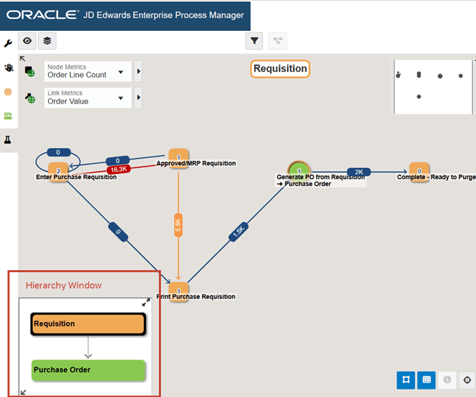
To preview the runtime metrics of the enterprise process and make the changes (optional) to the settings:
-
In the Enterprise Process Manager window, click the Preview tab. The Process Analytics tab is displayed on the right. This tab displays the analytics charts for the enterprise process.
When you click a node, the Node Analytics tab is displayed along with the specific node-related metrics, and when you click a link, the Link Analytics tab is displayed along with the specific link-related metrics.
-
You can drag and drop the nodes to change their positions. You can use the Snap to Node, Snap to Grid, and Zoom to Fit options to make changes to the layout of the enterprise process diagram.
- You can make changes to the metrics of the nodes and links by selecting the values
from the Node Metrics and Link Metrics drop-down lists. Click the
arrow icon next to the Node Metrics and Link Metrics fields to change the threshold
values. Note: The values and colors change on the nodes and links in the enterprise process diagram when you make changes to the Node Metrics and Link Metrics fields. See Understanding Color Codes.
To preview the node and link metric details:
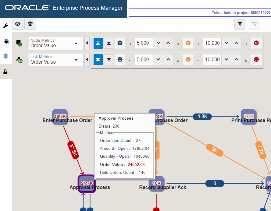
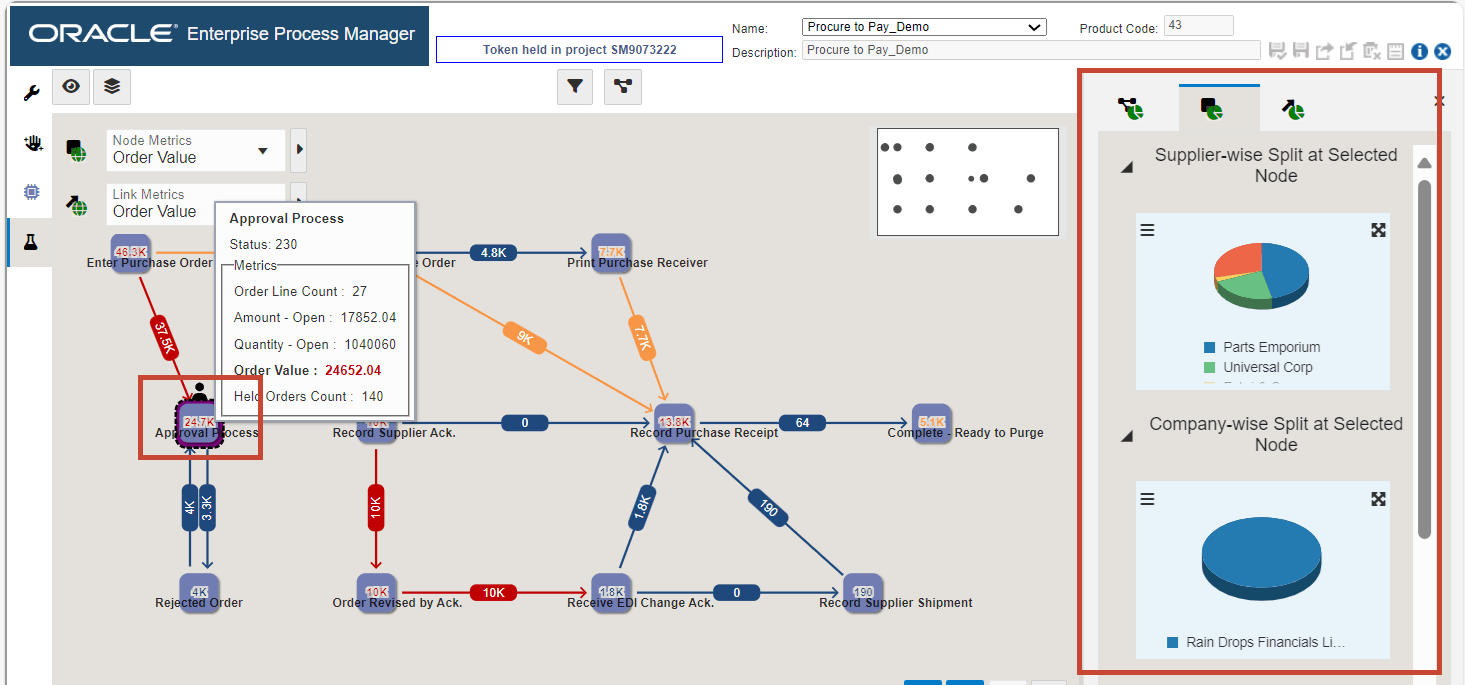
- Hover over the node to view the status code and metric details on the hover
form. On the hover form, the field selected in the Node Metrics drop-down
list is displayed in bold and its value is displayed in the threshold
color.
In the following example screenshot, you can see that the Order Value is selected in the Node Metrics drop-down list. The value is displayed in red, since it exceeds the threshold value.
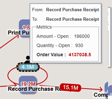
- Hover over the individual link to view the From and To details and metrics on the hover form. On the hover form, the field selected in the Link Metrics drop-down list is displayed in bold and its value is displayed in the threshold color.
(Tools Release 9.2.9.3) The system displays a loop around the node if an activity rule involves a self-referential loop (for example, transitioning from the 400 status back to the 400 status within the activity rules). In the Preview tab, the self-referential loop displays the appropriate metric values depending on the options defined in the Show Display Options and Show Filter Options windows. You can hover over the loop to view the From, To, and Metric details of the loop. When you click the loop, the system displays a People icon and a border to indicate that the link is selected. The system displays a dashed border (with a "marching ants" effect) around the link when you hover over a selected link. The corresponding analytics are displayed on the Link Analytics tab on the right.
-
(Tools Release 9.2.26.0) Right-click the nodes or links and click the Drill into Data option.
The query conditions and the table or view are determined by the context of the node and link. These are not provided in the Data Browser Query Selector window. The system also displays a Data Browser window to retrieve raw data based on all filters relevant to the current context.
-
(Tools Release 9.2.26.0) Right-click the nodes or links and click the Show Query Details option.
The Show Query Details option enables you to view the details of the table selections, returns, inputs and outputs, summary of the queries, and filter details that are used to generate the metrics on the nodes, links, and analytics charts.
- Hover over the node to view the status code and metric details on the hover
form. On the hover form, the field selected in the Node Metrics drop-down
list is displayed in bold and its value is displayed in the threshold
color.
- To refine the analytics details in the Process Analytics tab use the following
filtering options:Note:
You can click the arrow icons to collapse or expand the individual charts in the analytics tabs. Also, you can click the Maximize
 or Minimize
  icons on the charts to view them in maximized or minimized modes.
 (Tools Release 9.2.26.0) In the maximized mode of the charts, you can click the Toggle Table View icon
 to view the list of Series, Groups, and Values of the chart in a
tabular format. You can click the Show Query Details
to view the list of Series, Groups, and Values of the chart in a
tabular format. You can click the Show Query Details and Drill into Data
 icons on the rows to view the Query Details and the Data Browser
windows. Additionally, you can right-click the charts to access these
windows. To close the table view, click the Toggle Table view icon.
icons on the rows to view the Query Details and the Data Browser
windows. Additionally, you can right-click the charts to access these
windows. To close the table view, click the Toggle Table view icon.Starting with Tools Release 9.2.26.0, the Configure window displays the Chart Configuration and Series Configuration tabs. The fields displayed on these tabs depend on the chart type (bar or pie chart) and source (aggregation, orchestration, or logic extension) of the analytics charts. The Configure window also displays the Show Query Details and Drill into Data options.
Note: Starting with Tools Release 9.2.26.0, the Stack Series option is displayed on the Series Configuration tab (instead of Chart Configuration), and this option is available only for bar, line, area, and combined charts (not the pie charts).-
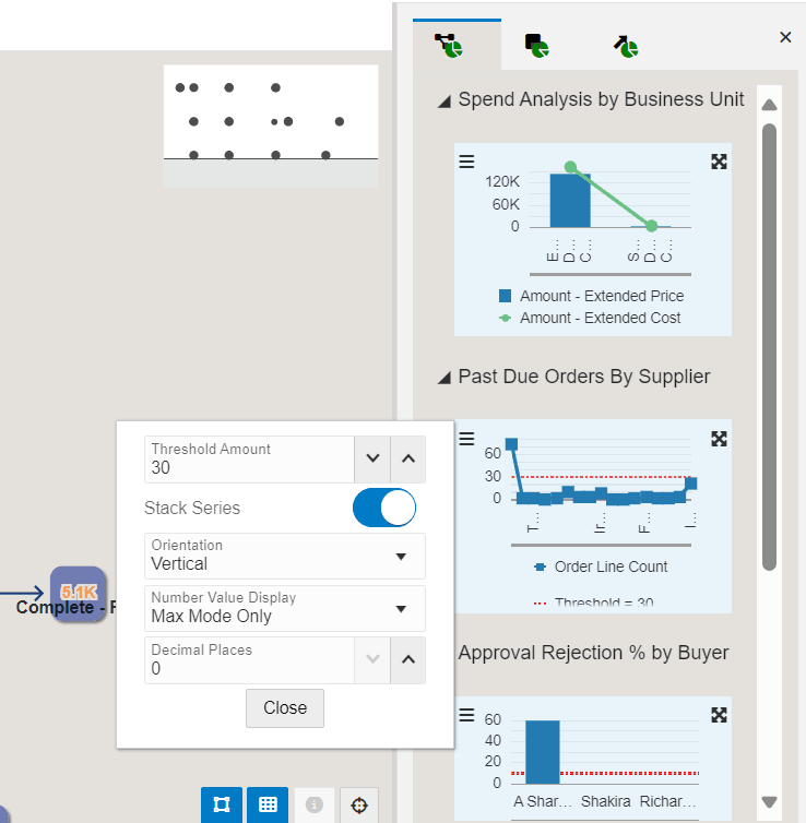
On the chart, click the Configure icon
 and enable the Stack Series option if you want to view
the bar chart or pie chart in the stack chart format .
and enable the Stack Series option if you want to view
the bar chart or pie chart in the stack chart format . - Select the values as required in the Configure window for the charts such as
Orientation (Vertical or Horizontal), Number Value Display (Never, Always,
or Max Mode Only) and so on. In the Process Analytics tab, you may see the
fields such as Threshold Amount, or Alert Limit displayed in the Configure
window depending on the template you select in the design time mode.
- Hover over the colors on the charts to review the details of the individual record.
-
- Click the node to view the node-specific analytics in the Node Analytics tab on the
right. Note:
The system displays a People icon and a border to indicate that the node is selected. The system displays a dashed border (with a "marching ants" effect) around the node when you hover over a selected node.
To refine the node details, use the following filtering options:
-
Click the Configure icon
and enable the Stack Series option to view the charts in
the stack chart format. - Select the values as required in the Configure window for the charts such as Number Value Display (Never, Always, or Max Mode Only) and Decimal Places (you can use the arrow icons in the field to increase or decrease the numbers).
- Hover over the colors in the stack or pie chart to review the details.
-
- When you click a link, the system displays link-specific analytics in the Link
Analytics tab on the right. Note: The system displays a People icon and a border around the value of the link to indicate that the link is selected. The system displays a dashed border (with a "marching ants" effect) around the value on the link when you hover over a selected node.
To refine the link details, use the following options:
-
Click the Configure icon
and enable the Stack Series option to view the charts in
the stack chart format. - Select the values as required in the Configure window for the charts such as Number Value Display (Never, Always, or Max Mode Only) and Decimal Places (you can use the arrow icons in the field to increase or decrease the numbers).
- Hover over the colors in the stack or pie chart to review the details.
Note:You can click the Click to set the context to the process level icon
 to view the Process Analytics tab.
 -
-
Click the Show Display Options icon
 . This tab enables you to choose the display options for your enterprise
process model.
. This tab enables you to choose the display options for your enterprise
process model.- From the Label Format for all Nodes drop-down list, you can choose the Description and Code, Description Only, or Code Only values. The system displays the selected label format on the nodes in the process model diagram.
- To further refine your process model diagram, enable or disable the Use Short Number Format, Show Undefined Paths, Show Zero Links, Show Orphan Nodes, and Show Zero Nodes options as required for your process model template.
- In the Analytics Lables section, select the values in Group Label Format for Analytics drop-down list. You can choose the Description and Code, Description Only, or Code Only fields. The system displays the selected label format in the analytics tabs.
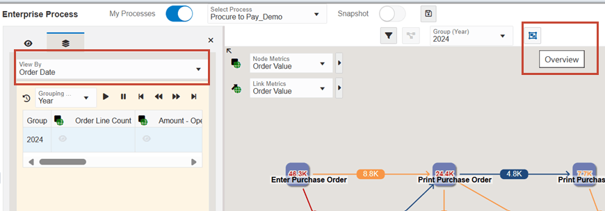
Click the Show Analytics Options icon
 . Select the values from the View By drop-down list. The values
displayed in this drop-down list are based on the selected template. If you
select an option other than Overview, either a Timeline view (for Date and UTIME
data types) or a Domain view (for other data types) is displayed. You can make
changes to the node and link metrics in the Timeline and Domain views. The
system displays the corresponding changes in the analytics tab on the
right.
. Select the values from the View By drop-down list. The values
displayed in this drop-down list are based on the selected template. If you
select an option other than Overview, either a Timeline view (for Date and UTIME
data types) or a Domain view (for other data types) is displayed. You can make
changes to the node and link metrics in the Timeline and Domain views. The
system displays the corresponding changes in the analytics tab on the
right.(Tools Release 9.2.9.3) If you select an option other than Overview, the system displays the Overview icon next to the Group drop-down list. Click this icon to reset the value in the View By drop-down list to Overview.
-
Click Save. The system saves the enterprise process as a UDO.
Note:You can reopen the existing personal enterprise process UDOs later, modify the settings, and click Save to save them again to overwrite the previous version. You can click Save As to save the UDO with a new name.
If you click Close before saving your changes, the system displays the Do you want to discard your changes? message. You can click OK to discard your changes or click Cancel to proceed and save the changes.