| Skip Navigation Links | |
| Exit Print View | |

|
Oracle Solaris Studio 12.3: Performance Analyzer MPI Tutorial Oracle Solaris Studio 12.3 Information Library |
| Skip Navigation Links | |
| Exit Print View | |

|
Oracle Solaris Studio 12.3: Performance Analyzer MPI Tutorial Oracle Solaris Studio 12.3 Information Library |
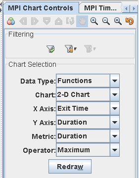
This section describes the attributes you can set in the MPI Chart Controls tab to create charts of the MPI experiment data. The MPI Chart Controls tab is shown in the following screen capture.

Data Type – Controls the type of data that is displayed in the chart, and can be set to one of the following values:
Functions - Plot data about the MPI functions used by the program. See Functions Chart Attributes for attributes you can set for Functions charts.
Messages - Plot data about the MPI messages sent between process ranks. See Messages Chart Attributes for attributes you can set for Messages charts.
Chart – Controls the type of chart that is created, and can be set to one of the following values:
Y Histogram - One dimensional chart with the data plotted on the vertical axis as a function of another metric on the horizontal axis. You must select the type of data to plot on the Y axis and the metric for the X axis.
X Histogram - One dimensional chart with the data plotted on the horizontal axis as a function of time on the vertical axis. You must select the type of data to plot on the X axis, and the metric for the Y axis.
2-D chart - Two dimensional chart with data plotted on both X and Y axis, making a 2-D matrix or scatter plot. You must specify what to plot on the X and Y axis, and the metric.
X Axis - Select the type of data to plot on the horizontal axis, for X Histogram or 2-D Chart. The types available depend on whether you have selected Functions or Messages from the Data Type list. The possible values are described in Functions Chart Attributes and Messages Chart Attributes.
Y Axis - Select the type of data to plot on the vertical axis, for Y Histogram or 2-D Chart. The types available depend on whether you have selected Functions or Messages from the Data Type list. The possible values are described in Functions Chart Attributes and Messages Chart Attributes
Metric - Select what data is shown as a function of X or Y. The metric value is indicated through color in the charts. The types available depend on whether you have selected Functions or Messages from the Data Type list. The possible values are described in Functions Chart Attributes and Messages Chart Attributes.
Operator – Select the method used to combine metrics in the chart. The possible values are described in Operator Settings.