2 About Decision Center Reports
Each element in the Inline Service Navigator represents a portion of the running Inline Service. Each of these elements gathers and displays useful information for analysis. Decision Center includes an extensive set of reports that let users explore all the aspects of the learning and statistics to any desired depth. Some of this information can also be exported to other BI systems for further use in analysis. This allows individuals to understand how Oracle Real-Time Decisions works and to verify its analysis.
The reports shown in this chapter are included with the CrossSell example Inline Service. Some of the data in your reports will differ slightly from the report examples in this chapter, due to the random nature of the data used in this simulated use case.
The following considerations apply in general to Decision Center reports:
-
While all the reports shown in this chapter are built out of the box, the labels (such as descriptions, object names, event names, and partitions) are defined at configuration time in Decision Studio.
-
Key data fields are represented as blue text links. You can drill down on these links for more information.
This chapter contains the following topics:
2.1 About Application Reports
This section describes the reports that are available at the application level. The application element in the Inline Service Explorer is identified by your Inline Service name. The Inline Service name is followed by its Deployment State. For example:
This section contains the following topics:
2.1.1 Application Definition Overview
The Application Definition Overview report provides general information about the Inline Service, including:
-
Description: A description of the Inline Service.
-
Definition: Any application parameters that are used by the Inline Service.
-
Goals: The performance goals that the Inline Service supports.
Figure 2-1 shows an example of the Application Definition Overview report.
Figure 2-1 Application Definition Overview Report

Description of "Figure 2-1 Application Definition Overview Report"
2.1.2 Application Definition Integration Map
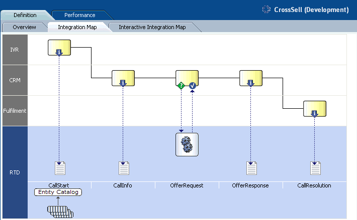
The Application Definition Integration Map report provides a swim lane view of the overall Inline Service. Each system to which the Inline Service integrates is shown as a swim lane, with the name along the left hand side. Integration Points are represented along the blue swim lane. There are two types of Integration Points: Informants and Advisors.
Informants are collectors of information and events from the various operational systems; they show data flowing in one direction towards the Inline Service. For instance, the CallStart Informant shown in Figure 2-2 is collecting data about an incoming call from an IVR system.
Advisors provide advice back to the operational systems at the request of that system; they show data flowing both to the Inline Service (making a request for advice) and back to the operational system with the advice. For instance, in Figure 2-2, the OfferRequest Advisor shows a request coming in to the Inline Service for a cross selling offer, and the advice for cross sell being returned to the CRM system.
Figure 2-2 shows an example of the Application Definition Integration Map report.
Figure 2-2 Application Definition Integration Map Report
Description of "Figure 2-2 Application Definition Integration Map Report"
2.1.3 Application Definition Interactive Integration Map
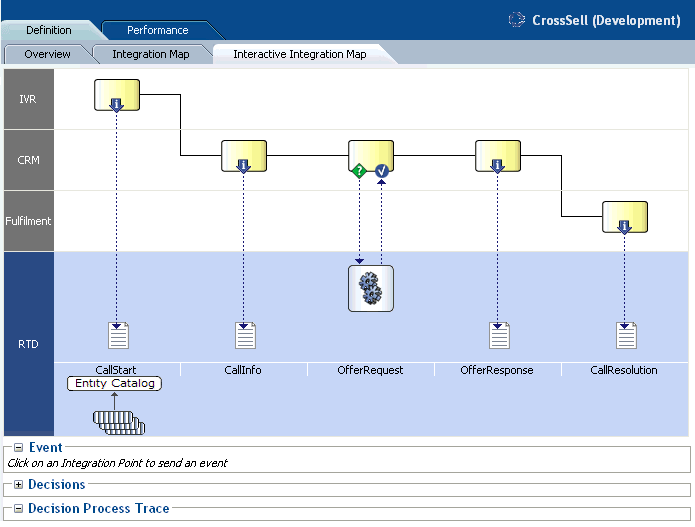
The Application Definition Interactive Integration Map report displays the same swim lane view of the Inline Service as the Application Definition Interactive Integration Map report, but it also contains features that enable users to interact with the Integration Points appearing on the report. Users can trigger Informant and Advisor calls, and examine the internal steps performed by Oracle RTD when executing the calls.
Figure 2-3 shows an example of the Application Definition Interactive Integration Map report, as it is launched.
Figure 2-3 Application Definition Interactive Integration Map Report
Description of "Figure 2-3 Application Definition Interactive Integration Map Report"
Note:
This section concentrates more on Advisors than Informants, to describe the more detailed information that Advisors generate.Every Advisor is associated with a Decision. In general, the main high-level stages of the Decision process logic for an Advisor request can be summarized as follows:
-
Eligibility
First, the Decision checks Choices for eligibility in a downward sequence starting from the Choice Group to which the Decision is attached and continuing until all eligibility conditions for all Choices within this Choice Group are assessed.
-
Scoring for Each Goal
Then, Oracle RTD computes a score (the total score) for each eligible Choice. The total score for each Choice is a function of the decision priorities, weights and scoring functions associated with each of the Performance Goals.
-
Ordering the Choices
Finally, Oracle RTD compares each of the Choices and orders them by decreasing total score to identify the "winner(s)" of this selection process.
To illustrate this, take an example of the Advisor OfferRequest - the Integration point that will trigger the Oracle Real-Time Decisions Decision logic.
In this example, the customer, whose ID is 1000, interacts with the Call channel (both 1000 and Call are parameters to the Advisor OfferRequest). The net result of the Oracle Real-Time Decisions Decision logic for the OfferRequest Advisor is as follows:
-
Oracle Real-Time Decisions returns an offer - in this example, Credit Protection
-
Additional information is also passed back to the client application (such as the likelihood of purchase and a message), so that it can properly render the recommendation to the customer.
In general, clicking any of the Integration Points on the Integration Map causes the Event area to display the session keys and parameters for the Integration Point. For example, when the Advisor Offer Request is clicked, the following appears in the Event area:
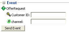
After you enter key and parameter values and click Send Event, Oracle RTD performs the logic to action the Integration Point, and then makes available the following information:
-
The Decision Process Trace area, when expanded, contains a trace of the decision process steps
-
For Advisor calls, the Decisions area, when expanded, shows the recommended choice and choice attribute values.
Note:
The specific results you will get when clicking the OfferRequest Advisor will not necessarily match the values in the following output. This is due to the fact that the learning data associated with your CrossSell example has been built with a data generation script using the LoadGen tool, which simulates customer responses with a level of randomness. As a result, the Advisor may return an Offer other than Credit Protection, and the likelihood value will be different from the value shown in the following output.Continuing the OfferRequest call example, sending an event after entering 1000 for Customer ID and Call (the default value) for channel produced the following attribute values for the Credit Protection choice in the expanded Decisions area:
-
likelihoodOfPurchase =
0.0089383116255807877 -
message =
Some things in life are expected.... -
shouldRespondPositively =
false
The expanded Decision Process Trace area contained the following timed trace entries (annotated here to show the three main Advisor processing stages of Eligibility, Scoring, and Ordering):
Eligibility
10:36:59,906 Entering integration point OfferRequest
10:36:59,906 Decision  will return 1 choice(s).
10:36:59,906 Decision  will use choicegroups: Offers
10:36:59,921 Checking eligibility for group Offers.
10:36:59,921 Group Offers is eligible.
10:36:59,921 Checking eligibility for group Loans.
10:36:59,921 Group Loans is eligible.
10:36:59,921 Checking eligibility for group Loans.
10:36:59,921 Group Loans is eligible.
10:36:59,921 Checking eligibility for group Loan Services.
10:36:59,921 Group Loan Services is eligible.
10:36:59,921 Checking eligibility for group Loan Services.
10:36:59,921 Group Loan Services is eligible.
10:36:59,921 Checking eligibility for choice Waive Fees
10:36:59,921 Choice Waive Fees is eligible
10:36:59,921 Checking eligibility for choice Reduced Interest Rate
10:36:59,921 Choice Reduced Interest Rate is eligible
10:36:59,921 Checking eligibility for group Loan Products.
10:36:59,921 Group Loan Products is eligible.
10:36:59,921 Checking eligibility for group Loan Products.
10:36:59,921 Group Loan Products is eligible.
10:36:59,921 Checking eligibility for choice Home Mortgage
10:36:59,921 Choice Home Mortgage is eligible
10:36:59,921 Checking eligibility for choice Student Loan
10:36:59,921 Choice Student Loan is eligible
10:36:59,921 Checking eligibility for group Credit Cards.
10:36:59,921 Group Credit Cards is eligible.
10:36:59,921 Checking eligibility for group Credit Cards.
10:36:59,921 Group Credit Cards is eligible.
10:36:59,921 Checking eligibility for group Credit Services.
10:36:59,921 Group Credit Services is eligible.
10:36:59,921 Checking eligibility for group Credit Services.
10:36:59,921 Group Credit Services is eligible.
10:36:59,921 Checking eligibility for choice Electronic Payments
10:36:59,921 Choice Electronic Payments is eligible
10:36:59,921 Checking eligibility for choice Credit Protection
10:36:59,921 Choice Credit Protection is eligible
10:36:59,921 Checking eligibility for group Credit Products.
10:36:59,921 Group Credit Products is eligible.
10:36:59,921 Checking eligibility for group Credit Products.
10:36:59,921 Group Credit Products is eligible.
10:36:59,921 Checking eligibility for choice Platinum Card
10:36:59,921 Choice Platinum Card is eligible
10:36:59,921 Checking eligibility for choice Gold Card
10:36:59,921 Choice Gold Card is eligible
10:36:59,921 Checking eligibility for choice Miles Card
10:36:59,921 Choice Miles Card is eligible
10:36:59,921 Eligible choices: (Waive Fees,Reduced Interest Rate,Home Mortgage,Student Loan,Electronic Payments,Credit Protection,Platinum Card,Gold Card,Miles Card)
Scoring for Each Goal
10:36:59,921 Goals Normalization Factors Applied: (Customer Retention: 1.0, Revenue: 1.0)
10:36:59,921 Goals Optimizations Applied: (Customer Retention: Maximize , Revenue: Maximize )
10:36:59,921 Goal Weights Received: (CustomerRetention: 0.30000000000000004, Revenue: 0.7 )
10:36:59,921 Weighted, normalized score for performance goal Customer Retention for choice Waive Fees: 2.175
10:36:59,921 Weighted, normalized score for performance goal Revenue for choice Waive Fees: 0
10:36:59,921 Total score for choice Waive Fees: 2.175
10:36:59,921 Weighted, normalized score for performance goal Customer Retention for choice Reduced Interest Rate: 2.175
10:36:59,921 Weighted, normalized score for performance goal Revenue for choice Reduced Interest Rate: 0
10:36:59,921 Total score for choice Reduced Interest Rate: 2.175
10:36:59,921 Weighted, normalized score for performance goal Customer Retention for choice Home Mortgage: 0.3
10:36:59,921 Weighted, normalized score for performance goal Revenue for choice Home Mortgage: 0.02
10:36:59,921 Total score for choice Home Mortgage: 0.32
10:36:59,921 Weighted, normalized score for performance goal Customer Retention for choice Student Loan: 0.3
10:36:59,921 Weighted, normalized score for performance goal Revenue for choice Student Loan: 0.02
10:36:59,921 Total score for choice Student Loan: 0.32
10:36:59,921 Weighted, normalized score for performance goal Customer Retention for choice Electronic Payments: 1.5
10:36:59,921 Weighted, normalized score for performance goal Revenue for choice Electronic Payments: 0.024
10:36:59,921 Total score for choice Electronic Payments: 1.524
10:36:59,921 Weighted, normalized score for performance goal Customer Retention for choice Credit Protection: 2.1
10:36:59,921 Weighted, normalized score for performance goal Revenue for choice Credit Protection: 0.125
10:36:59,921 Total score for choice Credit Protection: 2.225
10:36:59,921 Weighted, normalized score for performance goal Customer Retention for choice Platinum Card: 0.6
10:36:59,921 Weighted, normalized score for performance goal Revenue for choice Platinum Card: 0.991
10:36:59,921 Total score for choice Platinum Card: 1.591
10:36:59,921 Weighted, normalized score for performance goal Customer Retention for choice Gold Card: 0.6
10:36:59,921 Weighted, normalized score for performance goal Revenue for choice Gold Card: 0.419
10:36:59,921 Total score for choice Gold Card: 1.019
10:36:59,921 Weighted, normalized score for performance goal Customer Retention for choice Miles Card: 0.6
10:36:59,921 Weighted, normalized score for performance goal Revenue for choice Miles Card: 0.207
10:36:59,921 Total score for choice Miles Card: 0.807
Ordering the Choices
10:36:59,921 Comparing choice Waive Fees random value 0.207 with choice Reduced Interest Rate random value 0.818
10:36:59,921 Comparing choice Reduced Interest Rate total score 2.175 with choice Home Mortgage total score 0.32
10:36:59,921 Comparing choice Reduced Interest Rate total score 2.175 with choice Student Loan total score 0.32
10:36:59,921 Comparing choice Reduced Interest Rate total score 2.175 with choice Electronic Payments total score 1.524
10:36:59,921 Comparing choice Reduced Interest Rate total score 2.175 with choice Credit Protection total score 2.225
10:36:59,921 Comparing choice Credit Protection total score 2.225 with choice Platinum Card total score 1.591
10:36:59,921 Comparing choice Credit Protection total score 2.225 with choice Gold Card total score 1.019
10:36:59,921 Comparing choice Credit Protection total score 2.225 with choice Miles Card total score 0.807
10:36:59,921 Winner number 0 is Credit Protection
10:36:59,921 Selected choices: Credit Protection
2.1.4 Application Performance Trends
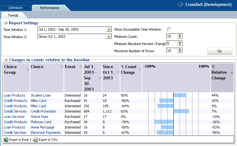
The Application Performance Trends report shows a summary of important trends related to events associated with choices defined in the Inline Service.
The Application Performance Trends report shows the relative percentage of change in the number of offers extended across all models in the Inline Service for a particular time period. Each offer (Choice column) is shown for each event that occurred during the time period.
In the CrossSell example:
-
There are three events defined by the Inline Service for cross sell offers: Delivered, Interested, and Purchased. Delivered is the baseline event.
-
The % Count Change is the amount of change in Interested or Purchased events from time period to time period.
-
The % Relative Change is the amount of change in Interest or Purchase rates over baseline.
Figure 2-4 shows an example of the Application Performance Trends report.
Figure 2-4 Application Performance Trends Report
Description of "Figure 2-4 Application Performance Trends Report"
2.2 About Strategic Objectives Reports
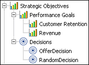
This section describes the reports that are available at the Strategic Objectives level. Strategic Objectives reports are identified under a branch titled Strategic Objectives in the Inline Service Navigator. For example:
Description of the illustration isn_strategic_objectives.gif
This section contains the following topics:
-
Section 2.2.2, "Performance Goal Definition Overview for Each Performance Goal"
-
Section 2.2.4, "Decision Definition Overview for Each Decision"
-
Section 2.2.5, "Decision Definition Priorities for Each Decision"
2.2.1 Performance Goals Definition Overview
The Performance Goals Definition Overview report lists all performance goals defined in the Inline Service. In the example shown in Figure 2-5, the advice given by the Inline Service is optimized to both maximize customer retention and to maximize revenue.
Figure 2-5 shows an example of the Performance Goals Definition Overview report.
Figure 2-5 Performance Goals Definition Overview Report

Description of "Figure 2-5 Performance Goals Definition Overview Report"
2.2.2 Performance Goal Definition Overview for Each Performance Goal
Each performance goal also has a Performance Goal Definition Overview report. This report shows details about each performance goal, including whether it is required, a normalization factor, and which direction in which to optimize.
Note:
If you have more than one performance metric, and they use different units, a Normalization Factor has been set to normalize score values. For instance, if you had another metric called "Minimize hold time" measured in seconds, an example of the normalization factor would be how many minimized seconds are worth a dollar (revenue) to your organization.Figure 2-6 shows the Definition Overview report for the Customer Retention performance goal.
Figure 2-6 Performance Goal Definition Overview Report

Description of "Figure 2-6 Performance Goal Definition Overview Report"
The Required flag indicates whether a score is needed for each choice when using this performance goal. When Required is true, this indicates that random value might be used for this performance goal, when associated with a non-convergent predictive model.
2.2.3 Decisions Definition Overview
The Decisions Definition Overview report lists all Decisions that are defined in the Inline Service. There are two decisions in our example: OfferDecision and RandomDecision. A Decision is used by an Advisor to determine eligible Choices, score those Choices dynamically, weight the scoring according to segments of the population, and select the best outcome of the choice. The Choices that a Decision selects represent the advice that is given to a requesting operational system, such as the CRM system in our example.
Each Decision shows a description, and the Performance Goals associated with this Decision.
Figure 2-7 shows an example of the Decisions Definition Overview report.
Figure 2-7 Decisions Definition Overview Report

Description of "Figure 2-7 Decisions Definition Overview Report"
2.2.4 Decision Definition Overview for Each Decision
Each Decision also has a Decision Definition Overview report. This report shows a description of the Decision, the number of Choices (advice) returned, and the Choice Group from which it picks.
The OfferDecision definition overview report shows the following description:
-
The OfferDecision decides on the offer to suggest to the customer. Offers that support the customer retention performance metric will be more heavily weighted for the segment of the population that is eligible for retention.
Figure 2-8 shows the Definition Overview report for the Decision called "OfferDecision."
Figure 2-8 Decision Definition Overview Report

Description of "Figure 2-8 Decision Definition Overview Report"
Note that you can navigate to the Offers Choice Group by clicking the Offers link.
2.2.5 Decision Definition Priorities for Each Decision
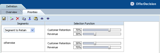
Decision priorities indicate the relative importance of performance goals. Different priorities can be defined for different situations or customer segments.
For instance, in the example shown in Figure 2-9, for the decision OfferDecision, we have segmented a group of customers that it is important to retain, in the context of deciding which offer to present. You can see that the Customer Retention performance goal is heavily weighted for this segment of population.
For the remaining population, we choose to weight our Maximize Revenue performance goal more heavily.
See Section 4.2.1, "Using Filtering Rules to Segment Population" for information on segmenting population.
Note:
Changing priorities in this report is possible only when the Inline Service is opened is in edit mode.Figure 2-9 shows the Definition Priorities report for the Decision called "OfferDecision." The CrossSell Inline Service was opened in edit mode.
Figure 2-9 Decision Definition Priorities Report
Description of "Figure 2-9 Decision Definition Priorities Report"
2.3 About Decision Process Reports
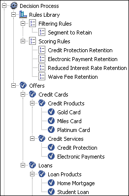
This section describes the reports that are available at the Decision Process level. Decision Process reports are identified under a branch titled Decision Process in the Inline Service Navigator. For example:
Description of the illustration isn_decision_process.gif
Choices and Choice Groups are hierarchical. Choice Groups are useful for organizing choices. Choice Groups can be used in one of two ways: they provide a way to organize the observations that are collected and analyzed; they are also a way to organize the feedback we will give to the business process through the Advisor Integration Points.
Impact of Dynamic Choices on Decision Center Reports
Choices can be either static or dynamic:
-
Static choices are explicitly defined in an Inline Service
-
Dynamic choices are retrieved at run time from external data sources or can be generated programmatically at run time
Note:
In Decision Center, whereas all static choices are displayed in the tree regardless of whether events associated with them have occurred, only those dynamic choices that have been added to model learning data appear in the Inline Service Navigator.As a result, dynamic choices in the tree and associated reports will only appear in Decision Center with the first occurrences of the associated events.
During the definition of dynamic choices in an Inline Service, another factor influences how dynamic choices appear in the Decision Center, namely the parameter Maximum number of choices within one choice group folder on decision center, also referred to in this section as the Maximum choices parameter. You specify this parameter when you define the Choice Group that includes dynamic choices.
In Decision Center reports, each static choice is preceded by a check mark icon:
and each dynamic choice is preceded by an icon, that contains a check mark and an asterisk:
The Choice Group folder under which the dynamic choices appear can be represented in one of two ways, that depends on the Maximum choices parameter:
-
If the total number of choices exceeds the maximum defined for the Choice Group folder, the choices appear in system-created "range groups" or subfolders
-
Otherwise all the choices appear directly under the Choice Group name
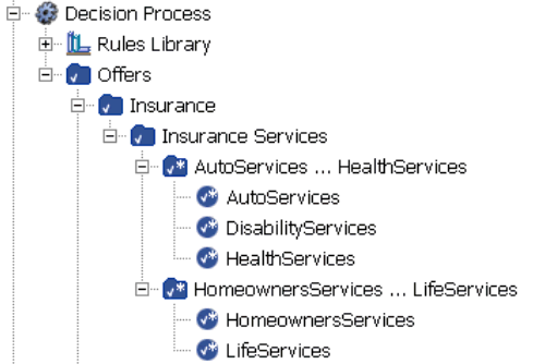
The name of each system-created folder is made up of the names of the first and last choices in the folder, with the string "..." separating the two choices. System-created folders are also known as range folders. The icon representing the range folder contains a check mark and an asterisk.
The example Inline Service Navigator menu in Figure 2-10 shows the following:
-
Five dynamic choices were recommended and added to model learning data.
-
Each dynamic choice appears under one of the two system-created range folder names.
For this example, the maximum number of choices per choice group for the Insurance Services choice group was set to 3.
Note:
There is an important difference in how you use standard and range folders in the Decision Center.Whereas you can click the name of a standard folder to open reports for choices within the folder, range folders are for presentation only.
In other words, clicking the name of a range folder will not open any reports. To see reports for a dynamic choice, you must click the dynamic choice itself.
This section contains the following topics:
2.3.1 Filtering Rule Definition Overview
The Filtering Rule Definition Overview report is a graphical representation of a particular filtering rule defined in the Inline Service.
Filtering rules enable business users to define reusable logic that can be referenced in multiple places such as eligibility rules, scoring rules, and decision priorities.
See Chapter 4 for more information about creating new rules.
The example shown in Figure 2-11 defines the population segment that we want to retain. In this example, the segment is defined to be when the following two conditions are met:
-
The number of calls abandoned by this customer is greater than or equal to six
-
The customer tenure is greater than or equal to two years
Figure 2-11 shows the Definition Overview report for the Segment to Retain filtering rule. The CrossSell Inline Service was opened in edit mode.
Figure 2-11 Filtering Rule Definition Overview Report

Description of "Figure 2-11 Filtering Rule Definition Overview Report"
2.3.2 Scoring Rule Definition Overview
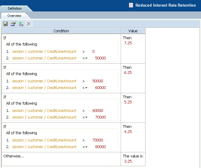
The Scoring Rule Definition Overview report is a graphical representation of a particular scoring rules defined in the Inline Service. Scoring rules can be used for assigning scores to Choices (Offers in our example). For instance, the rule shown in Figure 2-12 assigns a different score according to the level of the customer's credit line amount.
Scoring rules enable business users to define reusable scoring logic that can be associated to choice attributes and performance goals.
See Chapter 4 for more information about creating new rules.
Figure 2-12 shows the Definition Overview report for the Reduced Interest Rate Retention scoring rule. The CrossSell Inline Service was opened in edit mode.
Figure 2-12 Scoring Rule Definition Overview Report
Description of "Figure 2-12 Scoring Rule Definition Overview Report"
2.3.3 Choice/Choice Group Definition Overview
Choice Groups are created for grouping Choices into logical categories and can be set up in nested hierarchies. Choices are always members of a particular Choice Group.
In Decision Center, definition reports are available for Choice Groups and for static Choices only - there are no definition reports for dynamic Choices.
Note:
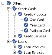
Unless stated otherwise, in the rest of this section, all references to Choices apply to static Choices only.Groups that contain other groups and choices are arranged in a nested manner in the Inline Service Navigator, as in the following example which contains Choice Groups and static Choices:
Description of the illustration isn_choices.gif
In the examples shown in the following two sections, the Gold Card Choice is part of the Credit Cards Choice Group.
This section contains the following topics
2.3.3.1 Choice Group Definition Overview
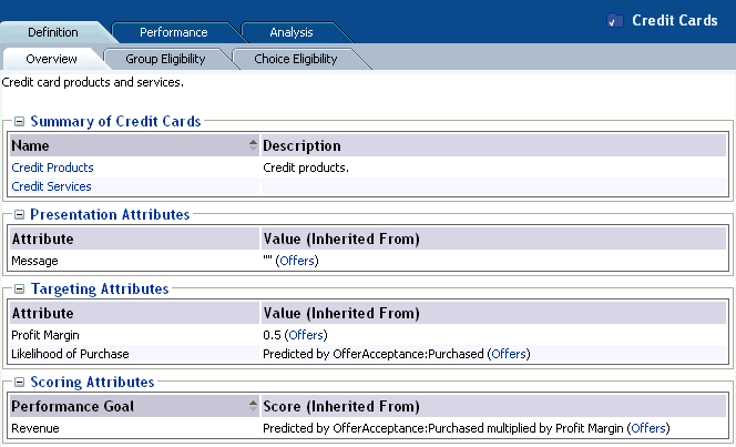
The Definition Overview report for Choice Groups provides a summary of the Choice Group. In the example shown in Figure 2-13, Credit Cards contains two Choice Groups: Credit Products and Credit Services.
Figure 2-13 shows the Definition Overview report for the Credit Cards choice group.
Figure 2-13 Choice Group Definition Overview Report
Description of "Figure 2-13 Choice Group Definition Overview Report"
2.3.3.2 Choice Definition Overview
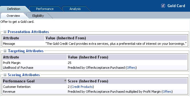
The Definition Overview report for Choices describes the different attributes of the Choice and their values. For each attribute, the report indicates its value, or how that value is inherited from a value or function defined at a higher level of the choice group hierarchy.
These Choice attributes are organized into different categories. In the example shown in Figure 2-14, the categories include Presentation Attributes, Targeting Attributes, and Scoring Attributes.
Figure 2-14 shows the Definition Overview report for the Gold Card choice.
Figure 2-14 Choice Definition Overview Report
Description of "Figure 2-14 Choice Definition Overview Report"
2.3.4 Choice Definition Eligibility
Note:
While eligibility rules can be associated with both static and dynamic choices, choice definition eligibility reports are available for choice groups and static choices only, but not for dynamic choices.Both Choices and Choice Groups can use rules to define when they are eligible to participate in the Decision. In the example shown in Figure 2-15, the Credit Products choice group is eligible for any Decision that uses it.
Eligibility rules on Choices and Choice Groups are additive. So, if a choice that belongs to this Choice Group (for example, Gold Card) has an Eligibility rule, it is executed after this Rule is executed.
Note:
When not explicitly defined, all choices and choice groups are considered eligible for all decisions.Figure 2-15 shows the Definition Eligibility report for the Credit Products choice group. The CrossSell Inline Service was opened in edit mode.
Figure 2-15 Choice Definition Eligibility Report

Description of "Figure 2-15 Choice Definition Eligibility Report"
2.3.5 Choice/Choice Group Performance Counts
The Choice Performance Counts report shows how each individual Choice is performing within the system. The Choice Group Performance Counts report is a rollup of the Choices contained in the group. Both types of report allow you to set a time frame for the data reported.
This section contains the following topics:
2.3.5.1 Choice Group Performance Counts
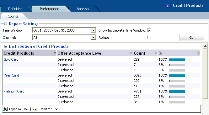
In the Choice Group Performance Counts report, counts for all the contained Choices, Base Event, and Outcomes are displayed.
In the example shown in Figure 2-16, the Miles Card was presented (base event Delivered) 5028 times. For the positive outcomes, Interested and Purchased, customers showed interest 292 times (6%), and purchased 41 times (1%).
Figure 2-16 shows the Performance Counts report for the Credit Products choice group.
Figure 2-16 Choice Group Performance Counts Report
Description of "Figure 2-16 Choice Group Performance Counts Report"
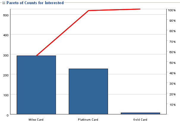
Additionally, a Pareto chart is shown for the Choices for each of the outcomes and the base event. A Pareto chart is used to display the relative counts for each choice in decreasing order.
Figure 2-17 shows the Pareto chart of the Performance Counts for the Interested outcome.
Figure 2-17 Performance Counts Pareto Chart
Description of "Figure 2-17 Performance Counts Pareto Chart"
You can use the Rollup check box to control the level of detail for the Choice Group Performance Counts report.
With the Rollup check box unset, the report shows counts for the Choices in all the lower-level Choice Groups.
If the Rollup check box is set, the report contents depend on the level of the Choice Group within the Choice Group hierarchy:
-
For a Choice Group at the lowest level of the hierarchy, the report shows counts for all the Choices in the Choice Group
-
For a Choice Group at any other level of the hierarchy (the top level or an intermediate level), the report shows summary counts for the next lower level Choice Groups
Note:
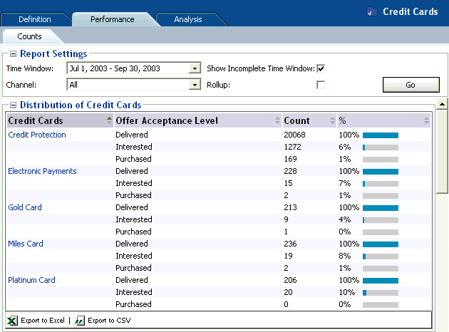
Rollup does not apply to the dynamic choice folder names, whose format is <dynamic_choice_1>...<dynamic_choice_2>.Figure 2-18 shows the Performance Counts report for the intermediate level Credit Cards choice group, with the Rollup check box not set.
Figure 2-18 Intermediate Level Choice Group Performance Counts Report without Rollup
Description of "Figure 2-18 Intermediate Level Choice Group Performance Counts Report without Rollup"
Figure 2-19 shows the Performance Counts report for the intermediate level Credit Cards choice group, with the Rollup check box set.
Figure 2-19 Intermediate Level Choice Group Performance Counts Report with Rollup
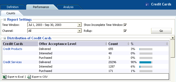
Description of "Figure 2-19 Intermediate Level Choice Group Performance Counts Report with Rollup"
2.3.5.2 Choice Performance Counts
In the Choice Performance Counts report, counts for the individual choice are provided for the chosen time period.
Figure 2-20 shows the Performance Counts report for the Miles Card choice.
Figure 2-20 Choice Performance Counts Report
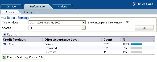
Description of "Figure 2-20 Choice Performance Counts Report"
2.3.6 Choice Performance History
The Choice Performance History report is a historical report that shows how the counts of a particular Choice change over time. The graph shows the outcome of a particular choice over the time period selected, and an associated report shows the detailed outcome counts as tabular data.
You can choose to display counts for a "success" event only (such as Interested for an Offer), a "base" event only (such as Delivered), or both a success event and a base event.
The granularity of the data depends on the time period defined for the associated model. Each model time period that lies within the time period req uested for the report is represented in the report, and appears under the appropriate graph bar or pair of bars (and in the Detailed counts section).
If the time period requested for the report spans a time when the model time period was changed, the time periods in the report reflect the different model time period lengths. For example, if the model time period changed from Quarter to Month, the report could show both quarter and month date ranges.
Figure 2-21 shows the Performance History report for the Credit Protection choice, with the associated Detailed counts section appearing under the graphical section. The time period for the associated model was Week, and each pair of bars represents a week's data.
Figure 2-21 Choice Performance History Report with Detailed Counts Section
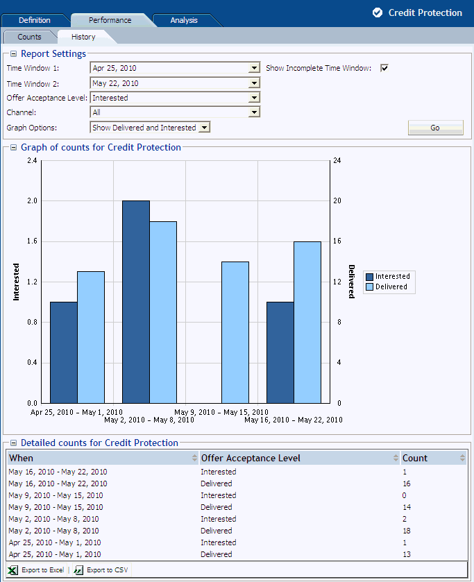
Description of "Figure 2-21 Choice Performance History Report with Detailed Counts Section"
2.3.7 Choice/Choice Group Analysis Drivers
Choice/Choice Group Analysis reports provide insights into why choices are associated with positive outcomes, such as Interest and Purchase. Exploring these reports enable business analysts to gain a deep understanding of data that is correlated with each of these events.
Notes:
-
If the reports show a high correlation between the output and input of a prediction, it may be because the output is represented in the input. For example, when the output is a product category and the input is a product of that product category.
In this case, a more accurate set of correlations will be achieved with Premise Noise Reduction selected for the predictive model associated with the Choice Group. For more information, see the topic "Premise Noise Reduction" in Oracle Real-Time Decisions Platform Developer's Guide.
-
An attribute value of OTHER indicates that more than the maximum number of discrete values (default is 500) was found. Counts and statistics for all attribute values found beyond the maximum number are accumulated and appear for the OTHER attribute.
This section contains the following topics:
2.3.7.1 Choice Analysis Drivers
The Choice Analysis Drivers report identifies the attributes that are influential as drivers of predictiveness for each of the choices. The outcome and time frame can be adjusted at the top of the report.
Oracle Real-Time Decisions automatically creates the ordered list of most predictive attributes from the complete list of attributes defined as Entities in the Inline Service.
In the Choice Analysis Drivers report, by clicking an attribute name, you generate several charts associated with that attribute, as shown in Figure 2-22.
Figure 2-22 Choice Analysis Drivers Reports Overview
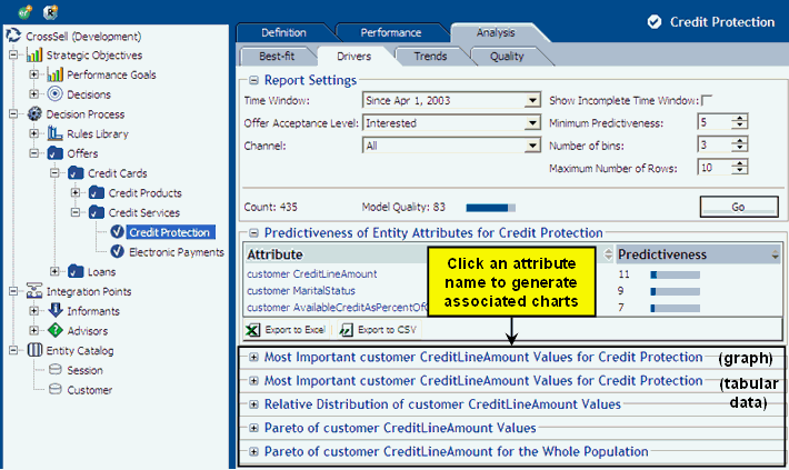
Description of "Figure 2-22 Choice Analysis Drivers Reports Overview"
The rest of this section describes the "base" analysis drivers report and each of the charts associated with a particular attribute.
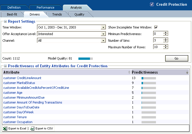
Figure 2-23 shows the Analysis Drivers report for the Credit Protection choice.
In the examples shown in this section, Credit Line Amount, Marital Status, and AvailableCreditAsPercentOfCreditLine are the three highest predictive factors associated with customer interest in a cross sell offer for credit protection.
Note:
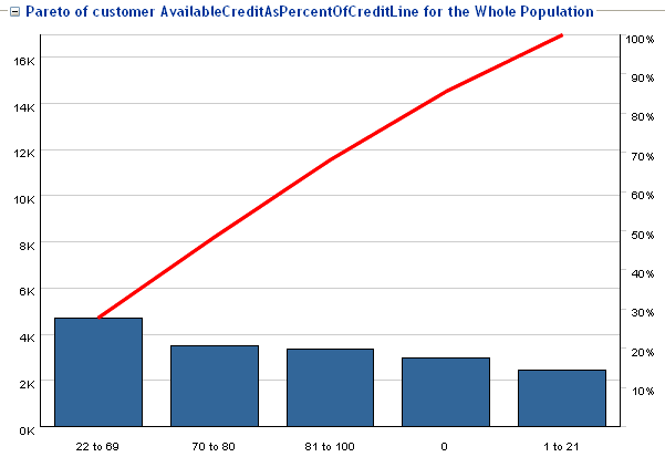
For numeric attributes such as CreditLineAmount and AvailableCreditAsPercentOfCreditLine, Oracle RTD automatically divides the continuum of values into significant ranges, by empirical observation from the data.For example, for AvailableCreditAsPercentOfCreditLine, the ranges in the example reports are 0, 1 to 21, 22 to 69, 70 to 80, and 81 to 100.
Figure 2-23 Choice Analysis Drivers Report
Description of "Figure 2-23 Choice Analysis Drivers Report"
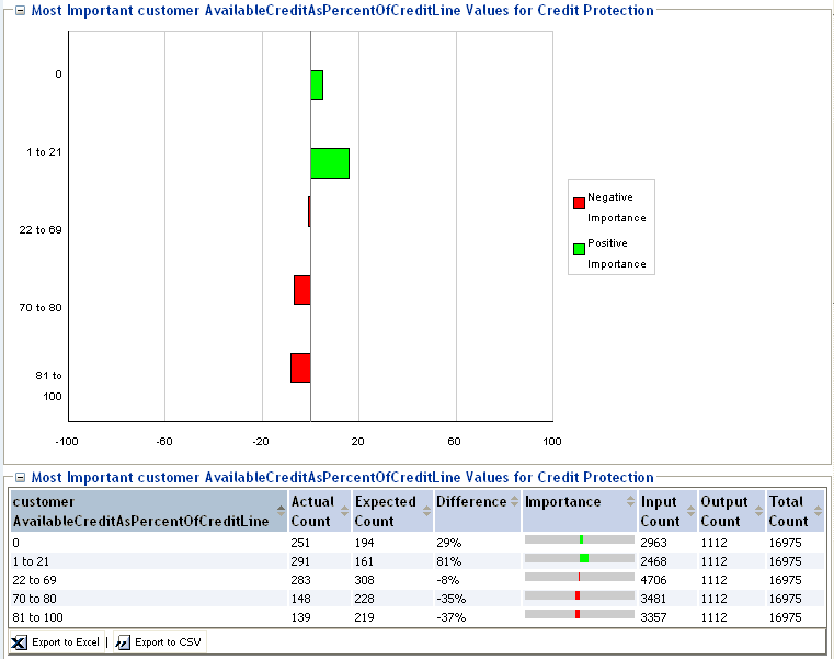
Figure 2-24 shows additional information about the customer AvailableCreditAsPercentOfCreditLine attribute. The graph and data show that the higher the percentage of available credit, the less likely the customer is to be interested in a cross sell offer for credit protection.
Figure 2-24 Most Important Analysis Drivers Graph and Data
Description of "Figure 2-24 Most Important Analysis Drivers Graph and Data"
Note:
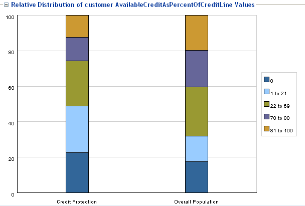
Input and Output counts in the graph reflect significant correlations, and do not include the cases where an attribute either had no value for a session or a low correlation.Other graphs are also available. For example, Figure 2-25 shows a relative distribution as compared to the overall population.
This graph shows, for example, that there are proportionally more Interested customers in the 1 to 21 range for AvailableCreditAsPercentOfCreditLine in the Credit Protection offer than there are in the overall population. In the graph, these two values are represented by the second areas from the bottom in the two columns.
The relative area sizes are derived from the values displayed in Figure 2-24, as follows:
-
For the 1 to 21 range for AvailableCreditAsPercentOfCreditLine, the Actual Count of customers that were interested in the Credit Protection choice is 291, and the total across all ranges is 1112 - a ratio of 0.26.
-
For the 1 to 21 range for AvailableCreditAsPercentOfCreditLine, the Input Count of all customers is 2468, out of a total across all ranges of 16975 - a ratio of 0.145.
The difference between the two ratios (0.26 and 0.145) is an 81% difference between the two populations, that is, there are 81% more people with the 1 to 21 range for AvailableCreditAsPercentOfCreditLine in the "Interested" audience than in the overall population.
Figure 2-25 Analysis Drivers Relative Distribution Graph
Description of "Figure 2-25 Analysis Drivers Relative Distribution Graph"
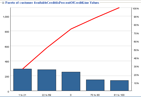
Figure 2-26 shows a Pareto graph of the credit protection customers.
Figure 2-26 Analysis Drivers Pareto Graph: Credit Protection Customers
Description of "Figure 2-26 Analysis Drivers Pareto Graph: Credit Protection Customers"
Figure 2-27 shows a Pareto graph of the entire population.
Figure 2-27 Analysis Drivers Pareto Graph: Entire Population
Description of "Figure 2-27 Analysis Drivers Pareto Graph: Entire Population"
2.3.7.2 Choice Group Analysis Drivers
The Choice Group Analysis Drivers report summarizes the predictiveness information for the Choices in the Choice Group. The outcome and time frame can be adjusted at the top of the report.
There are two types of Choice Group Analysis Drivers report - with and without rollup:
-
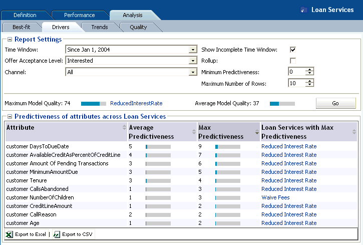
The Choice Group Analysis Drivers report without rollup shows the average and maximum predictiveness for the most predictive attributes, as well as the Choice within the Choice Group with the maximum predictiveness.
This report also displays the Average Model Quality, which is the arithmetic mean of model qualities at each descendant Choice of the Choice Group.
In this report, you can click the "maximum predictiveness" Choice to display the Choice Analysis Drivers report for that Choice. For more information, see Section 2.3.7.1, "Choice Analysis Drivers."
-
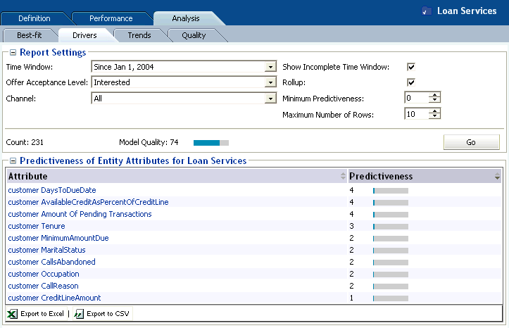
The Choice Group Analysis Drivers report with rollup shows the most predictive attributes across the combination of all descendant Choices of the Choice Group.
The submodels at each choice are combined for a particular attribute, and then the predictiveness of the attribute is calculated across this composite model.
In this report, you can click an attribute to enable the additional attribute-related graphs (such as the Most Important Values and Pareto graphs) that are available from the Choice Analysis Drivers report. For more information, see Section 2.3.7.1, "Choice Analysis Drivers."
Figure 2-28 shows the Analysis Drivers report for the Loan Services choice group without rollup.
Figure 2-28 Choice Group Analysis Drivers Report without Rollup
Description of "Figure 2-28 Choice Group Analysis Drivers Report without Rollup"
Figure 2-29 shows the Analysis Drivers report for the Loan Services choice group with rollup.
In Figure 2-29, DaysToDueDate and AvailableCreditAsPercentOfCreditLine are the top two most predictive factors associated with customer interest in Loan Services. This is an aggregate predictiveness report across all choices within the Loan Service choice group.
Figure 2-29 Choice Group Analysis Drivers Report with Rollup
Description of "Figure 2-29 Choice Group Analysis Drivers Report with Rollup"
2.3.8 Choice/Choice Group Analysis Trends
You can see trend reports at both the Choice Group and Choice levels.
This section contains the following topics:
2.3.8.1 Choice Group Analysis Trends
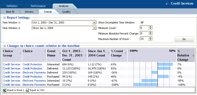
At the Choice Group level, the Analysis Trends report shows the change of counts for each of the Choices and outcomes over a period of time. The time frame can be adjusted at the top of the report.
In the CrossSell example:
-
There are three events recorded by the Inline Service for cross sell offers: Delivered, Interested, and Purchased. Delivered is the baseline event.
-
The % Count Change is the amount of change in Interested, Delivered, or Purchased events from time period to time period.
-
The % Relative Change is the amount of change in Interest or Purchase rates over baseline.
Figure 2-30 shows the Analysis Trends report for the Credit Services choice group.
Figure 2-30 Choice Group Analysis Trends Report
Description of "Figure 2-30 Choice Group Analysis Trends Report"
2.3.8.2 Choice Analysis Trends
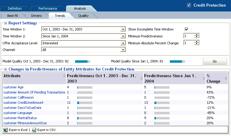
At the Choice level, the Analysis Trends report shows the change of predictiveness for each of the Choices and attributes over a period of time. The time frame can be adjusted at the top of the report. If you have multiple channels, you can see the predictiveness across each channel independently.
Note:
An attribute value of OTHER indicates that more than the maximum number of discrete values (default is 500) was found. Counts and statistics for all attribute values found beyond the maximum number are accumulated and appear for the OTHER attribute.Figure 2-31 shows the Analysis Trends report for the Credit Protection choice. As you can see from this example, some attributes become more predictive over the time period and some less so.
Figure 2-31 Choice Analysis Trends Report
Description of "Figure 2-31 Choice Analysis Trends Report"
2.3.9 Choice/Choice Group Analysis Best-Fit
You can see analysis Best-Fit reports at both the Choice Group and Choice levels.
The Best-Fit reports list attribute values that are the most correlated with the selected positive outcome.
Note that there might not exist a record that has all those attribute values at once. In that regard, the Best-Fit report is a hypothetical profile.
Notes:
-
For a discrete, non-numeric attribute, an attribute value of the highest importance on a Drivers report will also appear as the highest correlating attribute value in the corresponding Best-Fit report, provided that the Actual Count for that driving value (as displayed in the Most Important attribute values table in the Drivers report) is greater than or equal to the Significance Threshold (a parameter defined for the model from which the report is derived).
For a numeric attribute, the attribute values displayed on a Drivers report depend on the Number of bins selected for that report, and will not necessarily match up with attribute values displayed in the corresponding Best-Fit report.
-
An attribute value of OTHER indicates that more than the maximum number of discrete values (default is 500) was found. Counts and statistics for all attribute values found beyond the maximum number are accumulated and appear for the OTHER attribute.
This section contains the following topics:
2.3.9.1 Choice Group Analysis Best-Fit
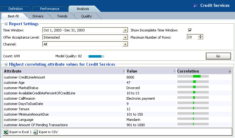
The Choice Group Analysis Best-Fit report shows all of the attributes and values that are most likely to predict all the outcomes in the Choice Group.
For the example shown in Figure 2-32, the following attributes and values have the highest correlation to a customer being interested in the choices in the Credit Services choice group:
-
customer CreditLineAmount - 8000
-
customer Age - 47
-
customer MaritalStatus - Divorced
Figure 2-32 shows the Analysis Best-Fit Report for the Credit Services choice group.
Figure 2-32 Choice Group Analysis Best Fit Report
Description of "Figure 2-32 Choice Group Analysis Best Fit Report"
2.3.9.2 Choice Analysis Best-Fit
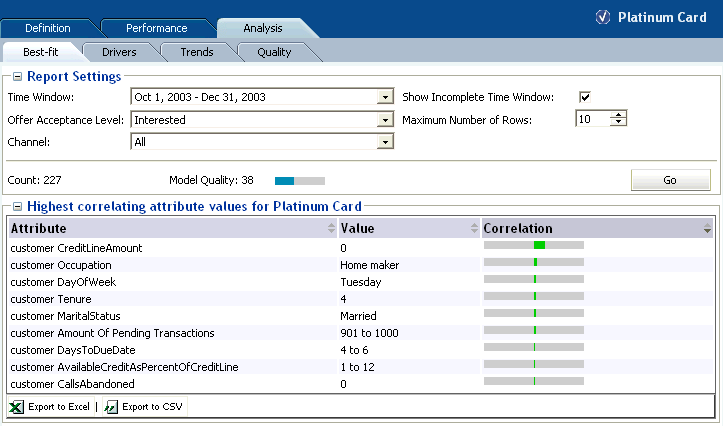
The Choice Analysis Best-Fit report shows all of the attributes and hypothetical values that are most likely to predict the outcome that is specified.
For the example shown in Figure 2-33, the following attributes and values have the highest correlation to the Platinum Card choice:
-
customer CreditLineAmount - 0
-
customer Occupation - Homemaker
-
customer DayOfWeek - Tuesday
The Best-Fit report gives you a snapshot of the most predictive behavior for this cross sell offer.
Figure 2-33 shows the Analysis Best Fit Report for the Platinum Card choice.
Figure 2-33 Choice Analysis Best Fit Report
Description of "Figure 2-33 Choice Analysis Best Fit Report"
2.3.10 Choice/Choice Group Quality
Quality reports show how effective models are at predicting positive outcomes in a particular time window.
This section contains the following topics:
2.3.10.1 Model Quality Concepts
Predictive models are functions built from an observable data sample and used to estimate an outcome that is unknown at the point of decision. For example:
-
Based on one year's weather data for an area, what will tomorrow's weather be?
-
Based on 5 years data of marketing campaign responses, will a given individual respond positively to the next campaign?
The difference between the estimated and actual values occurs for a variety of reasons, for example:
-
Because of randomness, as the underlying phenomenon is probabilistic in nature
-
Because the estimator does not account for information that could produce a more accurate estimate
-
Because the estimator was built on stale data
By the very nature of most data and inter-data associations, estimates of future events and values are always subject to error.
The Oracle RTD quality reports provide the following set of metrics, at both choice and choice group level, to characterize the quality of predictive models:
Model quality is a numeric value, from 0 to 100, that indicates how reliable a model is at predicting an outcome.
Model quality is computed as follows.
In Oracle RTD, model quality is computed incrementally as more records are seen. During the learning phase, there is a period where there is not yet enough data in the model for the model to be reliable. During this period, Decision Center reports show the model quality as 0, until a number of positive counts have been recorded, for example, 50. After the model becomes reliable, Decision Center reports will display model quality.
While the model quality metric distills model evaluation into a single number, it should be understood as a relative number rather than an absolute value.
For example:
-
A model quality of 80 indicates that in 80% of the cases, the choice that Oracle RTD considers best is actually the best case, regardless of the actual predicted value.
-
A model quality below 50 is generally not very useful. This may occur for a variety of reasons, such as:
-
Input data not sufficiently correlated to output
-
Too much noise introduced by input variables with too many values
-
Modeling the wrong data
-
-
A model quality above 95 should be examined, because some inputs may be self-fulfilling, that is, they are always present when the outcome is present.
Note:
In certain Decision Center reports, this often appears as very high values for the correlation of certain values and very high values for predictiveness of attributes.Oracle RTD models can be set up to attempt to automatically identify the cases where some attributes have a suspiciously high degree of predictiveness by enabling Premise Noise Reduction in the Model definition. For more information, see the topic "Premise Noise Reduction" in Oracle Real-Time Decisions Platform Developer's Guide.
Cumulative gains charts measure the degree to which the predictions of a model are better than randomly generated predictions.
A cumulative gains chart shows graphically the variation and comparison between the following two sets of data, which form the basis for the axes of the chart:
-
The total number of positive event predictions made by the model
-
The accumulated number of base events recorded
To illustrate the structure and interpretation of a cumulative gains chart, consider the following annotated example.
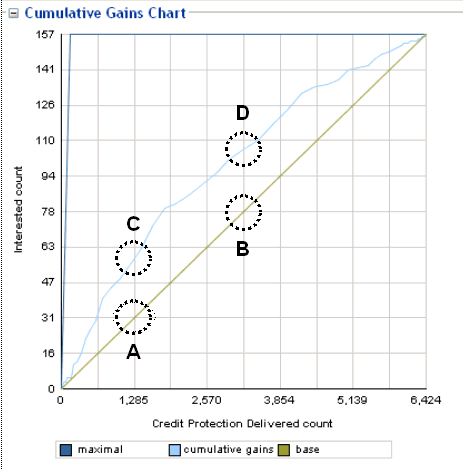
For the Credit Protection choice, Figure 2-34 shows the effectiveness of the predictions for the positive outcome Interested as compared to the base event Delivered.
To build the data for the chart, the data is first divided into quantiles after it is scored. A typical number of quantiles is 10.
The data is ranked by probability of the positive class from highest to lowest, so that the highest concentration of positive predictions is in the top quantiles.
In Figure 2-34, the X-axis shows the cumulated counts of the base event Delivered for the choice Credit Protection. The first quantile contains the count of the records with the highest likelihood of the positive outcome Interested. The counts for each successive quantile include the aggregated counts of all previous quantiles.
The Y-axis shows the counts of the actual positive outcomes Interested for the appropriate number of accumulated records in the X-axis.
The Cumulative Gains Chart displays three graphs:
-
The diagonal (base graph) is a straight line, that displays the expected success rate (number of true positives predicted for a sample) which would be obtained for random samples.
The line connects the zero point of the chart to the point represented by (total base event counts, total positive outcome counts).
Figure 2-34 shows the following:
-
1285 responders out of 6424 (20%) if selected randomly (Point A)
[This means that 20% of the responses would come from the first two quantiles if they were selected randomly.]
-
3213 responders out of 6424 (50%) if selected randomly (Point B)
-
-
The cumulative gains graph indicates the cumulative number of positive classification identified by a model at a given quantile, for example:
-
57 responders out of 157 (36%) if selected from top 20% highest likelihoods (Point C)
[This means that 36% of the responses would come from the first two quantiles if they were selected using the Oracle Real-Time Decisions model.]
-
108 responders out of 157 (68%) if selected from top 50% highest likelihoods (Point D)
Note:
The gain provided by a predictive model at a given quantile reflects how good the model is. For example, the gain at the second quantile is 36% (Point C) versus 20% (Point A). -
-
The maximal graph indicates how an ideal model would classify the data, where the base events are ordered such that all the highest likelihood base events lead to positive outcomes.
The first part of the maximal graph is the straight line connecting the zero point to the point represented by (total positive outcome counts, total positive outcome counts). The maximal graph then continues as a horizontal straight line to the top right end point.
Graphically, the more effective the model is at predicting positive outcomes, the higher the elevation is of the cumulative gains graph above the base diagonal. In general, model quality is the area between the cumulative gains graph and the base diagonal.
Model error metrics are various statistical metrics characterizing errors, where errors are the amounts by which predictions differ from the actual values of the quantity being estimated.
For example, Mean Square Error is a metric that incorporates the variance of the estimator, and normalizes positive and negative deviations of the predicted from the actual values.
The basic components used in the calculation of the model errors are actual likelihoods and predicted likelihoods. The average of the actual likelihoods is also used as a component in the model errors.
Actual likelihoods are represented as subscripted "p" elements:
Description of the illustration act_lik_bold.gif
Predicted likelihoods are represented as subscripted "p*" elements:
Description of the illustration pred_lik_bold.gif
The average actual likelihood is the average of the actual likelihoods:
Description of the illustration ave_act_lik_bold.gif
The model errors shown on the quality reports are:
-
Mean Square Error (MSE)

Description of the illustration mse.png
-
Relative MSE

Description of the illustration rel_mse.png
-
Root Mean Square Error (RMSE)

Description of the illustration rmse.png
-
Relative RMSE

Description of the illustration rel_rmse.png
-
Mean Absolute Error (MAE)

Description of the illustration mae.png
-
Relative MAE

Description of the illustration rel_mae.png
-
Mean Error (ME)

Description of the illustration me.png
-
Relative ME

Description of the illustration rel_me.png
2.3.10.2 Choice Group Quality
Each choice group quality report contains the following report sections:
-
Cumulative gains chart
-
Cumulative gains table, which shows the cumulative gains chart data values in table form
-
Model errors
-
Glossary describing the model errors
For more information on model quality and cumulative gains charts, see Section 2.3.10.1, "Model Quality Concepts."
Choice Group Quality Cumulative Gains Chart
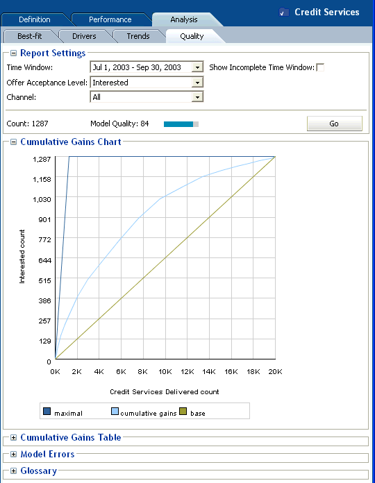
The Cumulative Gains Chart has the following properties:
-
The X-axis shows the cumulated counts of all the Choices in a Choice Group.
-
The Y-axis shows the counts of the actual positive outcomes for the appropriate amount of records in the X-axis.
There are three graphs on each cumulative gains chart:
-
Base
The Base graph is a straight line, that reflects what you would expect without model predictions.
-
Cumulative Gains
The Cumulative Gains graph shows the "lift" provided by the model predictions. The size of the area between the Base graph and the Cumulative Gains graph that is above the Base graph reflects the effectiveness or quality of the model.
-
Maximal
The Maximal graph shows the hypothetical "ideal" situation, where the base events are ordered such that all the first base events lead to positive outcomes.
Figure 2-35 shows the Cumulative Gains Chart for the Choice Group Credit Services for the positive outcome Interested.
Figure 2-35 Choice Group Cumulative Gains Chart
Description of "Figure 2-35 Choice Group Cumulative Gains Chart "
Choice Group Quality Cumulative Gains Table
The Cumulative Gains Table report section shows the values that are plotted and which appear in the Cumulative Gains Chart. The first column shows the X-axis values, the second column shows the Y-axis values.
Choice Group Quality Model Errors
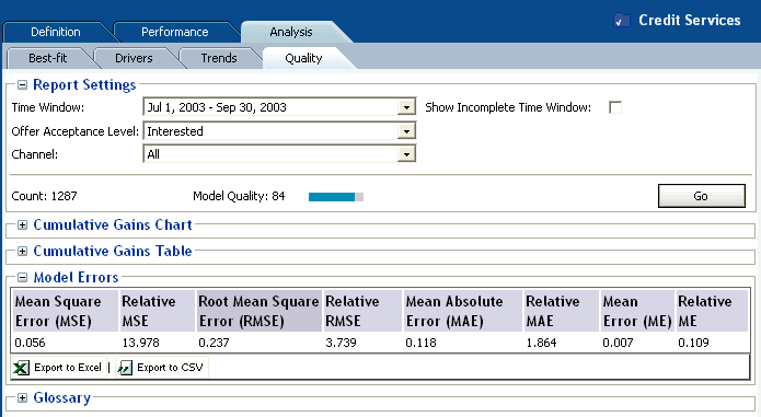
At the Choice Group level, the Model Errors report section shows model errors of predicted likelihoods for the total counts of all the Choices in the Choice Group.
Figure 2-36 shows the Model Errors for the Choice Group Credit Services for the positive outcome Interested.
Figure 2-36 Choice Group Model Errors Report
Description of "Figure 2-36 Choice Group Model Errors Report"
2.3.10.3 Choice Quality
Each choice quality report contains the following report sections:
-
Cumulative gains chart
-
Cumulative gains table, which shows the cumulative gains chart data values in table form
-
Model errors
-
Glossary describing the model errors
For more information on model quality and cumulative gains charts, see Section 2.3.10.1, "Model Quality Concepts."
Choice Quality Cumulative Gains Chart
The Cumulative Gains Chart has the following properties:
-
The X-axis shows the cumulated counts of a particular Choice.
-
The Y-axis shows the counts of the actual positive outcomes for the appropriate amount of records in the X-axis.
There are three graphs on each cumulative gains chart:
-
Base
The Base graph is a straight line, that reflects what you would expect without model predictions.
-
Cumulative Gains
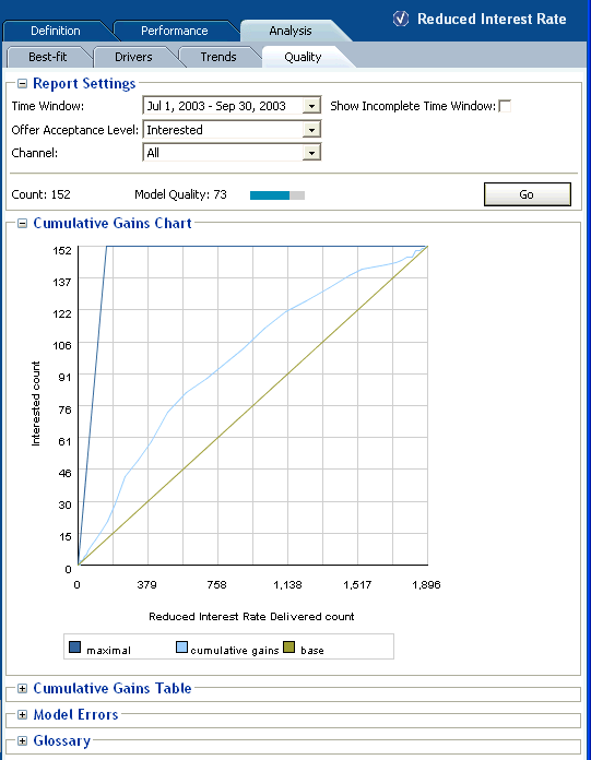
The Cumulative Gains graph shows the "lift" provided by the model predictions. The size of the area between the Base graph and the Cumulative Gains graph that is above the Base graph reflects the effectiveness or quality of the model.
-
Maximal
The Maximal graph shows the hypothetical "ideal" situation, where the base events are ordered such that all the first base events lead to positive outcomes.
Figure 2-37 shows the Cumulative Gains Chart for the Choice Reduced Interest Rate in the Choice Group Loan Services for the positive outcome Interested.
Figure 2-37 Choice Cumulative Gains Chart
Description of "Figure 2-37 Choice Cumulative Gains Chart"
Choice Quality Cumulative Gains Table
The Cumulative Gains Table report section shows the values that are plotted and which appear in the Cumulative Gains Chart. The first column shows the X-axis values, the second column shows the Y-axis values.
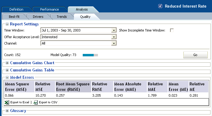
At the Choice level, the Model Errors report section shows model errors of predicted likelihoods for the Choice that is the subject of the quality report.
Figure 2-38 shows the Model Errors for the Choice Reduced Interest Rate for the positive outcome Interested.
2.4 About Integration Point Reports
This section describes the reports that are available at the Integration Point level. Integration Point reports are identified under a branch titled Integration Points in the Inline Service Navigator.
There are two types of Integration Point report, one for Informants, the other for Advisors. For example:
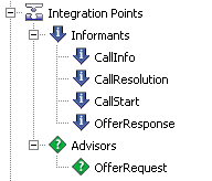
Each integration point has a set of keys and a set of attributes.
This section contains the following topics:
2.4.1 Informant Reports
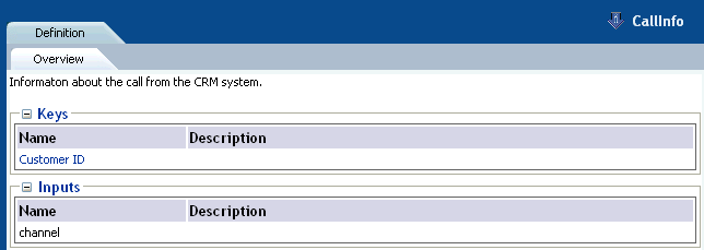
The Informant Definition report describes the keys and input parameters for the Informant.
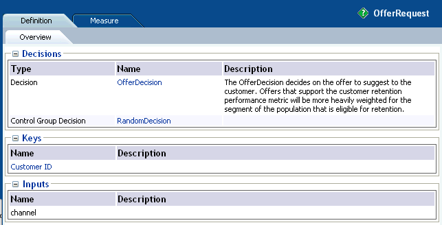
Figure 2-39 shows the Definition report for the Callinfo informant.
2.4.2 Advisor Reports
There are two types of Advisor report, Definition and Measure.
This section contains the following topics:
2.4.2.1 Advisor Definition Report
The Advisor Definition report describes the types, keys, and input parameters for the Advisor.
Figure 2-40 shows the Definition report for the OfferRequest advisor.
2.4.2.2 Advisor Measure Report
The Advisor Measure report describes the statistics for an advisor for a particular time window. The statistics are:
-
The number of times that the advisor was called
-
The number of times that the advisor used the Control Group decision
-
The percentage of Control Group calls within the total number of calls
Figure 2-41 shows the Measure report for the OfferRequest advisor.
2.5 About Entity Catalog Reports
This section describes the reports that are available at the Entity Catalog level. Entity Catalog reports are identified under a branch titled Entity Catalog in the Inline Service Navigator. For example:

The Entity / Analysis / Counts report and Entity / Analysis / Statistics reports typically draw their information from a learning model called "Statistics" that is automatically added to any Inline Service you create. If the reports are unable to access the Statistics model, you may choose any other model from which to examine the counts by entity. The advantage of having this separate Statistics model is that its only job is to record the objective characteristics of the population, acting as a historian.
This section contains the following topics:
2.5.1 Entity Definition Overview
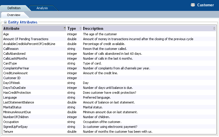
The Entity Definition Overview report describes all of the attributes for the Entity.
Figure 2-42 shows the Definition Overview report for the Customer entity.
Figure 2-42 Entity Definition Overview Report
Description of "Figure 2-42 Entity Definition Overview Report"
2.5.2 Entity Analysis Counts
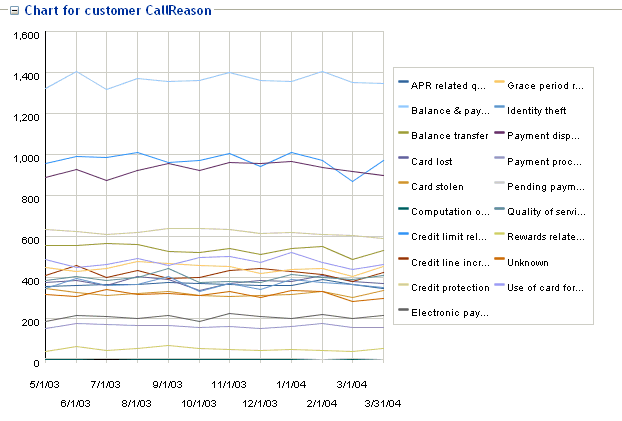
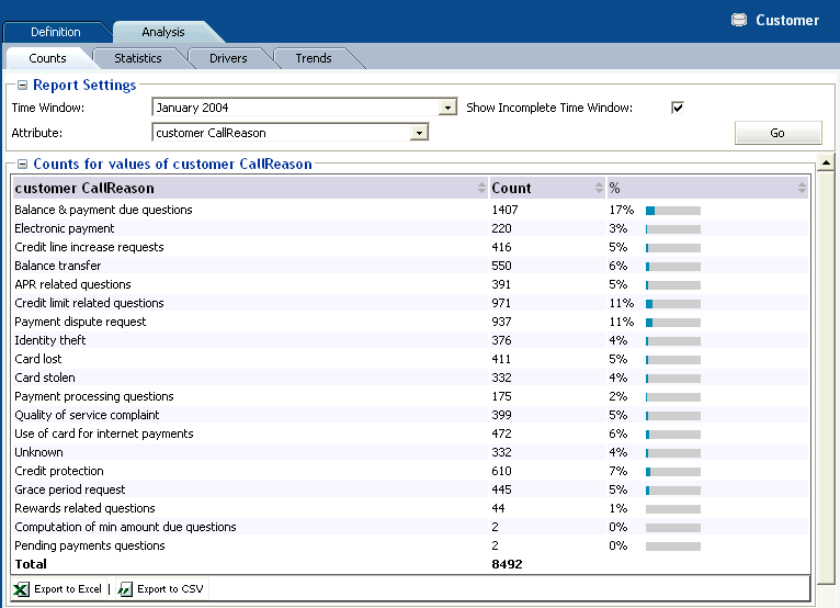
The Entity Analysis Counts shows the total count of how many times a particular attribute has been part of a transaction in the Inline Service. The Entity Analysis Count report allows you to set a time frame and choose an attribute for the data reported.
Note:
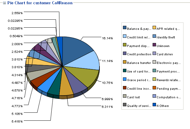
An attribute value of OTHER indicates that more than the maximum number of discrete values (default is 500) was found. Counts and statistics for all attribute values found beyond the maximum number are accumulated and appear for the OTHER attribute.Figure 2-43 shows the Analysis Counts report for the Customer entity. This example shows the distribution of the reason for calls into the call center.
Figure 2-43 Entity Analysis Counts Report
Description of "Figure 2-43 Entity Analysis Counts Report"
In addition, a pie chart is provided, as shown in Figure 2-44.
Figure 2-44 Entity Analysis Counts Pie Chart
Description of "Figure 2-44 Entity Analysis Counts Pie Chart"
2.5.3 Entity Analysis Statistics
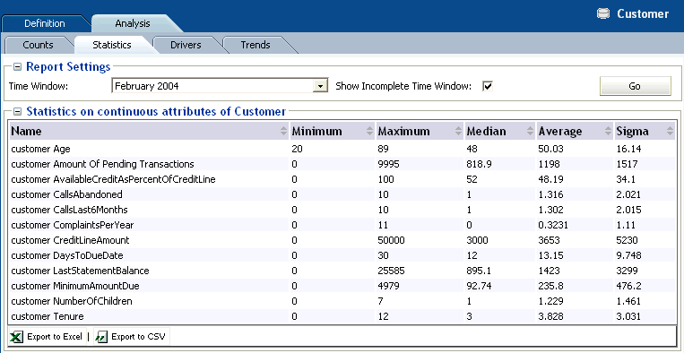
The Entity Analysis Statistics reports shows the minimum, maximum, median, average, and sigma values for each of the numeric attributes of the entity. For instance, in the example shown in Figure 2-45, the median age of customers is 48.
Note:
An attribute value of OTHER indicates that more than the maximum number of discrete values (default is 500) was found. Counts and statistics for all attribute values found beyond the maximum number are accumulated and appear for the OTHER attribute.Figure 2-45 shows the Analysis Statistics report for the Customer entity.
Figure 2-45 Entity Analysis Statistics Report
Description of "Figure 2-45 Entity Analysis Statistics Report"
2.5.4 Entity Analysis Drivers
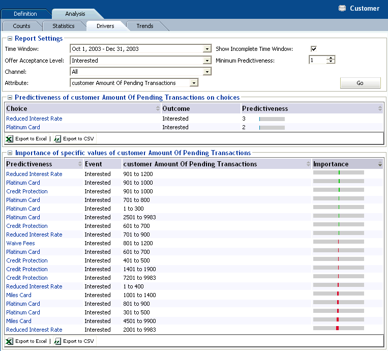
The Entity Analysis Drivers report identifies the attributes that are influential as drivers of predictiveness for the Entity. The outcome and time frame can be adjusted at the top of the report.
Additionally, a best fit report for the Entity is included. This shows the importance of specific values on predictiveness of an attribute.
The Entity Analysis Drivers report helps business users to analyze how a specific attribute correlates with any of the predictive models defined in the Inline Service. Unlike the Choice Analysis reports that only look at the correlation between one choice and attributes, the Entity Analysis Drivers report helps users understand the choices that specific attribute values are most successful at predicting.
Note:
An attribute value of OTHER indicates that more than the maximum number of discrete values (default is 500) was found. Counts and statistics for all attribute values found beyond the maximum number are accumulated and appear for the OTHER attribute.Figure 2-46 shows the Analysis Drivers report for the Customer entity.
Figure 2-46 Entity Analysis Drivers Report
Description of "Figure 2-46 Entity Analysis Drivers Report"
With reference to the example shown in Figure 2-46, the following observation can be made:
-
Looking at the Customer entity, and the particular attribute Amount of Pending Transactions, the most likely prediction is that customers will be interested in an offer to reduce their interest rate, especially if the customer has between 901 to 1200 pending transactions.
2.5.5 Entity Analysis Trends
The Entity Analysis Trends report shows the change of predictiveness for an attribute of an Entity over a period of time. The time frame can be adjusted at the top of the report.
Note:
An attribute value of OTHER indicates that more than the maximum number of discrete values (default is 500) was found. Counts and statistics for all attribute values found beyond the maximum number are accumulated and appear for the OTHER attribute.Figure 2-47 shows the Analysis Trends report for the Customer entity.
Figure 2-47 Entity Analysis Trends Report
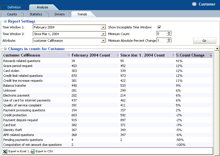
Description of "Figure 2-47 Entity Analysis Trends Report"
A trend chart is also provided, as shown in Figure 2-48.
