MobileAware Interaction Server - Sample Workshop Mobility Project Guide
|
|
|
Sample BEA WebLogic Workshop Mobility Project Guide
About This Manual
The installer for the MobileAware Interaction Server, BEA WebLogic Edition installed a sample mobility project for BEA WebLogic Workshop along with the MobileAware Mobility Extension for BEA WebLogic Workshop. The MobileAware Interaction Server, BEA WebLogic Edition Installation Guide document described the steps to import the mobility project, restaurantWeb, into a newly created domain and application in BEA WebLogic Workshop.
This document takes you through the step-by-step process of mobilizing this web application for mobile devices using the MobileAware toolbars and features that have been integrated into BEA WebLogic Workshop by the Mobility Extension.
As this is only a demonstration project to get you started mobilizing content in Workshop, some of the links have been left inactive intentionally. Once you have learned the mobility basics by following the steps in this document, you are free to extend and modify the demonstration project for further practice.
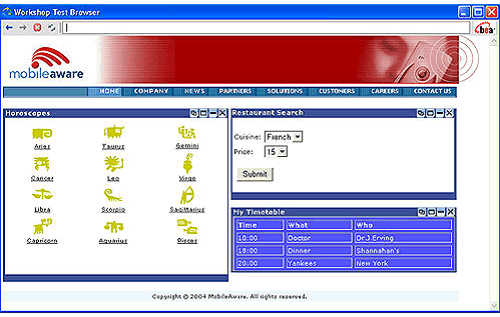
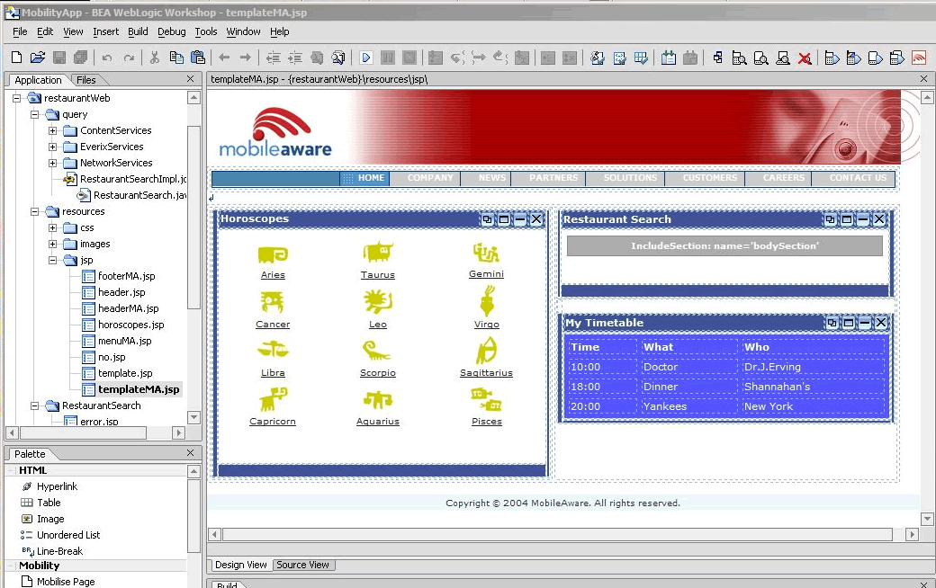
Figure 1 The sample application in the Workshop Test Browser
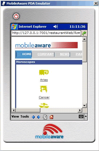
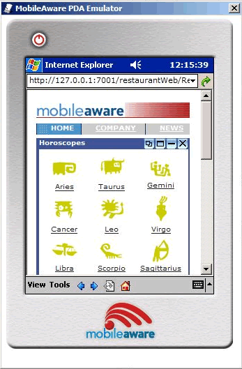
The sample project is an example of a typical web page, containing three different features: horoscopes, a restaurant search, and a personal timetable. It has currently only been optimized for full browser (PC) display. Run the sample in either a phone or PDA emulator and you can see how the display becomes distorted or too wide in these smaller mobile device screens.
By using the MobileAware Mobility Extension for BEA WebLogic Workshop, developers can quickly make their applications "mobile-ready". Follow the steps in the next sections to mobilize the sample restaurantWeb project.
Pre-requisites Before Getting Started
Before using this guide, the following steps must have been completed as described in the MobileAware Interaction Server, BEA WebLogic Edition Installation Guide:
The BEA Workshop IDE with the Mobility Extension
After installing the MobileAware Interaction Server, BEA WebLogic Edition, including the Mobility Extension for BEA WebLogic Workshop (see the installation guide), the BEA WebLogic Workshop Integrated Development Environment can be used for creating multi-channel applications and extending existing applications to wireless.
Summary of the Mobility Extension Features
This section provides an overview of the Mobility Extension features, including:
- Enable Multi-Channel for new or existing projects
- Mobility Palette, for easy Access to Mobility Tags
- Mobility Toolbar, including:
- Design Preview icons for the different device classes
- Emulator Launch icons for the different device classes
- Launch MobileAware Tools icon
- IDE Properties additions, including:
- Mobility Menu under Tools, including:
These features are described in more detail below.
Enable Multi-Channel
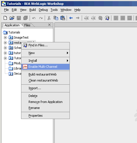
Any application project can be configured for multi-channel delivery by selecting the "Enable multi-channel" option for the highlighted project. Selecting this option configures the application project to deploy and use the MobileAware Interaction Server.
Mobility Palette
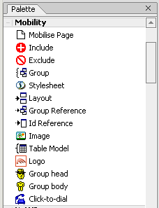
Using a "drag & drop" technique, mobility meta-data can be applied to any NetUI-defined interface to enable delivery to mobile devices. This includes support for wizard-based generation of layouts for different device categories, click-to-dial for embedding telephony commands in applications, multi-device image handling, and device-category styling.
For more details on each of these mobility tags, please refer to the MobileAware Interaction Server, BEA WebLogic Edition User Guide.
Mobility Toolbar
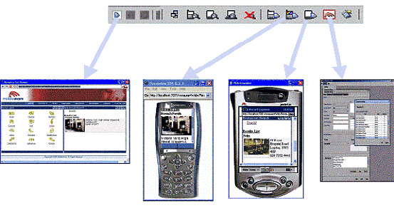
Toolbar extension that enables launching of device emulators for smart phones and PDAs in addition to the Workshop test browser. The Mobility Toolbar also provides a diagnostics application that enables the simulation of advanced mobile requirements for detailed testing of applications.
Figure 4 The Mobility Toolbar features
The Mobility Toolbar additionally provides the capability to manage target devices from within Workshop, enabling addition/removal of devices in the device repository and device profile configuration for optimization of NetUI for different device types.
Viewing Content With Emulators
The Mobility Extension installation adds a toolbar to Workshop that makes it easy to view and debug mobilized content. Once your emulators have been configured as described in the installation instructions, you will have an extra toolbar in Workshop, the Mobility Toolbar.
The first icon simplifies the management of groups of content that have been created on the page that is open in the Edit Pane.
The next four icons allow you to see the mark-up for a particular device. Content groups that have been excluded for a particular device will not appear in the window when that device's button is pressed. The groups that are to be delivered to the device will be expanded so that you can see approximately how they would look.
These four icons are as follows:
Figure 9 Preview Full Browser (PC) Content
Figure 10 View All Contents and Mobility Mark-up
The next four icons let you launch the particular device emulator to see the results of the mobility markup, as it would appear in the actual device.
Figure 11 Launch Configured WAP 1.x Emulator
Figure 12 Launch Configured WAP 2.x Emulator
Figure 13 Launch Configured PDA Emulator
Figure 14 Launch Other Configured Emulators / Browsers
The sample project, when viewed in a menu-driven (for example smart phones) or a PDA device, demonstrates the types of issues that can arise when sending PC web content to handheld devices. As the code is mobilized, you will be able to see how the MobileAware Interaction Server can manipulate the content to make it look good on all types of devices.
Note: Openwave 6.2.2 will sometimes pause or freeze when launched from Workshop. In order to stop this behaviour, follow these instructions:
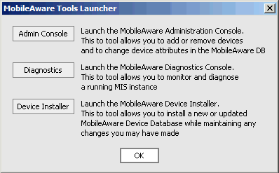
The final icon on the toolbar gives access to additional MobileAware Interaction Server tools:
- Administration Console for managing devices and their attributes
- Diagnostics Console for diagnostic output and troubleshooting
- Device Installer for managing the MobileAware Device Database
Figure 15 MobileAware Interaction Server Tools
Clicking on this icon will open the MobileAware Tools Launcher dialog box for these tools (see below). The tools can also be launched directly from the Mobility Menu.
Figure 16 MobileAware Tools Launcher
IDE Properties additions
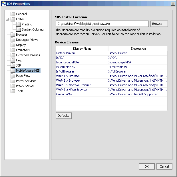
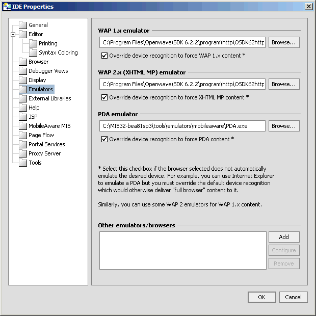
Two additional panes have been added to the IDE Properties dialog:
MobileAware MIS Pane
The "MobileAware MIS" pane allows the user to set the MIS Install Location property.
Figure 17 Additions to IDE Properties Dialog
The "Device Classes" section provides a drop down list of configured device classes when using the MobileAware Mobility Tags. Developers can specify frequently used "where" expressions for inclusion in the drop down list. See the MobileAware Interaction Server, BEA WebLogic Edition User Guide for a detailed explanation of the Mobility Tags and "where" expressions.
To add a new item to the drop down list, insert the frequently used expression in the "Expression" column and an easily identifiable "Display Name" to be associated with it. Subsequent usage of the Mobility Tags will allow the user to select this "Display Name" resulting in the automatic insertion of the defined "Expression".
Emulators Pane
The "Emulators" pane enables configuration of different emulators for testing the application appearance and flow on a range of devices.
For more information on configuring these emulators refer to "Configuring the Device Emulators" in the MobileAware Interaction Server, BEA WebLogic Edition Installation Guide.
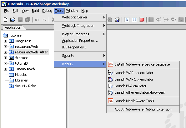
Mobility Menu
The Mobility Menu contains links to the following:
- Install MobileAware Device Database
- Launch WAP 1.x emulator
- Launch WAP 2.x emulator
- Launch PDA emulator
- Launch other emulators/browsers
- Launch MobileAware Tools
MobileAware Mobilization Methodology
This section gives a brief overview of the mobilization process using MobileAware's Mobility Tags. For a detailed description, please refer to the MobileAware Interaction Server, BEA WebLogic Edition User Guide.
Once a page of content has been mobilized, it can be delivered by the MobileAware Interaction Server to a range of devices from PDA's to PCs to WAP devices and smartphones.
Device Classes
To simplify the developer's task of catering for all devices, MobileAware has broadly grouped devices into three main categories:
MIS recognises devices as they access content and transforms the content appropriately based on device profile characteristics retrieved from the MobileAware Device Database. The device profile includes information such as the appropriate mark-up language (for example WML, XHTML-MP, etc) for each device, as well as device display capabilities such as image handling capabilities, screen size, WAP decksize, and whether javascript or tables are supported.
With this information, MIS can optimally transform and deliver content in the correct format to the device, including paginating the content and adding navigation links automatically if necessary.
Developers can also refine their content beyond these initial device classes.
Mobilizing Content
Before mobilizing content, you must first indicate that a page is to be transformed. You do this by adding the "Mobilise Page" tag to the content (this will be demonstrated in the next section).
Next, to mobilize the page, there are 2 main steps:
Grouping
A detailed page of HTML content would be too complex to send directly to WAP or PDA device. To overcome this, the page is split into logical groups.
Presentation
Once the content is logically split into groups, you can decide which groups should be sent to particular device classes and how they will be displayed.
Grouping and Presentation of content will also be demonstrated in the next section.
Begin Mobilization of the Sample Project
You should have followed the steps in the MobileAware Interaction Server, BEA WebLogic Edition Installation Guide to import the restaurantWeb sample project. If you have not already done so, please refer to the Installation Guide and import the sample restaurantWeb Project.
After following the installation steps you will have a Workshop Application called "MobilityApp", which will contain a Web Project called "restaurantWeb".
Open BEA WebLogic Workshop 8.1 and open the "MobilityApp" application:
In this tutorial, you will be mobilizing a pageFlow.
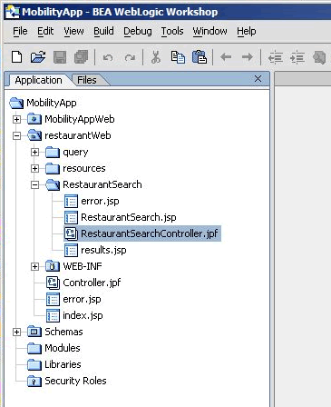
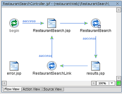
The pageFlow for the sample project is called RestaurantSearchController.jpf and is located in the RestaurantSearch directory. It has two jsp pages for displaying content, called RestaurantSearch.jsp and results.jsp.
Figure 20 Restaurant Search Directory
Figure 21 RestaurantSearchController.jpf
Both of these pages use a Template called TemplateMA.jsp, which is located in the directory \resources\jsp. This is the page you will be mobilizing.
Step 1: Enable the restaurantWeb Project for Multi-Channel
The pageFlow to be mobilized is in the default Web Project called restaurantWeb, which first must be enabled for multi-channel.
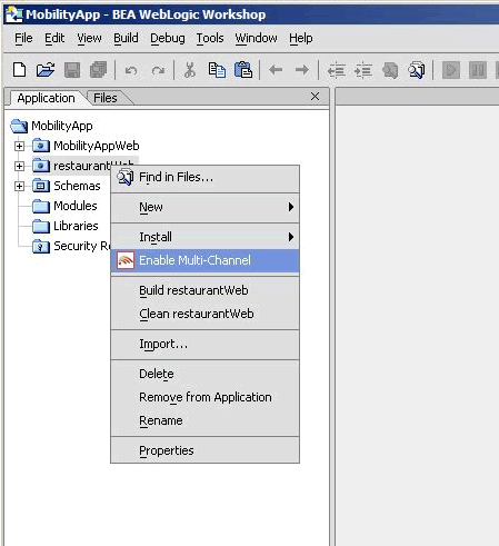
To do this, right-click on the project name, "restaurantWeb" and select "Enable Multi-Channel'.
This will deploy the MobileAware Interaction Server into the project as well as the necessary libraries to enable content transformation for the different device classes.
Figure 22 Enable Multi-Channel
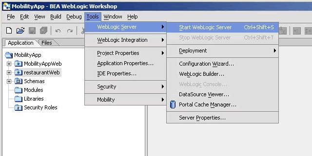
Step 2. Start the WebLogic Server
Now that you have enabled the project for multi-channel, you should start the WebLogic server for this domain
Step 3. Set Up the Page for Mobilization
As described above, you are now going to mobilize the templateMA.jsp page.
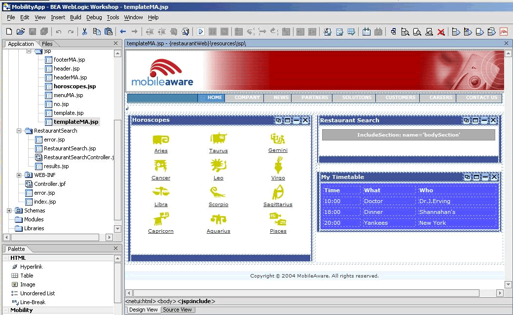
Open restaurantWeb\resources\jsp\templateMA.jsp in Design View.
Figure 24 Design View for templateMA.jsp
As described in the "Mobilizing Content" section, you must indicate that this page is to be transformed by the MobileAware Interaction Server. To indicate this, add the "Mobilise Page" tag to the page you are mobilizing as follows:
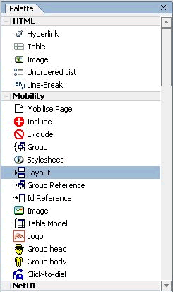
- Go to the Palette and expand the Mobility tab to see the Mobility items that have been added to speed the mobilization of the web application.
- Prepare the page for mobilization by selecting "Mobilise Page" on the Mobility Palette and dragging it onto the Edit Pane.
- Before proceeding further, you should view the project for the first time using the Workshop Test Browser to see how it would look on a PC browser.
Open RestaurantSearchController.jpf in the RestaurantSearch directory.
Note: To view the page, be sure to launch RestaurantSearchController.jpf and not the templateMA.jsp file directly.
- To view the project, select the "Debug" Menu and choose "Start" or simply press the "Play" button on the Toolbar (pressing "Play" also will automatically save your changes).
Note: This tab will be referred to as the Mobility Palette throughout this document.
Figure 25 The MobileAware Mobility Palette
Note: The Edit pane is the centre pane of Workshop, and shows the current file. There are 2 options for viewing a jsp page: Design View and Source View. These options are selected by clicking on the appropriate tab at the bottom of the Edit pane.
Step 4. Grouping the Content
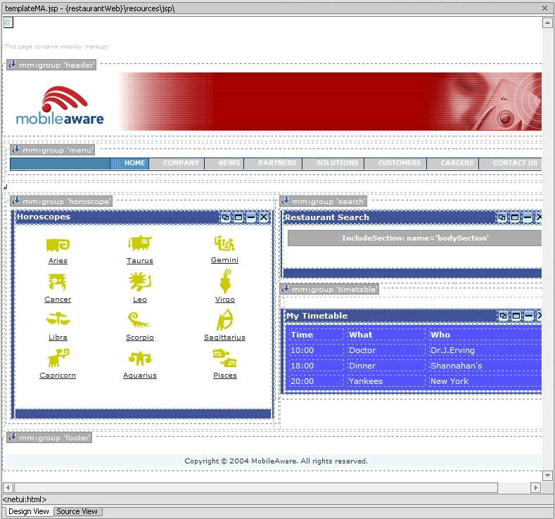
The next step in mobilizing the page is to group the major sections of content. The "restaurantWeb" sample project has six main content sections:
Each of these sections must be labelled as an individual group. To do this:
- From the Application tree view pane, go to restaurantWeb\resources\jsp and double-click on templateMA.jsp to open it in the Edit Pane (you should already have this file open from the previous step). This file is the basic template file for the sample application. Look at the file in Design View.
- Click on the header to highlight the banner image. This will select a <jsp:include> as can be seen from the selection information at the bottom of the Edit pane.
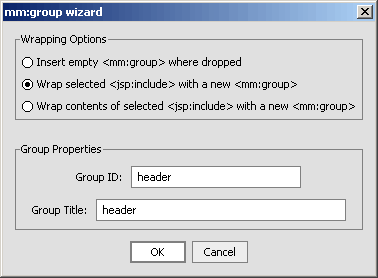
- Select "Group" in the Mobility Palette and drag it onto the Edit Pane over the banner image that you have highlighted. This will cause an insert wizard to pop up called "Wrapping options".
- Select "Wrap selected <jsp:include> with a new <mm:group>" and enter "header" into the Group ID and Group Title boxes and click OK.
- Now you will need to group the remaining sections of the page in a similar fashion.
If you make a mistake in adding a group, see the "Remove a Group" section below.
Note: Make sure that all of the content of each group has been highlighted before grouping them. Use the tag list below the Edit Pane in Design View to confirm the correct content is highlighted.
Note: You can also directly click tags in the tag list to change the selected tags or confirm your selection by switching to the Source View.
Figure 29 Using the Tag List to Highlight the Correct Part of the Page
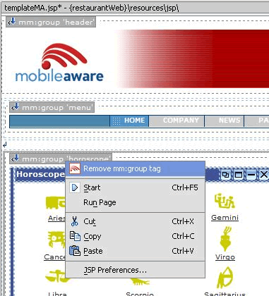
As each group is added, you will be able to see the grouping in the Design View.
- Create the "menu" group, ensuring that you only group the <jsp:include> and not the surrounding table.
If your groups are not as shown in the figure above, you should remove the incorrect group selections and re-group them using the correct content.
Removing a Group
To remove a group, right-click on the particular "mm:group" icon in the Design View, and select "Remove mm:group tag".
Now, re-group the correct content as described above.
You have now completed the grouping phase of the content mobilization process. The next step is to design the presentation (look & feel) for the different device classes.
Step 5: Adding Layouts for Handheld Devices
Layouts have to be created for the smaller handheld devices such as PDAs and WAP devices.
The content groups that have been created in the previous section must be properly organized to suit the smaller screen sizes and bandwidth limitations of these handheld devices.
Adding a Layout for Menu-Driven Devices
- A "Layout Page" insert wizard will appear. Select "IsMenuDriven" under "Use this layout where" and click OK.
Figure 32 Selecting Layout on the Mobility Palette
Figure 33 Selecting a Layout for Menu-Driven Devices
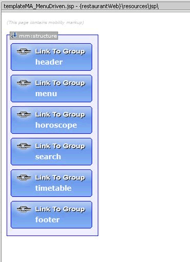
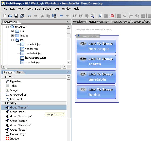
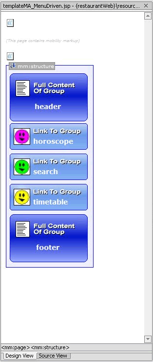
This will create a new file called, by default, templateMA_MenuDriven.jsp that will contain instructions on how to organize content for menu-driven devices (for example smart-phones, web-enabled phones, and so on).
Figure 34 TemplateMA_MenuDriven.jsp
- Open the java pageFlow controller page RestaurantSearchController.jpf from the directory \restaurantWeb\RestaurantSearch\.
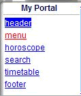
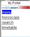
- Now launch your menu-driven device emulator from the Mobility Toolbar. The groups that have been created have been reduced to a list of links. Each link points to the content of the associated group (although, this content has yet to be optimized at this point).
Figure 35 Groups Displayed as List of Links
Adding a Layout for PDA Devices
To facilitate optimization of the content for PDAs, you need to add another layout.
- Using the same method as above, create a layout for PDAs. Select the mobility tag "Layout" from the Mobility Palette and drag it onto templateMA.jsp.
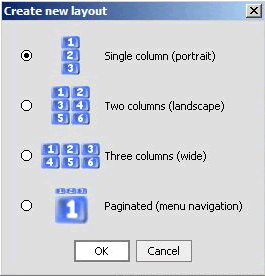
- A second insert wizard called "Create new layout" will allow you to select the type of layout for PDA devices. Choose the single column layout and click OK.
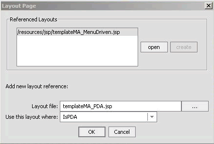
Note: The "Layout Page" insert wizard has an extra pane showing the layouts you have already added.
Figure 36 The Layout Page for PDA devices
Figure 37 Create New Layout dialog
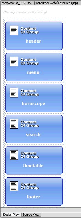
A file called templateMA_PDA.jsp will be created containing the organizational schema for PDA devices.
Figure 38 templateMA_PDA.JSP Design View
Manipulating Groups
Once the groups have been placed in layout files, they can easily be rearranged. Go to templateMA_MenuDriven.jsp. Clicking and dragging a group from one place within the structure to another changes the order of the groups.
Note: Save your changes after each manipulation and view the results in the emulators.
Deleting a Group
A group can be deleted from a menu-driven layout. To do this, right click on the group to be deleted in the Edit Pane's Design View and select "Cut" from the menu or simply select the group and press the Delete key.
Example: Delete the header and menu groups from templateMA_MenuDriven.jsp, save your changes (Ctrl-S will typically save all files) and refresh the page in the menu-driven emulator.
Adding a Group
- Highlight the desired group in the list of groups in the Mobility Palette and drag it onto the Edit Pane.
Figure 39 Adding Groups from the Mobility Palette
Moving a Group
You can change the order of groups in the layout file by dragging and dropping them in Design View.
Move the "search" group so that it appears before the "horoscopes" group. Save your changes and refresh the page in the emulator again.
Configuring Groups on Menu-Driven Devices
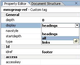
To streamline the information sent to menu-driven devices, this example currently shows only headings in the menu. You can change the display by modifying the "display" attribute in the Property Editor for the group.
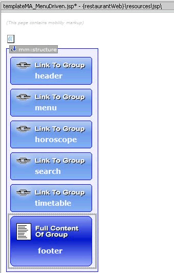
- In the Property Editor, change the value of the "display" attribute from "headings" to "all". The "all" option has the effect of showing the entire content of the group, where "headings" only shows a link to the group's content.
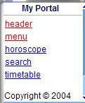
- Save your changes and view again in your menu-driven browser. Notice that the footer text now appears at the bottom.
Figure 40 Property Editor "display" Headings
Figure 41 Design View with Footer Display=All
Figure 42 Footer Displayed on Emulator
Delivering the Correct Images to Handheld Devices
One of the main issues involved with mobilizing content is the delivery of images to mobile devices. Different devices have different screen widths and graphical capabilities. Some of the older mobile devices cannot render GIF or JPEG images. Some are only capable of handling small WBMP images. MobileAware provides a real-time Image Conversion Tool that can be deployed with the Mobile Interaction Server to render images in the appropriate size and format for a given device. The Image Conversion Tool has not been used for the purposes of this sample application, but can be found in the <bea>\weblogic81\mobileaware\tools\media directory during the MobileAware Interaction Server install for your own experimentation.
For this sample project, images of different types and formats have been supplied in the \restaurantWeb\resources\images folder.
The following sections will show how to manipulate the header banner images and zodiac sign graphics so that the correct image is delivered to the requesting device.
Optimizing The Header Group
To change the header for the different devices:
- Highlight the "header" group in the Design View (make sure you haven't highlighted only the image). Select "Image" tag from the Mobility Palette and drag it onto the highlighted "header" group.Do not confuse this with the "Image" tag on the HTML Palette.
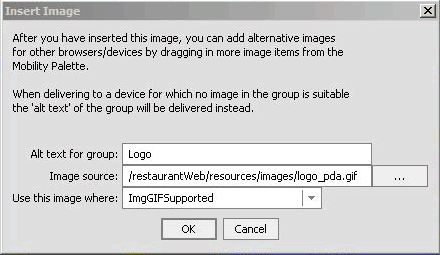
- In the "Insert Image" insert wizard, enter "Logo" in the "Alt text for group" field and enter "ImgGIFSupported" for the "Use this image where" field.
- To select an appropriate image, browse to the \restaurantWeb\resources\images folder and select logo_pda.gif and click OK.
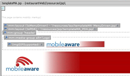
- In the Design View, you can see that the PDA image has been placed inside a media-group that can hold several image formats. The proper image will be selected from this group depending on the requesting device type.
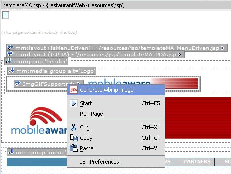
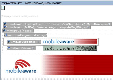
- Now highlight the image that you've just inserted. Right click on it and choose "Generate wbmp image" from the drop-down list. This will launch the WBMP image conversion tool. You can adjust the image using this tool if desired, or simply save it. The new image will then be added to the media-group.
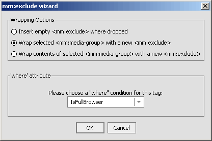
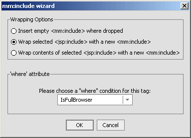
- In the "Wrapping options" insert wizard, select "Wrap selected <mm:media-group> with a new <mm:exclude>".
- The original banner is outside the media-group. As it is really only appropriate for full browser display, you should:
- Highlight the header image in the Design View pane, select an "Include" tag from the Mobility Palette and drag it onto the header image.
- In the "Wrapping options" insert wizard, select "Wrap selected <jsp:include> with new <mm:include>".
- Select "IsFullBrowser" from the dropdown list and then click OK. Including a section of content for a particular device class will automatically exclude it from all other device classes.
Figure 43 Insert Image Insert Wizard
Figure 44 Insert Image Design View
Figure 46 WBMP Image Added to Media Group
Figure 47 Wrapping Media Group With an Exclude
Figure 48 Including the Header Image for Full Browser
Figure 49 Optimized Header on PDA
Optimizing the Horoscope Group
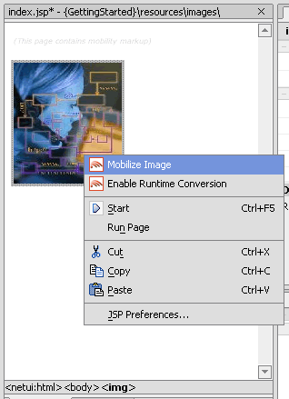
- If a comparable image exists (i.e. either an image with the same name but a different extension, or one that has been created earlier by mobilizing this image), a pop-up will tell you of the existence of the image and ask if you want to add it to the group. Click OK and it will be added to the media-group.
If a comparable image does not exist, you will be asked if you want to generate an image. If you agree, the Pic2WBMP conversion tool will be launched. The new image will then be added to the media-group.
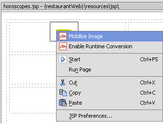
Figure 50 Using Mobilize Image on the Aries Image
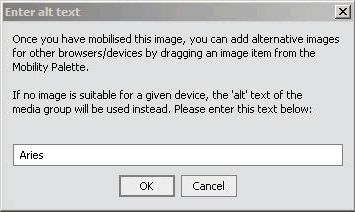
Figure 51 Enter Alt Text Insert Wizard
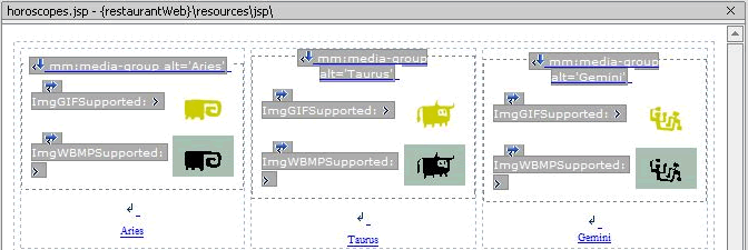
Figure 52 Mobilizing the Horoscope Images
As you can see in the figure above, a GIF image will be delivered to devices that support GIF Images and a WBMP will be delivered to menu-driven devices that do not support GIF images as denoted by "ImgGifSupported" and "ImgWBMPSupported", which are set as the "where" clauses for those images. If the source image had been a JPG format image, then the "where" clause would have automatically been set to "ImgJPGProgressiveSupported".
To change the default image settings:
This refinement can be done for the header image as well.
- hange the "where" clause on the WBMP image to "ImgWBMPSupported" (you will have to type this in). The MobileAware Interaction Server will deliver the first image in the media-group that matches the characteristics of the requesting device and ignore all others.
Figure 54 Updated Header in WML Emulator
To further tidy the "horoscope" group, you can change the "horoscopes" title bar so it will not appear when the content is delivered to menu-driven devices:
Figure 55 Exclude Horoscope Header Title for Menu-Driven Devices
Figure 56 Horoscope With No Header Title
Optimizing the Menu Group
The menu bar has been deleted from the layout for menu-driven devices, so no optimization for this type of device is necessary.
For PDAs, the menu is too long in its current form for the size of most PDA screens. To correct this, you could exclude the first blank cell and the last five menu items from PDA, leaving just three links to form a shorter menu. This will leave Home, Company, and News for the PDA display.
- Open Source View and highlight the first <td> cell. This is the 140 pixel wide blank cell that appears on full browsers. Select "Exclude" from the Mobility Palette and drag it onto the selected code.
Figure 57 Exclude First Table Cell
Note: The MobileAware Interaction Server may have cached the content. This can result in changes not being visible when the emulator is refreshed while pointing at a particular page. If the changes do not appear in the emulator:
Optimizing the Timetable
Tables can cause a number of issues when they are delivered to handheld devices. Many older devices do not support tables at all. The MobileAware Interaction Server enables developers to customise the way that tables are delivered to different device types so that the information is properly displayed on each type of device.
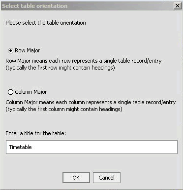
- In the "Select table orientation" insert wizard, select "Row Major" (this is selected by default), enter `Timetable' for the title of the table and click OK.
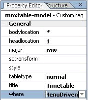
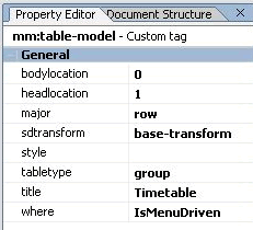
- By default, this Table Model will apply to menu-driven and PDA devices. In this case, we want to restrict it to menu-driven devices only. To achieve this, in the property editor for the Table Model set the where attribute to "IsMenuDriven".
Figure 59 Table Orientation Insert Wizard
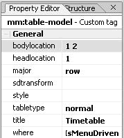
Figure 60 Table Model Property Editor
Note: The timetable contains nested tables. The table of interest is the timetable itself, which is nested inside an outer table that includes the title.
In order to display the most relevant timetable content on all device types:
- Select the inner table, and drag on "Group Body" from the Mobility Palette. To do this, click on the table and then use the netui tag display to select the appropriate table as shown below.
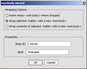
- n the "Wrapping options" insert wizard, select the "Wrap selected <table> with a new <mm:body>"option, enter "ttbody" for the Body ID, and enter "timetable" for the idref.
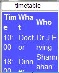
- Notice how the device tries to render the table, but because of the reduced screen size, the data wraps excessively.
Figure 61 Selecting the inner table
Figure 62 Wrapping the Table Model
Figure 63 Timetable With Wrapped Data
There are several options for delivering a better table to this device:
- In the Property Editor, replace the asterisk under "bodylocation" with "1 2" (with a space between). This means only deliver the first two columns in a Row Major table.
- Save the file and view on the emulator. You may need to close the emulator, open RestaurantSearchController.jpf, and then relaunch the WAP 2.x emulator for your changes to be seen due to caching.
- Change the "bodylocation" attribute in the Property Editor back to an asterisk "*". (This means all table cells will be displayed.)
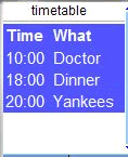
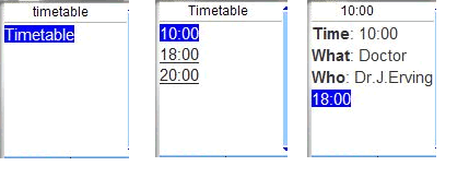
- Notice that only one row of table data is shown at a time. If you click on the first row in the timetable, you will see the details of the 10:00 appointment and a link to the next appointment.
Figure 64 Updating the Bodylocation
Figure 66 Update Table Model for Tabletype Group
Figure 67 Updated Timetable With Links
Optimizing the Restaurant Search
The Restaurant Search section of this project sends data using a form. Depending on the values selected in the dropdown boxes, a different results page will be displayed when you click the "Submit" button.
For menu-driven devices, some JSP code needs to be added to facilitate navigation with form processing. This will show the full contents of the results page at the top, followed by the other links (Horoscopes and Timetable). The results page will have a link inside itself that can take you back to the first restaurant page to make another search.
public Forward RestaurantSearch( RestaurantSearchForm aForm )
throws Exception
{
java.lang.String var = myControl.RestaurantSearch( aForm.cuisine, aForm.price );
getRequest().setAttribute( "results", var );
getRequest().setAttribute( "focus_group", "search" );
return new Forward( "success" );
}
public Forward RestaurantSearchLink()
throws Exception
{
getRequest().setAttribute( "focus_group", "search" );
return new Forward( "success" );
}
<%
String searchDisplay;
if ("search".equals(request.getAttribute("focus_group"))) {
searchDisplay="all";
} else {
searchDisplay="headings";
}
%>
<mm:group-ref display="<%=searchDisplay%>" idref="search" depth="0" />
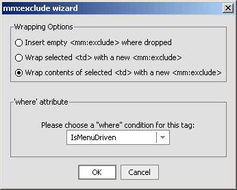
- Now, remove the restaurant search title bar for menu-driven devices by highlighting the table element in templateMA.jsp that contains the title bar (be sure to select the <table> tag from the netui tag display), selecting "Exclude" from the Mobility Palette and dragging it onto the table element, and then selecting "IsMenuDriven" in the insert wizard.
- Save your files again and view the changes in the emulators. On the WML Emulator, the Search Results will be displayed in place of the "search" link as shown below. Scroll down in the emulator to see the rest of the page.
Figure 68 Updated Search Results
Navigation Styling on Menu-Driven Devices
To improve the look of menu-driven navigation, the Mobility Extension for BEA WebLogic Workshop lets you easily add images to menu links.
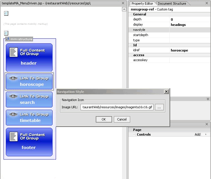
- Go to the Property Editor and use the `' button to browse and select the image file next to the "navstyle" property. For this example, choose one of the three icon images that can be found in the restaurantWeb\resources\images\ folder and click OK:
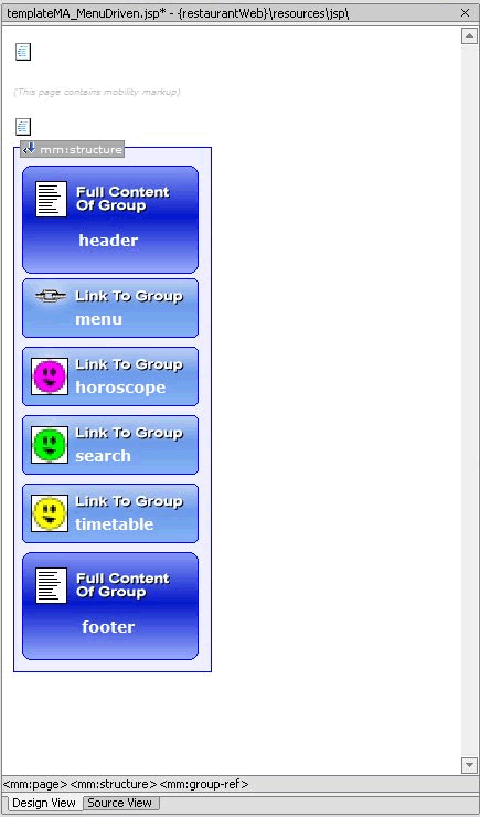
Figure 70 After Assigning Navigation Style Images
Figure 71 Navigation Menu Displayed with Images
The menu list itself can be styled by setting the "navstyle" attribute value on the <mm:structure> itself. As an example:
- With the templateMA_MenuDriven.jsp open, highlight the "structure" in the Design View of the Edit Pane.
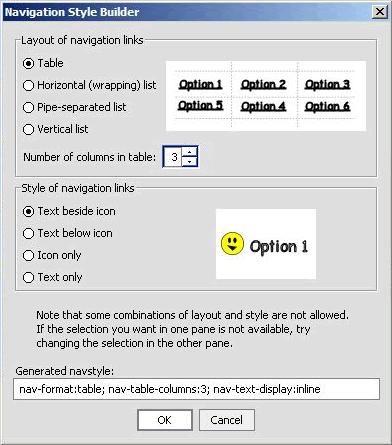
- Click on "navstyle" box in the Property Editor and then on the `'. The "Navigation Style Builder" insert wizard will be displayed. You can select the navigational styling that best suits the links.
Figure 72 Navigation Style Builder Insert Wizard )
Automatic Navigation for PDA Layouts
The Mobility Extension for BEA WebLogic Workshop offers a way of displaying content on PDAs other than the default navigation list created from the groups.
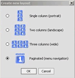
After dragging "Layout" from the Mobility Palette into the templateMA.jsp page and selecting PDA, the "Create new layout" insert wizard appears with four options. The earlier example demonstrated how the single column layout looks on a PDA - each group is placed one on top of the other. The user must scroll down the page to see all of the content. This example will demonstrate how the "Paginated" option works by breaking up the content into smaller pages that can be navigated using the generated menu.
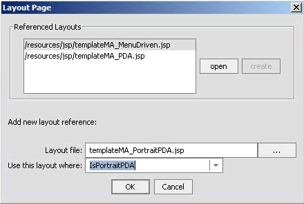
- In the "Layout Page" insert wizard, select "IsPortraitPDA" in the "Use this layout file where" dropdown box and click OK. (Selecting "IsPortraitPDA" will allow you to see the results of Pagination in your PDA emulator without deleting the "IsPDA" layout that you have already created. The selection of layout is a top down search and the first eligible layout will be selected for the device.)
Figure 73 Portrait PDA Layout Insert Wizard
Figure 74 Create New Paginated Layout
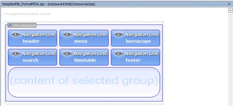
This will create and open a templateMA_PortraitPDA.jsp file. You can see that all of the groups that were created in the templateMA.jsp page have been placed in a structure.
Figure 75 TemplateMA_PortraitPDA.jsp Design View
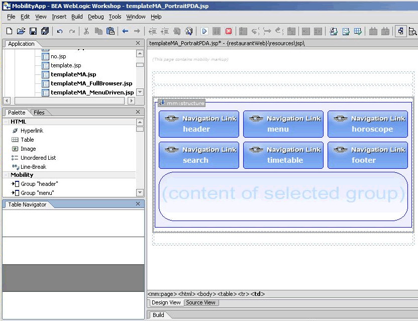
The header, footer and menu need to be taken out of this structure so that they can be expanded and not just appear as links. In order to do this, three rows must be created outside the structure. Each row will provide a space to place the header, footer and menu.
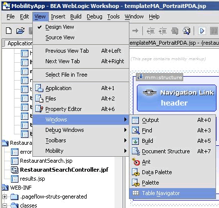
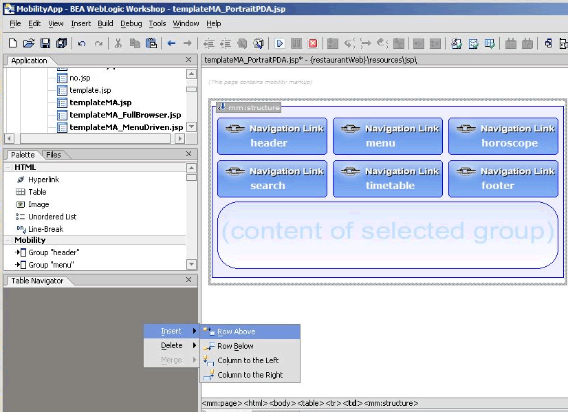
- Right click on the Table Navigator and insert a row above. The Table Navigator will now visually indicate that the table has 2 rows.
- Go to the Mobility Palette and drag "header" onto the first row, drag "menu" onto the second row and drag "footer" onto the last row.
- Finally, give the Restaurant Search more prominence by moving the "search" group to the left of the "horoscope" group inside the structure.
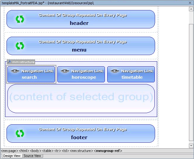
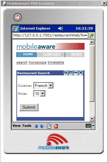
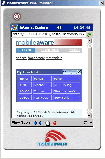
- Save your changes and view from the PDA emulator. As can be seen below, the groups in the structure appear on separate pages. The header, menu and footer are persistent and appear on all pages. The automatically created navigation menu (Search, Timetable, Horoscopes) allows you to scroll between groups.
Figure 76 Select Workshop Table Navigator
Figure 77 Insert Table Row Above
Figure 78 Design View After Inserting Rows
Figure 79 Updated PDA Structure
Figure 80 Updated PDA Emulator View - Main Page
Figure 81 Updated PDA Emulator View - Timetable
Summary
Congratulations! You have now mobilized the "restaurantWeb" project. You can refer to the mobilized sample "restaurantWeb_After" project to compare your mobilization effort with the provided one.
Appendix A - Enabling Runtime Image Conversion
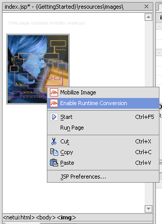
The Mobility Extension for BEA WebLogic Workshop offers a mechanism for enabling images for Runtime Image Conversion. This means that instead of creating or sourcing all of the necessary renditions of each image you want in a given application, you can simply include a single source image and rely on the MobileAware Interaction Server Image Converter to generate appropriate sized renditions of the source image as required. Images will be cached as they are created so that future requests for the same size image will not necessitate regeneration of an already converted image.
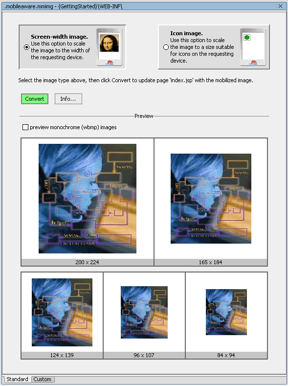
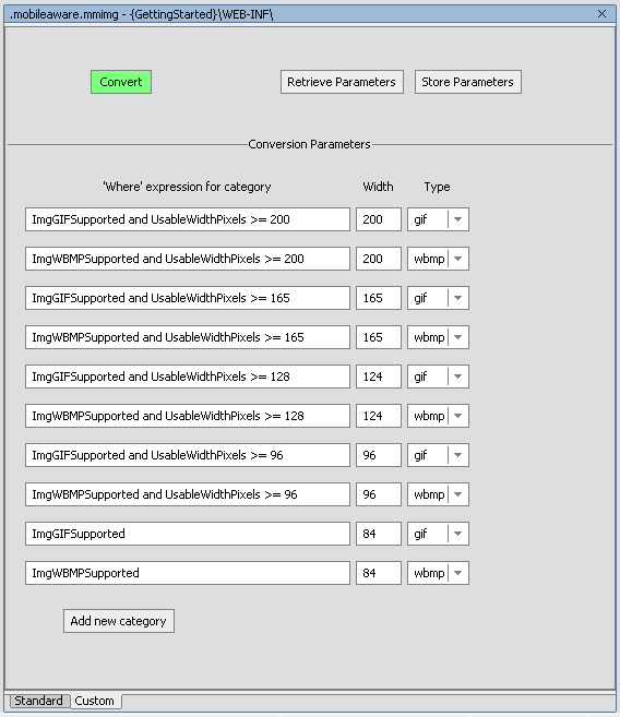
- On the Image Conversion Setup screen, select the "Standard" tab at the bottom of the pane to use pre-defined image sizes and formats for the image conversion setup. Select the "Custom" tab to define yourself the image sizes and formats that should be configured.
- On the Standard Image Conversion Setup screen, select whether the image should be rendered as a "screen-width image" or as an "icon image". Selecting "screen-width image" will result in an <mm:media-group> being added to the page that will be automatically configured to convert the source image into screen-width image sizes based on the screen width of the device accessing the content. Selecting "icon image" will result in an <mm:media-group> being added to the page that will be automatically configured to convert the source image into images suitable for use as clickable image icons. You will see a preview of the images sizes to be produced in the lower half of the window. Click Convert to complete the Standard Image Conversion configuration.
- On the Custom Image Conversion Screen, you can configure specific "where" expressions for each configured image setting, along with the image width to use in the conversion and the format that should be generated. The figure below illustrates an example custom image conversion configuration.
- To save the parameter settings you have defined so they can be used with other images, Click Store Parameters. Enter a file name and click OK.
- To retrieve and use a previously stored custom configuration file, click Retrieve Parameters, select the file from the list shown and click OK.
- Once you have satisfied with the configuration settings, click Convert. This will result in an <mm:media-group> being added to the page that will be automatically configured to convert the source image into the custom sizes as they have been defined a device accesses the content.
Figure 82 Selecting Enable Runtime Conversion for an Image
Figure 83 Image Conversion Setup - Standard Screen-width Preview
Figure 84 Image Conversion Setup - Standard Icon Preview
Note: The first expression that returns true will determine which image rendition gets delivered. The up and down buttons can be used to change the order of the expressions. The middle button (`X') will delete a selected expression. Click Add New Category to add a new expression row into the setup screen.
Figure 85 Custom Image Conversion Setup Screen
