


|

|
|
|
|
BPM Graphical User Interface Style Sheet
This section provides information to help you design custom plug-ins based on Java Swing classes. It includes the following sections:
Designing a Plug-In
Designing a plug-in that meets the learning and information needs of users requires careful planning and a systematic application of the principles described in Working with Interaction Components and Working with Presentation Components.
To design a plug-in panel, perform the following steps:
Working with Interaction Components
Interaction components allow users to interact with your plug-in panels. Choosing appropriate components is not simply a matter of following a formula; rather, it involves achieving a balance among industry standards, corporate standards, and user needs.
The following sections provide guidelines for designing interaction components:
Check Boxes
Check boxes can be used to replace some data-entry fields and provide a quick way to make multiple choices. The following BPM example illustrates appropriate check-box design.
Figure C-1 Check Box Design
Use the following guidelines to design check boxes: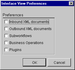
Command Buttons
Command buttons are the interaction components used most frequently by users to complete tasks within a dialog box. The following BPM example illustrates appropriate command-button design.
Figure C-2 Command Button Design
Use the following guidelines to design command buttons: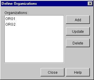
List Boxes
List boxes provide an alternative to data entry. The following BPM example illustrates appropriate list-box design.
Figure C-3 List Box Design
Use the following guidelines to design list boxes: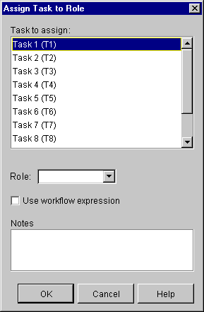
Radio Buttons
Radio buttons can be used in place of many data-entry fields. The following BPM example illustrates appropriate radio button design.
Figure C-4 Radio Button Design
Use the following guidelines to design radio buttons: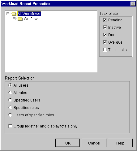
Tables
Tables allow users to enter or view relatively large amounts of information at a time. The following BPM example illustrates appropriate table design.
Figure C-5 Table Design
Use the following guidelines to design tables: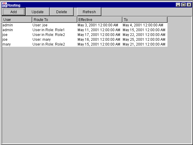
Text-Entry Fields
Text-entry fields are interaction components used most frequently by users to enter data. The following BPM example illustrates appropriate text-entry field design.
Figure C-6 Text-Entry Field Design
Use the following guidelines to design text-entry fields: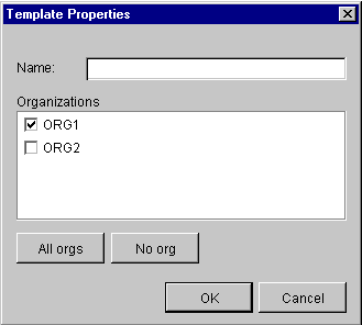
Working with Presentation Components
Presentation components control how data is displayed in dialog boxes. When designing your plug-ins, consider what a user needs to do with the data. For example, do users need to compare bits of information or make selections based on specific criteria? The appropriate display of information can make a major difference in how users perceive the usefulness of an application.
The following sections provide guidelines for designing presentation components:
Color
Color is an important device for getting the user's attention. When used judiciously, color can enhance the usability of a dialog box.
Use the following guidelines when working with color:
Dialog Box Layout
Dialog box layout is an important aspect of application usability. A layout can influence a customer's perception of whether an application is friendly or unfriendly.
Use the following guidelines to create dialog-box layouts:
A horizontal flow typically results in dialog boxes that are wider than they are tall. In this case, users process information starting in the top left corner and move left to right.
A vertical flow typically results in dialog boxes that are taller than they are wide. In this case, users process information starting in the top left corner and move top to bottom. The following BPM example illustrates vertical information flow.
Figure C-7 Vertical Flow
Fonts
Appropriate font selection can improve the readability of control labels in dialog boxes. The following BPM example illustrates an appropriate font selection.
Figure C-8 Font Selection
Use the following guidelines to select fonts:
Icons
Icons play an important role in plug-in design. When a plug-in is loaded, the start and event nodes in the interface view display a 16x16-pixel icon in the upper right-hand corner indicating that a workflow has triggers that are plug-in defined.
Icons are also displayed when assigning plug-in actions to tasks in the interface view. In this case, you can use the default icon provided for plug-in actions or create your own 32x32-pixel icon. The following BPM example illustrates the start, task, event, decision, and done icons in a workflow named Inventory.
Figure C-9 Start, Task, Event, Decision, and Done Icons
Use the following guidelines to create your own 32x32-pixel plug-in action icon:![]()
Messages
Application messages are displayed in various contexts and are categorized by severity. For example:
The following BPM example illustrates appropriate message design.
When writing message text, it is important to understand what response you expect from users. Use the following guidelines to create messages that are meaningful to users:
Visual Balance
Balance is the weight of elements in a design relative to the horizontal, vertical, or diagonal axes of the composition. Controls on either side of an axis must be seen to balance each other, whether through equality of size, color, similarity, or placement.
Use the following guidelines to balance the controls in dialog boxes:
For horizontal information flows, stack the command buttons vertically and place them along the right-hand side of the dialog box. Experiment by shifting the buttons to the top, middle, or bottom portion of the dialog box to offset larger or darker controls on the left-hand side. Continue adjusting until the buttons and other controls are symmetrical along the vertical axis.
For vertical information flows, align the command buttons horizontally and place them along the bottom of the dialog box. In this case, shift the buttons to the left or right margin of the dialog box to offset larger or darker controls at the top. Continue adjusting until the buttons and other controls are symmetrical along the horizontal axis.
Figure C-11 Horizontal Layout
Recommended Reading
Review the following sources for more information about designing intuitive and easy-to-use interfaces:

|

|
|
|
|
Copyright © 2002 BEA Systems, Inc. All rights reserved.
|