You can create a query-based widget using Application Performance Monitoring
traces.
You can use the many features available in the query-based widget builder
to create a widget that displays a Trace Query Language (TQL) expression. The
query-based widget builder provides you with options and functionalities to
visualize and monitor trace data. For example, you can display transactions that
scored low on performance when used by many customers, thereby making these
transactions worthy of performance improvement efforts.
To create a query-based widget that displays trace data:
- Go to the Dashboards page.
- Click Create dashboard to create a new dashboard or open
an existing dashboard in edit mode.
- On the Widgets tab, click the Add widget group and
widgets icon (
 ) and click Create query-based widget....
The query-based widget builder is displayed.
- Optionally, click the Open/close filter panel icon
(
 ) to view the filters already added to the dashboard and make changes,
if required.
Note that when creating a query-based widget to add it to a
brand new dashboard, a Compartment filter is
automatically added and the compartment input for the new widget being
created is linked to this newly added filter.
- In the upper-right corner, select a time period for which you want to display
data in the widget.
- Select Traces in the Data source
drop-down list.
If an APM domain filter is not added to
the dashboard, it's automatically added when Traces is
selected.
- Edit the default query displayed in the Query field or
enter a new query and click Run.
Use TQL syntax to create queries and retrieve trace data from
Application Performance Monitoring. For information on TQL, see Work with Queries.
The trace data is displayed in a tabular format with the name of
the service and other details. Below the Table chart,
another table with the raw data returned by the trace query is displayed and
you can click Hide raw data to hide it.
- Use the following tabs on the right side to perform tasks such as adding a name
for the widget and customizing the visualization of data in the widget:
Note
You can click
JSON in the upper-right corner to edit the JSON
metadata of the widget directly. The JSON editor provides you with greater
flexibility and more options to visualize data in the widget, however, it's
recommended that you use it only if you're familiar with editing widget
JSON. For more information on the JSON editor, contact
Oracle Support.
- About: Enter a name for the widget,
select the compartment in which you want the widget to reside, and add a
description for the widget.
Optionally, click
Show advanced options to add free-form or
defined tags to the widget. If you have the permissions required to
create a widget, then you also have permissions to add free-form
tags. To add a defined tag, you must have permissions to use the tag
namespace. For information on:
- Visualization: Select a chart type
and customize visualization by specifying or modifying additional
options.
For information on the chart types and
visualization options in a query-based widget builder, see About Chart Types and Visualization Options.
- Settings: Review and edit widget
inputs, if required.
- Click Save to save the widget in the widget library and
add it to the dashboard.
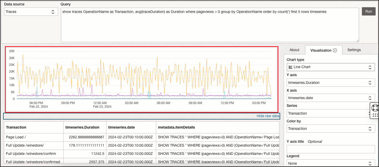
Here's a scenario in which the top 5 transactions in the specified time
period are displayed using a line chart. In the query-based widget builder:
- Ensure that the time period is selected in the upper-right corner.
- In the Data source drop-down list, select
Traces.
- In the Query field, enter the following
trace and click
Run.
show traces OperationName as Transaction, avg(traceDuration) as Duration where pageviews > 0 group by OperationName order by count(*) first 5 rows timeseries
- Specify the following on the Visualization
tab:
- Select Line chart as the
Chart type.
- Select timeseries.Duration in the
Y axis drop-down list.
- Select timeseries.date in the
X axis drop-down list.
- Select Transaction in the
Series drop-down list.
- Select Transaction in the
Color by drop-down list.
A line chart with the top 5 transactions is displayed.

