6 Understand Oracle JET User Interface Basics
htmlElement prototype to implement the World Wide Web Consortium (W3C) web component specification for custom elements. Custom elements provide a more declarative way of working with Oracle JET components and allow you to access properties and methods directly on the DOM layer.About the Oracle JET User Interface
Oracle JET includes components, patterns, and utilities to use in your app. The toolkit also includes an API specification (if applicable) and one or more code examples in the Oracle JET Cookbook.
Identify Oracle JET UI Components, Patterns, and Utilities
The Oracle JET Cookbook lists all the components, design patterns, and utilities available for your use. By default, the cookbook is organized into functional sections, but you can also click Sort to arrange the contents alphabetically.
The Cookbook contains samples that you can edit online and see the effects of your changes immediately. You’ll also find links to the API documentation, if applicable.
About Common Functionality in Oracle JET Components
All Oracle JET components are implemented as custom HTML elements, and programmatic access to these components is similar to interacting with any HTML element.
Custom Element Structure
Oracle JET custom element names start with oj-, or
oj-c- for the newer Core Pack components, and you can add them to your
page the same way you would add any other HTML element. In the following example, the
oj-label and oj-input-date-time custom elements are
added as child elements to a standard HTML div element.
<div id="div1">
  <oj-label for="dateTime">Default</oj-label>
  <oj-input-date-time id="dateTime" value='{{value}}'>
  </oj-input-date-time>
</div>
Each custom element can contain one or more of the following:
-
Attributes: Modifiers that affect the functionality of the element.
String literals will be parsed and coerced to the property type. Oracle JET supports the following string literal type coercions: boolean, number, string, Object, Array, and any. The any type, if used by an element, is marked with an asterisk (*) in the element’s API documentation and coerced to Objects, Arrays, or strings.
In the
oj-input-date-timeelement defined above,valueis an attribute that contains a Date object. It is defined using a binding expression that indicates whether the element’s ViewModel should be updated if the attribute’s value is updated.<oj-input-date-time id="dateTime" value='{{value}}'>The
{{...}}syntax indicates that the element’svalueproperty will be updated in the element’s ViewModel if it’s changed. To prevent the attribute’s value from updating the corresponding ViewModel, use the[[...]]syntax. -
Methods: Supported methods
Each custom element’s supported method is documented in its API.
-
Events: Supported events
Events specific to the custom element are documented in its API. Define the listener’s method in the element’s ViewModel.
var listener = function( event )
{
  // Check if this is the end of "inline-open" animation for inline message
  if (event.detail.action == "inline-open") {
    // Add any processing here
  }
};
Reference the listener using the custom element’s DOM attribute, JavaScript property, or the
addEventListener().-
Use the DOM attribute.
Declare a listener on the custom element usingon-event-namesyntax.<oj-input-date-time on-oj-animate-start='[[listener]]'</oj-input-date-time>Note that in this example the listener is declared using the
[[...]]syntax since its value is not expected to change. -
Use the JavaScript property.
Specify a listener in your ViewModel for the
.onEventNameproperty.myInputDateTime.onOjAnimateEnd = listenerNote that the JavaScript property uses camelCase for the
onOjAnimateEndproperty. The camelCased properties are mapped to attribute names by inserting a dash before the uppercase letter and converting that letter to lower case, for example,on-oj-animate-end. -
Use the
addEventListener()API.myInputDateTime.addEventListener('ojAnimateEnd', listener);
By default, JET components will also fire
propertyChangedcustom events whenever a property is updated, for example,valueChanged. You can define and add a listener using any of the three methods above. When referencing apropertyChangedevent declaratively, useon-property-changedsyntax.<oj-input-date-time value="{{currentValue}}" on-value-changed="{{valueChangedListener}}" </oj-input-date-time> -
-
Slots
Oracle JET elements can have two types of child content that determine the content’s placement within the element.
-
Any child element with a supported slot attribute will be moved into that named slot. All supported named slots are documented in the element’s API. Child elements with unsupported named slots will be removed from the DOM.
<oj-table> <div slot='bottom'<oj-paging-control></oj-paging-control></div> </oj-table> -
Any child element lacking a slot attribute will be moved to the default slot, also known as a regular child.
-
A custom element will be recognized only after its module is loaded by the app. Once
the element is recognized, Oracle JET will register a busy state for the element and will
begin the process of upgrading the element from a normal element to a custom element. The
element will not be ready for interaction until the upgrade process is complete. The app
should listen to either the page-level or element-scoped BusyContext before
attempting to interact with any JET custom elements. However, property setting (but not
property getting) is allowed before the BusyContext is initialized. See the
BusyContext API documentation on how BusyContexts can be scoped.
The upgrade of custom elements relies on a binding provider which manages the data
binding. The binding provider is responsible for setting and updating attribute expressions.
Any custom elements within its managed subtree will not finish upgrading until the provider
applies bindings on that subtree. By default, there is a single binding provider for a page,
but subtree specific binding providers can be added by using the
data-oj-binding-provider attribute with values of none
and knockout. The default binding provider is knockout,
but if a page or DOM subtree does not use any expression syntax or knockout, the app can set
data-oj-binding-provider=”none" on that element so that its dependent JET
custom elements do not wait for bindings to be applied to finish upgrading.
Other Common Functionality
Oracle JET custom elements also have the following functionality in common:
-
Context menus
Custom elements support the
slotattribute to add context menus to Oracle JET custom elements, described in each element’s API documentation.<oj-some-element> <-- use the contextMenu slot to designate this as the context menu for this component --> <oj-menu slot="contextMenu" style="display:none" aria-label="Some element's context menu" ... </oj-menu> </oj-some-element> -
Keyboard navigation and other accessibility features
Oracle JET components that support keyboard navigation list the end user information in their API documentation. For additional information about Oracle JET components and accessibility, see Develop Accessible Oracle JET Apps.
-
Drag and drop
Oracle JET includes support for standard HTML5 drag and drop and provides the
dnd-polyfilllibrary to extend HTML5 drag and drop behavior to supported mobile and desktop browsers. In addition, some Oracle JET custom elements such asoj-tablesupport drag and drop behavior through thedndattribute. For specific details, see the component’s API documentation and cookbook examples. To learn more about HTML5 drag and drop, see http://www.w3schools.com/html/html5_draganddrop.asp. -
Deferred rendering
Many Oracle JET custom elements support the ability to defer rendering until the content shown using
oj-defer. To useoj-defer, wrap it around the custom element.<oj-collapsible id="defer"> <h4 id="hd" slot="header">Deferred Content</h4> <oj-defer> <oj-module config='[[deferredRendering/content]]'> </oj-module> </oj-defer> </oj-collapsible>Add the deferred content to the app’s view and ViewModel,
content.htmlandcontent.js, as specified in theoj-moduledefinition. For the complete code example, see Collapsibles - Deferred Rendering.For a list of custom elements that support
oj-defer, see oj-defer.
Custom Element Examples and References
The Oracle JET Cookbook and API Reference for Oracle® JavaScript Extension Toolkit (Oracle JET) provide examples that illustrate how to work with custom elements. In addition, the Cookbook provides demos with editing capability that allow you to modify the sample code directly and view the results without having to download the sample.
To learn more about the World Wide Web Consortium (W3C) web component specification for custom elements, see Custom Elements.
About Oracle JET Reserved Namespaces and Prefixes
Oracle JET reserves the oj namespace and prefixes for the original
set of UI components that predate the introduction of the Oracle JET Core Pack
components in release 14.0.0. This includes, but is not limited to component names,
namespaces, pseudo-selectors, public event prefixes, CSS styles, Knockout binding keys,
and so on. Oracle JET also reserves the oj-c namespace for the newer
Core Pack components.
About Binding and Control Flow
Oracle JET includes components and expressions to easily bind dynamic elements to a page in your app using Knockout.
Use oj-bind-text to Bind Text Nodes
Oracle JET supports binding text nodes to variables using the oj-bind-text element and by importing the ojknockout module.
The oj-bind-text element is removed from the DOM after binding is applied. For example, the following code sample shows an oj-input-text and an oj-button with a text node that are both bound to the buttonLabel variable. When the input text is updated, the button text is automatically updated as well.
<div id='button-container'>
   <oj-button id='button1'>
      <span><oj-bind-text value="[[buttonLabel]]"></oj-bind-text></span>
   </oj-button>
   <br><br>
   <oj-label for="text-input">Update Button Label:</oj-label>
   <oj-input-text id="text-input" value="{{buttonLabel}}"></oj-input-text>
</div>
The script to create the viewModel for this example is shown below.
import * as ko from "knockout";
import "ojs/ojinputtext";
import "ojs/ojlabel";
import "ojs/ojbutton";

class ButtonModel {
  buttonLabel: ko.Observable<string>;

  constructor() {
    this.buttonLabel = ko.observable("My Button");
  }
}

export = ButtonModel;
define(["knockout", "ojs/ojknockout", "ojs/ojbutton",
"ojs/ojinputtext", "ojs/ojlabel"],
function (ko) {
function ButtonModel() {
this.buttonLabel = ko.observable("My Button");
}
return ButtonModel;
});The figure below shows the output for the code sample.
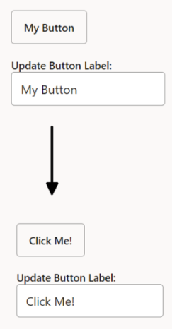
The Oracle JET Cookbook contains the complete example used in this section. See Text Binding.
Bind HTML Attributes
Oracle JET supports one-way attribute data binding for attributes on any HTML element by prefixing ":" to the attribute name and by importing the ojknockout module.
To use an HTML attribute in an HTML or JET element, prefix a colon to it. JET component–specific attributes do not need the prefix.
The following code sample shows two JET elements and two HTML elements that use both the prefixed and non-prefixed syntax. Since the label and input elements are native HTML elements, all their data bound attributes should use the colon prefixing. The oj-label and oj-input-text elements use the prefix only for native HTML element attributes and the non-prefixed syntax for component-specific attributes.
<div id="demo-container">
  <oj-label for="[[inputId1]]">oj-input-text element</oj-label>
  <oj-input-text :id="[[inputId1]]" value="{{value}}"></oj-input-text>
  <br><br>
  <label :for="[[inputId2]]">HTML input element</label>
  <br>
  <input :id="[[inputId2]]" :value="[[value]]" style="width:100%;max-width:18em"/>
</div>
The script to create the viewModel for this example is shown below.
import * as ko from "knockout";
import "ojs/ojinputtext";
import "ojs/ojlabel";
import 'ojs/ojknockout';

class ViewModel {
  inputId1: ko.Observable<string>;
  inputId2: ko.Observable<string>;
  value: ko.Observable<string>;

  constructor() {
    this.inputId1 = ko.observable("text-input1");
    this.inputId2 = ko.observable("text-input2");
    this.value = ko.observable("This text value is bound.");
  }
}

export = ViewModel;
define(["knockout", "ojs/ojknockout", "ojs/ojinputtext", "ojs/ojlabel"],
function (ko) {
function ViewModel() {
this.inputId1 = ko.observable("text-input1");
this.inputId2 = ko.observable("text-input2");
this.value = ko.observable("This text value is bound.");
}
return ViewModel;
});The figure below shows the output for the code sample.
The Oracle JET Cookbook contains the complete example used in this section. See Attribute Binding.
Use oj-bind-if to Process Conditionals
Oracle JET supports conditional rendering of elements by using the oj-bind-if element and importing the ojknockout module.
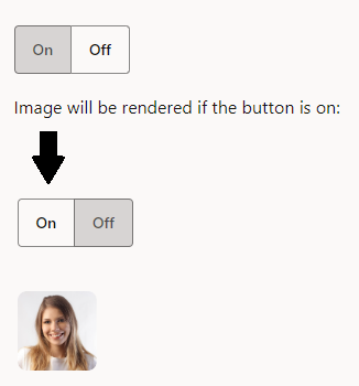
The oj-bind-if element is removed from the DOM after binding is applied, and must be wrapped in another element such as a div if it is used for slotting. The slot attribute has to be applied to the wrapper since oj-bind-if does not support it. For example, the following code sample shows an image that is conditionally rendered based on the option chosen in an oj-buttonset.
<div id="demo-container">
<oj-buttonset-one class="oj-buttonset-width-auto" value="{{buttonValue}}">
  <oj-option id="onOption" value="on">On</oj-option>
  <oj-option id="offOption" value="off">Off</oj-option>
</oj-buttonset-one>
<br><br>
<div>Image will be rendered if the button is on:</div>
<oj-bind-if test="[[buttonValue() === 'on']]">
  <oj-avatar role="img" aria-label="Avatar of Amy Bartlet" size="md" initials="AB"
	src="../css/images/avatar-image.jpg" class="oj-avatar-image"></oj-avatar>
</oj-bind-if>
</div>
In the above example, the oj-avatar element is an icon which can display a custom or placeholder image. See
oj-avatar.
The script to create the view model for this example is shown below.
import * as ko from "knockout";
import "ojs/ojknockout";
import "ojs/ojbutton";
import "ojs/ojavatar";

class ViewModel {
  buttonValue = ko.observable("off");
}
export = ViewModel;
define(['knockout', 'ojs/ojknockout', 'ojs/ojbutton', 'ojs/ojavatar'],
function (ko) {
function ViewModel() {
this.buttonValue = ko.observable("off");
}
return ViewModel;
}
);The figure below shows the output for the code sample. When the
oj-buttonset is set to 'on', the oj-avatar element is
rendered and displayed.
The Oracle JET Cookbook contains the complete example used in this section. See If Binding.
Use oj-bind-for-each to Process Loop Instructions
Oracle JET supports processing loop instructions, such as binding items from an array by using the oj-bind-for-each element and by importing the ojknockout module.
The oj-bind-for-each element only accepts a single template element as its direct child. Any markup to be duplicated, such as li tags, must be placed inside the template tag. For example, the following code sample shows an unordered list nested inside another unordered list. The list items are created using an oj-bind-text tag inside nested oj-bind-for-each elements.
<div id="form-container">
  <ul>
    <oj-bind-for-each data="[[categories]]">
      <template data-oj-as="category">
        <li>
          <ul>
            <oj-bind-for-each data="[[category.data.items]]">
              <template data-oj-as="item">
                <li>
                  <oj-bind-text value="[[category.data.name + ' : ' + item.data]]"></oj-bind-text>
                </li>
              </template>
            </oj-bind-for-each>
          </ul>
        </li>
      </template>
    </oj-bind-for-each>
  </ul>
</div>
In the above example, the data-oj-as attribute provides an alias for the bound data. This alias is referenced in the nested oj-bind-for-each and oj-bind-text elements.
The script to create the viewModel for this example is shown below.
import 'ojs/ojknockout';
import "ojs/ojbutton";

class ViewModel {
  categories: Array<Object>;

  constructor() {
    this.categories =
      [{ name: "Fruit", items: ["Apple", "Orange", "Banana"] },
       { name: "Vegetables", items: ["Celery", "Corn", "Spinach"] }
      ];
  }
}

export = ViewModel;
define(["ojs/ojknockout", "ojs/ojbutton"],
function () {
function ViewModel() {
this.categories =
[{ name: "Fruit", items: ["Apple", "Orange", "Banana"] },
{ name: "Vegetables", items: ["Celery", "Corn", "Spinach"] }
];
}
return ViewModel;
});The figure below shows the output for the code sample.
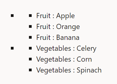
The Oracle JET Cookbook contains the complete example used in this section. See Foreach Binding.
Bind Style Properties
The Oracle JET attribute binding syntax also supports style attributes, which can be passed as an object or set using dot notation. The ojknockout module must be imported.
The style attribute binding syntax accepts an object in which style properties should be referenced by their JavaScript names. Apps can also set style sub-properties using dot notation, which uses the CSS names for the properties. The code sample below shows two block elements with style attributes. The first element binds a style object, while the second binds properties directly to the defined style attributes.
<div id="demo-container">
  <div :style="[[style]]">Data bound style attribute</div>
  <br>
  <div :style.color="[[fontColor]]" :style.font-style="[[fontStyle]]">Data bound style using dot notation</div>
</div>
The script to create the viewModel for this example is shown below. The style object referenced above is highlighted below.
import 'ojs/ojknockout';
import 'ojs/ojlabel';
import 'ojs/ojinputtext';

class ViewModel {
  fontColor = 'blue';
  fontStyle = 'italic';
  style = { fontWeight: 'bold',
            color: 'red' };
}

export = ViewModel;
define(["ojs/ojknockout", "ojs/ojlabel", "ojs/ojinputtext" ],
function () {
function ViewModel() {
this.fontColor = 'blue';
this.fontStyle = 'italic';
this.style = {
fontWeight: 'bold',
color: 'red'
};
}
}
return ViewModel;
});The figure below shows the output for the code sample.
The Oracle JET Cookbook contains the complete example used in this section. See Style Binding.
Bind Event Listeners to JET and HTML Elements
Oracle JET provides one-way attribute data binding for event listeners on JET and HTML elements using the on-[eventname] syntax and by importing the ojknockout module.
Oracle JET event attributes provide two key advantages over native HTML event listeners. First, they provide three parameters to the listener:
-
event: The DOM event, such as click or mouse over. -
data: equal tobindingContext['$data']. When used in iterations, such as in anoj-bind-for-each, this parameter is the same asbindingContext['$current']. -
bindingContext: The entire data binding context (or scope) that is applied to the element.
Second, they have access to the model state and can access functions defined in the ViewModel using the data and bindingContext parameters.
Note:
Thethis context is not directly available in the event listeners. This is the same behavior as native HTML event listeners.
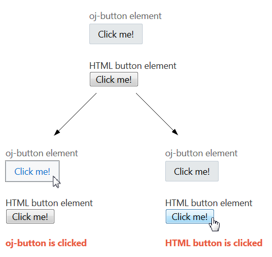
For example, the following code sample shows an oj-button that uses the on-oj-action event attribute and an HTML button that uses the on-click event attribute to access custom functions defined in the ViewModel shown below.
<div id="demo-container">
  <oj-label for="button1">oj-button element</oj-label>
  <oj-button id="button1" on-oj-action="[[clickListener1]]">Click me!</oj-button>
  <br><br>
  <label for="button2">HTML button element</label>
  <br>
  <button id="button2" on-click="[[clickListener2]]">Click me!</button>
  <br><br>
  <div style="font-weight:bold;color:#ea5b3f;">
    <oj-bind-text value="[[message]]"></oj-bind-text>
  </div>
</div>
Note:
HTML events use the prefix “on”, such asonclick and onload. JET events use the prefix “on-”, such as on-click and on-load.
The script to create the view model for this example is shown below. Note the usage of the data attribute to access the message parameter.
require(['ojs/ojbootstrap', 'knockout', 'ojs/ojbutton', 'ojs/ojlabel', 'ojs/ojknockout'],
  function(Bootstrap, ko)
  {
    function ViewModel()
    {
      this.message = ko.observable();

      this.clickListener1 = function(event, data, bindingContext)
      {
        data.message('oj-button is clicked');
      };

      this.clickListener2 = function(event, data, bindingContext)
      {
        data.message('HTML button is clicked');
      };
    }

    Bootstrap.whenDocumentReady().then(
      function ()
      {
        ko.applyBindings(new ViewModel(), document.getElementById('demo-container'));
      }
    );
  });
The figure below shows the output for the code sample.
The Oracle JET Cookbook contains the complete example used in this section. See Event Binding.
Bind Classes
The Oracle JET attribute binding syntax has enhanced support for the class attribute, and can accept in addition to a string, an object or an array. This can be used to set classes on components. The ojknockout module must be imported.
The :class attribute binding can support expressions that resolve to a space delimited string, an Array of class names, or an Object of class to a boolean value or expression for toggling the class in the DOM. Object values can be used to toggle classes on and off. Array and string values can be used only to set classes.
For example, the following code sample shows an oj-input-text and an HTML input that both use :class.
<oj-input-text id="input1"
               :class="[[{'oj-form-control-text-align-right': alignRight}]]"
               value="Text Content"></oj-input-text>
<oj-button id="button2" on-oj-action="[[clickListener2]]">Toggle Alignment</oj-button>

<input id="input2" :class="[[classArrayObs]]"
       value="Text Content" style="width:100%;max-width:18em"/>
<oj-button id="button1" on-oj-action="[[clickListener1]]">Add Class</oj-button>
The script to create the view model for this example is shown below.
require(['ojs/ojbootstrap', 'knockout', 'ojs/ojlabel', 'ojs/ojinputtext', 'ojs/ojbutton', 'ojs/ojknockout'],
  function(Bootstrap, ko)
  {
    function ViewModel()
    {
      this.alignRight = ko.observable(false);
      this.classArrayObs = ko.observableArray();
      var classList = ['pink', 'bold', 'italic'];
      var self = this;

      this.clickListener1 = function(event, data, bindingContext) {
        var newClass = classList.pop();
        this.classArrayObs.push(newClass);

        // Disable the add button once we're out of classes
        if (classList.length === 0)
          document.getElementById('button1').disabled = true;
      }.bind(this);

      this.clickListener2 = function(event, data, bindingContext) {
        self.alignRight(!this.alignRight());
      }.bind(this);;
    }

    Bootstrap.whenDocumentReady().then(
      function ()
      {
        ko.applyBindings(new ViewModel(), document.getElementById('demo-container'));
      }
    );
  });
The CSS class styles used by the classList variable above are shown below.
.bold {
  font-weight: bold;
}
.italic {
  font-style: italic;
}
.pink {
  color: #ff69b4;
}
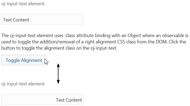
The figure below shows the first of the two outputs for the code sample. The button acts as a toggle to switch on and off the oj-form-control-text-align-right class property and hence change the alignment of the text.
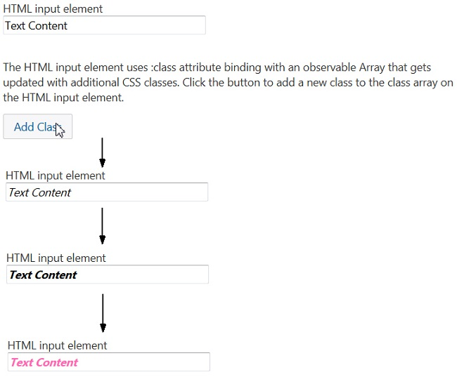
The figure below shows the second of the two outputs for the code sample. The button calls a function to take a pre-defined array of classes and add them to the input element. Each class has CSS modifications that come into effect when the class is added.
The Oracle JET Cookbook contains the complete example used in this section. See Class Binding.
Add an Oracle JET Component to Your Page
Use the Oracle JET Cookbook recipes and API documentation to locate examples that illustrate the specific element and functionality you want to add to your page.
If you haven't already, create the app that you will use for this exercise.
To add an Oracle JET custom element to your page:
Add Animation Effects
You can use the oj-module component’s animation property in conjunction with the ModuleAnimations namespace to configure animation effects when the user transitions between or drills into views. If you’re not using oj-module, you can use the AnimationUtils namespace instead to add animation to Oracle JET components or HTML elements.
Adding Animation Effects Using the oj-module Component
The ModuleAnimations namespace includes pre-configured implementations that you can use to configure the following animation effects:
-
coverStart: The new view slides in to cover the old view. -
coverUp: The new view slides up to cover the old view. -
drillIn: Animation effect is platform-dependent.-
Web and iOS:
coverStart -
Android:
coverUp
-
-
drillOut: Animation effect is platform-dependent.-
Web and iOS:
revealEnd -
Android:
revealDown
-
-
fade: The new view fades in and the old view fades out. -
goLeft: Navigate to sibling view on the left. Default effect is platform-dependent.-
Web and iOS: none
-
Android:
pushRight
-
-
goRight: Navigate to sibling view on the right. Default effect is platform-dependent.-
Web and iOS: none
-
Android:
pushLeft
-
-
pushLeft: The new view pushes the old view out to the left. -
pushRight: The new view pushes the old view out to the right. -
revealDown: The old view slides down to reveal the new view. -
revealEnd: The new view slides left or right to reveal the new view, depending on the locale. -
zoomIn: The new view zooms in. -
zoomOut: The old view zooms out.
For examples that illustrate how to add animation with the oj-module component, see Animation
Effects with Module Component.
Adding Animation Effects Using AnimationUtils
The AnimationUtils namespace includes methods that you can use to configure the following animation effects on HTML elements and Oracle JET components:
-
collapse: Use for collapsing the element -
expand: Use for expanding the element -
fadeInandfadeOut: Use for fading the element into and out of view. -
flipInandflipOut: Use for rotating the element in and out of view. -
ripple: Use for rippling the element. -
slideInandslideOut: Use for sliding the element into and out of view. -
zoomInandzoomOut: Using for zooming the element into and out of view.
Depending on the method’s options, you can configure properties like delay, duration, and direction. For examples that illustrate how to configure animation using the AnimationUtils namespace, see Animation
Effects.
Manage the Visibility of Added Component
Follow the recommended best practice when you programmatically manage the display of Oracle JET components in the DOM.
If you manage the display of collection components and other complex
component by using the CSS display property values of
none or block, you may also need to use
Components.subtreeHidden(node) when you hide a component
and Components.subtreeShown(node) when you display the
component. The node parameter refers to the root of the subtree
in the DOM for the component that you are hiding or displaying. You need to notify
Oracle JET if you change the display status of these types of component to ensure that
the component instance continues to work correctly in the app.
Not all components where you programmatically manage the display require you
to notify Oracle JET when you change their display state. Components such as
oj-collapsible, oj-dialog, and
oj-popup are examples of components where you do not need to call
Components.subtreeHidden(node) or
Components.subtreeShown(node). These components manage rendering
when visibility is changed and also manage any components that they contain. Similarly,
you do not need to use these methods in conjunction with the oj-bind-if
component because Oracle JET rewrites the appropriate part of the DOM in response to the
evaluation of the oj-bind-if component’s test
condition.
Failure to use the subtreeHidden and
subtreeShown methods to notify Oracle JET when you hide or show a
component can result in unexpected behavior for the component, such as failure to render
data or failure to honor other component attribute settings. For more information about
the subtreeHidden and subtreeShown methods, see
API
Reference for Oracle® JavaScript Extension Toolkit (Oracle JET).
