Bar Graphs
Bar graphs are commonly used visualization types. You can use them to compare data across categories, identify outliers, and uncover historical high and low data points.
Simple Bar Graphs
The simplest bar graph visualizations available in Oracle Analytics are called Bar ![]() and Horizontal Bar
and Horizontal Bar ![]() .
.
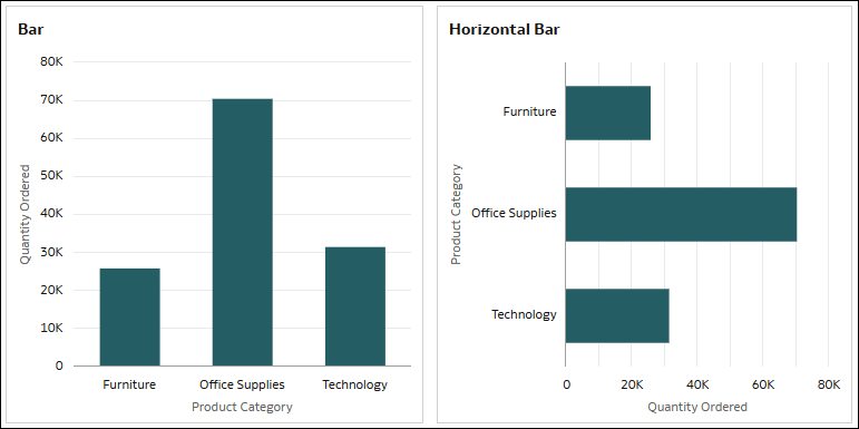
These visualizations graph data in the form of vertical or horizontal bars where the length of the bars is proportional to the values they represent. They compare groups of data using a measure and a single attribute.
The vertical bar graph is best used to show large changes. A horizontal bar graph can make text labels easier to read than a standard bar graph, particularly if the labels are long.
For example, use a vertical or horizontal bar graph to compare the quantity ordered across the different product subcategories.
For a vertical bar graph, use a measure such as Quantity Ordered for Values (Y-Axis) and an attribute such as Product Category for Category (X-Axis).
For a horizontal bar graph, use Quantity Ordered for Values (X-Axis) and Product Category for Category (Y-Axis).
Stacked Bar Graphs
The two basic stacked bar graph visualizations available in Oracle Analytics are called Stacked Bar ![]() and Horizontal Stacked
and Horizontal Stacked ![]() .
.
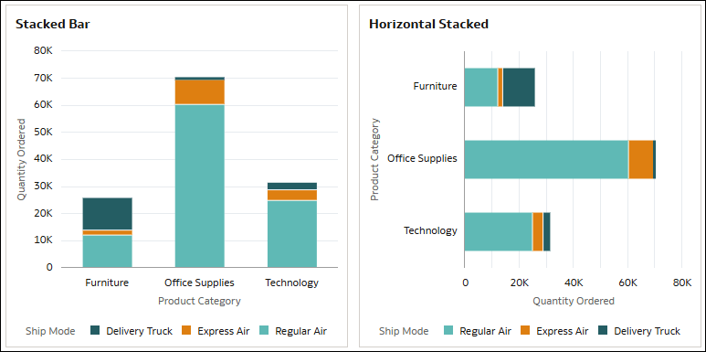
A stacked bar visualization depicts the bars using two categories instead of one and is best used to show the total sizes of groups. You can create vertical or horizontal stacked bar visualizations.
For example, use a stacked bar graph to compare the quantity ordered across the different product categories while also showing the ship modes used.
For a vertical stacked bar graph, use a measure such as Quantity Ordered for Values (Y-Axis), an attribute such as Product Category for Category (X-Axis), and another attribute such as Ship Mode for Color.
For a horizontal stacked bar graph, use Quantity Ordered for Values (X-Axis), Product Category for Category (Y-Axis), and Ship Mode for Color.
In these examples, the values axes display the numeric values for Quantity Ordered to indicate the absolute value for each product category by the ship modes. The bars show the product categories and the colors within the bars represent the ship modes.
100% Stacked Bar Graphs
The two 100% stacked bar graph visualizations available in Oracle Analytics are called 100% Stacked Bar ![]() and Horizontal 100% Stacked Bar
and Horizontal 100% Stacked Bar ![]() .
.
A 100% stacked bar visualization spreads the relative data point percentage values to equal the entire bar length. Data containing negative values extends the bar below the baseline of 0%. You can create vertical or horizontal 100% stacked bar visualizations.
This visualization type is sometimes easier to understand than a regular stacked bar where the composition of bars that are small might be difficult to see.
For example, use a 100% stacked bar graph to compare the quantity ordered across the different product categories while also showing the ship mode used.
For a vertical 100% stacked bar, use a measure such as Quantity Ordered for Values (Y-Axis), an attribute such as Product Category for Category (X-Axis), and another attribute such as Ship Mode for Color.
For a horizontal 100% stacked bar, use Quantity Ordered for Values (X-Axis), Product Category for Category (Y-Axis), and Ship Mode for Color.
In this example, similar to the stacked bar graphs, the bars show the product categories and the colors within the bars represent the ship modes. However, the values axes display percentages from 0 to 100 to indicate the composition of each product category by the ship modes. In the Furniture product category, the Delivery Truck ship mode is 46% of quantity ordered, Express Air is 7%, and Regular Air is 47%.
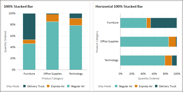
Description of the illustration 100_stacked_bar_examples.png
Mekko Charts
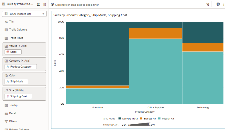
In Oracle Analytics, you can also use a 100% stacked bar visualization to create a Mekko chart.
For example, take a vertical 100% stacked bar graph comparing the sales and shipping costs across the different product categories and ship modes, and then use the Bar Gap and Bar Size properties to turn it into a Mekko chart. In the Grammar pane, use Sales for Values (Y-Axis) and Shipping Cost for Size (Width). Use Product Categories for Category (X-Axis) and Ship Mode for Color. In the General Properties tab, use the Bar Gap property to remove the space between the bars and select the Apply to Stack option for the Bar Size property to make the segments in each bar the same width.
Combo and Overlay Charts
As part of the bar graphs visualization type, Oracle Analytics offers a Combo ![]() visualization and an Overlay Chart
visualization and an Overlay Chart ![]() visualization.
visualization.
A combo chart displays different types of data in different ways, all within the same graph. In Oracle Analytics, you can use bar, line, area, and scatter graphs in a combo visualization.
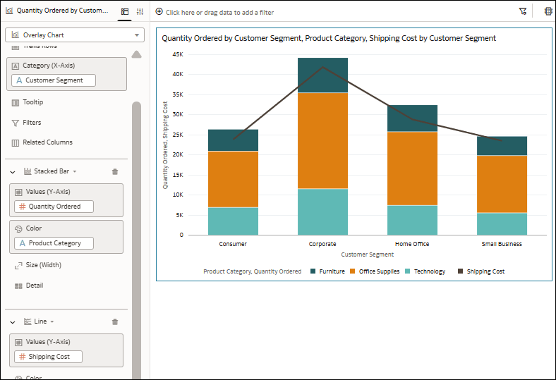
An overlay chart enables advanced combination charts with a multi-layer grammar experience. In Oracle Analytics, you can use bar, stacked bar, line, area, category, and stacked category charts. You can configure various properties for the different layers to ensure an overlay chart is clear using the properties in the Data Layers tab of the Properties pane.
For example, create an overlay chart that uses a stacked bar graph to show the quantity ordered across the different customer segments by product category, and a line graph to show the shipping cost.
Use the column Customer Segment for Category (X-Axis) which is a common element. Then choose a Stacked Bar visualization for the first layer and use Quantity Ordered for Values (Y-Axis) and Product Category for Color. Add another layer with a Line visualization and use Shipping Cost for Values (Y-Axis). The visualization shows the stacked bar graph and line graph together as one.
Butterfly Charts
As part of the bar graphs visualization type, Oracle Analytics offers the Butterfly ![]() visualization.
visualization.
A butterfly chart compares two measures side-by-side along a vertical line. The left side of the vertical line represents the first measure on the X-axis and the right side of the vertical line represents the second measure on the X-axis. To compare the measures, you select a common attribute.
For example, use a butterfly chart to compare profit and sales numbers for product subcategories. Use two measures such as Profit and Sales for Values (X-Axis) and an attribute such as Product Sub Category for Category (Y-Axis).
In this example, the bars to the left of the vertical line in the visualization represent Profit and the bars to the right represent Sales.
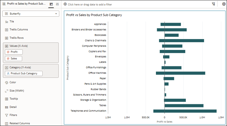
Description of the illustration butterfly_chart_example.png
You can configure the scale for the measures on the horizontal axis to use the same or different levels of granularity. Use the Synchronize Scales property for the visualization.
Waterfall Charts
As part of the bar graphs visualization type, Oracle Analytics offers the Waterfall ![]() visualization.
visualization.
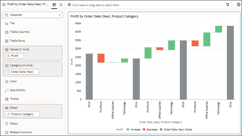
A waterfall visualization shows how a value changes over time, uses the X, Y, Z axes to display intermediate values, and is useful in executive presentations.
For example, use a waterfall chart to see the composition of profit over time and how the different product categories contribute to the changes. Use a measure such as Profit for Values (Y-Axis), a date column such as Order Date (Year) for Category (X-Axis), and an attribute such as Product Category for Detail.
In this example, the different colored bars show the increases and decreases in profit for the product categories and the long bars touching the vertical axis show the totals for each year.
Boxplots
The two boxplot visualizations available in Oracle Analytics are called Boxplot ![]() and Horizontal Boxplot
and Horizontal Boxplot ![]() .
.
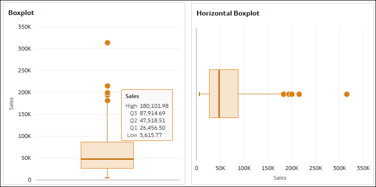
A boxplot visualization depicts groups of numerical data through quartiles and identifies outliers. The box contains the three quartiles in the interquartile range (IQR) and represents the middle 50% of the data, and the dots represent the outliers. The data limit is 10,000 rows.
For example, use a boxplot to see the distribution of cities across sales.
For a vertical boxplot, use a measure such as Sales for Values (Y-Axis) and an attribute such as City for Detail (Box).
For a horizontal boxplot, use Sales for Values (X-Axis) and City for Detail (Box).
- High - The maximum value (Q3 + 1.5*IQR), represented by the end of the vertical line on top of the box (or to the right of the box for horizontal boxplots).
- Q3 - The upper quartile, represented by the top of the box (or the right side of the box for horizontal boxplots).
- Q2 - The median, represented by the line in the middle of the box.
- Q1 - The lower quartile, represented by the bottom of the box (or the left side of the box for horizontal boxplots).
- Low - The minimum value (Q1 - 1.5*IQR), represented by the end of the vertical line below the box (or to the left of the box for horizontal boxplots).
