Create a Cluster or Outlier in a Visualization
Add clusters or outliers to your workbooks.
- On your home page, hover over a workbook, click Actions, then select Open.
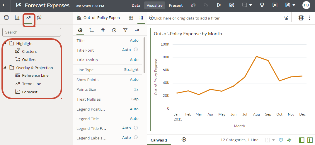
- In the Data Panel, click Analytics
 .
. - Drag and drop Clusters or Outliers from the Analytics pane to a visualization.
- To configure the analytics function, click Analytics on the Properties pane.
