9.2 Add Conditions

This topic describes the systematic instruction to Add Conditions option.

This capability allows designers to define complex interaction handling for supported components. It establishes a relationship between two components:

  • Variable component: The dependent component that changes based on input from the controlling component.
  • Controlling component: The component that determines what is displayed or how the variable component behaves.

This feature simplifies managing interactions within a particular component ensuring dynamic design behavior.

This capability has two use cases:

  1. Show/Hide of variable component based on the explicit value, state or selection of the controlling component.
  2. Show/Hide of variable component based on the defined properties of the controlling component.

Note:

  • For cases where there are multiple variable components controlled by a single controlling component, place all the variable components in a single frame.
  • For cases where the interaction leads an external component, please use Figma’s native prototyping feature.

Case 1: Show/Hide of variable component based on the explicit value, state or selection of the controlling component.

For example:

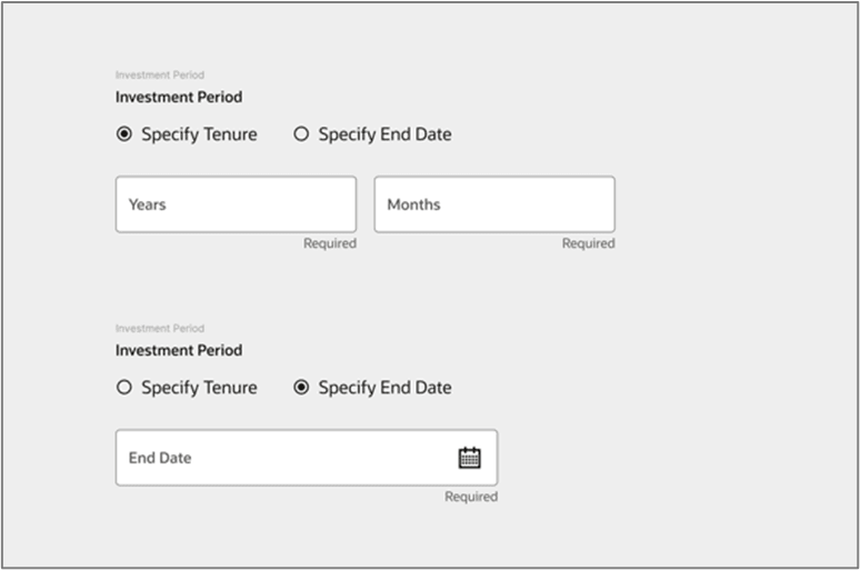
To hide and show the relevant fields on the click of the below radio button:

Figure 9-6 Variable Component


  1. Ensure that all the components are present in one single frame.
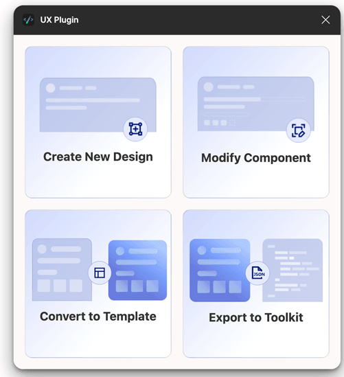
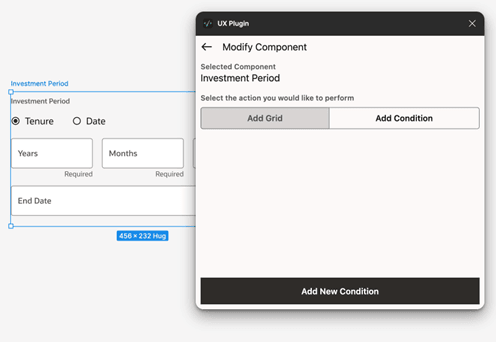
  2. Select the designed frame, run the plugin, and select the Modify Component option.
  3. Select the variable component (in this case, the Input fields), then choose the Add Condition option. Next, click on the Add New Condition button located at the bottom of the window.

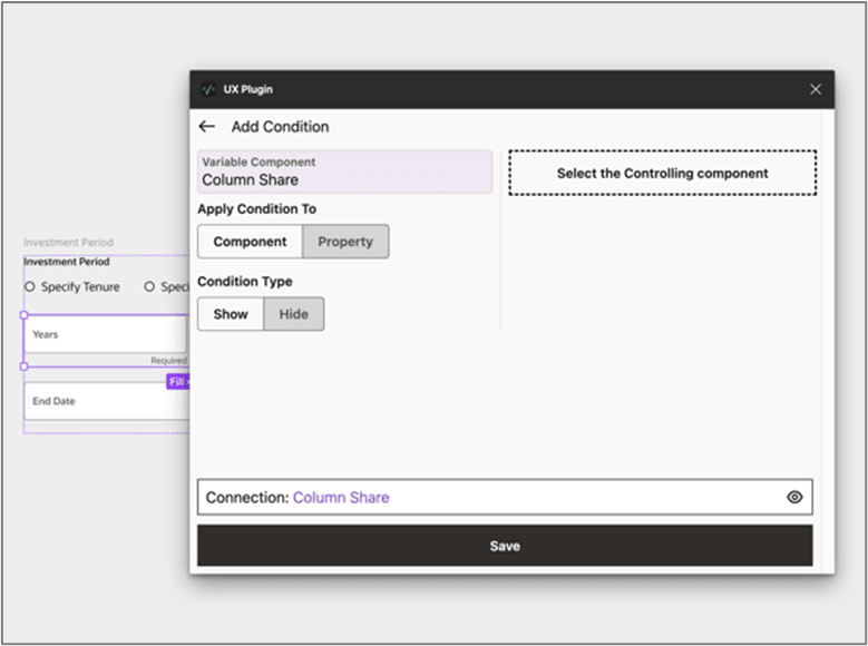
    The next page appears.

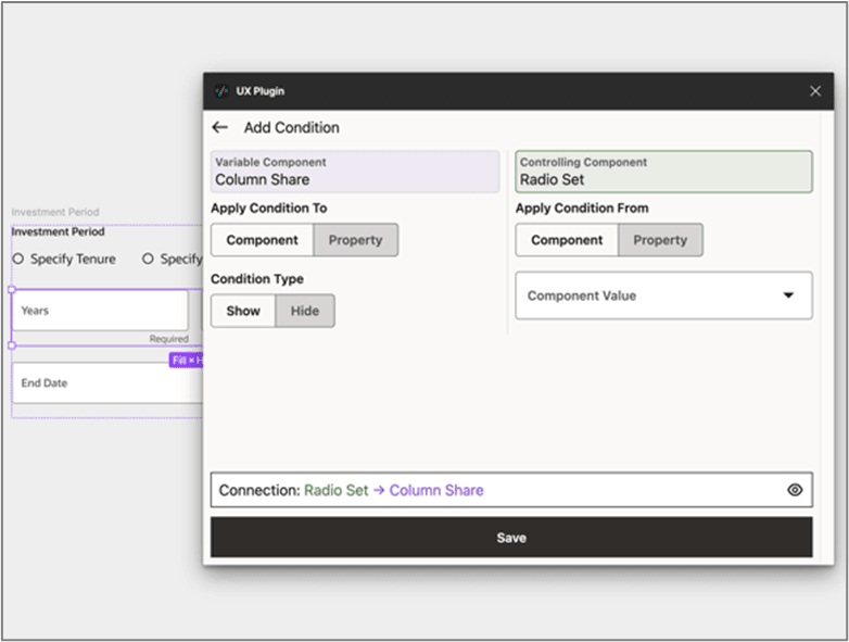
  4. Choose which aspect of the variable component the controlling component will affect.
    • The entire variable component
    • A property of the variable component
    • In this case, show the entire variable component.

    Figure 9-10 Controlling Component


  5. Tap on the button Select the Controlling Component and choose the controlling component Radio Set.

    Figure 9-11 Controlling Component


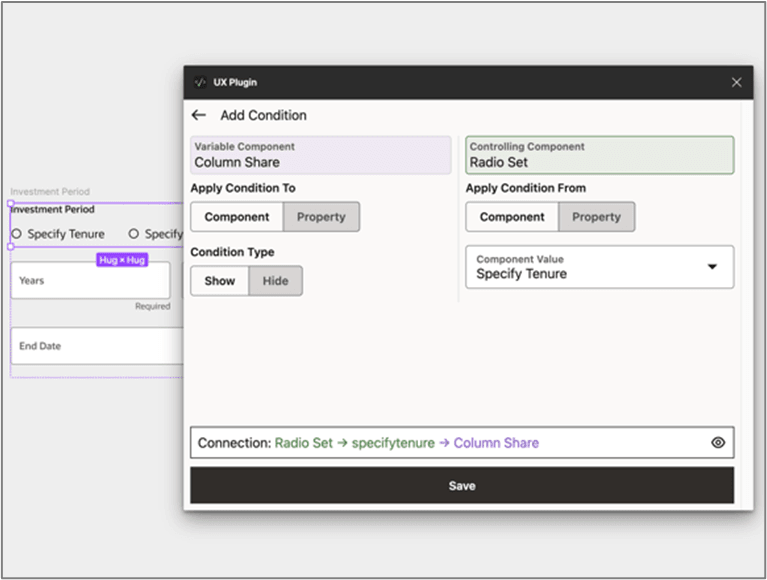
  6. Select the controlling radio button Specify Tenure from the Component Value drop-down to control the visibility of the input fields on tap of the Specify Tenure radio button.

    Figure 9-12 Controlling Component


  7. Review the condition through the connection flow located at the bottom of the window and click Save to save the condition.
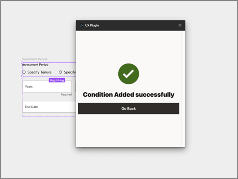
    The success message od condition added appears.
  8. Repeat the same procedure for the other radio button Specify Duration and ensure that the connection reads:

Case 2: Show/Hide of variable component based on the defined properties of the controlling component.

  1. Repeat the steps 1-4 of the Case 1.
    The variable component is set.
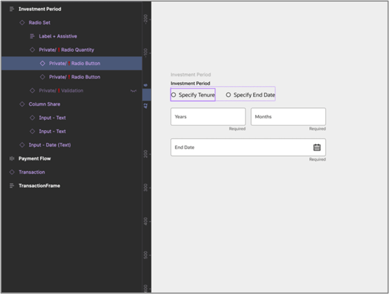
  2. In order to control the selected property of the Specify Tenure radio button, the radio button's layer must be selected.

    Note:

    For convenience use Figma’s layer panel to select that specific layer.
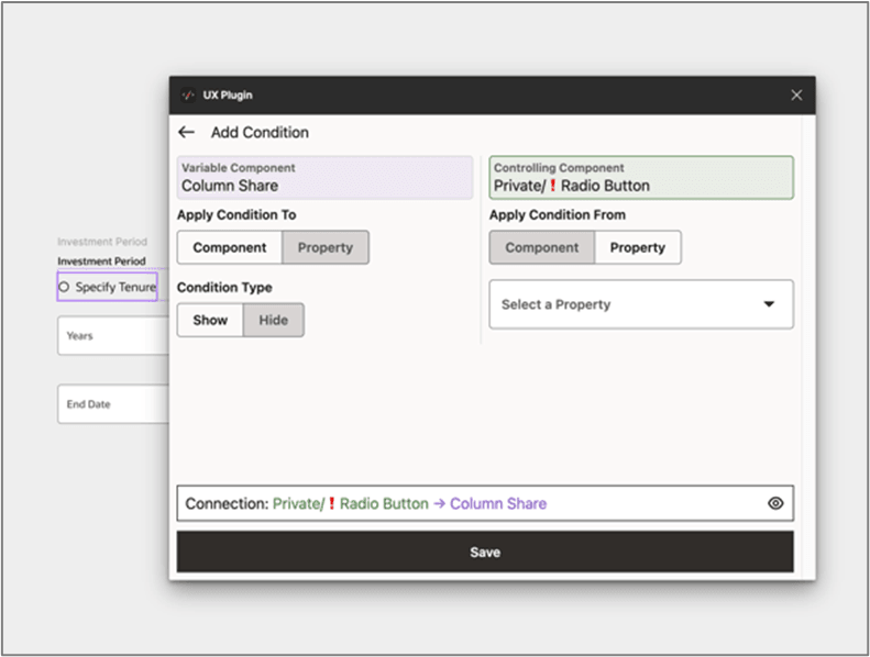
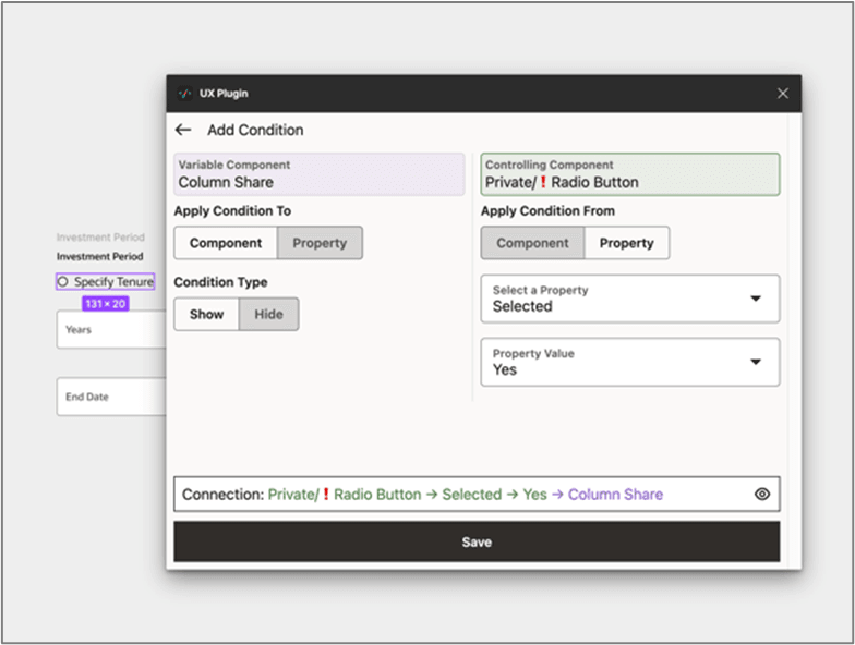
  3. After selecting the appropriate layer, switch back to the plugin and apply the desired condition from the Property options.
  4. Choose the selected property followed by the Yes property value from their respective drop-downs.
  5. Review the condition through the connection flow located at the bottom of the window and click Save to save the condition.
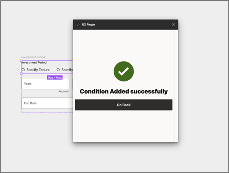
    The success message of condition added appears.
  6. Repeat the same procedure for the other radio button Specify Duration and ensure that the connection reads: